")
Overview
Navigation Collection pages group together functionally similar components. This enables users to easily navigate between the different components. Refer to the Navigation Standard for more information on the use of Application Start pages and Homepages for user navigation.
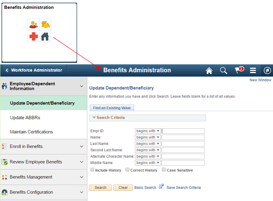
The following example shows navigation from a Benefits Administration tile to a Benefits Administration Navigation Collection page:
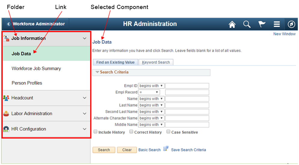
A Navigation Collection page is displayed in a two panel layout with links to components displayed in the left panel and the selected component displayed in the right content area. Component links may be grouped together into folders:
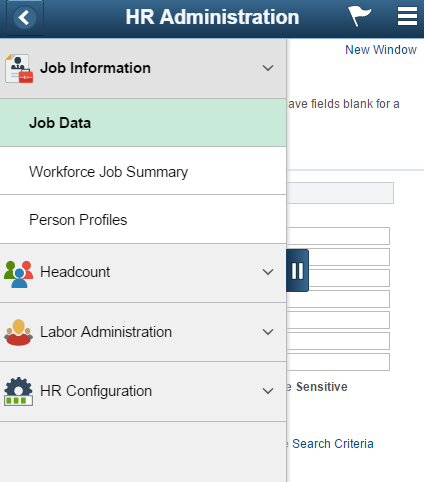
The two panel layout becomes an overlay when the window narrows and on small form factor devices:
Default behavior and attributes of a Navigation Collection page are as follows:
- Components may be either Fluid or Classic.
- When the left panel contains folders, the first folder is automatically expanded.
- By default, the first component in the list is selected when the page is opened.
- The selected component in the left panel is highlighted in the green active color, and the selected component appears in the content area on the right.
- Users see only those folders and links they have security authorization for. These items will not appear if the user does not have security access.
- The back button in the upper left of the selected component returns users to the prior page, typically a Fluid homepage.
Guidelines and recommendations:
| Type | Guidelines for Use |
|---|---|
| Banner Title | The banner title should match the name of the tile that opens the Navigation Collection page. |
| Component Grouping | Group components together on a Navigation Collection page in such a way that it will reduce the total number of clicks needed to navigate between components that are frequently used together. |
| First Component | By default, the first component in the list on the left panel will automatically open. The first component selected should be the most frequently used component for the Navigation Collection page and ideally should be quick to load. The first component cannot be a Fluid component with a two panel layout, refer to the section on Fluid Components with a Left Panel below. |
| Left Panel | The left panel should be fixed and not collapsible on non small form factor when the screen is wide enough and the left panel is displayed next to the selected component. The left panel tab does not display when screen width allows full left panel display. The tab displays on small form factor and whenever the left panel is displayed as an overlay. The left panel should open in an expanded state when it opens as an overlay. For example, on small form factor when the Navigation page is first opened, users see the expanded left panel with the list of component links; the left panel will not be collapsed. |
Left Panel Contents
Folders
Users may need to access many components, one after another, to perform their job duties. Folders can be expanded and collapsed providing a way to place more component links onto one Navigation Collection page. Folders also provide named categories for groups of links.
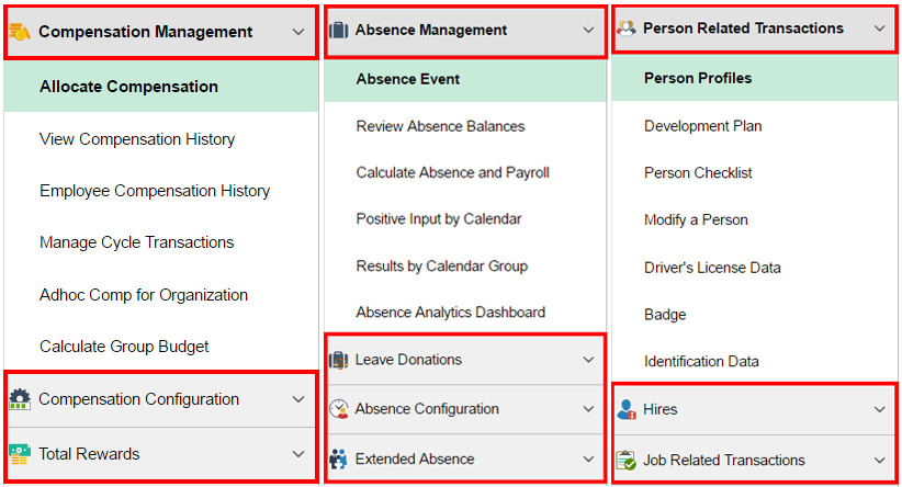
The following examples show folders used in Navigation Collection pages:
The example above shows the maximum number of folder levels allowed. There is not enough space in the left panel to display more than one nested child level list of links.
Guidelines and recommendations:
| Type | Guidelines for Use |
|---|---|
| Folders versus Individual Links | It is acceptable to combine both folders and individual links. Related links should be categorized and placed into folders. |
| Number of Folders and Links | The number of folders a given user has access to should not require excessive scrolling. The number of links within a folder when the folder is expanded should not require excessive scrolling. |
| Folder Levels | Folders may not contain folders. The left panel of a Navigation Collection page can contain no more than one level of folders. There is not enough space in the left panel of a two panel layout to properly display a hierarchy of nested folders. |
Images
Images appear differently based on whether the left panel contains individual links or links grouped into folders.
- Folders – images are displayed for the folder only, to the left of the folder name. No images are displayed for the component links under the folder.
- Individual Links – images are displayed for each individual component link, to the left of the link.
Guidelines and recommendations:
| Type | Guidelines for Use |
|---|---|
| Type | Images must be of type svg. |
| Size | The image size requested should be medium in size or 24x24 pixels. The image renders as 24x24 on small form factor and 20x20 on non small form factor. |
| Image | A descriptive image should be provided for all folders and all links that are not included in folders. A default image appears when no alternate image is provided and this should be avoided. |
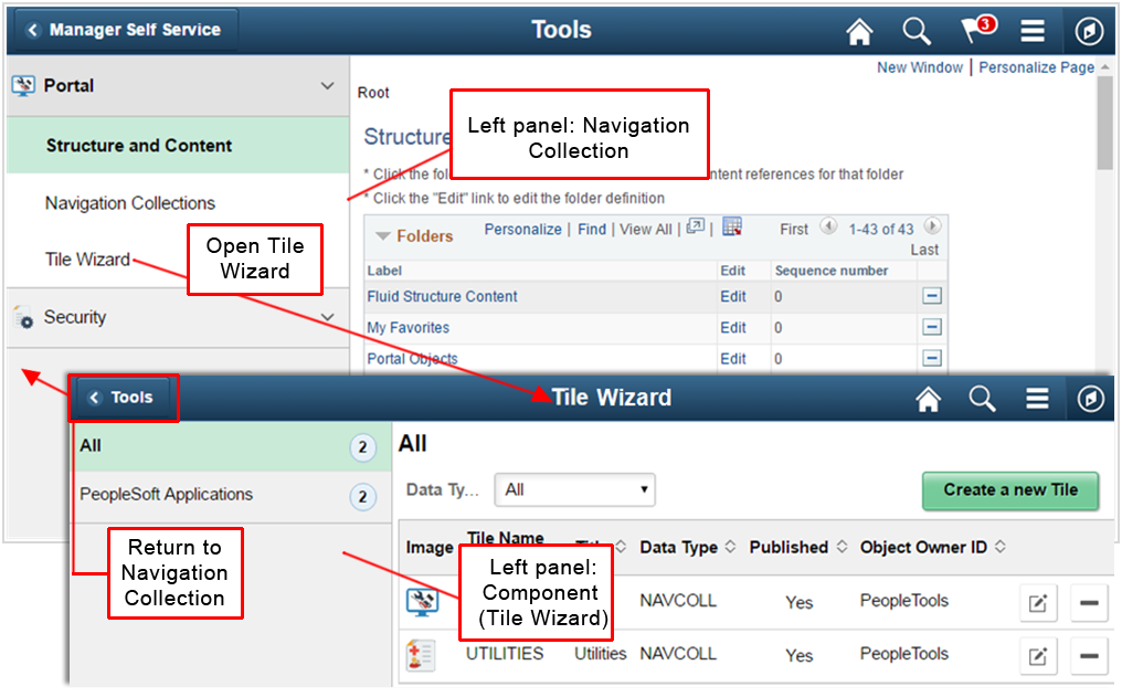
Fluid Components with a Left Panel
The Navigation Collection page is itself a page with a two panel layout. A component link placed in the left panel of the Navigation Collection page may also contain a page with a two panel layout:
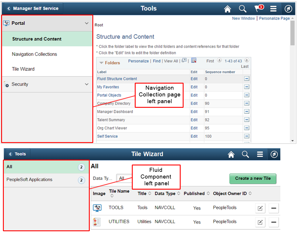
When a Fluid page contains a left panel and it is included as a link in the left panel of the Navigation Collection page, replace the entire Navigation Collection page with the Fluid component.
In the example below, the Tools Navigation Collection page contains a Fluid component, Tile Wizard, which contains a page that also has a two panel layout. When the Tile Wizard link is selected in the left panel, the entire Tile Wizard page replaces the Tools Navigation Collection page so the left panel of the Tile Wizard page can be displayed. When users select the Back button in the banner, they are returned to the Navigation Collection page:
Guidelines and recommendations:
| Type | Guidelines for Use |
|---|---|
| First Component | Do not place a two panel Fluid component as the first component in the left panel of a Navigation Collection page. There is no way for users to access the left panel of the Navigation Collection page. WorkCenters and Activity Guides are all two panel components and cannot be the first component in a Navigation Collection page. For example, the following Talent Profile page is a Fluid page with a two panel layout: 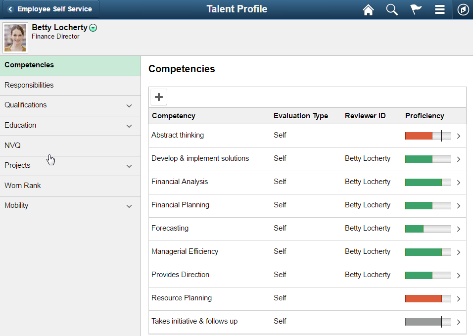
Do not place this Fluid two panel layout page as the first link in a Navigation Collection because there will be no way for users to access the Navigation Collection left panel. The left panel of the Talent Profile page will always be displayed because it is the first component loaded resulting in the Navigation Collection page left panel never being displayed. Because the Navigation Collection left panel is never displayed, there is no way for users to select the back button to go back to the Navigation Collection page left panel to select any other links in the collection and navigate to a different component. |
| Options | It is not acceptable to have two left panels displayed at the same time. The options are:
|
| Additional Left Panel Considerations | When designing a collection of links, consider scenarios when the security does not allow non-two panel pages to display for a given user. If a collection contains a Fluid two panel layout page and the security settings result in making the link for this page the first in the list, there should not be any additional components in the link list following the Fluid two panel link. Per the First Component guideline above, the first component in a Navigation Collection link list should not open a Fluid two panel component or there will be no way to navigate to any other component. |
Application Headers
A Fluid page that is placed inside a Navigation Collection page may have an application header. The application header typically applies only to the contents of the selected component. Therefore the application header should not span the entire width of the page covering the left panel because it implies that it is related to all of the links in the left panel, not just the selected link.
Refer to the Activity Guide standard for more information on optimizing pages with application headers.
The following example shows the Company Directory page with an application header as it appears outside of a Navigation Collection page and as it appears inside a Navigation Collection page.
Outside of the Navigation Collection page, the application header spans the width of the page:
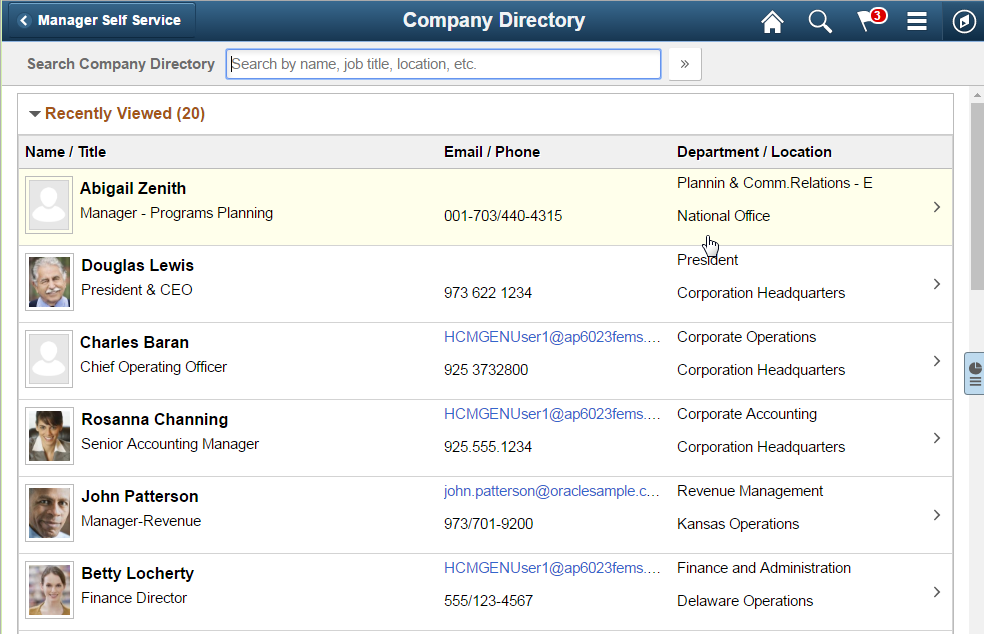
Inside of a Navigation Collection page, the application header only applies to the Company Directory page and therefore the header does not span the width of the page, it spans the content area only:
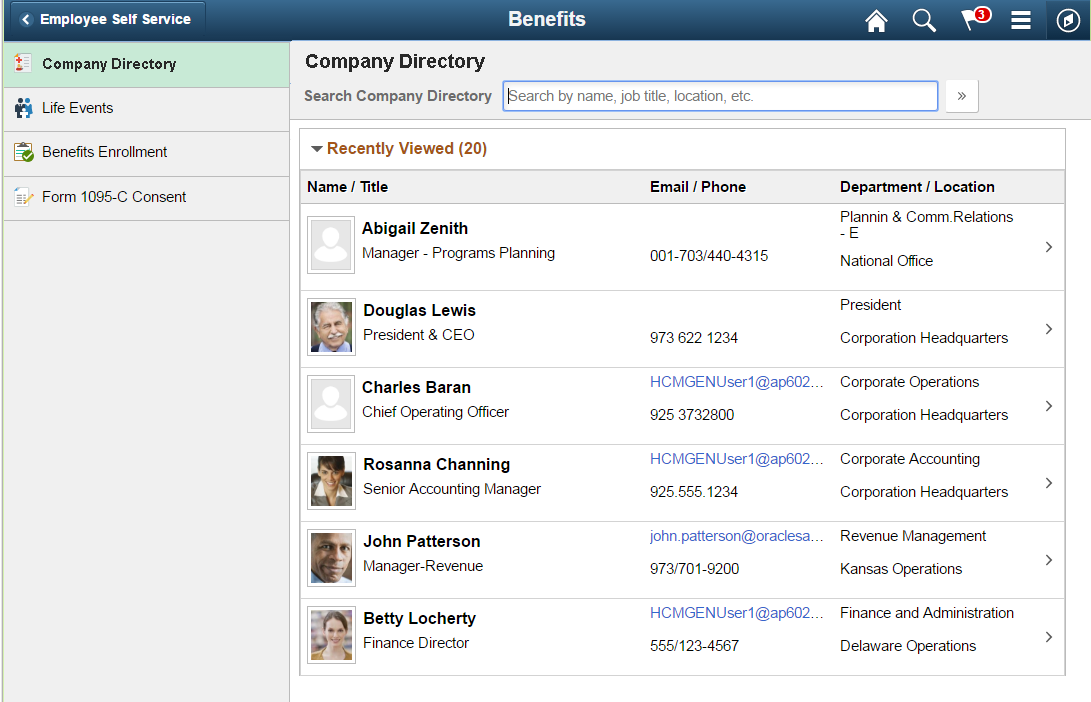
Guidelines and recommendations: The application header should span the width of the related component only in the right side content area and not the entire width of the page when the Header contents does not apply to all of the links in the left panel of the Navigation Collection page.
Tile Wizard
Each Navigation Collection page must have a tile created for it. Create tiles for Navigation Collection pages using the Tile Wizard. The example below shows the Benefits Administration tile that opens the Benefits Administration Navigation Collection page:
Guidelines and recommendations:
| Type | Guidelines for Use |
|---|---|
| Tiles | Create a new tile for each new Navigation Collection page |
| Tile Repository | Place the tile in a parent folder according to the guidelines in the Tile Repository section below. |
| Optimized | Always use an optimized setting when creating tiles so links appear in the left panel. Do not use non-optimized. |
| Name | The tile name should match the name of the Navigation Collection page. For example, in the example above the Tile title is Benefits Administration and the title in the banner of the Navigation Collection page is also Benefits Administration. |
| Homepage | Determine whether the tile will automatically default onto a homepage according to the guidelines in the Homepage Tile Defaulting section below. |
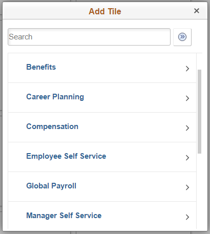
Tile Repository
The tile repository is organized alphabetically by subject area. When adding a new Navigation Collection page tile, determine the most appropriate parent folder for the tile.
The following example shows the parent folders in the tile repository for HCM:
Guidelines and recommendations:
| Type | Guidelines for Use |
|---|---|
| Parent | Place the Navigation Collection page tile in a Parent folder that has a matching subject area. For example, the Benefits Administration Navigation Collection page is placed in the Benefits folder. |
| Order | Order the tiles under the folder alphabetically. |
| Keyword Search | Provide key words for the Add Tile Search capability. |
Homepage Tile Defaulting
Tiles can be made available in the tile repository without automatically defaulting the tile onto a user’s homepage. The user is required to add the tile to one of their homepages themselves.
Tiles can default onto a specific homepage so users automatically see the tile without having to manually add it to one of their homepages. Guidelines and recommendations:
| Type | Guidelines for Use |
|---|---|
| Optional-Default | In general, Navigation Collection page tiles should be defaulted onto a homepage so that users can easily navigate to necessary components. |
| Homepage Tile Count | Do not create situations where a logged in user has access to only one tile on a homepage based on security authorization. In this case it is preferable to allow the user to select a homepage for the tile or, where it makes sense, to default the tile onto a homepage that contains additional tiles for the logged in user. |