")
Overview
This documentation discusses tiles in PeopleSoft Fluid Applications. Both homepage tiles and NavBar tiles are discussed.
Homepage Tiles
Fluid homepages appear when you log in to the PeopleSoft system. Homepages consist of a collection of tiles that show information to the end-user, and enable an easy way to navigate around the system. Homepages can be organized and delivered to end-users with tile content appropriate for specific roles, such as employee or manager. Tiles provide a new PeopleSoft navigational and informational structure. Tiles allow users a quick way to perform routine tasks, such as decision making or monitoring. Tiles give users direct access to targeted transactions.
End-users may personalize tiles, such as modifying which tiles they want to display and their position and sequence on a homepage. Tiles can link to fluid transactions or classic PIA transactions. Tiles are secured by role and can be made mandatory or optional. Tiles automatically change size and position to accommodate viewing on different form factors.
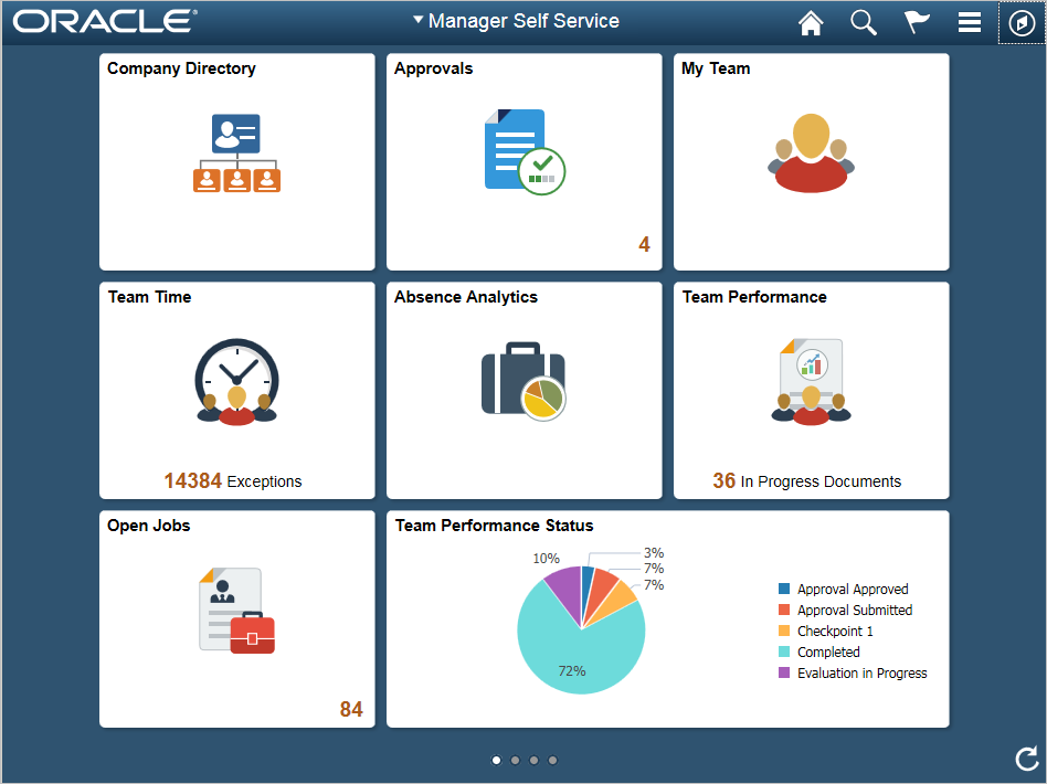
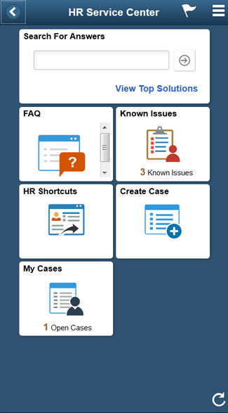
The following is an example of a Fluid homepage containing tiles that users can view for high-level information and completing tasks.
NavBar Tiles
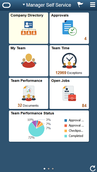
The Fluid Navigation Bar (NavBar) is used to access additional navigational options, also using tiles. The NavBar can be personalized in order to add, remove, or alter the sequence in which the tiles appear. The following is an example of a NavBar containing tiles that you can use as convenient links to navigate the PeopleSoft system.
The primary purpose of the NavBar is to optimize navigation for the end-user and allow them to quickly and easily navigate to transactions.
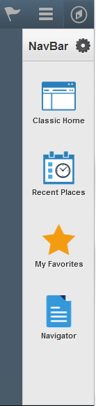
Tools NavBar Tiles
Tools will deliver a set of NavBar tiles to all end-users. These are required tiles that can be re-ordered but not removed from the NavBar by the end-user:
- Recent Places
- My Favorites
- Navigator


NavBar Tile Types
There are two types of NavBar tiles:
- Navigation Tile: a one–touch tile that transfers users directly to a component, it acts as a bookmark and does not display anything in the right-hand content area of the NavBar
- Collection Tile: a tile that when tapped opens up a secondary level of content which can display a list of additional links in the right-hand content area for users to select from
You decide whether it makes sense to provide either a navigation tile or a collection tile for your transactions:
- You need to provide a static image for every tile (showing a representational image of the functional area).
- The NavBar will use the homepage static image, automatically auto-sized by Tools to fit the NavBar.
- NavBar tiles are not interactive. The tile title and image will display on the NavBar tile. No counts, live data, informational text or charts will be shown.
- The tile title will display below the image, auto-formatted by Tools.
- The tile title may auto-wrap to fit NavBar tile dimensions, to display two lines maximum, and then truncate at the end of the second line. Recommendation is to have two lines maximum only.
- If the homepage tile has a chart then the default chart static image will be shown to indicate analytics.
- In Tools Release 8.55 the NavBar does not automatically expand the second level content area if the first tile contains second level content unlike Tools Release 8.54 functionality.
Note: See the Fluid Navigation UX Standard for more information.
Key Elements of Tiles
The following sections discuss the standards for key elements of tiles.
General Tile Guidelines
Users access Fluid components via tiles that are configured to display on a homepage:
- A tile should present meaningful content to the end-user.
- A tile can either contain live data or simply be a static navigation-only tile:
- Live: tiles automatically update to display new content
- Static: tiles always display the same content, usually in the form of a graphic image
- Tiles can display any or all of the following elements:
- Title (required
- Graphic
- Live data
- Informational text
- Numerical count
- Homepage tiles come in four sizes:
- 1x1
- 1x2
- 2x1
- 2x2
- For a static tile use only a small size tile, for example 1x1.
- For a small tile do not use long tile titles.
- For a live tile use a small 1x1 size only if it can support scenarios with short summaries and/or counts.
- Display a count on a tile only when the number is small enough to be meaningful for the scenario.
- If a live tile sends updates that should not be shown in detail, use a small size tile and display information telling users that a new paycheck is available, for example, instead of displaying the paycheck amount.
- Use the wider or larger size tile if it displays new and interesting content and is updated frequently.
- For small form factor devices, the system only displays homepage tiles that were specifically optimized for those devices.
Tile Design Considerations
When you design your tile, consider what type of data and how much of it needs to be displayed on a homepage. This will help determine which tile type and tile size to use, and the content to display:
- Your Fluid application is represented by a tile on a homepage screen. Selecting the tile launches your application.
- Create a visually appealing tile that is simple, uncluttered, and fits within the larger homepage context, such as a manager or employee homepage.
- For each size tile, several widget variations are provided, such as images, textual data and numerical counts, or a combination of different styles.
- If you use a live tile, present meaningful content that users finds valuable on a homepage. Make sure the information is easily understandable within the overall tile context; for example, showing the latest account balance, or a count of new or overdue tasks.
- Live tiles should be accurate, up-to-date, relevant, reliable and quickly understandable so that users can make an informed, at-a-glance decision on whether to take action or not.
- Tiles optimized for small form factor devices will be displayed in a 1x1 size format. Consider whether your tile is intended to be displayed on a small form factor. Also consider whether the tile content and overall design carries over and displays well on small devices.
Tile Titles
All tiles must have a title:
- Tile titles are defined on the Tools CREF
- Tile titles are automatically formatted and left-aligned by Tools
- End-users will not be able to rename homepage tile titles
- Keep the tile title short to avoid overflow
- If the tile title is too long and overflows it will truncate and show an ellipsis
- It is important to verify that the tile title can display without overflow, if at all possible, on a small form factor
- Always reserve a 30% space for the title translation
Tiles for Different Roles
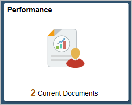
For tiles that point to similar functional transactions, but are used by different roles, use the following format as a guideline, for example:
- Manager Tile: Team Performance
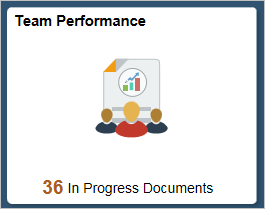
Figure 6: Example of manager tile for team performance - Employee Tile: Performance
- Verify that the same tile title is not already in use, either in the same pillar or other pillars.
- For multiple tiles that begin with the same word, follow these guidelines:
- Try not to use the ‘My’ prefix for employee centered transactions (for example My Pay, My Benefits, My Time, and so on).
- Use common prefixes sparingly, and only when absolutely necessary, to avoid multiple similar tile tiles beginning with ‘My’, or ‘View’, or similar.
Static versus Live Tiles
A static tile is simply a navigation link. Use static tiles so users can quickly navigate to transactions when there is no need to show live high-level informational data:
- Static tiles must always contain a title and an image.
- Static tile information always remains the same and does not change.
- Static tiles do not display numerical counts, charts or other textual information.
A live tile is a navigation tile that also contains live data. Use live tiles so users can view at-a-glance live informational data for decision making and monitoring, in addition to being able to drill-down to the transaction and perform routine tasks.
Live data on tiles is either automatically refreshed by the system or manually refreshed using the homepage refresh icon.
Keep in mind the following regarding live tiles:
- Any tile size may contain live data.
- Live tiles may contain static images and/or counts, or charts, and/or textual information.
- Tile with charts are view-only and are not interactive.
- Tile with charts can be based on either pivot grids or traditional Tools charts.
- Do not use multiple hotspots on live tiles.
- Take into consideration that tiles with a heavy data load may adversely affect system performance.
Tile Sizes
Choose between the following supported tile sizes:
- 1x1
- 1x2
- 2x1
- 2x2
The following is a visual example of supported desktop and tablet tile sizes:

- Tiles are rectangular in shape and of a fixed height and standard width.
- The tile size is selected from the available options by the product team.
- Tile sizes remain the same in both portrait and landscape views and do not change on device orientation change.
- Tiles cannot be re-sized by end-users.
- Use a small size tile if your live tile scenario contains only a short summary or numerical count, otherwise use an appropriately sized larger tile.
- Display a numerical count on your tile only when the number is small enough to be meaningful in the context of the scenario.
- As a general guideline no more than a 3-digit count should be displayed, however this can vary depending on the specific scenario.
- If your scenario updates a live tile with potentially sensitive data inappropriate to display in full detail on a Homepage, choose a small tile instead and simply notify users that an update is available. For instance, a paycheck tile could simply indicate that a new paycheck is available instead of displaying the amount.
- Use larger size tiles if your tile has new and interesting content to display and is updated frequently.
Note: The tile height and the tile width are set in Application Designer when the target content reference (CFREF) is defined on the Fluid Attributes page.
Tile Images
Static tiles should show a representative image of the underlying application. The same image is used by both the Homepage and NavBar. The image is used if the tile is added to the NavBar and automatically re-sized to fit by Tools (see NavBar Tiles section).
Live tiles may contain dynamic images as well as live textual data. You can select from a range of live tile options, such as:
- Simple or complex charts including Pivot Grids
- Informational text including counts
- Static images and live textual data
- A combination of styles
Note: You must also request an additional static image to represent your live tile, for the following reasons:
- The static image displays while live data is loading or refreshing
- The static image displays if it is added to the NavBar (see NavBar Tiles section)
Tile Styles
You have a number of tile format recommendations to choose from. The following tile examples represent some common implemented tiles.
Static Tile with Image
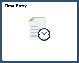
- A static tile contains a title and a representational application image.
- Use a static image tile to quickly navigate to applications.
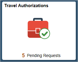
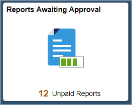
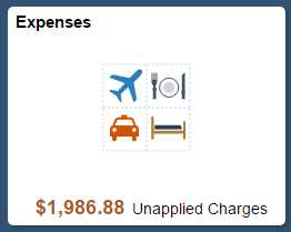
Tile with Image and Count

- A tile can contain a numeric count in addition to a static image.
- The count can signify notifications, pending items or some other kind of activity on the underlying application.
- The count is positioned on the bottom right of the tile, within the tile boundary, but not on the graphic image
- Use a tile with a numerical count when it’s contextually obvious from the tile title what the count refers to.
- The count should be meaningful to the end-user.
- The count should not be so large that it can become truncated and lose meaning.
- The general recommendation is to suppress a zero count if there is no underlying activity.
- The exception to showing a zero count is if there is a specific functional usefulness in doing so, when it provides value or meaning to users.
- In high-volume scenarios, where the tile's count could be continually displaying a value of "999" or higher, remember that it could be overwhelming for users to always see a high value and that useful information may not be conveyed.
- A tile count should only decrease if the interaction within
the underlying application makes sense for it to do so, for
example:
- If a notification is read from a Notification tile then it could decrease the tile count
- If a My Team tile is viewed then the team member count will not decrease
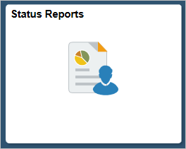
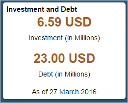
Tile with Image, Count and Informational Text

- If the meaning of a count is not clear and more information is needed then a count combined with textual information can be used.
- Textual information can for example indicate pending items, upcoming deadlines or status updates.
- The informational text and count appears at the bottom of the tile in the live data strip.
- A single line of informational text is supported. Multiple lines are not supported.
- The count should be a different size and color from the informational text font.
- If the meaning of a count is ambiguous and more information is needed then select a tile style that displays additional informational text.
- The tile informational text should not be bolded.
- The tile title should not be repeated in the informational text.
- The tile informational text should leave a 30% space reserved for translations.
- Text will be truncated where there is not enough space.
- A zero count should be shown only if it is functionally meaningful; otherwise suppress the zero and any accompanying textual data.
- Verify small form factor for readability, truncation and so on.
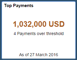
Tile with Counts and Informational Text
In some scenarios showing live textual data is more appropriate than an image. For live textual data tiles, you can select from a range of tile styles.
Note
Live data tiles must also have a default static tile image for these scenarios:
- Homepage: loading or refreshing a tile will show the tile’s static image
- NavBar: the tile’s static image will show as live data is not shown on NavBar tiles
For accessibility compliance, two counts maximum should be displayed on a tile.
The following examples show a single and double count, where the count appears above the live data text:
- Tile showing single count:
- Tile showing a double count:
Tile with Charts
PeopleTools provides two types of charts that can be displayed on tiles: simple chart and complex chart.
Note
- Charts used on tiles are not interactive.
- Tile content should always be clear and large enough for users to quickly scan and take action.
- Chart font sizes and style sheets can be modified for different form factor devices. This will allow for the minimum chart text size to be set on small form factors.
Simple Charts
- A simple chart is defined as having only two bars, columns,
slices or lines.
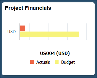
Figure 16: Example of a tile with simple chart - A simple chart on a 1x1 tile is allowed.
- No more than 2 bars, columns, slices or lines should be shown on a 1x1 tile.
- Chart legends are optional on a 1x1 tile if chart labels do not adequately describe or explain the content.
- If you use a chart legend, verify that there is also enough room for the live data strip below.
- If there is numeric data included in the live data strip it
can be bolded and use a different color, for example:
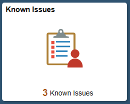
Figure 17: Example of tile with numeric live data
Complex Charts
- Use 2x1 or 2x2 tiles for more complex charts.
- A complex chart is defined as having more than 2 bars, columns, slices or lines.
- Contextual data can be displayed on the right-hand side or on the bottom of the tile.
- For 2x1 tiles chart legends should be displayed on the right.
- Chart labels (for example bar chart labels) should be kept short to avoid truncation or suppression.
- Axis labels should not be truncated and should be fully spelled out and readable.
- All items in a legend need to be visible to retain meaning.
The following examples show typical usage of complex charts on both 2x1 and 2x2 tile:
- 2x1 Vertical Bar Chart:
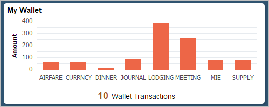
Figure 18: Example of vertical bar chart on 2X1 tile - 2x1 Horizontal Bar Chart:
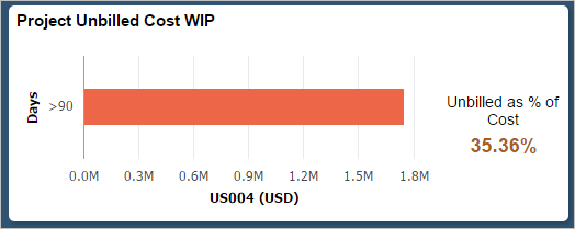
Figure 19: Example of horizontal bar chart on 2X1 tile - 2x1 Pie Chart:
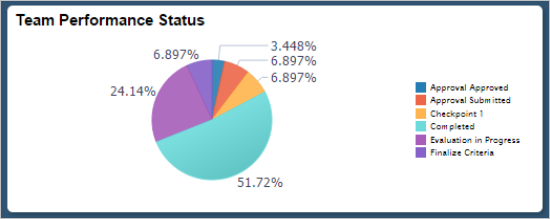
Figure 20: Example of pie chart on 2X1 tile - 2x2 Horizontal Bar Chart:
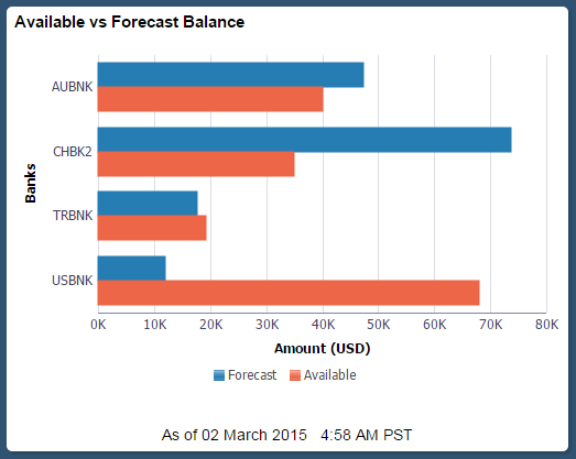
Figure 21: Example of horizontal bar chart on 2X2 tile
Tile with Pivot Grids
A pivot grid can also be used as the data source type for a tile.
- Tiles that contain a pivot grid can perform all of the tasks that can be executed directly from the Pivot Grid Viewer.
- Pivot grids cannot show live data, for example a pivot grid cannot have a pivot chart and a separate live data section. In this case a PeopleTools chart must be used instead.
Small Form Factor (SFF) Tiles
A tile will not show on a SFF device unless the “Display on Small Factor Homepage” option is selected on the Component Properties page in Apps Designer.
Supported SFF Tile Sizes
Recommended SFF homepage tiles sizes are:
- 1x1
- 1x2
- 2x1
- 2x2
Rendering Tiles on the SFF
SFF tiles will be automatically scaled down by Tools. This may impact the tile rendering, for example the tile title or informational text and so on. You need to verify the tile renders on the SFF correctly.
- The same tile will be shown on all form factors
- 30% space should be left for translation
- A 1x1 simple chart on a SFF will work
- Large blocks of tile should be avoided
- You may need to display SFF tiles with more limited data or with a shortened label.
System Default Tile
When tiles are added to the Fluid homepage or NavBar, if there are no associated tile images the system default tile image will appear, along with the tile title obtained from the CREF.
Note: You are expected to provide tile images for your applications.
System Default Tile Image
- File Name: Tile_Generic.svg
- Icon Size: 80x80px
- Object ID: PTNUI_DEFAULT_ICN

Figure 24: Example of the system default tile image
Loading or Refreshing Tiles
Static Tile Image
While static homepage tiles are loading or refreshing, the system default tile image will display until the tile load/refresh process is complete.
Note: You are expected to provide tile images for your applications. Otherwise the system default tile will display. See above.
Live Tile Image
While live homepage tiles are loading or refreshing, the system default tile image will display until the tile load/refresh process is complete.
Chart Tile Image
While homepage tiles with charts are loading or refreshing, the system default chart tile image will display until the tile load/refresh process is complete.
The system default chart tile image is shown below. You will need to specify this default image for charts with live data on the CREF.
- File Name: AnalysisDashboard.svg
- Icon Size: 80x80px
- Object ID: PS_DASHBOARD_L_FL
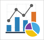
Figure 25: Example of system default chart tile image image
Pivot Grids
When homepage tiles with pivot grids are loading or refreshing, the system default chart tile image will display until the tile load/refresh process is complete. All tiles showing pivot grids also need to define the system default chart tile image on the CREF. See above.
Tile Refresh Rate
We recommend that tiles not be configured to auto-refresh because of the impact on performance and also for accessibility compliance.
Tile Sequencing
Tiles need to be sequenced so that they appear in the correct order when they are delivered to users.
See Fluid Navigation UX Standard for more details.
Tile Translations
Leave 30% extra space on tiles for translations, not just for titles but also for the live data strip on the bottom of the tile. If enough space is not provided then the tile text will truncate (and potentially be unclear and unusable for end-users).
The tile footprint for small form factor devices is different than other form factors – the text should be manually reviewed on device to see if it displays correctly.
Scrolling Tiles
Scrolling content should not be put in a homepage tile. It is difficult to see what is scrollable within a tile especially when using a tablet or smartphone.
Multiple Hotspots on Tiles
In order to maintain overall UX consistency and accessibility compliance on Fluid Homepages do not use multi-tappable hotspots on tiles.
Tools functionality does provide the ability to incorporate multi-tappable hotspots on tiles. However, we recommend not doing this to maintain simplicity and overall UX consistency.
Related Actions on Tiles
In order to maintain overall UX consistency and accessibility compliance on Fluid Homepages do not use related actions on tiles.
Tools functionality does provide the ability to incorporate related actions on tiles. However, we recommend not doing this to maintain simplicity and overall UX consistency.
Personalization
One way users can personalize their fluid experience is by adding tiles to homepages, the NavBar, or their Favorites.
Therefore it’s important that each component, classic or Fluid, includes a unique tile image in which case when users personalize their Fluid experience they display the same tile image.
If the component does not have unique tile image, then the default tile image will be used, leading to multiple instances of the default tile image displaying for different components.
For further information see the Navigation Standard.
Accessibility
Tiles need to be accessibility compliant.
In accessibility mode, the screen reader reads the tile text. After the text is read it ends with the term “…button”, as the tiles are implemented as buttons.
Therefore, from an accessibility perspective, it is important to stress the need to use precise titles and succinct live text elements.
Optimally tile titles should state the tile functionality and should not rely on tile images to provide the meaning. If a tile shows an error in the tile image, then for accessibility compliance alternate text can be provided and read by a screen reader.