When a filter uses a metric, the filter’s metric values are calculated for the attributes displayed on a visualization. You can instead select the attribute to calculate the metric values for.
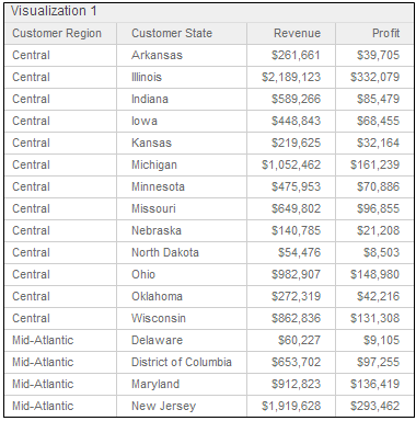
For example, a sheet contains a grid that displays revenue and profit data by geographical region and state. The values on the grid are calculated for each state, not each region, as shown below:
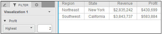
You want to display only the top two profit values, so you create a filter on the Profit metric’s values. The filter calculates the Profit metric values for the same attribute as the grid does, so the top two most profitable states are displayed, as shown below:
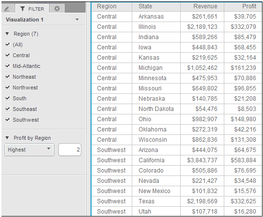
If you want to display the top two most profitable regions instead, create a top ranking filter, which allows you to specify the attribute to calculate the metric values for. A top ranking filter uses an attribute filter to specify the attribute for the metric calculation. To display the top two most profitable regions, create an attribute filter on region. Create a top rank filter, based on the region filter, that selects the two most profitable regions for display. The result is shown below:
An attribute filter uses selected attribute values to limit the sheet’s data. For an example, see Creating an attribute filter for a sheet. A sheet is a layer of data, filtered independently of other sheets on the dashboard; for background information, see Adding, modifying, and deleting sheets in a dashboard.
The filter applies to the sheet that it was created on, and any pages that the sheet contains. The filter is not applied to any other sheets that the dashboard contains. If the sheet in the example above contained other visualizations, the filter would filter those visualizations as well. For an example of a filter applied to multiple visualizations in the same sheet, see Adding, modifying, and deleting sheets in a dashboard.
You must have Edit Dashboard, Create Dashboard, and Run Dashboard privileges.
The dashboard contains the attribute filter to base the metric rank filter on. For steps, see Creating an attribute filter for a sheet.
To create a metric filter that ranks the values of an attribute:
Click the name of the dashboard to run it.
Click the tab of the sheet to filter.
On the Filter panel, hover the cursor over the name of the attribute filter to base the top ranking filter on, then click the arrow icon. Point to Top N Rank, then select the metric to use to rank each attribute value. Your top rank filter is added to the Filter panel and is automatically named Metric by Attribute, where Metric is the name of the metric used to rank the values of Attribute, the attribute in the selected filter.
If the Filter
panel is not displayed, from the View
menu, select Filter Panel.
If the Filter panel is hidden behind another panel, click the Filter icon  to display the Filter panel.
From the drop-down list at the top of the filter, select one of the following:
To create a filter to display data for the top n values in the filter, select Highest. Type the appropriate value in the field and press ENTER to apply your changes. For example, to display data for the top 2 values, type 2.
To create a filter to display data for the bottom n values in the filter, select Lowest. Type the appropriate value in the field and press ENTER to apply your changes. For example, to display data for the bottom 5 values, type 5.
To create a filter to display data for the top n% of values in the filter, select Highest %. Type the appropriate value in the field and press ENTER to apply your changes. For example, to display data for the highest 10% of values, type 10.
To create a filter to display data for the bottom n% of values in the filter, select Lowest %. Type the appropriate value in the field and press ENTER to apply your changes. For example, to display data for bottom 30% of values, type 30.
Select one of the following:
To filter data by comparing metric rank to a number that you specify, complete the following steps. For example, you can display data for the top 10 most profitable stores.
Hover the cursor over the name of the filter that you just added, then click the arrow icon. Point to Display Style and select Qualification.
In the field, type the rank value to use to filter data, then press ENTER. When you use the filter, you can change the rank value to display a different set of data in the sheet.
To filter data by choosing rank values on a slider, complete the following steps. For example, you can display data for stores with a profit rank between 10 and 25.
Hover the cursor over the name of the filter that you just added, then click the arrow icon. Point to Display Style and select Slider.
On the Filter panel, click and drag the endpoints of the slider to cover the range of values for which you want to filter data.
You can choose to include or exclude data using the values selected in the slider. Hover the cursor over the filter name, click the arrow icon, and select one of the following:
To display data for the metric values selected in the slider, select Include.
To display data for the metric values selected in the slider, select Include.
By default, as you make choices in the Filter panel, data is updated automatically in the sheet. You can change this behavior so that you control when the update occurs, by disabling automatic apply. When automatic apply is disabled, you click Apply in the Filter panel to update the sheet with the filter choices. For steps, see Applying filter changes individually or all at once.
Creating filters for a sheet of data
Adding, modifying, and deleting sheets in a dashboard
_____________________________
Copyright © 2019, Oracle and/or its affiliates. All rights reserved.
Legal Notices