Pie charts show a single metric aggregated across a group dimension. They are useful for showing how each value contributes towards a total. Sunburst charts show concentric rings of metric values, in order to display contribution towards a total while also showing relationships between increasingly finer-grained metrics.
- Pie — A basic pie chart.
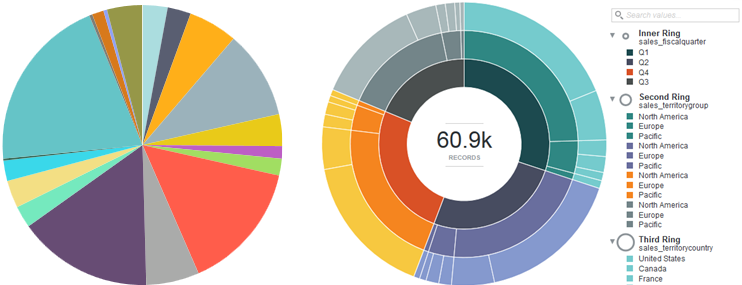
- Sunburst — A multilevel pie chart hierarchical data is displayed from an inside ring outwards, with another selected metric used as the unit of measurement for rendering segments. For example, you might configure a sunburst to use Total Sales as the scale metric, and organize the rings with Fiscal Quarter as the inner ring, territories as the next ring, and companies as the third ring. A sunburst can contain up to five rings.
About using a Pie / Sunburst chart
Mousing over a wedge or ring segment displays the corresponding metric value as well as its percent of the total. Mousing over any outer Ring values in a Sunburst chart also highlights the selected value in other segments of the chart for easier visibility. Highlighting a color in the legend highlights the corresponding wedge or segment.
You can also search for values in a Sunburst chart by using the search box above the color legend. This allows you to refine the visualization by a metric value that might otherwise be displayed only as part of the "Others" group.
You can refine displayed data by clicking a segment. To select multiple segments, hold the CTRL key and click each one, then click Apply refinements in the selection box when finished. You can also select refinements in the same manner from the color legend.
Selected refinements display in the Selected Refinements Panel and can be toggled to set them as negative refinements. See About the Selected Refinements panel for details.
About configuring a Pie / Sunburst chart
- One hue per ring — Each ring uses a different base color, making it easier to distinguish which level a data point belongs to (inner ring, second ring, third ring, etc).
- Hierarchical (fan gradient) — Each inner ring value uses a different base color, making it easier to distinguish which data is associated with a given root value in the hierarchy. This may also display data multiple times in the legend if an outer ring value is present for multiple inner ring values. For this reason, when displaying hierarchical data try to choose an inner data metric where the values each have non-overlapping data for outer ring values.
Converting a Sunburst chart back to a pie chart renders the chart based on the innermost ring. If a second Rings metric is present, it is used to display a Trellised set of charts. Any additional metrics are removed from the configuration.
When configuring the chart, note that Pie charts use an independent metric (Slice size) and render dependent values from one configured Color metric. Sunburst charts use one dependent metric (Segment size) and render one or more independent metrics (the Rings). The Segment size metric must be both numeric and countable — scaling by total sales works, but attempting to scale by median sale value does not create an accurate visualization. Keep this in mind if you create your own metrics and want to use them in a Sunburst chart.
For detailed configuration steps, see Configuring a Chart.
