4.4.2 Creating Custom Dashboards
You can also create custom dashboards for models that have indicators defined. Models need indicators to be defined because the visualization charts in the custom dashboard use the dimensions or measures to be represented in the chart.
Only users with the role InsightModelCreator/InsightExecutive/InsightAdmin can create custom dashboards.
To create custom dashboards:
Click the model for which you want to monitor the progress on the Consoles page.
Ensure that the model has indicators defined. If not, create/define indicators.
Click My Custom Dashboards icon.
Click Create Dashboard.
The Create Dashboard dialog opens.
Figure 4-11 Create Dashboard Dialog
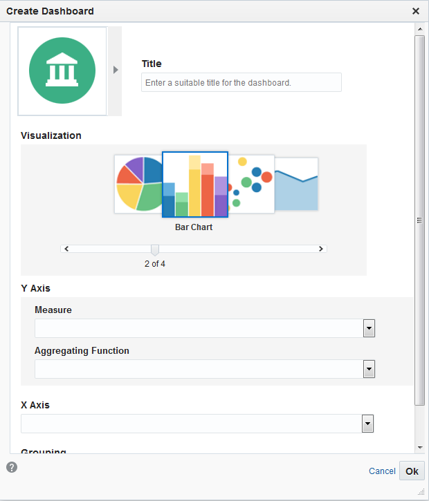
Enter a suitable Title for the dashboard.
Choose an appropriate icon.
Choose a Visualization, the chart through which the data is visualized. Based on the type of the chart you choose, the parameters vary. The charts available are listed below:
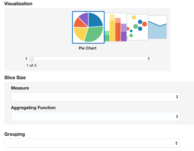
Pie Chart
Slice Size - select the values to be represented by the slice size. This is a mandatory field.
Measure - select the measure for the slice size. This is a mandatory field.
Aggregating Function - select the aggregating function for the slice size. This is a mandatory field.
Grouping - select the value based on which the grouping needs to be done. This is a mandatory field.
Figure 4-12 Create Dashboard — Pie Chart
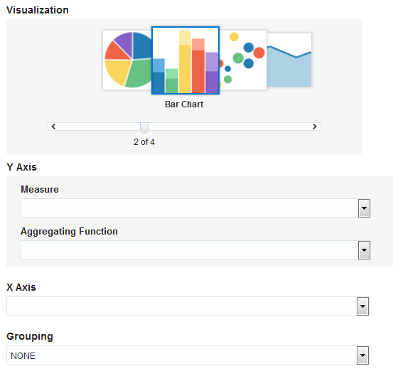
Bar Chart
Y Axis - select the values to be represented on the Y Axis.
Measure - select the appropriate measure. This is a mandatory field.
Aggregating Function - select the appropriate aggregating function. This is a mandatory field.
X Axis - select the values to be represented on the X Axis. It is typically a dimension.
Grouping - select the value based on which the grouping needs to be done. This is an optional field.
Figure 4-13 Create Dashboard — Bar Chart
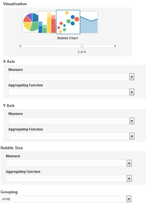
Bubble Chart
X Axis - select the values to be represented on the X Axis.
Measure - select the appropriate measure. This is a mandatory field.
Aggregating Function - select the appropriate aggregating function. This is a mandatory field.
Y Axis - select the values to be represented on the Y Axis.
Measure - select the appropriate measure. This is a mandatory field.
Aggregating Function - select the appropriate aggregating function. This is a mandatory field.
Bubble Size - select the values to be used to determine the bubble size.
Measure - select the appropriate measure. This is a mandatory field.
Aggregating Function - select the appropriate aggregating function. This is a mandatory field.
Grouping - select the value based on which the grouping needs to be done. This is a mandatory field.
Figure 4-14 Create Dashboard — Bubble Chart
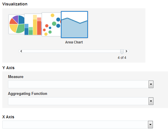
Area Chart
Y Axis - select the values to be represented on the Y Axis.
Measure - select the appropriate measure. This is a mandatory field.
Aggregating Function - select the appropriate aggregating function. This is a mandatory field.
X Axis - select the value to be represented on the X Axis. This is a mandatory field.
Figure 4-15 Create Dashboard — Area Chart
Select appropriate values for each of the fields in Create Dashboard dialog.
Click Ok to create the dashboard.