")
Overview
Icons may be used in various places throughout fluid applications. This documentation discusses the use of icons and specifications for their use. Note that all fluid icons are created in the Scalable Vector Graphics (SVG) format.
Icon Usage
Whether or not an icon should be used will depend largely on where it will be used. Icons may be actionable (hotspots)—clicking or tapping on such icons will perform some action, or may be purely visual for the purpose of drawing attention.
The style, color, and size of an icon will depend on its use and the form factor on which it will be rendered. In some instances, a specific icon size may be used in a form factor, but the size will automatically scale up or down for different form factors.
This section describes the use of icons in the following parts of a fluid application:
- Banner
- Home Page Tile
- Navigation Bar
- Left Panel
- Detailed Content
- Button
Icons in a Banner
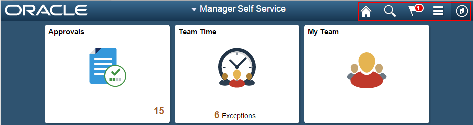
The highlighted icons in the following example show the icons used in a banner. Banner icons are PeopleTools images and they are actionable buttons.
Specifications
Color: White
Size: 25x25 pixels
Type: Flat
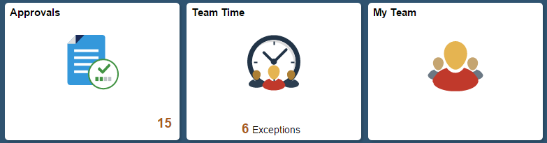
Icons in a Home Page Tile
In general, Homepage tile icons are not hotspots. Use a single icon in a Homepage tile when there is minimal or no live data to be displayed. Refer to the Homepage Tiles Standards for details about when the icon can be a hotspot.
Specifications
If an icon is used in a Homepage tile, the following format should be used for the icon:
Color: Multi-colored
Size: 80x80 pixels for non-small form factor. It will be scaled to 48x48 pixels for the small form factor. (When requesting a new icon, request 80x80 pixels.)
Type: Flat
Example
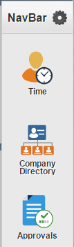
Icons in a Navigation Bar
Icons used in the navigation bar (NavBar) are not hotspots. The same icon used for the corresponding application tile should be used for the NavBar. Use the default static image for the tile when the tile itself does not show the image but displays live data. However, it should be a smaller size: 48x48 pixels.
Specifications
Color: Multi-colored
Size: 80x80 pixels for non-small form factor. It will be scaled to 48x48 pixels for the small form factor. (When requesting a new icon, request 80x80 pixels.)
Type: Flat
Example
Icons in a Left Panel
Icons used in the left panel are not hotspots. For guidelines about using icons in the left panel, see the Panel Layout Standards , Left Panel Icons and Counts section.
Specifications
Color: Multi-colored
Size: 24x24 pixels on small form factor. It will scale down to 20x20 pixels on non-small form factors because of padding in the left panel. (When requesting a new icon, request 24x24 pixels.)
Type: Flat
Example
Icons in Detailed Content
This section discusses icons in the content area and application header as well as actionable icons and provides examples.
Content Area and Application Header
Important elements in a content area or an application header can be called out using icons. These icons are not hotspots. As a general rule, these icons should be followed with text that explains the meaning of the icon.
Specifications
Color: Monotone gray unless the information is urgent or needs immediate user attention; in this case, use a colored icon.
Size: 16x16 pixels
Type: Flat
Actionable or hotspot icons may be used on a transaction page.
Any icons that are not part of a button but are actionable or tappable should be colored and should have a 3D look. These icons do not need to be followed by text that explains the meaning of the icon.
Specifications
Color: Colored
Size: 16x16 pixels
Type: 3D
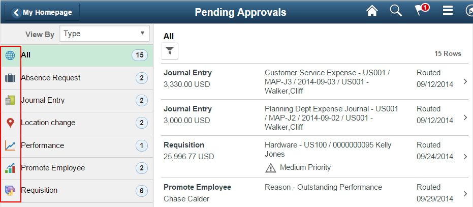
This example shows icons on a page:
This example shows icons in the content panel of a two-panel layout:
This example shows an icon in the application header:
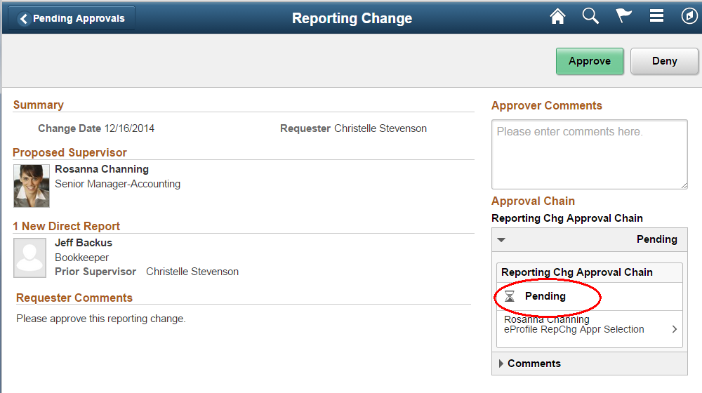
This example shows a red warning icon on a detail content page that draws attention to urgent or important information:
This example shows an actionable 3D icon for Related Actions:
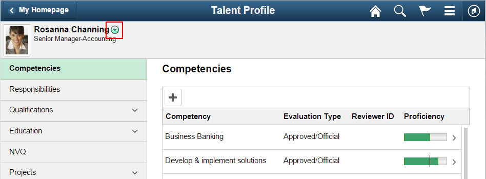
This example shows NavBar icons and an actionable Related Actions icon:
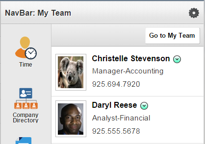
This example shows a hotspot (3D Information icon) that when tapped brings up a message box displaying more information:
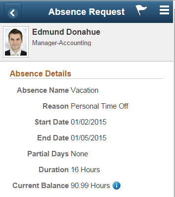
This example shows the 3D hotspot Favorites icon that adds or removes the person from your favorites when tapped:
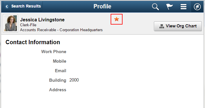
Icons on a Button
Buttons with an icon can have only an icon or can have an icon with text. Refer to the Button Standards for details.
Specifications
Color: Monotone gray
Size: 16x16 pixels
Type: Flat
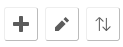
This example shows image buttons (icon only):
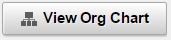
This example shows a button with both an icon and text:
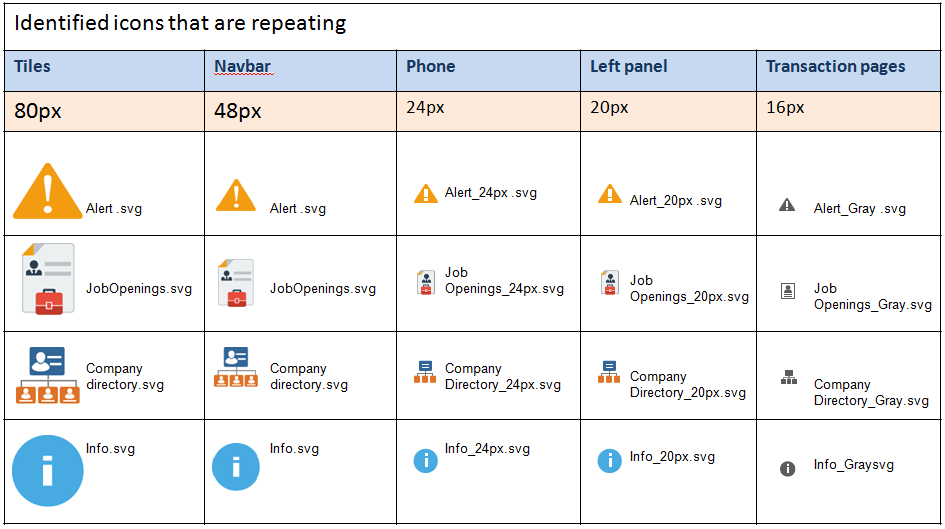
Icon Sizing
This chart shows the scaling of icons: