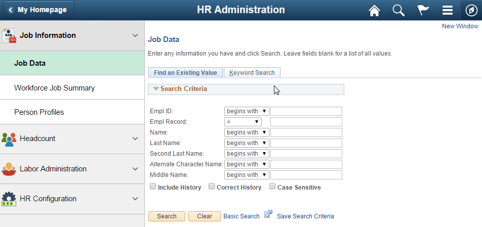
")
Overview
The philosophy of Fluid navigation focuses on:
- Multiple paths for users to access functionality
- Users choosing the path that is most effective for them
- Use of Related actions to make navigation work across all paths
The Classic PIA navigation uses a breadcrumb menu with a deep hierarchy. Fluid navigation uses Homepages and Tiles as the starting point for navigation to both Fluid and Classic PIA pages. Further categorization and navigation to Fluid and Classic transactions is achieved through the use of Fluid Application Start pages and Fluid Application Homepages.
Personalization allows users to configure navigation based on their own personal preferences. Users are able to personalize in the following ways:
- Create new Homepages
- Add tiles to Homepages via the tile repository
- Add a component tile to any Homepage from within the component
- Add Tiles to the NavBar
- Reorder Tiles in the NavBar
- Add favorite components to My Favorites in the NavBar
Homepage
Homepages are the starting point for navigation in Fluid. A user can have several homepages and one default homepage that is displayed after login.
Homepages may have role based titles or function based titles.
- Examples of role based homepage titles are Manager, Employee, and Administrator
- Examples of function based homepage titles are Cash Management, Project Management, and Procurement Operations
Guidelines and recommendations for Homepage Titles:
- Use role based homepages when users of a role will need to access many functions
- Use function based homepages when users with many different roles will need access to the same homepage
- Avoid having both role based and function based homepages with overlap of tiles
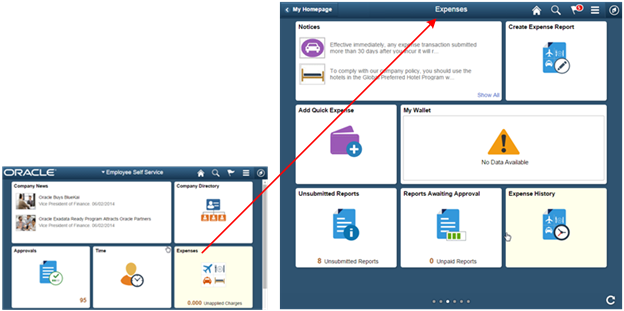
The following example shows the navigation launch points on the Employee Self Service homepage for the small and medium form factors:
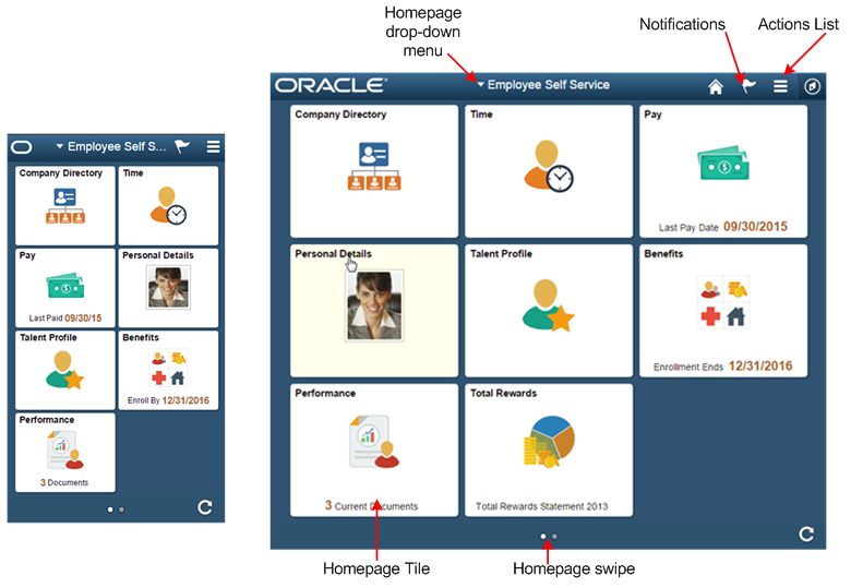
PeopleSoft recommends:
- Individual users not have more than five delivered homepages.
- A homepage not have more than nine tiles for a given user.
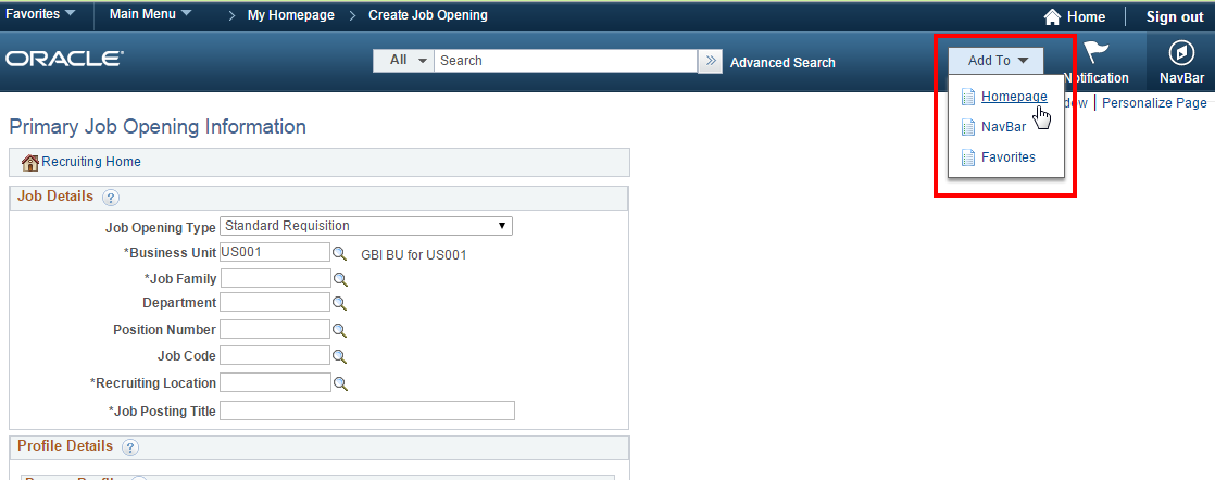
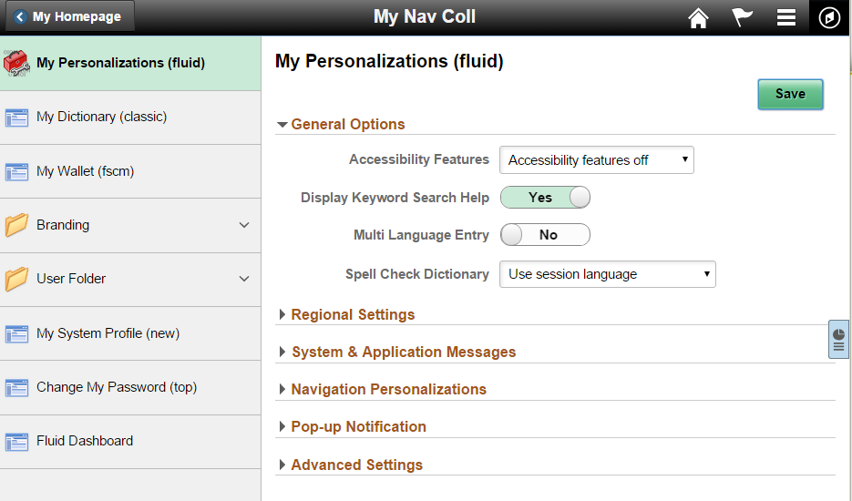
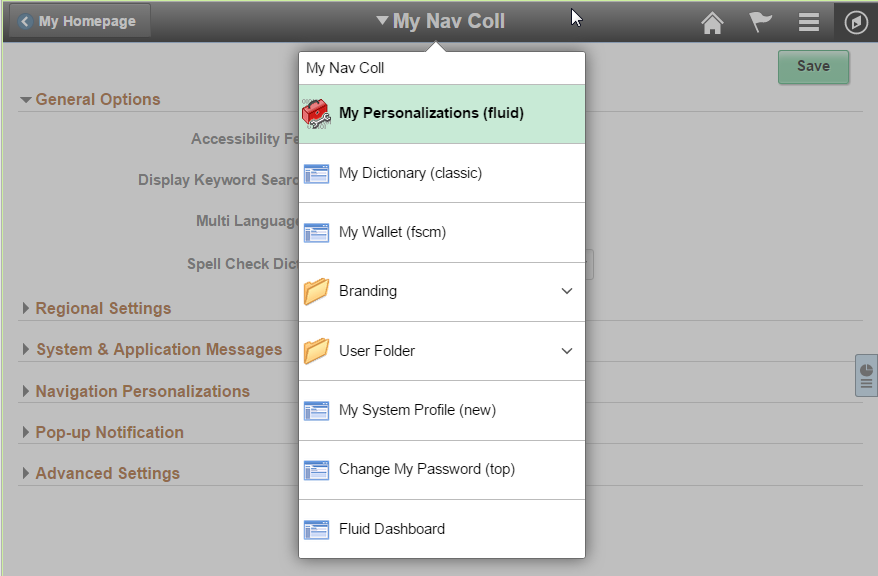
Add To Drop-Down Menu
End Users can add any component they are currently viewing to any one of their homepages. PeopleSoft recommends that each Fluid or Classic component contain a unique image for the component in order to improve usability by making it easier for users to identify individual components that were added to their homepages.
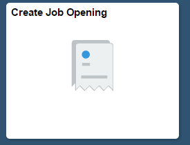
The following example shows the tile that is added to the Fluid Homepage when the Create Job Opening component is added:
The tile that is placed on the Fluid Homepage will have the default image as shown below if no image is specified in the content reference for that component:
PeopleSoft recommends that all components have a unique image defined for Fluid.
Interaction Hub Environment
In an Interaction Hub environment, databases across pillars that contain homepages with the same name will automatically have the tiles merged onto a homepage of that name. For example, a homepage with a title of Employee Self Service will be created in an Interaction Hub Environment when FSCM and HCM databases both have homepages named Employee Self Service. All of the tiles from the FSCM Employee Self Service homepage and all of the tiles from the HCM Employee Self Service homepage will be displayed in just one homepage named Employee Self Service in the Interaction Hub environment.
The ordering of the tiles on the merged homepage is based on the sequence number provided in the Content Reference for each tile across databases.
Guidelines and recommendations for the Homepage in an Interaction Hub environment:
- Frequently used transactions across database pillars will have higher sequence numbers than less frequently used transactions.
- When a new transaction is added to a homepage that is shared across pillars, the sequence numbers of all tiles across pillars should be evaluated, and the new tile should be given an appropriate sequence number so that it will appear in a logical order when in an Interaction Hub Environment.
- To avoid confusion in an Interaction Hub Environment, tiles in different databases that are merged should not repeat the same title in two different tiles.
Notifications
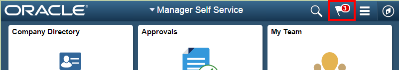
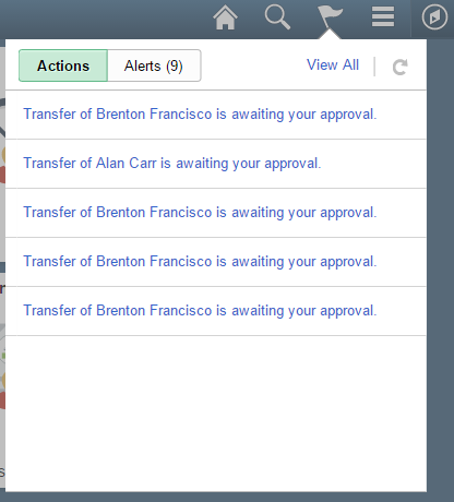
The Notifications framework provided by PeopleTools will display a badge with a count on the flag icon in the banner to notify the user of any new Actions or Alerts. The following example shows a count of three Notifications:
Tapping the flag icon opens a modal window that displays Actions and Alerts:
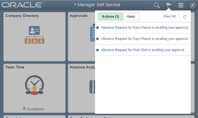
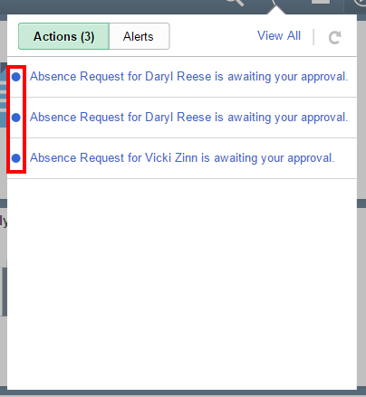
Actions or Alerts that have not been viewed yet will have a blue circle next to them:
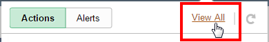
Tap an individual Action or Alert to transfer to the transaction. Alternatively, tap the View All link to see a detailed list of the transactions:
After tapping the View All, the View All Notifications window will open:
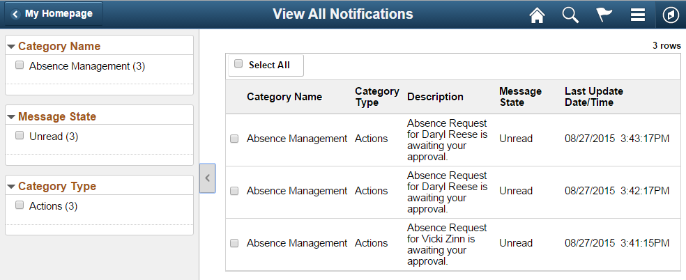
Once the user has viewed the Actions and Alerts, the blue circle will no longer appear next to them, and the system will recalculate the count for the Notifications flag:
The Notification Framework may be used to provide the user with easy navigation to transactions that need their attention.
There are two types of notifications:
- Actions: Allow transfer to a transaction where some action may be performed.
- Alerts: An informational message that may be deleted by the user. A transfer to the transaction may also be performed, but is optional.
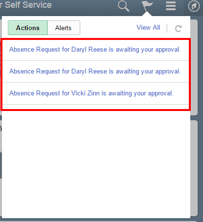
Actions
Actions are notifications that enable users to navigate directly to transactions that need their attention. The following example shows a list of Actions that are awaiting an Approval action:
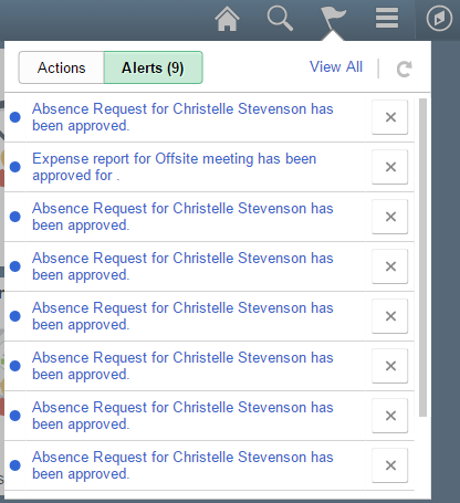
Alerts
Alerts enable users to navigate to a transaction where a status or some other information may have changed, thus enabling users to see details of the change. The following example shows a count of nine Alerts indicating that request for approval was granted. In this scenario, since the alert is informational, the user has the option of tapping the ‘X’ icon to dismiss the alert because no action is required:
Guidelines and recommendations for Notifications:
- Use an Action type notification when a time-sensitive action must be taken. This type of notification is similar to workflow and can be used to notify a user that a transaction is awaiting input.
- Use an Alert when it is important to communicate to the user that the status or some other transaction change was made. Allow transfer to the transaction if it makes sense for the functionality.
Actions List
The Actions List contains system level actions as well as context actions:
- Context Action: an action that is specific to the current component. Context Actions may enable the user to navigate to component-specific pages.
- System Action: an action that is at the system level and is not related to a component.
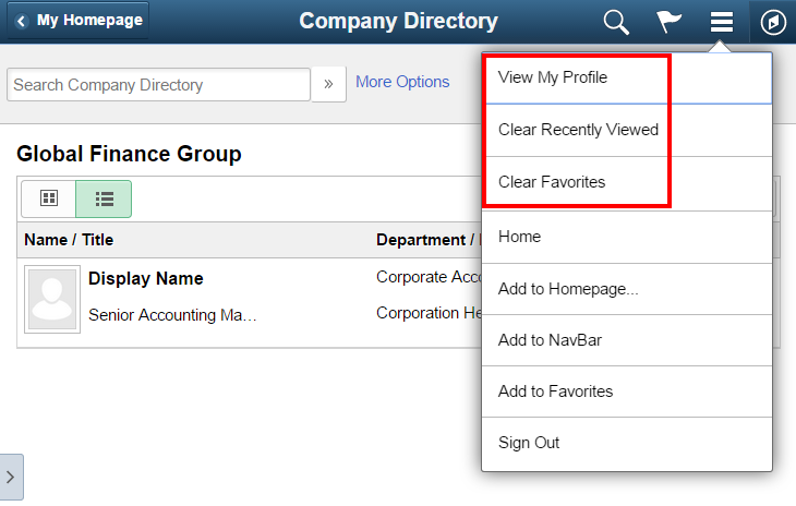
The following example from Company Directory shows three context actions and five system actions:
Note: Context Actions are always listed first, followed by the System Actions.
Guidelines and recommendations for Context Actions:
- Navigation from the Actions List should be used for non-primary actions.
- Primary navigation should be placed in the main content area or in the left panel for component or page tab navigation.
- When a page is accessed less frequently, the Actions List may used for navigation so that the main content area can be used for primary tasks.
- In general, the total number of Context Actions displayed for a component should not exceed six.
- Do not use the Actions List as a set of Quick Links.
- Refer to the Banners and Footers Standard for more information about the Actions List.
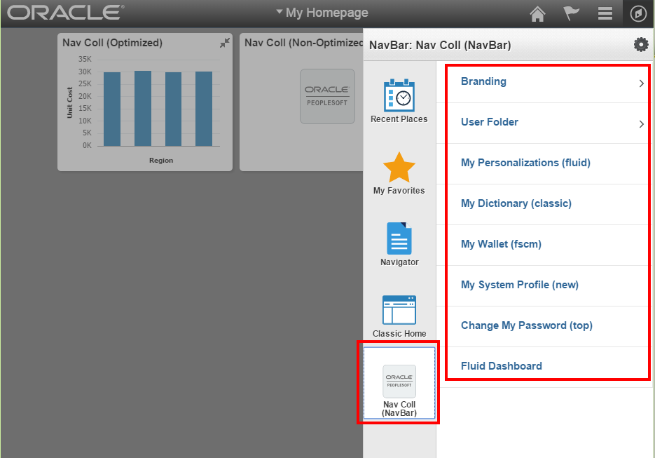
NavBar
The NavBar contains the following elements:
- Tiles
- Second Level Content
- Recent Places
- My Favorites
- Navigator
Each of these elements is shown in the following example and described in the sections that follow.
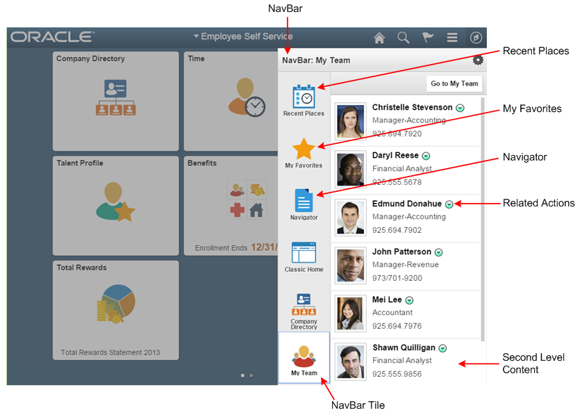
NavBar Tiles
There are two types of behavior for NavBar tiles when tapped:
- Transfer the user to a component
- Open Second Level Content
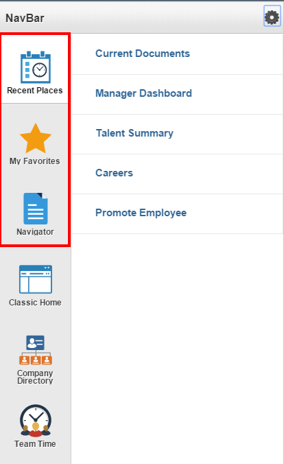
A set of NavBar tiles is delivered out of the box. The system always displays the Recent Places, My Favorites, and Navigator PeopleTools tiles.
Guidelines and recommendations for NavBar tiles:
- The first three tiles that appear should appear at the top of the NavBar in the following order: Recent Places, My Favorites, Navigator
- Tiles selected to be in the NavBar should be the most frequently used functionality.
- As delivered, no more than five tiles should be placed in the NavBar for a given user; all first-level tiles should be visible to the user.
- In an Interaction Hub environment, the system will display all NavBar tiles selected across pillars, and the ordering will follow the sequence number defined for the tile in the content reference. When adding a new tile to the NavBar, work across pillars to determine what the sequence number of that tile will be when merged with all tiles from all pillars.
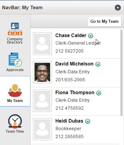
Second Level Content
Second Level Content in the NavBar enables users to:
- Transfer to another page
- Opening a modal
Second Level Content may enable the user to navigate to transactions. In the My Team example that follows; users have two options for navigation from Second Level Content:
- Navigate to a transaction via the Related Content icon
- Navigate to My Team via the Go to My Team button
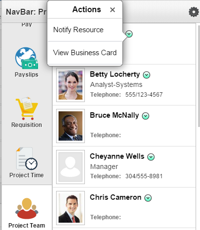
Second Level Content may also enable users to perform actions without navigating away from the current context. In the following Project Team example, the Notify Resource action opens a modal window where an email can be sent to a member of the project team. When the modal window is dismissed, the user remains in the same context they were in before launching the modal window to send an email:
Guidelines and recommendations for NavBar Second Level Content:
- Second Level Content may be informational only and does not need to provide navigation to another location.
- Tapping Second Level Content may enable the user to navigate to another transaction. When the Second Level Content allows navigation to another transaction, use a chevron to indicate that the row is tappable.
- Second Level Content may contain Related Actions that provide navigation to a transaction.
- To avoid mis-tapping, do not provide a Related Action hotspot on top of a tappable row.
- Do not have a hotspot on top of a tappable row because hotspots on tappable rows may cause mis-tapping and accessibility issues.
Recent Places
The Recent Places tile in the NavBar stores a list of recently visited components. Users can easily navigate back to components from this list.
My Favorites
The My Favorites tile in the NavBar stores a list of components the user has marked as Favorites. This tile enables the user to choose frequently visited components and add them to a list for easy access.
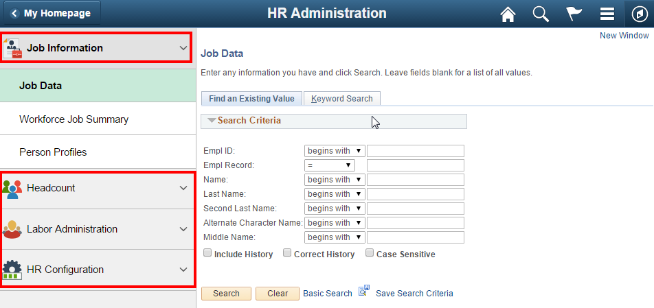
Navigator
The Navigator provides navigation access to all components that are registered in the Portal Registry as Content References and are marked visible in the PeopleTools Portal Structure and Content. The following example shows the top level when the Navigator NavBar Tile is selected in an Interaction Hub environment:
Guidelines and recommendations for NavBar Navigator:
- The Navigator is not intended to be the primary method of Fluid navigation.
- The primary method for Fluid navigation is via Homepages, the NavBar, Application Start Pages and Application Homepages. The Navigator supports legacy PeopleSoft hierarchical navigation to Classic components.
- Conditional Navigation can be used in the Navigator menu hierarchy to bypass the Classic transaction and transfer the user to the new Fluid transaction.
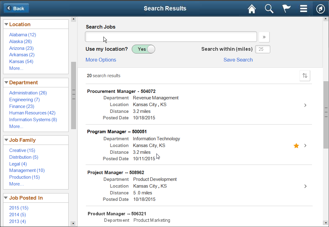
Search Results
There are two types of searches that may be performed:
- Global Search – SES based keyword search, not real time
- Component Search – real time database search based on a query with set field values
There are two types of Component Search:
- Tools Component Search – delivered by PeopleTools
- Custom Component Search – developed by Application Teams
It is important to select the appropriate search method so users can easily navigate to the transactions they are interested in.
Global Search: Keyword SES based search
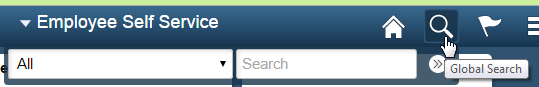
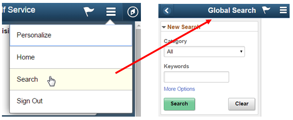
Global Search uses the SES and PeopleTools Global Search framework. Global Search is accessed differently based on the size of the device or window:
- Access is from the Actions List when the window width becomes small enough that the search operation is moved into the Action List.
- Access is from the magnifying glass icon in the banner when the window width is sized large enough to accommodate the Search icon:
Example of Global Search from the banner:
Example of Global Search from the Actions List:
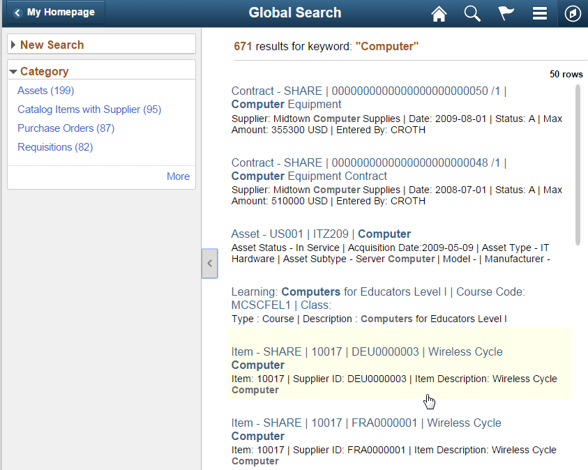
The system displays the search results in a two-panel layout on form factors other than the small form factor:
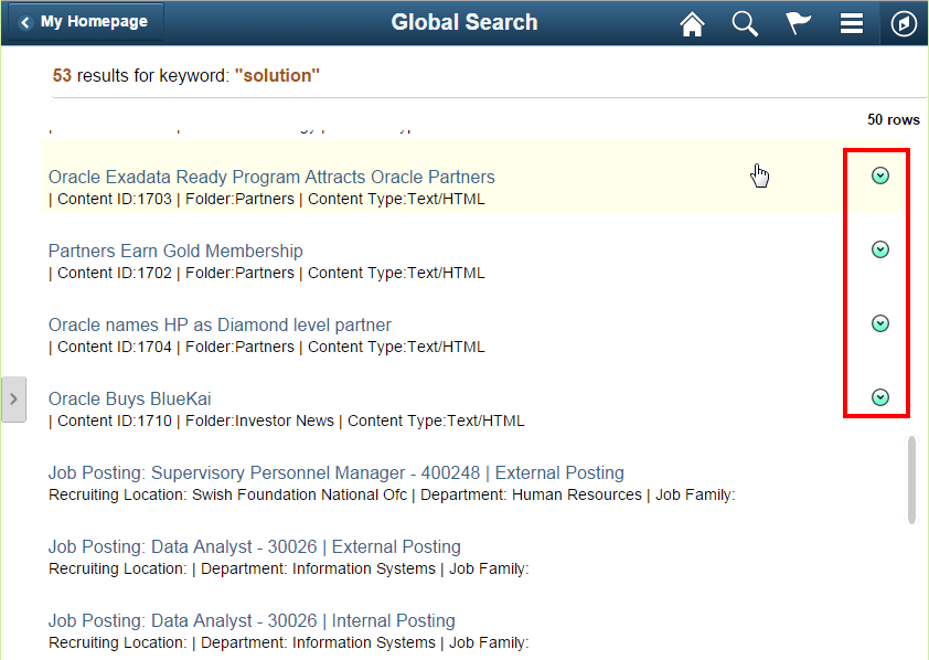
Related Actions may be displayed in global search results when the component-level related action has been configured in Related Content Services:
Tools Component Search: Real Time pivot grid based search
A Component Search may be accessed from a Homepage Tile, an Application Start Page or an Application Homepage.
Component Search uses pivot grid technology to display search results in any of the following formats:
- A chart and a grid
- A chart only
- A grid only
The user navigates to a transaction from the search results through interaction with the chart or the grid:
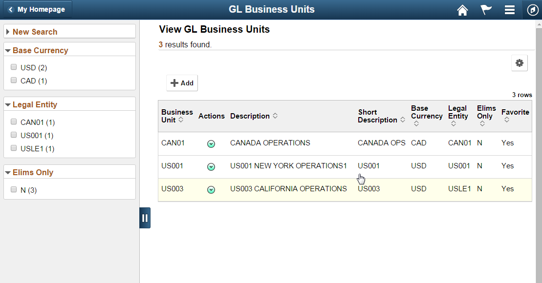
Select the entire row to navigate to the transaction. If you have keys defined for the URL it will transfer directly to the transaction upon execution of the search. If the keys are known, the user should be transferred directly to the transaction rather than requiring an additional interaction to select a transaction returned in the search result.
Related Actions may be configured to display or not display in the search results list as needed. A Related Action that is displayed in the search results may perform an update to a transaction without navigation away from the page, it may open a modal window, or it may transfer to a transaction. Related Actions may be placed in either the grid view of the search results or directly on the chart.
Custom Component Search
There is also an option to use a custom application search if needed. A custom Application Page is created and used as the Search page in the component.
- Use when additional functionality that is not available in the PeopleTools delivered Search framework is needed.
- This search could be an SES based search, a real time search or both.
- It can contain any custom search requirements needed for the specific application functionality.
The following example shows a custom search page that was developed specifically for external users who have no familiarity with PeopleSoft applications and will be interacting with the application on a one time basis. An application level SES Search was needed to provide the ability for external applicants to search on indexed jobs. These requirements fell outside of the PeopleTools delivered component search and an application custom search was created to support this unique scenario:
General guidelines and recommendations:
- Include Related Actions in the Search Results when there are a number of different transactions the user may navigate to from the search result.
- Avoid exposing a toggle between real time and keyword search as it is confusing to the user.
- Use when you do not require the latest information in the search results. The results will be based upon the last time the indexes were updated.
- Use when free text search is sufficient for your searching mechanism.
- Use when you need to return non-homogeneous search results that may come from several different categories or components.
- Use when you require the latest information in the search results.
- Consider usability of the left panel if you have an 8.54 left panel in the component. The search results page uses a left panel itself and the component will have a left panel as well.
- Use when none of the other search options meet your application requirements.
Application Start Page
Use an Application Start page to reduce the navigation burden. The Fluid navigation paradigm moves away from the deep locator link (“breadcrumb”) hierarchy used in Classic PIA that may require a user to click many times to navigate the Classic menu hierarchy. Instead, components are grouped into an Application Start page, where a user can easily navigate among the different components. Application Start pages are typically accessed via the homepage and are only one click away. This ease of access provides the user with two-click access to navigate to the components they need to open.
Application Start pages are also used to reduce the total number of tiles on a homepage. Refer to the Homepage topic for guidelines on limiting the number of tiles on a homepage. Grouping components into an Application Start page allows developers to reduce the total number of tiles that would be required if they mapped a tile to every Fluid component.
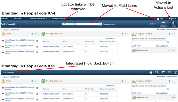
Fluid and Classic Coexistence
With PeopleTools 8.55, PeopleSoft delivers a Fluid Homepage with one overall branding that will be the same whether the user is in a Classic PIA component or a Fluid component:
Navigation between Fluid and Classic components will no longer be separate. Every user will land on a Fluid Homepage that may contain tiles that transfer the user to a Fluid or a Classic component. Similarly, an Application Start Page may contain both Classic components and Fluid components in the left panel. Refer to the Panel Layout Standard for more information on a two panel layout.
The following navigational flows may be used based upon the functional requirements:
- Left Panel item directly opens a Fluid Component.

- Left Panel directly opens a Classic Component.

- Left Panel directly opens a Fluid Component, which in turn
opens a Classic Component.

The following Application Start Page contains an example of each of the three navigational flows shown above:
The following screenshots show the flow on non small form factor for each of the three items listed above:
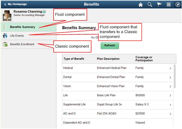
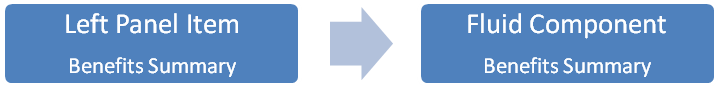
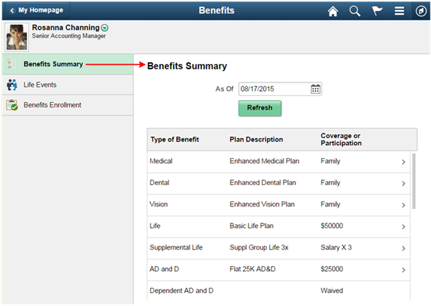
Example Flow: Benefits Summary
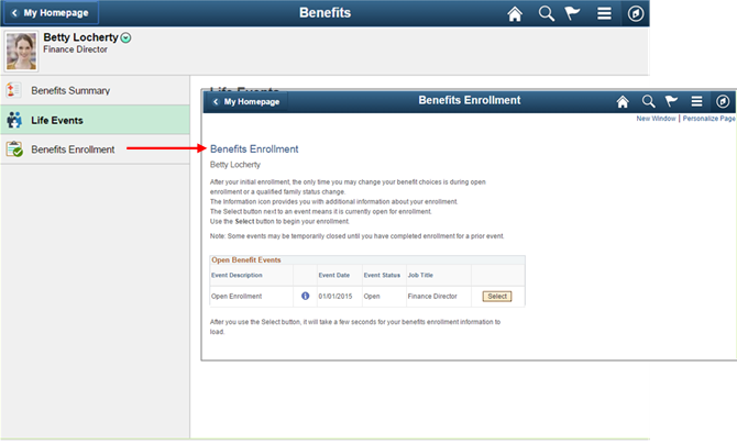
Example Flow: Benefits Enrollment

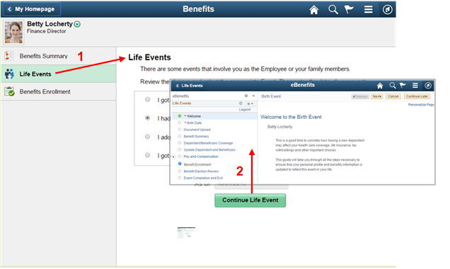
Example Flow: Life Events

With Tools 8.55, an Application Start Page can easily be created by using a Navigation Collection rendered in the left panel of a two panel layout. Refer to the topic on Navigation Collections below for more information. The following example shows an Application Start Page that renders a Navigation Collection in the left panel:
The two panel layout becomes an overlay when the window narrows and on the small form factor:
An application start page uses a two panel layout with a list of related components in the left panel and the selected component displayed in the content area. The selected component changes to a green color in the left panel.
The behavior of an Application Start Page is as follows:
- The first component in the list is selected when the page is opened.
- A list of components is displayed in the left panel and the selected component is displayed in the content area.
- The back button in the upper left of the selected component returns the user to the prior page, typically a Fluid Homepage.
Guidelines and recommendations:
- Group together functionally similar components in an application start page
- Each component must have a unique image so that when it is added to a homepage, that unique image will be displayed and it should match what is displayed in the left panel of the Application Start Page.
- The page should contain no more than eight to ten components or folders for the logged in user based on their security access. When the left panel contains a large number of components, the components can be grouped into folders.
- The first component in the list will be selected and loaded when the start page is first opened for t and above.
- The application start page must handle user security. Application start pages that use Navigation Collections will use the security built into the Navigation Collection.
- Order the components based on the level of usage.
- In general the left panel should be fixed and not collapsible for medium and larger form factors. The left panel may be set to collapsible when the entire right content area needs to be displayed to accommodate a large amount of information. For example, Org Chart Viewer requires a large amount of horizontal space.
Application Homepage
An Application Homepage provides navigation launch points to components similar to an Application Start page. However, an Application Homepage contains tiles rather than a list of links as is seen in the Application Start page. The tiles in the Application Homepage contain charts and other live data. Use an Application Homepage when you want to convey high-level summary information to users that will allow them to determine whether they want to open the component.
The following example shows a comparison of the Application Start Page and the Application Homepage:
In both cases, functionally similar components are grouped together. However, in the Application Start Page navigation between components is done by selecting a component in the left panel of the page, which contains only an icon and a label. In the Application Homepage, navigation between components is done by returning to the Application Homepage and selecting a component. The Application Homepage contains tiles with live data that provides additional information to the user.
The following screenshot shows navigation to the Application Homepage from a homepage tile:
The navigation in the banner is different in the Homepage banner as compared to the Application Homepage banner:
All of the Tile hot spot guidelines and standards apply to both Homepages and Application Homepages.
Guidelines and recommendations for Application Homepages:
- Provide live data in the tiles showing a high level summary of information that is important to the user.
- As with the Application Start Page, the Application Homepage should group together functionally similar components.
- Do not add unnecessary hierarchy to the navigation requiring the user to tap through multiple tiles to reach their destination. When intermediary tiles are used, they should add value for the user.
- Do not use a homepage tile to transfer to another homepage. This will confuse the user and they will not know how to get back to the homepage they came from. Instead use the Application Homepage available in Tools Release 8.55.
Component with Page Tabs and Page Subtabs
Use page tabs when a large amount of information must be displayed to the user. Rather than placing all of the fields on a page and allowing it to scroll, break up the information into logical groupings and placed on separate pages. Use page tabs to navigate among the separate groups of information.
Horizontal page tabs in Fluid are not recommended because they do not display well in the space provided in the small form factor and the overflow of tabs becomes an issue as browser window width is reduced. Tabs displayed vertically in the left panel provide a responsive design that renders well on all form factors.
The following example shows the traditional, horizontal display of tabs found in Classic PIA. This representation of tabs consumes a large amount of horizontal space:
In Fluid, two design patterns are available in a two panel layout for navigating various sections of a component:
- Page with tabs
- Page with tabs and subtabs
The following example shows how page tabs and subtabs can be placed in the left panel where the tabs can scroll vertically:
Note: Page subtabs may only be one level deep as shown in Figure 34.
Guidelines and recommendations for a component with page tabs and subpage tabs:
- Do not display a long list of navigation links horizontally across the page because it will result in horizontal scrolling in smaller windows and in a portrait orientation in smaller form factors. Consider using page tabs and subtabs instead.
- Display page tabs and page subtabs in the left panel of a two panel layout as shown in the previous figure. Do not display page tabs horizontally across the page.
- By default, display the contents of the first tab in the list in the left panel in the right side content area. Select the primary information as the first tab.
- Refer to the Panel Layout Standard for guidelines regarding the content of the left panel.
WorkCenters
WorkCenters will be delivered by Enterprise Components following the release of PeopleTools 8.55.
A WorkCenter displays grouplets on the left and a transaction in the content area on the right in a two panel layout. The purpose of the WorkCenter is to aggregate My Work for the logged in user. It supports multiple roles and provides role specific navigation content in the left panel.
Guidelines and recommendations:
- WorkCenters are not intended for casual users. They are intended for users that use the application frequently.
- Use WorkCenters when you need to pull together a number of related transactions and processes and display the aggregated launch points in a high level view where the user can easily switch from one transaction to another within the same business process.
- The term WorkCenter should be placed in the banner title, for example “Billing WorkCenter”.
Activity Guide
The Activity Guide Framework will be updated in PeopleTools Release 8.55. An Activity Guide Standard is scheduled to be written but does not currently exist.
The Activity Guide provides a user friendly framework for guiding a user through a set of related tasks either sequentially or non-sequentially. The user navigates through a set of steps created by the Activity Guide Designer. In general, once the user is in the Activity Guide, they should not have actions that would allow them to navigate away from the Activity Guide before it is complete or before they purposely exited it.
The options for navigating to an Activity Guide are via:
- Homepage tiles
- Application Homepage Tiles
- Application Start Pages
- WorkCenters
- Related Actions
- Component page links
- NavBar tiles
The following guidelines describe the use of optimized and non-optimized Activity Guides.
<>- Is designed to be optimized for the Activity Guide framework
- Supports both sequential and non sequential processes.
- Discourages user from transferring away from the process.
- Does not use the left panel.
- Does not use custom applications header.
- Could be a Unit of Work design.
- Evaluates Applications Save button placement as part of the optimization process.
- Uses the modified PeopleTools banner in Guided Mode:
- New Navigation functionality: Exit, Next, Previous
- Action List contains Home
- Optional Functionality: Notification
- Not available in guided mode: Search, NavBar
- Supports both sequential and nonsequential processes.
- Discourages user from transferring away from the process.
- Uses the modified PeopleTools banner in Guided Mode:
- New Navigation functionality: Exit, Next, Previous
- Action List contains Home
- Optional Functionality: Notification
- Not available in guided mode: Search, NavBar
Guidelines and recommendations for Activity Guides:
- Do not navigate to an Activity Guide from a modal window.
- Do not use Activity Guides in the content area of a two-panel layout.
Navigation Collections
In PeopleTools Release 8.55, you can use Navigation Collections to:
- Create NavBar Tiles that open the list of links from the Navigation Collection in the Second Level Content area of the NavBar
- Render an Application Start Page with the links from the Navigation Collection in the left panel of an Activity Guide. The Navigation Collection is used in conjunction with a Content Reference, and the Activity Guide is used to render the page. It does not require any setup in the Activity Guide Framework.
NavBar Tile Navigation Collection:
A NavBar Tile opens Navigation Collection Links in the Second Level Content area:
Optimized Application Start Page
The Application Start Page shown here is optimized. The left panel contains a list of links defined by a Navigation Collection, and none of the links n a Fluid page with a left panel or application header:
Non-Optimized Application Start Page
The Application Start Page shown here is non-optimized. The links from the Navigation Collection are contained in the banner drop-down menu.
The following example shows a Navigation Collection in the left panel that groups the component links into four folders
- Use when a group of links is needed for quick navigation.
- Navigation Collections allow an unlimited number of grouping levels for the transaction links; limit the number of levels in the Navigation Collection to four or less.
- Provide meaningful Navigation Collection names and folder names for the groups of links.
- Use when you want to navigate between components from the left panel.
- Group components into folders when there are more than a few components
- Ensure that Navigation Collections are no more than two levels deep.
Related Actions
Related Actions are key to providing seamless, quick navigation between components without requiring the user to perform a large number of clicks, taps, and page refreshes when moving from one component to another. Rather than requiring the user to back out of a component to the homepage and then move forward again to open a new component, Related Actions enable the user to move directly between components.
The following example shows how Related Actions can be used to allow quick navigation to any number of additional transactions for a selected employee once a manager has completed a task for the employee. In this example, the manager has just finished reviewing an employee’s Absence Requests and through Related Actions, they can easily navigate to any other transaction for that employee that they are interested in, for example, reported time or absence balances:
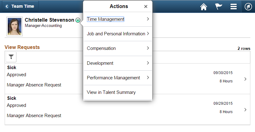
By providing Related Actions on the page, the manager does not have to navigate back to the Homepage, and then back into the transaction they would like to open next thereby saving a number of clicks or taps.
Related Actions guidelines and recommendations:
- When designing new Fluid pages, evaluate each page to see if it makes sense to place Related Actions on the page to help the user in navigating through their various business processes.
- If it is possible to assist the user by reducing navigation click counts through the use of Related Actions, then place the appropriate Related Actions on the page.
- Do not provide excessive unrelated Related Actions on a page. Navigating through a deep menu hierarchy in the Related Actions structure would require numerous clicks, which would be burdensome to the user, and should be avoided.
Refer to the Related Actions Standard for more information on guidelines and recommendations on the use of Related Actions.
Pivot Grids
You may use Pivot Grids to guide the user to specific components and transactions based on aggregated business data. Users may drill into more and more detailed aggregated data within the Pivot Grid, which leads to a list of links for navigating to specific transactions of interest. Pivot Grids and Charts may be used to provide summary level data to users with the ability to change a particular view of the data easily and, ultimately, to allow users to navigate to specific transactions where they may take an action based on their data analysis.
Comparison of Design Patterns
The following provides a guide to the appropriate use of each of the different design patterns in this document. Use this guide to help you determine the best navigation approach for your functionality.