")
Overview
The Fluid application development guidelines and standards documentation is divided by major content area. This documentation addresses the constructs and widgets that do not fall into one of the major content areas and are not covered in any one of those other standards.
Button Bar/Grouped Bar
You can use radio buttons to create two different constructs in addition to the traditional radio button group:
- Button Bar appears anywhere in the content area of a page.
- Grouped Bar appears directly below the banner at the top of the page or structure it is controlling; it is fixed and does not scroll away.
Both of these constructs use a group of radio buttons styled as a set of mutually exclusive buttons connected in a bar format. Only one button is selected at a time, and the selected button is highlighted in green.
Button Bar
Use the button bar to display or manipulate logically grouped sets of data on a page. In the following example, the button bar categorizes and enables the user to switch between views of related sets of employee data: Summary, Performance, Compensation, Leave Balances, and Analytics.
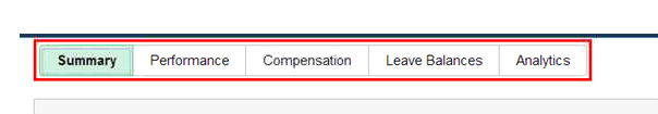
The button bar is best used when you have a static set of options that will not change and will display well in the small form factor. When selecting the button bar, consider how it will look in the small form factor: if the number of categories would cause horizontal scrolling, consider using another construct, such as the accordion or a drop-down list.
Another option for the small form factor is to change the text on the buttons to images. The images can be stylistically placed on the radio buttons and must meet accessibility requirements.
Grouped Bar
The grouped bar appears directly below the banner or above the structure it controls. Use a grouped bar when the button selections apply to the page as a whole and not just to one element of a page and when it is expected that the buttons will be used frequently. Do not use a grouped bar if you have a large number of categories that will not fit on the small form factor without scrolling.
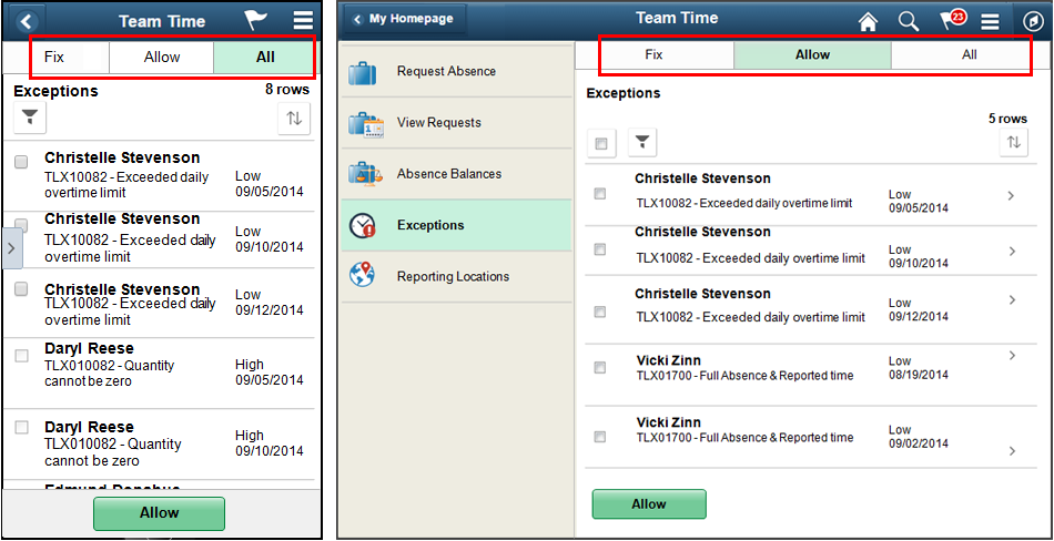
This example shows a button bar that allows the user to switch between different views of data on the page:
Slider Switches and Check Boxes
Two constructs are available for check boxes:
- Slider switch
- Traditional check box
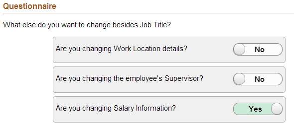
Slider Switch
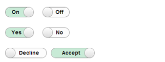
Use a slider switch to select one of two values. The affirmative value in a slider switch has a green background:
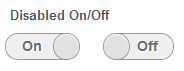
Disabled switches have a gray background and should only be used when the user can do something to activate the switch.
Another option for displaying disabled switches is to display text instead of the disabled switch.
The following example shows three slider switches; only one value is shaded green for the affirmative (Yes) selection:
Guidelines for Using Slider Switches
Use a slider switch when:
- Changes become effective immediately after users make a selection using the slider.
- Two values are available, such as on/off or yes/no.
- A value for a setting will be selected, and the setting value has two mutually exclusive choices.
Guidelines for Slider Switch Labels
- Replace the on and off labels when more specific labels are available for the setting.
- Use short (3 to 4 character) labels that represent opposites; the opposites should be obvious to the user.
- Consider translations when selecting labels for the switch. The text will grow in size by as much as 30 percent plus two characters when translated. Check boxes can be one of four sizes, and if the text exceeds the size of the check box, then it will truncate. The text should not truncate. Use a check box instead of a slider for long labels. Avoid using long labels such as the following:

Traditional Check Box
Check box labels should appear to the right of the check box:

Another option for displaying disabled check boxes is to display text rather than the disabled check box. Only use text if labels appear to the left of the check box.
Guidelines for Using Check Boxes
Use a check box when:
- The user has to perform extra steps for changes to be effective. For example, if the user must click a Submit or Next button to apply changes, then use a check box.
- You have two mutually exclusive values that require long labels (use a single check box).
- The user can select multiple items.
Date Picker
The date picker offers two options:
- Native date picker
- PeopleTools date picker
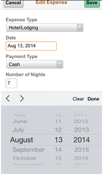
The native date picker is the preferred date picker for use in Fluid designs.
When selecting time pickers and datetime pickers, be consistent in the selection of the picker type, Native or PeopleTools. Users should have a consistent experience when they are selecting a date field and a datetime field on the same page.
Native Date Picker
The native date picker is preferred for the following reasons:
- It is accessible, while the PeopleTools date picker is not accessible.
- Users are familiar with their device’s date picker.
- The native date picker is similar to the native datetime picker.
- The PeopleTools team does not plan to enhance the PeopleTools date picker.
The following example shows the native date picker on an iPhone:
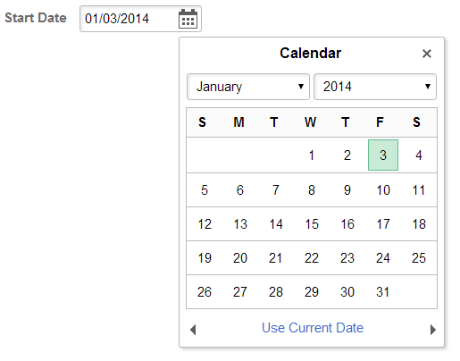
PeopleTools Date Picker
Use the PeopleTools date picker when the use case requires that a full calendar be displayed. Many native date pickers do not display a date in the context of the calendar. If users need to be able to see a date (for example, the date of the first Sunday in a month), then use the PeopleTools date picker.
If you use the PeopleTools date picker, you must document that it is not accessible.
Date Refresh
You can refresh From and Through dates by:
- Automatically updating data upon exiting either the From or the Through date.
- Providing a Refresh button.
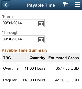
Automatic Refresh
Users enter values in the From or Through date fields, and the data on the page is updated immediately upon exiting either date field, for example:
Manual Refresh
Users enter values in the From and To date fields. No action is taken on exiting either of the date fields. The page data is updated only after the user selects the Refresh button, for example:
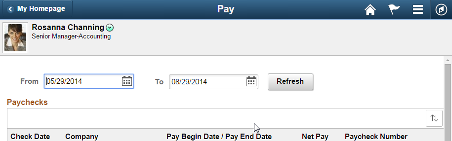
Use a manual refresh when the page data should not be refreshed until the user decides to do so. Also use the manual refresh when large amounts of data are expected to be retrieved.
File Attachment
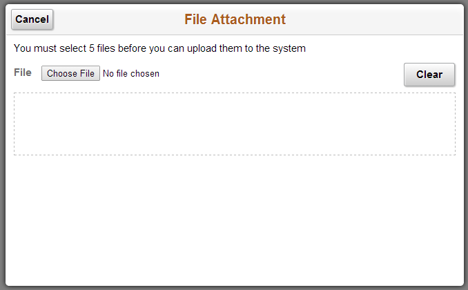
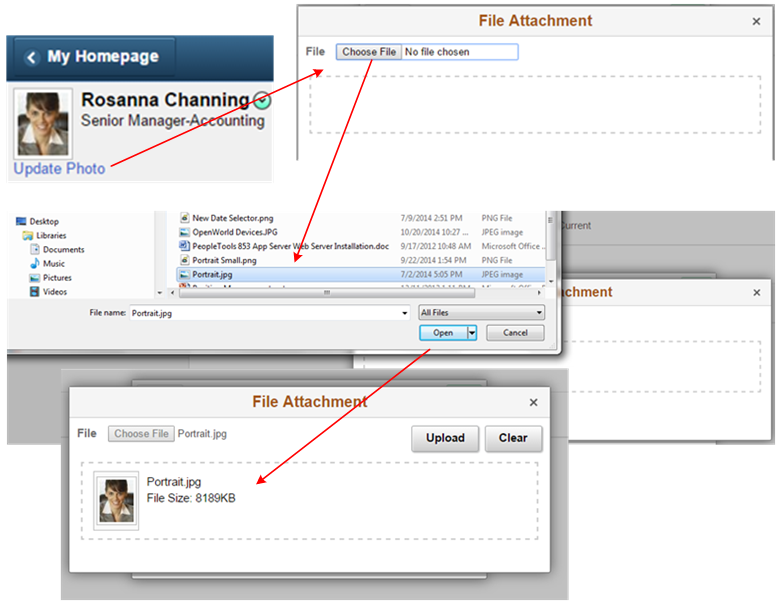
PeopleTools provides the File Attachment construct, which should be used by Applications when attaching single or multiple files. When the PeopleTools File Attachment construct is implemented, it will look and behave as follows.
- A file selection modal window appears:
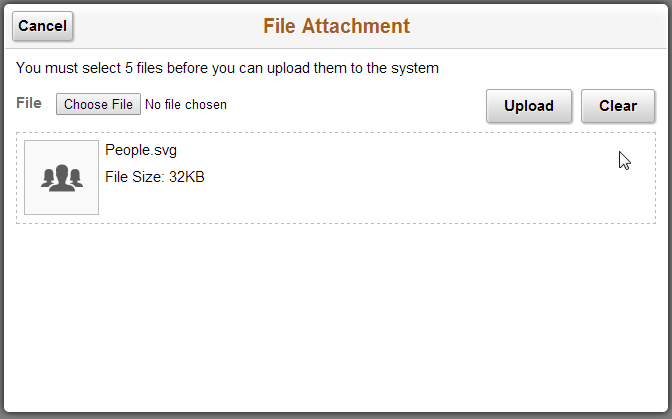
- The user clicks the Choose File button to select a file, the
file name appears in a grid below the Choose file button and the
Upload button appears to the left of the Clear button:
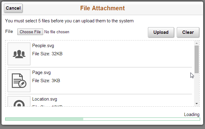
- If multiple file attachments are allowed, the selected files
will be added to the grid. When Upload is selected, a progress
bar will appear at the bottom of the window indicating that the
upload is in progress:
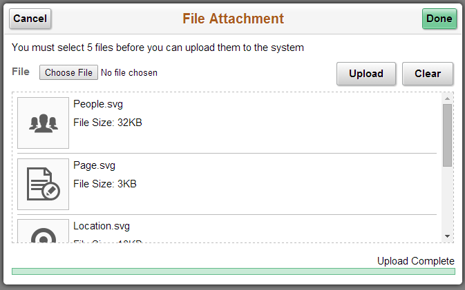
- When the upload is complete. The system displays the Done
button in the upper right of the modal window banner:
This example shows the upload process for an employee photo file:
Legends
Legends in fluid are not recommended because they add clutter to the page. If several icons must be shown, consider implementing one of the following alternatives to avoid using a legend:
- Provide a label with the icon if space permits.
- Use text instead of an icon, for example, use yes/no text instead of an image to indicate yes or no.
Required fields do not have a legend. Refer to the Fluid Required Field Standards for more information.
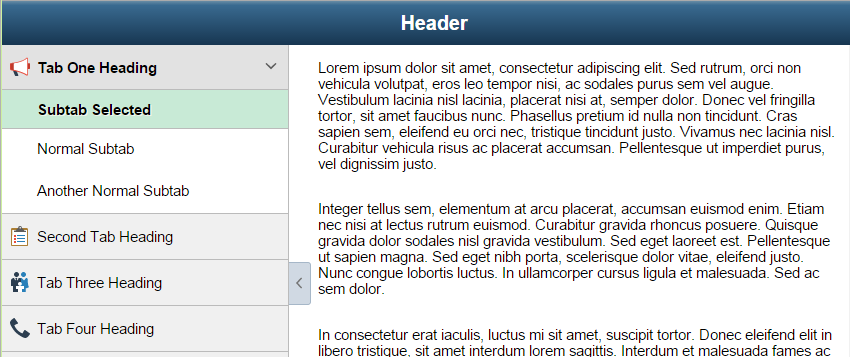
Page Tabs
Horizontal page tabs in fluid are not recommended because they do not display well in the space provided on the small form factor. PeopleTools 8.55 provides a fluid option that will render the tabs in the left panel. Tabs displayed vertically in the left panel provide a responsive design that renders well on all form factors.
This example shows the traditional horizontal display of tabs found in Classic PIA. This representation of tabs consumes a large amount of horizontal space:

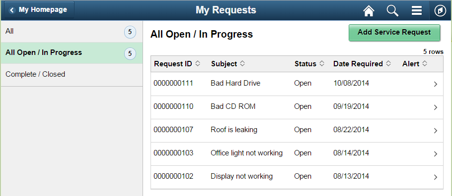
Instead of using horizontal page tabs, a two-panel layout should be used where the left panel contains each of the page tabs. In the following example, the page tabs All, All Open/In Progress, and Complete/Closed appear in the left panel for the My Requests page:
When a page contains tabs with subtabs, a two-panel layout is no longer optional, it is required. The following example shows a page with tabs and subtabs displayed in the left panel:
Responsive Design
When page tabs are needed, a two-panel layout provides a responsive design for both small form factors and larger form factors. Refer to the Fluid Panel Layout Standards for more information about the two-panel layout.
Range/Actual and Target/Actual
These two widgets show where specific values lie within a range and compared to a target value.
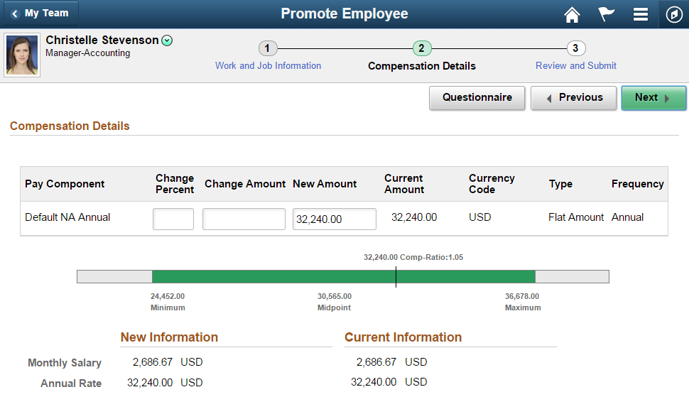
Range/Actual
This widget shows a horizontal bar and, with custom styling, shows where a specific value lies within a range. The range has a start point, an end point, and it may have a midpoint:
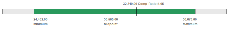
This example shows the range/actual widget used to show a salary range with an actual salary:
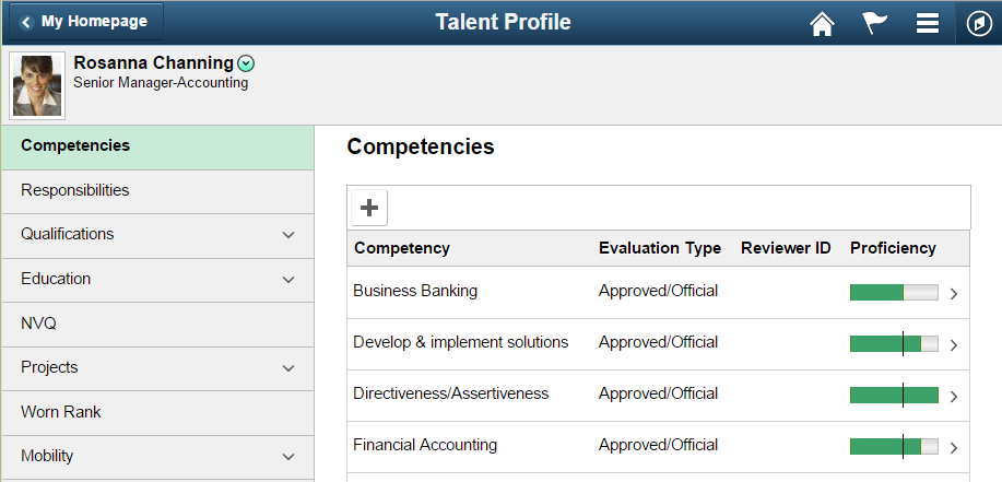
Target/Actual
The target/actual widget shows where a specific data value lies in comparison with a target value. The target is shown as a colored area starting from zero and ending at the target value; the actual data value is shown as a vertical bar:

The following example shows the target/actual widget used to show an employee’s target proficiency for a competency as compared to their actual proficiency:
Related Display
Use the Related Display style when the data value of a display-only field is controlled by the value selected in a related control field.
Related Display Field Placement
For a small form factor, place the Related Display field below the control field. Before the control field is populated, the empty space for the Related Display field should be hidden.
For medium and larger form factors, place the Related Display field to the right of the control field.
This example shows the Related Display field below the control field on the small form factor:
The following example shows the Related Display fields to the right of the control fields in medium and larger form factors:
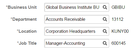
It is recommended that the codes in Related Display fields be shown only when they are meaningful to the user. In most situations, it is sufficient to display the description only.
Related Unit Style
Use the Related Unit style when a unit of measure is associated with a field. In the following example, Hours is a related unit that is associated with the Duration field:
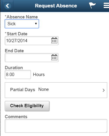
Always locate the related unit to the right of the field.
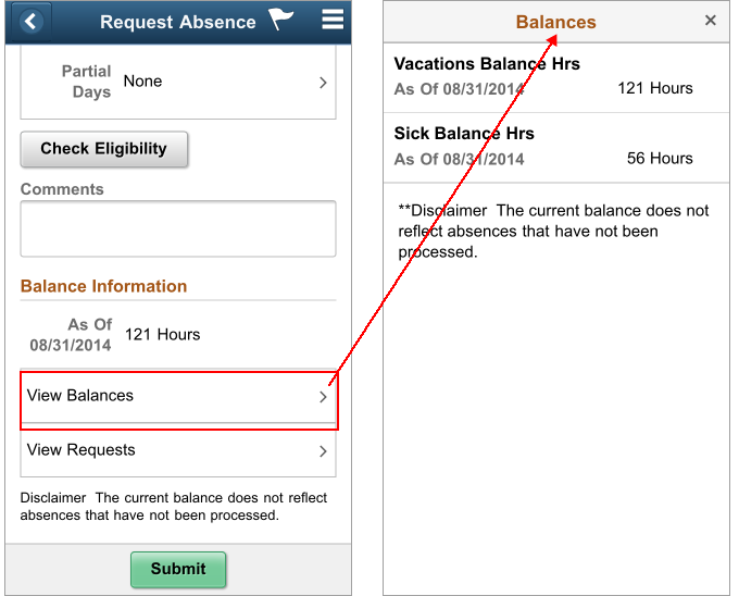
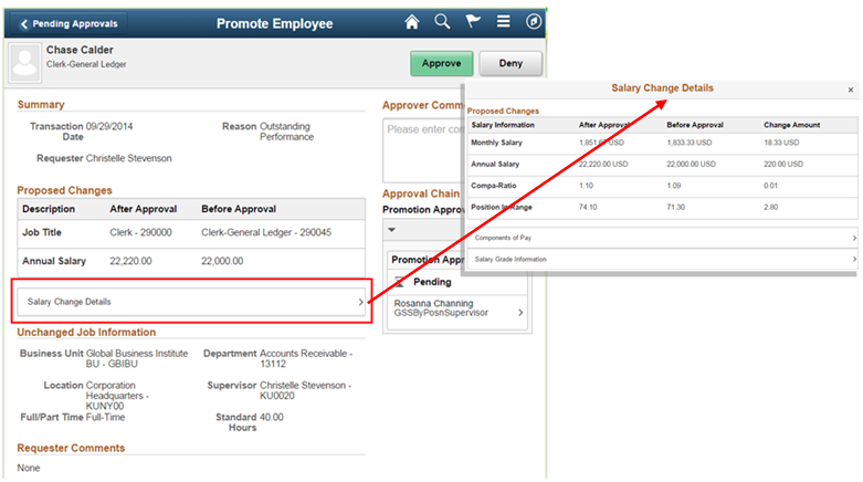
Standalone Link (Tap Out)
You use a standalone link, also known as a tap out, when progressive disclosure is needed on a page. For information or data entry that is secondary to the main task, a standalone link can be used to open a modal window where the nonprimary information or data entry is located. Moving nonprimary data from the main page provides a less cluttered user interface.
The following example shows two tap outs, one on top of the other: View Balances and View Requests.
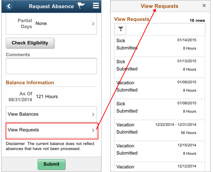
On medium and larger form factors, the maximum width of the standalone link is 400 pixels. The following example shows the 400-pixel wide standalone link in Approvals:
On medium and larger form factors, size the standalone link so that it aligns properly with the widgets around it.
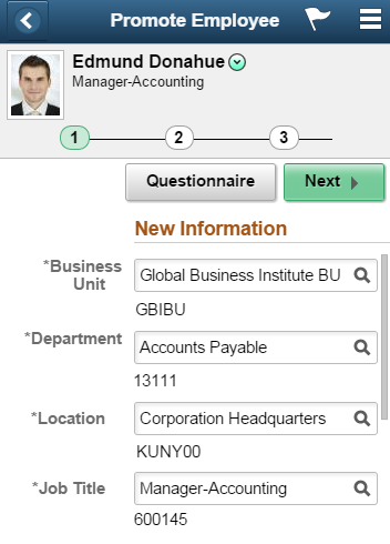
Subtitles
Use subtitles to provide headings for hierarchical information. In the following example, subtitles display Job Title, Location, and Salary under the Promotion Changes heading:
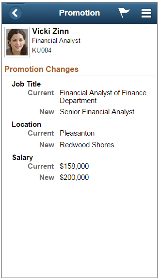
Subtitles are used here so the tangerine color of the group box label (Promotion Changes) is not repeated.