4. Operations
The operations that you can perform on the various interface elements can broadly be classified as follows:
- Text level changes – you can selectively change the attributes like font, font size, font color, text alignment etc. for the text appearing in many of the user interface elements, using Style Designer. You can also apply styles like bold, italic, underline etc. for some of the text elements.
- Background and border changes – you can apply the background properties to most of the interface elements. You can change the attributes like the background color, image, position, scrolling and tiling for the elements. You can also change the border properties like border color, style, thickness etc.
To make changes to the appearance of any of the interface elements, you need to first select the element in the navigation tab. The actions that you can perform on the selected element get enabled in the toolbar.
For some elements you can make the selection at two levels, inside level selection to change attributes of the text or the label, and outside level selection to change the properties of the container. You need to point the cursor appropriately to make the correct selection.
For example, for the ‘Horizontal Tab’ element under ‘Widgets’, you can make the selection at two levels as indicated below.
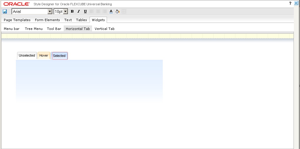
In the above screen, the label or the text part of the tab is selected for modification and the actions that you can perform on the label are enabled in the toolbar.
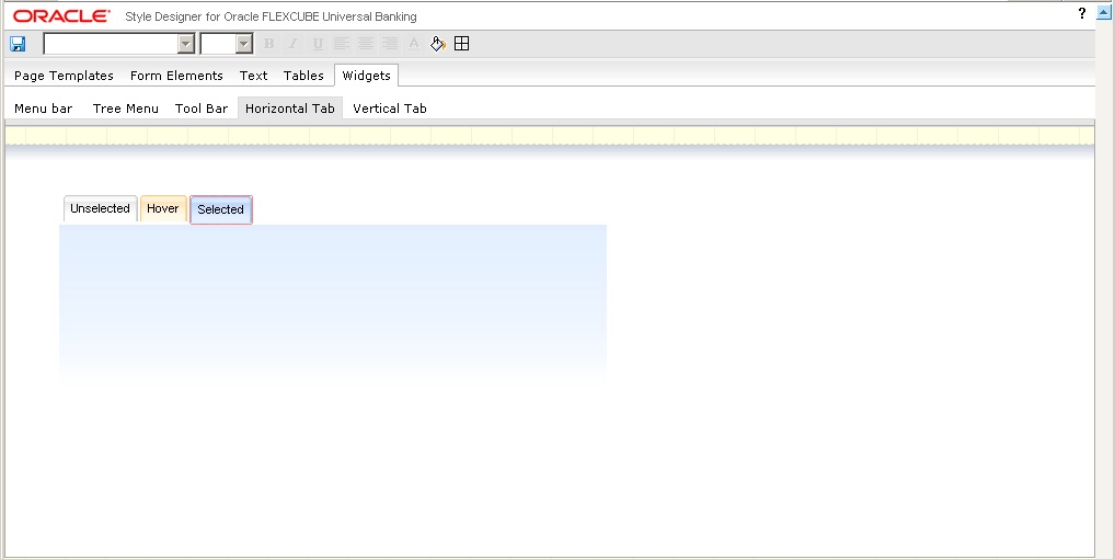
Here, the selection is at an outer level and only the background and border attributes are enabled in the toolbar. These properties will be applied to the base of the horizontal tab.
Some of the main operations that you can perform on the user interface elements are explained in the subsequent sections.
This chapter contains the following sections:
- Section 4.1, "Changing Font Properties"
- Section 4.2, "Changing Font Style"
- Section 4.3, "Changing Text Alignment"
- Section 4.4, "Changing Background Properties"
- Section 4.5, "Changing Background Image"
- Section 4.6, "Changing Border Attributes "
4.1 Changing Font Properties
You can change the font properties like font type, size and font color. The steps that you need to perform to modify the font properties for any desired interface element is explained taking an example.
- Select the interface element whose font properties you
wish to change. You can change font properties only for interface elements
involving a text component.
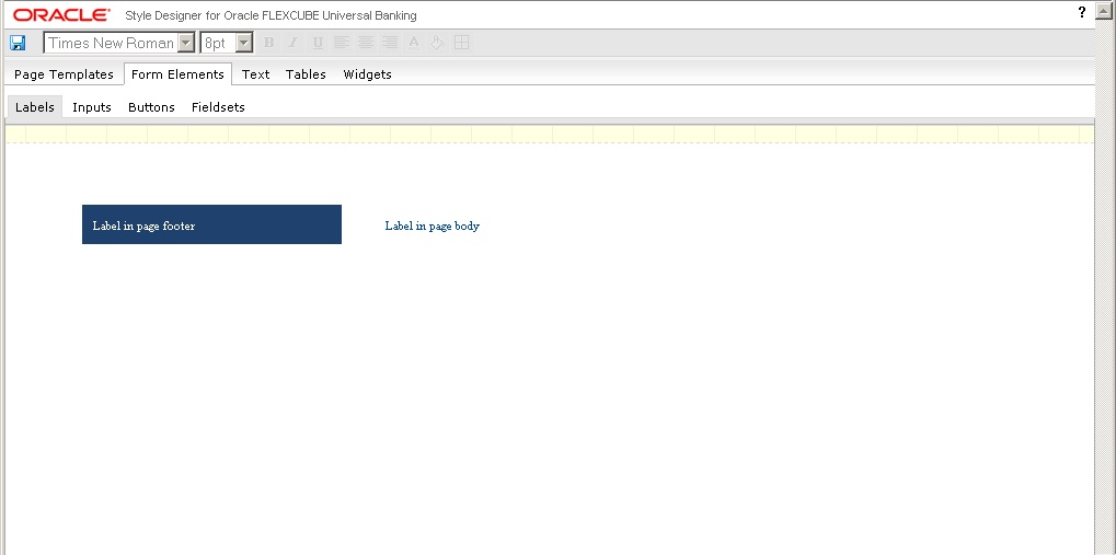
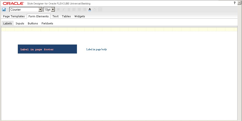
The label element appearing in page body is selected for modification here. The existing font is ‘Times New Roman’ with size ’8 pt’.
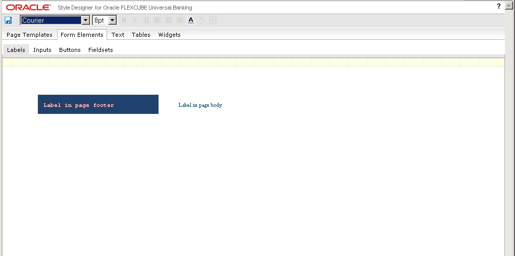
- To change the font type, select the required font from
the drop-down list, as indicated below. The font is changed to ‘Courier’
as displayed in the following screen.
- To change the font size, select the size from the drop-down list provided. You can increase the size up to 10 points and decrease it to a minimum of 8 points. You cannot type in the size that you wish to provide. You can only select the options that are provided in the drop-down list.
The following list shows the maximum size allowed for various elements:
- Labels, inputs, inline text button, normal page text, hyperlink, menu bar – maximum text size allowed is 10 pt
- Other elements apart from Headings – maximum text size allowed is 11 pt
- Headings – maximum text size allowed is 14pt
The font size is changed to ’10 pt’ as illustrated in the following screen.
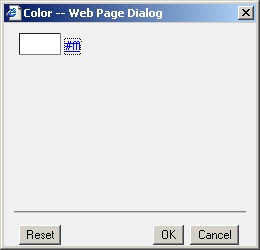
- To change the color of the font, select the text and click
the ‘Font Color’ icon in the toolbar. The following ‘Color’
screen gets displayed where you can select the color of the font.
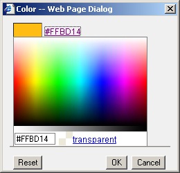
- To
select the color for the font, you can either click the color box displayed
or click the hyperlink provided for the color. The colors available appear
as a spectrum, as displayed by the following screen. You can make a selection
by moving the mouse over the spectrum and clicking to select the desired
color.
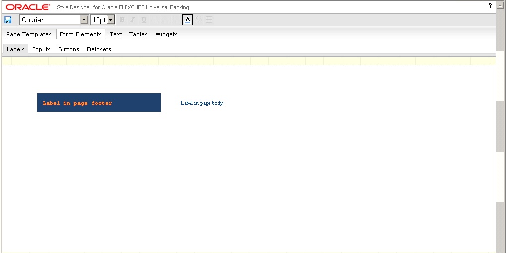
The font color is changed as indicated in the following screen.
You can change the font properties for the following interface elements:
- All components under ‘Form Elements’, except inline image buttons
- All components under ‘Text’
- All text components under ‘Tables’ and ‘Widgets’
4.2 Changing Font Style
You can change the appearance of the font by giving special effects like bold, italics underline etc. The steps that you need to perform to modify the font style for any desired interface element are explained taking an example.
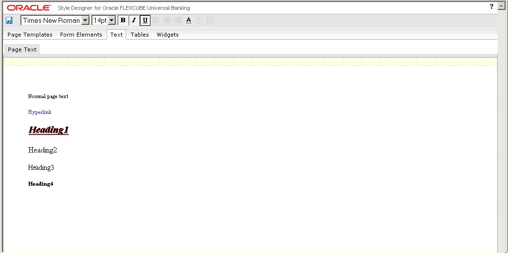
- Select the interface element whose font style you wish
to modify. Assume that you wish to change the appearance of ‘Heading
1’ under ‘Text’.
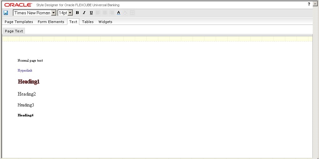
- To make the heading bold, click the ‘Bold’ icon
in the tool bar. To make the heading italicized, click the ‘Italic’
icon in the toolbar and to under line the heading, click the ‘Underline’
icon in the toolbar. The modified heading is displayed in the screenshot
below:
You can change the font style for the following interface elements:
- All ‘Button’ components under ‘Form Elements’, except inline image buttons and inline icon buttons
- All ‘Fieldsets’ under ‘Form Elements’
- All components under ‘Text’
- All text elements under ‘Forms’, ‘Calendar’ and ‘Editable Grid’ under ‘Tables’
- All text elements under ‘Tree Menu’, ‘Horizontal Tab’ and ‘Vertical Tab’ under ‘Widgets’
- Captions in ‘Tool Bar’ under ‘Widgets’.
4.3 Changing Text Alignment
You can change the alignment properties for the table headers appearing in the various types of tables. The following options are provided to change the alignment:
- Align Left
- Align Center
- Align Right
The steps that you need to perform to modify the alignment of a table header element are explained taking an example.
- Assume that you want to change the header alignment for
a table coming under ‘Forms’.
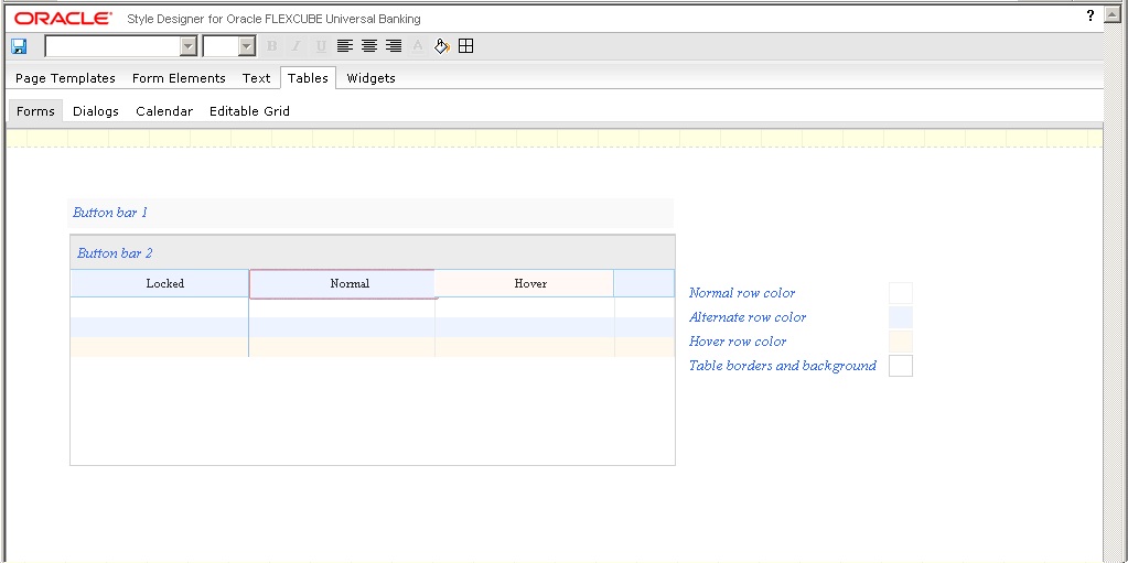
- To change the alignment of the table header, select the header as shown above, and click the required alignment icon available in the toolbar. You can change the alignment to Left, Right, or Center.
The following screen displays the ‘Forms’ table after modifying the header alignment.
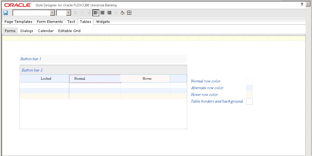
In the above screen, the table header has been left aligned.
- You can change the alignment back to default, by clicking the same icon again. i.e. If you click the ‘AlignLeft’ icon to change the header alignment towards left, you can click the ‘AlignLeft’ icon once again to bring the alignment back to default.
You can change the alignment for the table headers appearing in ‘Forms’ tables, ‘Dialogs’ tables and ‘Editable Grids’. You cannot change the alignment for ‘Calendar’ tables.
4.4 Changing Background Properties
You can change the background properties like background color, image, horizontal and vertical positions, scrolling, tiling, etc. for most of the non-text elements appearing in Oracle FLEXCUBE user interface. The steps that you need to perform to modify the background properties for any desired interface element is explained taking an example.
- Assume that you wish to change the background properties
of the menu bar in the ‘Landing Page’.
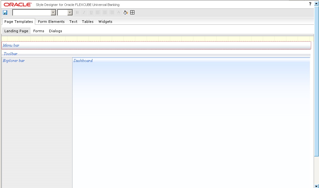
- To
modify the background attributes, click the ‘Background’
icon in the toolbar. The following ‘Background’ screen gets
displayed where you can make the required changes.
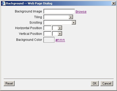
- You can modify any of the following properties of the background:
- Background Image – to modify the image click ‘Browse’ and select the image that you wish to provide as the background.
- Tiling – select the tiling option for the background image
from the drop-down list provided. The options provided are as follows:
- Do not tile
- Tile horizontally
- Tile vertically
- Tile both directions
- Scrolling – select the scrolling property of the background
image from the following options in the drop-down list.
- Scrolling background
- Horizontal and Vertical positions – specify the horizontal
or vertical position of the background image and select the units in
which the position is to be calculated. The following units are available
for selection
- px – pixels
- em - a relative unit based on font size
- % - percentage
- Background Color – select the background color from the color spectrum that gets displayed when you click the color hyperlink or the color box.
The following screen displays the menu bar after making the changes.
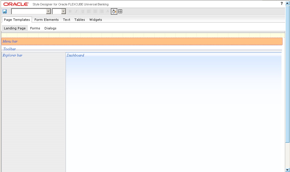
Here the existing background has been replaced with a new background color.
4.5 Changing Background Image
You can change the background image and its attributes like horizontal and vertical positions, scrolling, tiling, etc. for most of the non-text elements appearing in Oracle FLEXCUBE user interface. Background image will be displayed above the background color, if you have specified any. The steps that you need to perform to modify the background image for any desired interface element is explained taking an example.
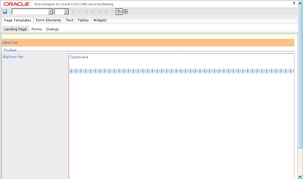
- Assume that you wish to change the background image for the ‘Dashboard’ area in the ‘Landing Page’.
- To modify the background image, you need to select the
image by clicking ‘Browse’ positioned next to the ‘Background
Image’ text box and selecting the required image from the image
folder created for the theme. You can select the image in the ‘Select
Image’ screen that gets displayed.
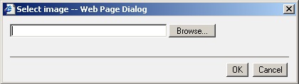
You need to copy the required image to the image folder created for the theme, before using it here. Style Designer prompts for the correct image folder path, if you specify a location other than this.
- After selecting the image, you can specify the tiling and
position details of the image in the ‘Background’ screen.
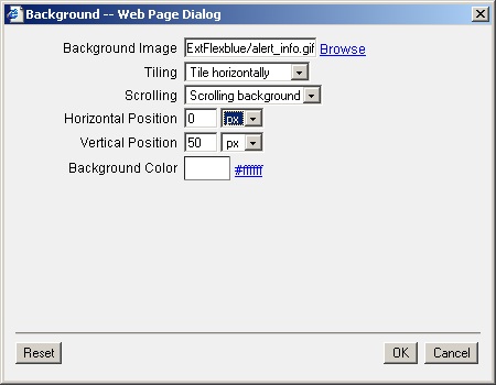
The following screen gets displayed, when you select ‘Tile Horizontally’ at ‘Vertical Position’ 50 pixels.
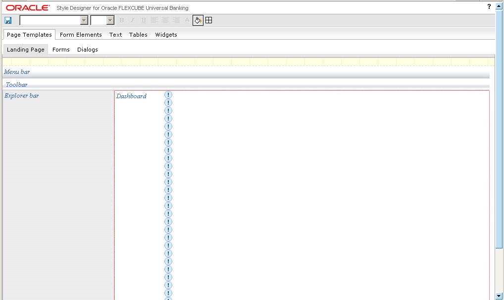
If you want to tile the image vertically, you can specify the ‘Horizontal Position’ where the tiling should happen. The following screen shows the background image tiled vertically at ‘Horizontal Position’ 100 pixels.
Note
Horizontal and vertical positions are not applicable if you select the tiling option as ‘Tile both directions’.
You can change the background properties for the following interface elements:
- All elements under ‘Page Templates’
- All ‘Form Elements’ except ‘Labels’
- All non-text elements under ‘Tables’ and ‘Widgets’
4.6 Changing Border Attributes
You can change the border properties like border style, width, color etc. for most of the non-text elements appearing in Oracle FLEXCUBE user interface. The steps that you need to perform to modify the border properties for any desired interface element is explained taking an example.
- Assume that you wish to change the border attributes for
‘Vertical Tabs’ appearing under ‘Widgets’.
- To change the border properties, click the ‘Border’
icon in the toolbar. The following ‘Borders’ screen gets
displayed, where you can make the changes you need.
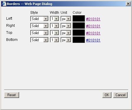
You can change the following properties for the borders:
- Style – you can change the border style to any of the following
options available:
- None
- Solid
- Dotted
- Dashed
- Width – select the width for the border from the drop-down-list. Border width cannot be more than 1px.
- Unit – select the unit in which the width needs to be calculated
from the option available in the drop-down list:
- px – pixels
- Color - select the border color from the color spectrum that gets displayed when you click the color hyperlink or the color box
You can change the border properties independently for the left, right, top and bottom borders.
The following screen displays the vertical tab after changing the border properties.
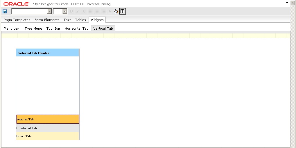
Here the right, left, top and bottom borders have been modified to solid style with 1 pixel width.
You can change the border attributes for the following interface elements:
- All elements under ‘Page Templates’
- All ‘Form Elements’ except ‘Labels’
- All non-text elements under ‘Tables’ and ‘Widgets’