| Siebel CRM Fundamentals Guide Siebel Innovation Pack 2016, Rev. A E52425-01 |
|


 Previous |
 Next |
View PDF |
| Siebel CRM Fundamentals Guide Siebel Innovation Pack 2016, Rev. A E52425-01 |
|
Previous |
Next |
View PDF |
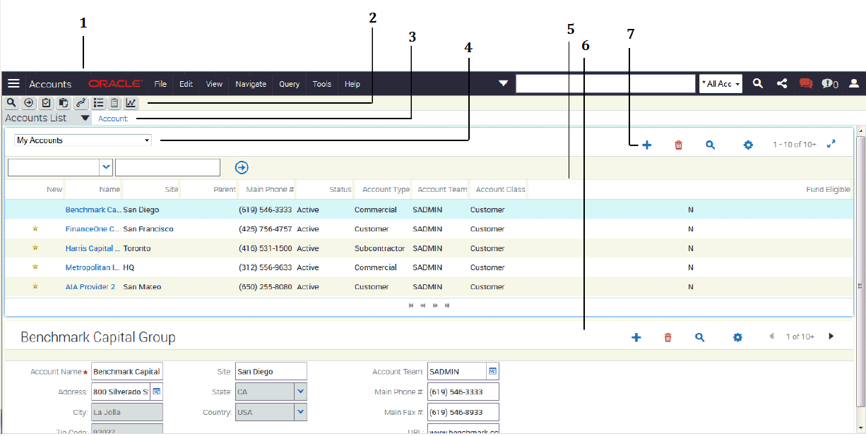
The Siebel application window by default uses the default Siebel Open UI theme. Figure 3-1 shows the main elements of an example Siebel application window using the default Siebel Open UI theme. Typically, the main elements of the Siebel application window, from top to bottom and left to right are:
Application banner, which contains the following elements from left to right: side menu, branding area, application-level menu, and menu toolbar. For more information, see "About the Application Banner".
Application toolbar, which contains the following buttons: query, execute query, apply target list, save target list, site map, how do I, tasks. For more information, see "About the Application Toolbar".
Second level view bar, which appears immediately below the application toolbar on the left side of the screen. For more information, see "About the Second Level View Bar".
Visibility filter, which appears at the top of a screen or view in the Siebel application (provided a visibility filter is available for the screen or view). For more information, see "About the Visibility Filter".
List, which consists of multiple records presented as rows. For more information, see "About Lists".
Form, which typically appears below a list and contains the data for the record you select in the list. For more information, see "About Forms".
Common icons in lists and forms, which appear at the top of lists and forms. For more information, see "About Common Icons in Lists and Forms".
These features are described in more detail in the remainder of this chapter.