| Oracle® Retail Allocation Oracle® Retail Allocation User Guide Release 14.1 E57805-01 |
|


 Previous |
 Next |
| Oracle® Retail Allocation Oracle® Retail Allocation User Guide Release 14.1 E57805-01 |
|
Previous |
Next |
Oracle Retail applications, like Oracle Retail Allocation, include some common interface options and controls that you can use throughout the application workflow. The following sections describe these user interface controls in more detail.
Although you may have more than one Oracle Retail application installed on your system, each application may use many of the same interface components and abides by common rules and constraints.
The following topics are covered in this chapter:
This application contains an online HTML help that can guide you through the user interface. User information is included to describe high-level processes and procedures, as well as provide step-by-step instructions for completing a task.
You can access online help for a particular page by clicking on the Help link at the top of the Allocation home page. Once in the help, you can access additional information through the table of contents or by using the index.
Oracle Retail applications support a variety of navigational tools and methods that allow you to move efficiently between application pages. Information on how to use and manage each of the tools and methods is included in this section.
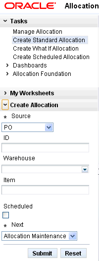
A task is a set of links to a series of task flows organized in a specific sequence to accomplish a business process or procedure. For example, tasks can be defined for common multi-step procedures or processes so that you can quickly step through tasks. By navigating sequentially to the pages outlined in the task, you are assisted in stepping through the business process or activity.
Your Tasks list appears on the extreme left side of the Allocation home page. All of the tasks to which you have access appear in the list on the Tasks window. Clicking on a specific task name in the list opens an adjoining tab that shows the steps for that task in the window.
To begin working with a task, choose the application feature or process from the list.
You can view the tables displayed in Allocation in a separate window and even save these tables in as a Microsoft Excel spreadsheet.
To view any table in a separate window, click Detach. The table appears in a new window.
To export the table to an excel spreadsheet, click the Export icon  . The table is saved as a Microsoft Excel spreadsheet.
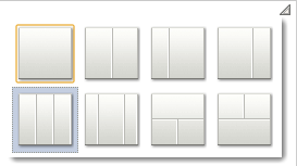
The Change Layout options allow you to choose between a set of predefined layout options. Through the use of the Change Layout icon, you can choose among eight different layouts to suit your needs and preferences. To select a layout, click on the option that best suits your needs. A gray colored border indicates the layout currently applied to the page.
The Preferences pages are where you specify the default regional, language, and accessibility settings that you want to use throughout the system.
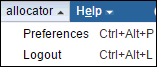
To set your preferred preferences, click Allocator > Preferences at the top of the Allocation home page, where Allocator can be any user who has the necessary permissions. The Preferences page appears. The standard preference options available are as follows:
Regional
Language
Accessibility
To return to the Allocation home page, click Preferences > Allocation Home at the top of the Allocation home page. The Preferences pages are where you specify the default regional, language, and accessibility settings that you want to use throughout the system.
Use the following options to specify the default formats for territory, date, time, number, and time zone you want to use throughout the system.
Table 2-1 Preferences Regional Options
| Value | Description |
|---|---|
|
Territory |
Specify the country details. |
|
Date Format |
Select the date format that you want to use. |
|
Time Format |
Select the time format that you want to use. |
|
Number Format |
Select the number format that you want to use. |
|
Time Zone |
Select the time zone you want to use. |
Use the following options to specify the default language you want to use throughout the system.
When you open an application page in a browser, the page opens in View mode. Additionally, Allocation provides access to another mode called the Edit mode to enable you, if you have the appropriate privileges, to edit application pages. These modes can be described as follows:
View mode—The default view of a page when opened in a browser. In this mode, you can perform tasks such as rearranging components, collapsing and expanding components, and changing the layout. Typically, changes made to a page in View mode are available for you alone and are saved as user customizations.
Edit mode—The mode typically available to authenticated users with access privileges to edit page content. In addition to the tasks that can be performed in View mode, Allocation provides controls for switching to Edit mode and performing tasks such as adding components, deleting components, and editing component properties. Typically, changes made to the page in Edit mode are saved as application customizations and are available only for you.
The Design view is the default page view that provides a WYSIWYG rendering of the page and its content, where Edit and Delete controls are directly selectable on each component. In Design view, you can perform tasks as adding content, editing page and component properties, changing page layout, and deleting components.
You may want to add custom content to an application page, such as a portlet displaying news, for example, or stock updates or reports. Allocation enables you to add content within any container in page Design view and Source view.
Allocation's resource catalog contains resources that you can add to a page. These include documents, alerts on important topics, reports, portlets, and task flows. The catalog can be invoked in the following ways:
In the Design view, by clicking the Add Content button on any container component on the page.
In the Source view, by selecting a container component and clicking the Add Content button on the Source view toolbar.
The following figure shows the default resource catalog available to you.
The resource catalog contains folders and components. An Open link next to an item in the catalog indicates that the item is a folder. You can drill down into the folder by clicking this link. An Add link next to an item indicates that the item can be added to the page.
Use the Top icon in the resource catalog to return to a top-level folders.
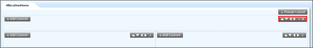
A toolbar on the box component in Design view provides options to add another box component before or after the component. This capability enables you to modify the layout of components on the page.
The box component toolbar contains the following Add Box icons in addition to the Edit and the Delete icon:
Table 2-4 Adding Box Components
| Icon | Description |
|---|---|
|
Add Box Above |
Adds a box component above the selected box component. |
|
Add Box Below |
Adds a box component below the selected box component. |
|
Add Box Left |
Adds a box component to the left of the selected box component. |
|
Add Box Right |
Adds a box component to the right of the selected box component. |
To delete a box component, click the Delete button on the box component toolbar. For more information on editing a box component's properties, see Editing the Properties of a Box Component.
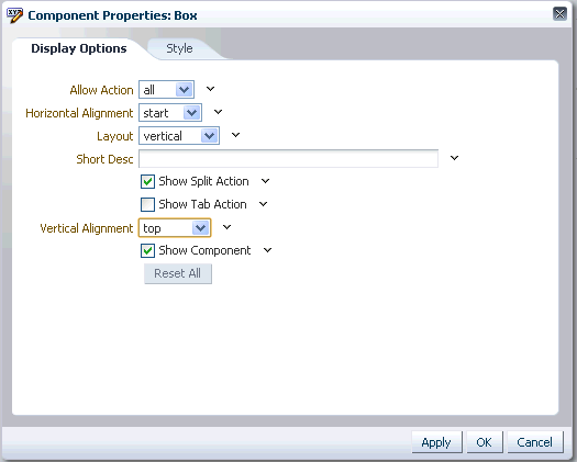
The Component Properties window enables you to edit component properties and the parameters associated with components. The Component Properties window is accessible in both Design view and the Source view.
The Display Options tab in the Component Properties window contains the following parameters:
Table 2-5 Adding Box Components - Display Options tab
| Icon | Description |
|---|---|
|
Allow Action |
Specify if you want to allow or deny actions on the box component. If you set this paramter to All, it adds actions depending on how you have set the Show Split Action and Show Tab Action options. |
|
Horizontal Alignment |
Select the horizontal alignment option you want to use. |
|
Layout |
Select the layout option you want to use. |
|
Short Description (Short Desc) |
Specify a short description for the component. |
|
Show Split Action Checkbox |
Select this option if you want to enable icons on the toolbar to split the box to add new box components above, below, to the left or to the right of the existing box component. The Allow Action parameter must be set to All for this option to work. |
|
Show Tab Action Checkbox |
Select this option to enable the Add Tab Set or a Tab icon on the toolbar of the box component. To add a new tab to the box component, click the icon. The Allow Action parameter must be set to All for this option to work. If you add a new tab to the box component using this icon, the Component Properties window creates a new tab, called Tabs, to enable you to edit its properties. |
|
Vertical Alignment |
Select the vertical alignment option you want to use. |
|
Show Component Checkbox |
Select this option to show or hide the box component. |
To reset all the parameters on the tab, click Reset All. To apply the parameters that you have defined, click Apply.
The Style tab in the Component Properties window contains the following parameters:
Table 2-6 Adding Box Components - Style tab
| Icon | Description |
|---|---|
|
Color |
Specify the default color of the text. |
|
Background Color |
Specify the background color of the component. |
|
Width |
Specify the width of the component. |
|
Height |
Specify the height of the component. You can use any standard CSS unit of measure, such as pt, px, pc, li, and so on. |
|
Font |
Specify the type of font to be used in the component. |
|
Font Size |
Specify the size of font to be used in the component. The size of component text should be relative to either your browser's default font size or the font size of the parent element. |
|
Font Style |
Specify the style of font to be used in the component. Choose from: Bold, Italic, Underline, Strikethrough. The font style you select here applies to any text inside the component. |
|
Background Image |
Specify the background image that you want to use in the component. Enter the URL to an image you want to render in the component background. Use standard CSS syntax. For example: http://www.abc.com/image.jpg. |
|
Margin |
Specify the fields for the border of space to draw around the component. Enter one of the following types of values: An absolute value. Include your preferred unit of measurement. For example: 2px. Use only those units of measurement supported in standard CSS, such as pt, px, pc, li, and so on. A percentage of the margin of a parent component (provide a percent sign with your value, such as 10%). Auto: Set the value automatically according to browser defaults. |
|
Style Class |
Specify the CSS style class to use for the component. The style class may be defined in your jspx or skinning CSS file. Note: Style classes are a set of styles bundled together and given a name. In contrast, values entered for Other CSS are individual styles. Style Class values are added to a component's styleClass attribute. Other CSS values are added to a component's inlineStyle attribute. |
|
Other CSS |
Specify any additional CSS for the component. Add any other CSS encoding that is not covered by the other Style or Content Style properties. You must use standard CSS syntax for this value to be valid. |
To apply the parameters that you have defined, click Apply.
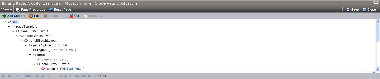
The Source view provides a WYSIWYG and a hierarchical rendering of page components in the Allocation navigator window. Add Content, Edit, Delete, Cut, and Paste controls, available on the Source view toolbar, provide specific operations that you can perform. You can also edit components within a task flow.
By default, the Allocation navigator window displays the code at the top of the page within a composer window. You can choose to display the code at the bottom, left, or right using the Source Position option on the View menu. You can also drag the border on the edge of the Allocation navigator window to alter its height or width.
Task flows that can be edited have Edit Task Flow links next to them. On clicking an Edit Task Flow link, the Allocation navigator window displays the hierarchy of components within the task flow's page or fragment. You can edit this page or fragment and click Close to zoom out of the task flow.
Similar to Design view, in Source view also you can perform such tasks as adding components, editing page and component properties, changing page layout, and deleting components. You can select a component on the page or in the Allocation navigator window and click the buttons on the Source view toolbar to perform these tasks.
You can rearrange components on a page using the Cut and Paste options on the Source view toolbar. A Paste menu enables you to paste a component into, before, or after any other component in the Allocation navigator window. The Cut and Paste buttons are grayed out if you select a component that does not support a cut or paste operation.
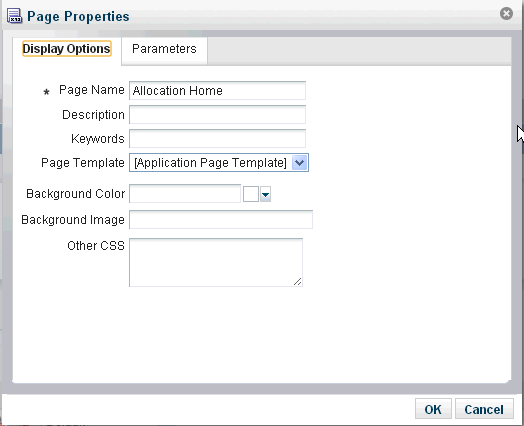
You can edit the page properties, namely page parameters and display properties, from both the design and the source view.
The Display Options tab in the Page Properties window contains the following parameters:
Table 2-7 Editing Page Properties - Display Options tab
| Icon | Description |
|---|---|
|
Page Name |
Specify the name of the page you want to create. This is a mandatory field. |
|
Description |
Specify the description of the page you want to create. |
|
Keywords |
Specify the keywords that can identify the page. |
|
Page Template |
Select the page template you want to use for the page. |
|
Background Color |
Select the background color you want to use for the page. |
|
Background Image |
Select the background image you want to use on the page. |
|
Other CSS |
Specify an alternate cascading style sheet to apply on the page. |
To apply the parameters that you have defined, click OK.
The Parameters tab in the Page Properties window allows you to add a new parameter to the list of existing parameters that are already defined. Click the Add a page parameter link in the Page Properties window to display the Add a Page Parameter window. Use the Add a Page Parameter window to define the new name of the parameter you want to add. Click Add Parameter to complete the process.
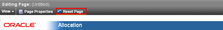
Use the Reset Page button to invoke the Reset Page window that provides options to remove your edits to the current page. On selecting this option, Allocation resets the page to its previously saved original version.
Use the Allocator menu to log out of the application, where Allocator can be any user who has the necessary permissions. This menu is named as per the user name you use to login. For example, for the user name System Administrator this menu is named System Administrator.