Banks can have varied requirements with regards to the theme and for look and feel of the application.
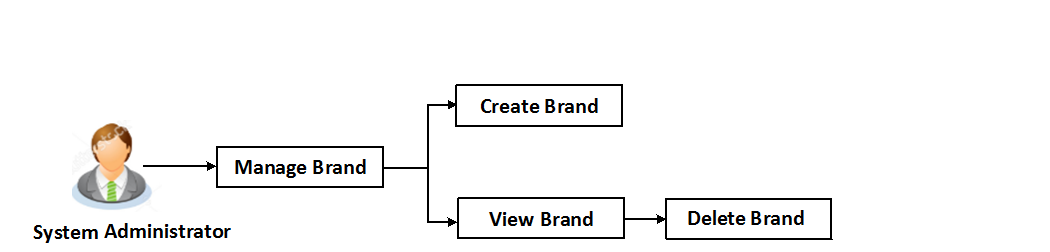
Manage Brand is an administrative maintenance that allows the system administrator to define the theme using brand logo, colors, fonts and font sizes.
System administrator can configure the style/theme by selecting brand logo, header colors, background colors, label colors, button colors, font color, header size, font type, font sizes for header texts, menu, buttons etc.
The administrator can define multiple themes with the above mentioned attributes and once defined, the administrator can activate one of the theme from the available list.
At any point in time, the administrator can deactivate a theme and activate another one
Prerequisites
Features supported in application
Workflow configuration allows Bank Administrator to:
 How to reach here:
Dashboard > Manage Brand
Manage Brand – Summary
 Field Description
|
Field Name |
Description |
|---|---|
|
Corporate User/ Administrator/ Retail User Select the role for which the theme needs to be viewed. |
|
|
Brand Name |
Displays the theme name as defined. |
|
Brand Description |
Displays the theme description as defined. |
|
Role |
The role for which the theme is displayed. The role can be corporate, retail and administrator user. |
|
Date Created |
Displays the date of theme creation. |
|
Actions |
The available action buttons against the theme are displayed. The action button can be:
|
Using this option System Administrator can view the created theme or brand.
To view the brand:
Field Description
|
Field Name |
Description |
|---|---|
|
Brand Name |
Displays the theme name. |
|
Brand Description |
Displays the theme description. |
|
Role |
Displays the role for which the theme is displayed. The role can be corporate, retail and administrator user. |
|
Customized Brands |
|
|
Assets |
This section displays the uploaded brand logo. Click Download to view the brand logo. |
|
Colors |
Displays the list of items with the color swatch that is being set in the application. The list includes:
|
|
Font Details |
Displays the font details of the application i.e. font URL and font name. |
|
Font Size Details |
Displays the font size details of the various fonts used in the application in 'rem' (length unit). 1px = 1rem |
|
Form |
|
|
Font Color |
The font color of the brand. |
|
Anchor Text Color |
The anchor text color (clickable text in the application) of the brand. |
|
Label Color |
The label color used in the brand. |
|
Input Properties |
|
|
Input Properties - Primary Button |
The color of the primary buttons of the brand. |
|
Input Properties - Secondary Button |
The color of the secondary buttons of the brand. |
|
Input Properties - Tertiary Button |
The color of the tertiary buttons of the brand. |
|
H1 - H6 Size |
The font size of the various level of headings of the brand. |
|
Header Font Size |
The font size of the header of the brand. |
|
Menu Font Size |
The font size of the menus of the brand. |
|
Button Font Size |
The font size of the button text of the brand. |
Using this option, system administrator can create a new theme for retail, corporate and administrator users.
To create a brand:
Field Description
|
Field Name |
Description |
|---|---|
|
Brand Name |
Specify the brand name. |
|
Brand Description |
Enter the theme description. |
|
Brand Type |
Select the role for which the theme is to be created. The role can be:
|
|
Customized Brands |
|
|
Assets |
Upload the desired file for brand logo. |
|
Colors |
The list of brand color items , the user can enter the colour hex value or can select color from the spectrum list. If color is selected from the spectrum, corresponding hex value to be displayed in this field. The color list includes:
|
|
Font Details |
Specify the font details of the application viz, font url and font name that is to be used in the brand. |
|
Font Size Details |
Font size details of the various fonts used in the application in 'rem' (length unit) for various level of headings in the brand. |
|
Form |
|
|
Font Color |
Displays the font color as selected in the Font Color category list. |
|
Anchor Text Color |
Displays the anchor text color as selected in the Font Color category list. |
|
Label Color |
Displays the label color used as selected in the Font Color category list. |
|
Input Properties |
|
|
Input Properties - Primary Button |
Displays the color of the primary buttons of the brand as selected in the Font Color category list. |
|
Input Properties - Secondary Button |
Displays the color of the secondary buttons of the brand as selected in the Font Color category list. |
|
Input Properties - Tertiary Button |
Displays the color of the tertiary buttons of the brand as selected in the Font Color category list. |
|
H1 - H6 Size |
Displays the font size of the various level of headings of the brand as selected from the Font Size Details category list. |
|
Header Font Size |
Displays the font size of the header of the brand as selected in the Font Size Details category list. |
|
Menu Font Size |
Displays the font size of the menus of the brand as selected in the Font Size Details category list. |
|
Button Font Size |
Displays the font size of the button text of the brand as selected in the Font Size Details category list. |
The system administrator can delete the created brand maintained in the application.
To delete the brand: