Providing Alternatives to Color Coding to Convey Meaning
This section explains how to design applications according to the following WCAG 2.0 standard:
1.4.1 - Use of Color: Color is not used as the only visual means of conveying information, indicating an action, prompting a response, or distinguishing a visual element.
Do not use color as your only way to convey information. Include a redundant clue so that people who are color-blind or visually impaired are aware that a field or process is special or different. For example, do not change the background or text color to red to indicate an error. Another common mistake is to use an icon that changes color based on status but is otherwise the same. Color-blind users cannot distinguish between certain colors, nor can screen readers. In addition, if a user prints a page on a black and white printer, color-dependent items on the page become indistinguishable.
When showing status, you have two options:
Use a display-only text field with the label Status to indicate status.
For example:
Image: Example of a display-only status text field
This example shows a display-only status text field.

Use icons that have different colors and different shapes to represent the different status values.
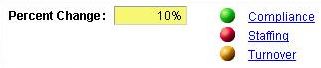
The following incorrect example shows status icons that are differentiated only by color:
Image: Incorrect example of status icons that use only color to convey meaning
This example illustrates status icons that use only color to convey meaning; this should be avoided.
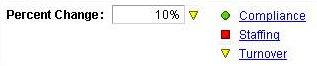
The following correct example shows status icons that have both different colors and different shapes:
Image: Correct example of status icons that use both color and shape to convey meaning
This example illustrates status icons that use both color and shape to convey meaning. This is desired.
Note: When using icons, be sure to assign alternative text labels to the icons.
See Identifying Images and User Interface Elements.
For consistency, use the following icons to indicate status:
Field or Control
Definition

PS_STATUS_OK_ICN: OK, normal, good

PS_STATUS_CAUTION_ICN: Warning, caution, at risk

PS_STATUS_ERROR_ICN: Error, critical

PS_STATUS_CLOSED_ICN: Completed

PS_STATUS_CANCELLED_ICN: Cancelled

PS_STATUS_UNCHANGED_ICN: No status, status unchanged

PS_STATUS_TREND_UP_ICN: Trend up

PS_STATUS_TREND_STABLE_ICN: Trend unchanged
Note: In addition, do not use flickering, moving, blinking, scrolling, or auto-updating objects to indicate status.