Ordering and Spacing Page Controls
This section provides an overview of page control order and spacing and discusses how to:
Order controls visually.
Order controls logically.
Test page control order.
Apply control order rules.
Change control order using the order list.
Find a field on a page definition.
Use default order.
Space controls on pages.
Page definitions include an Order tab. Here, the system populates a grid with the names and properties of the page controls associated with the page definition. Properties, which appear as grid column headings, include:
Tab Order
Field ID
Level
Label
(Control) Type
Field
Record
Display Control
Related Field
Control Field
Page Field Name
Allowed Deferred Processing
Popup Help
You can use the Order tab as a diagnostic tool, which can save time in addressing issues your page might have with page field processing order and page field tab order among other visual and logical page-processing properties. All values on the Order tab are display-only. Some property values, such as record and field names appear as text; other values, such as Popup Help appear as check boxes in which case, a check indicates that the property is applicable to the page control.
The order of the page controls that are on your new page is important to both how your users interact with the page and how the component processor interprets the underlying record and field relationships.
Two types of page control order are important on pages:
The order in which you visually arrange controls on the page.
The logical processing order—governed by levels—that the system requires to correctly process the page data.
As you add controls to a page, the system automatically builds a processing control order list that can be viewed on the Order tab of the page definition. Usually, you don't want to preserve this order for processing, so you can reorder your controls on the Order tab to indicate how the system should process your page.
Organize fields from top left to bottom right in a page. Include most important information at top. Use group boxes to group related fields and indicate the hierarchy of information on a page. Guidelines for grouping information include:
Keys
Group all key fields at the top of a page (such as Business Unit, Employee ID, and SetID).
Level 1−3
Controls at these levels must be enclosed by a scroll area or grid. At design time, these levels can be stacked. At runtime, they appear nested.
Tab ordering through a page at runtime is strictly defined by page field ordering. When you add a control to a page, PeopleSoft Application Designer automatically inserts it in the order list based on where you position it on the page. You can manipulate the ordering of fields on your page by moving them up or down on the Order tab in the page definition. In doing so, you also change the tab order that users follow as they move through fields on the page.
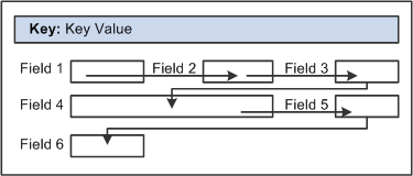
In general, field tab order should flow from top left to bottom right on a page. The flow should reflect the way that the eye naturally scans information. On a page with multiple scroll levels, the tab order should follow the scroll level order, from Level 0 to Level 1, and so on. In a noncolumnar page, the tab order should go from left to right on each line from top to bottom as depicted in this figure:
Image: Example flow of noncolumnar page
The bellow mentioned image is an example of flow of non columnar page
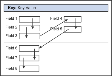
In a columnar page, the tab order should go from the top to the bottom of the first column, then from the top to the bottom of the second column, and so on.
Image: Example flow of columnar page
The bellow mentioned image is an example of flow of columnar page
Fields that share the same label should follow consecutively in the tab order from left to right.
After you have placed all of the controls on your page, you should test the tab order. You can do this using either the test mode or by viewing the page in the browser. Using the View Page in Browser mode is more useful because you can also check the placement of controls and subfields that are on your page. In these testing modes, you can enter data into edit boxes and select radio buttons and check boxes. However, you cannot save data that you enter, and push buttons and links do not function.
Note: The tab order that you establish at design-time may not apply for all browsers.
See Troubleshooting Browser Limitations available on the My Oracle Support website.
To test tab flow using View Page in Browser mode:
Open the page in PeopleSoft Application Designer that you want to test.
Select
Select the appropriate browser from the drop-down list box.
Press the Tab key to move from one field to the next.
Press Shift+Tab to move to the previous field.
If you’re working with a complex page or you’re new to order lists, you might print out a page definition and work on the hard copy. The sequence number of each control is reflected in the Num column on the page report. You can easily mark where you need to move a control to make your page function properly, or you can look at the Lvl column on the Order tab of the page definition.
Use these rules to order your controls:
Radio Buttons
For radio buttons to function in a single group, they must be associated with the same record field and be listed together on the Order tab of the page definition. The only control that you can place between related radio buttons is the static text control to extend radio button labels. Put the text immediately after the radio button to which it relates.
Level-Based Controls
List level-based controls (scroll areas, grids, and scroll bars) immediately before the first control that they govern, followed by the controls that are directly governed by that control. Level-based controls directly govern all controls that are listed below them on the order list until they encounter another level-based control that is at the same or lower level (higher occurs level number).
Display Controls
Place display controls before related displays that they govern. The related display controls don't have to follow the display controls immediately, but they must be inside the same scroll area or scroll. However, if you have more than one related display control, placing each immediately following its display control makes the order page easier to read and understand.
The Order tab of the page definition displays attributes about each of the page controls and their processing order. The Field ID column represents the order in which the control was added to the page. If you modify the order of page fields on the page, note that the numbers assigned to each field remain constant. Thus the IDs might not always appear in sequential order. When a database compare is performed, the Field ID appears on the Compare report to assist you in identifying specific page fields.
Reorder page fields on the Order tab by dragging them in the same view. Changing the order list doesn't change the physical location of controls on the page. It changes only the logical order or tab order in which controls are processed. When you have added and arranged all of your controls, you may want to print your page definition to see how you might need to reorder your controls.
The Order tab also governs processing rules for scrolls and record or field relationships. Consider which controls are associated with which scroll area or scroll bar and which secondary relationships are important to page processing.
To change the order list:
Open the page.
Select the Order tab on the open page.
The Order view appears. Use this view to change the logical processing order of fields on your page.
To move a control to another position in the control order list, select the control that you want to move.
Press the Shift key to select multiple controls.
Drag the selected control to the new position on the Order view.
The system moves the control to the new location in the list. The ID value remains static. The visual display of the page still looks the same—changing the order list doesn't move the control on the page, only the logical processing order of the control.
Important! When viewing your page in “Test Mode,” page fields cannot be accessed, moved, or modified from the Order tab if the page definition contains a sub page. Exit “Test Mode” to rearrange page fields in the order list.
Use the Order view to locate a field on a page definition. Using this method of locating fields is useful when you are working with detailed page definitions that contain many fields.
To find a field on a page:
Access the Order tab of your page definition.
Select the field that you want to locate on the page.
Select the Layout tab.
The field that you selected on the Order tab is selected in the Layout view.
You can reorder the field list on the Order tab so that the logical control order reflects the physical control order as shown on the Layout tab. Do so by selecting You can use this tool in either the Layout or Order view for your page definition. The system creates the default order by reading the page as though it was on a pixel-by-pixel grid, from top to bottom and left to right.
Note: Use the default ordering option sparingly on existing pages. It may offset any previous order that was created. However, on new pages, you may find default ordering a useful starting point for your control order list.
Provide adequate space between controls on a page so that fields and their labels don't touch or overlap other controls or labels in PeopleSoft Application Designer. If they do, then when your page appears in the browser, the label is offset automatically and the overlapped control might shrink.
Overlapping Fields
You can layer or overlap fields only if the one that you are overlapping is set to Invisible on the Use tab of the properties dialog box for that control. When you move through the data entry controls on a page, the component processor recognizes only visible, unhidden fields as available for entry.
You can layer multiple invisible fields. However, you must set up your stacks of edit boxes so that all but one field in the stack are invisible or hidden at RowInit time.