Using Group Boxes
Use group boxes to visually associate relevant page field controls and to create a page that is intuitive to the user.
To insert and move a group box:
Select
Position the mouse where you want the initial location of the group box and click.
Move the group box to the appropriate location by clicking and dragging.
Adjust the group box size and shape using the handles on the edge of the group box.
Remove cursor focus from the group box by clicking anywhere outside of the group box in your page workspace.
Use group boxes to visually associate relevant page field controls and to create a page that is intuitive to the user.
Setting Group Box Record Properties
Although the group box Record Field properties are optional, associating the group box with a record definition and record field enables you to:
Distinguish individual group boxes when multiple group boxes appear on the page definition Order tab.
Use PeopleCode to programmatically control the properties of the group box.
Access the Group Box Properties dialog box. Select the Record tab.
|
Field or Control |
Definition |
|---|---|
| Record Name |
Select the record definition to which you would like to associate this group box. |
| Field Name |
Select the field definition to which you would like to associate this group box. Only the fields in the previously selected record definition appear in this list. |
Setting the Group Box Label Properties
Use group box label properties to reflect how the fields that appear inside the group box are related.
In some cases, the group box may surround a variety of disparate controls. In those situations, you might opt to enter a label manually rather than associating the group box with a record definition and field.
Access the Group Box Properties dialog box. Select the Label tab.
Select the label Type:
Field or Control
Definition
Text Select to enter the group box label manually. Selecting this option enables the Text field and disables the Label ID field.
Note: You do not enter the text until the next step.
RFT Short (record field text short) Select to access the Short Name record field label properties of the record field that you associate with this group box. Selecting this option disables the Text field and enables the Label ID field.
Note: You do not select the label until the next step.
RFT Long (record field text long) Select to access the Long Name record field label properties of the record field that you associate with this group box. Selecting this option disables the Text field and enables the Label ID field.
Message Catalog Select to use a value stored in the message catalog as the label for the group box. Selecting this enables the Message Set/Number field in the Label Text group box.
Select or enter the specific Label Text.
Field or Control
Definition
Text Enter or view the text that is to appear as the label in the group box header.
If you select the RFT Short or RFT Long label type, the system automatically populates this field based on the Label ID that you choose and then disables it.
Group box labels are limited to 50 characters, regardless of whether the label is static text or retrieved from the field definition.
Label ID Select the value that is to appear as the label in the group box header. The values that appear in this list depend on the label type option that you selected in the previous step and the label properties of the field definition. Changing the Label ID value automatically changes the value in the Text field.
Context Enter a context for the label.Message Set/Number Enter the message set and message number of the message catalog entry to be used as the group box label value. Available only if the Type selection is Message Catalog.
Label Style Select a value to determine the look and feel of the label.
Note: Not all style classes are appropriate for labels. Changing the default style can produce unexpected results.
Select an Embedded Help Pop-up option.
Field or Control
Definition
No Popup Select this option to disable embedded pop-up help.
This value is the default.
Message Catalog Popup Select this option to enable the embedded pop-up help icon on the grid at runtime. Selecting this option enables the Message Set/Number edit boxes.
Message Set/Number Enter the message set number and message number of the message catalog entry to appear when the user clicks the embedded help icon.
Text Displays the message that appears when the user clicks the embedded help icon. This field is display-only.
Select an alignment option for the label.
Select the Display Options of the label.
Field or Control
Definition
Body Style You can control the color, line thickness, and background of the body section of a group box by specifying a style.
Adjust Layout for Hidden Fields Select to have the group box adjust its borders to accommodate any hidden fields.
Note: For the group box to adjust automatically, the hidden fields inside the group box must be surrounded by open space or have other hidden fields to the right or left.
Hide Border Select to hide the outside border of the group box. This selection overrides the border options specified in a style.
Suppress Accessible Label Select to hide any label applied for accessibility reasons.
Setting Group Box Use Properties
Access the Group Box Properties dialog box. Select the Use tab.
|
Field or Control |
Definition |
|---|---|
| Multi-Currency Field |
Select to associate this field with multicurrency processing. If the Multi-Currency option on the PeopleTools Options page is selected, the field displays at runtime only. |
| Hide all Fields when Group Box Hidden |
Select to hide all visible and hidden fields when the group box is hidden. Hide a group box by associating it with a record and field and invoking the relevant PeopleCode field class property. See Visible. |
| Collapsible Data Area |
Select to collapse the group box into a small image that the user must click to expand. Collapsing the group box enables the Default Initial View to Expanded State check box and enables you to select label images for both the expanded and collapsed states, typically small triangles. Each time that a user opens or closes a collapsible section, a transmission to the application server is required. Therefore, the initial state of whether the collapsible section is open or closed is important. You should carefully evaluate the performance and usability aspects of using collapsible sections versus designing a long page that displays all of the data using deferred processing mode instead. |
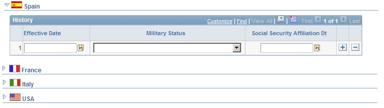
Example of Collapsible Group Boxes
Spain is expanded while the group boxes for France, Italy, and USA are collapsed:
Image: Example of collapsible group boxes
This example illustrates the fields and controls on the Example of collapsible group boxes. You can find definitions for the fields and controls later on this page.