Using Page Development Tools
This section discusses how to:
Use page definition menus.
Use page definition toolbars.
Use the page layout grid.
As you build pages, use the tools and options in these menus:
File Menu
In addition to the standard options for opening, deleting, and renaming pages, use this menu to access the definition (page) properties and project properties.
Edit Menu
Access the page field properties from this menu. To find out what other definitions reference the active page, select Find Definition References. You can also search for a text string in types of PeopleCode or SQL objects.
View Menu
Select View Definition to view the underlying definition, such as the subpage or record, for the selected control.
You can view the PeopleCode for the page or the underlying record definition.
The properties Edit Fill Display, Edit Fill All, and Edit Fill None refer to how controls appear only during design time. They do not affect the page during runtime.
Use the Show Page Control Inspector tool to view summary data of the selected page field.
Use Show Grid to display or hide a layout grid on the page that you are designing to help you place controls more accurately.
Insert Menu
Use this menu to insert different types of controls on your page. You can also insert the page on which you are working into a project.
Tools Menu
This menu provides access to various utilities, such as data administration, change control, upgrade, and translate.
Layout Menu
Use this menu to modify the number of pixels between points on the layout grid. Options on this menu also enable you to align page controls, align page control labels, view the processing order of the controls on the page, and test the tab order between fields on your page.
Use the Align functions to move selected page controls or page control labels to ensure consistency of vertical and horizontal placement among the selected elements. All selected elements align to the last element that you select in the set.
Use the Auto Size Page function to resize your page to the best height and width that accommodates your page controls.
Use the View in Browser function to see a very general image of the page in the selected browser without data. Note, however, that PeopleCode is not run on this page rendering, so the page may look significantly different to users if PeopleCode is used to hide or unhide page fields.
Use the Generate HTML function to create a text file containing the HTML for your page. The file is saved to the TEMP directory of your local drive. Note that the HTML that is generated contains no data or context. It is, therefore, likely to differ from the HTML on a page at runtime.
The toolbars in PeopleSoft Application Designer change, depending on the active window. When a page window is active, you see the page definition toolbar and the page control toolbar.
Page Definition Toolbar
|
Field or Control |
Definition |
|---|---|
 |
Click the Properties button to open the Page Properties dialog box (Alt+Enter). |
 |
Click the Project Workspace button to display or hide the project workspace ( or Alt+0). |
 |
Click the Select Group button to select several controls at once ( menu item or Ctrl+P). |
 |
Click the Default Ordering button to reorder all of the fields on the page based on their relative locations on the page (). |
 |
Click the Test Page button to test the tab order of your page design ( or Ctrl+T). |
 |
Click the View Page in Browser button frequently throughout the design process (). |
 |
Click the Toggle Inspector button to display or hide the floating Definition Inspector window (). |
 |
Click the Auto Size button to size a subpage or secondary page to fit around page controls. |
 |
Click the Toggle Grid button to display or hide the page grid ( or Ctrl+G). |
 |
Click the Left Label Position button to place the page control label for the currently selected field immediately to the left ( or Ctrl+D). |
 |
Click an Align Label (position) button to move the selected labels so that the edges or center points of the selected labels share a common axis ((position). |
 |
Click the Auto Size Fields button to resize the selected edit box and drop-down list box page controls so that they are all the same width as the last page control that you select. () |
 |
Click the Show Help button to view the page definition help. |
Page Control Toolbar
The page control toolbar contains a button for each type of page control that you insert. The buttons display images that look like the controls that they insert. You can move this toolbar on your workspace independently of the system toolbar or the other half of the page definition toolbar.
|
Field or Control |
Definition |
|---|---|
 |
Frame. |
 |
Group box. |
 |
Horizontal rule. |
 |
Static text. |
 |
Static image. |
 |
Grid tab separator. |
 |
Check box. |
 |
Drop-down list box. |
 |
Edit box. |
 |
HTML area. |
 |
Image. |
 |
Long edit box. |
 |
Push button/hyperlink. |
 |
Radio button. |
 |
Tree. |
 |
Grid. |
 |
Scroll area. |
 |
Scroll bar. |
 |
Secondary page. |
 |
Subpage. |
 |
Chart. |
When you open a page definition, evenly spaced dots appear in the workspace. This is the page layout grid that you use to align controls. When you run applications, the grid does not appear on pages. It appears only as a design aid in the page definition. This example shows the Layout Grid dialog box:
Image: Example of Layout Grid dialog box with default values
This example illustrates the fields and controls on the Example of Layout Grid dialog box with default values. You can find definitions for the fields and controls later on this page.
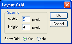
The default grid spacing is 4 × 4, which means that each row has one dot per 4 pixels and that the rows are 4 pixels apart on the vertical axis. Most pages in PeopleSoft applications are built using this grid. To change the spacing, open the Layout Grid dialog box by selecting Grid Settings from the Layout menu.
You can turn off the grid view of your page by clicking the Toggle Grid button in the page definition toolbar.
Changing Page Layout Grid Settings
To change grid spacing:
Select
Enter values for the width and the height, which is the spacing of the dots in pixels.
The smaller the value, the finer the grid. The finer the grid, the more difficult it is to align fields precisely without using the align functionality. Note that if either the width or height is set to one, then the grid will be slightly off.
Select a Show Grid option to activate or deactivate the page grid.
If you copy an existing page and save it by another name, you also copy the grid settings that were used to create the original page. For example, if the original page was built with a 5 × 5 grid, then your new page also will have a 5 × 5 grid, by default. You can change the grid settings anytime while working on a page. Doing so has no effect on the position of a field.
The snap-to-grid functionality is only available when the layout grid is showing.