Providing Left Navigation Using PT_SIDE_PAGETABS
Some fluid pages are the only page within a fluid component. In which case, they are standalone, and once an end user arrives at them, there is obviously no need to provide additional navigation devices within the component. However, other fluid components may have multiple pages within a component. You then need to consider how you would like users to navigate through the component.
By default, similar to classic components, the page tabs appear across the top of the page, always visible to the end user.
Image: Fluid Component: Page Tabs on Top
This example illustrates the default appearance of page tabs in a fluid component. They appear across the top of the main transaction page, similar to the classic interface.
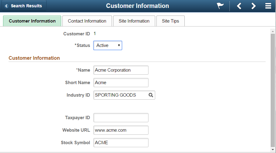
Image: PT_SIDE_PAGETABS Added to Fluid Component
This example illustrates adding the delivered PT_SIDE_PAGETABS page definition to a fluid component. No other configuration, other than inserting this page definition into the component, is required to achieve left navigation.
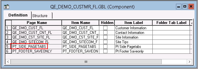
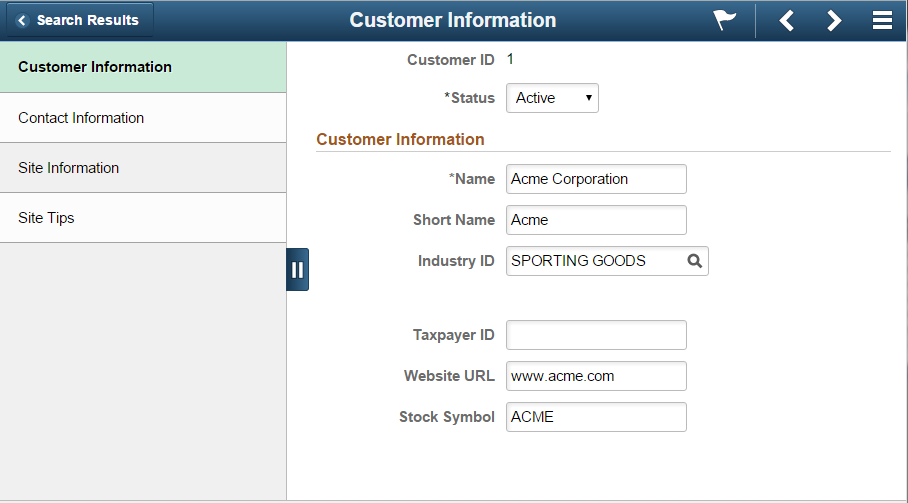
Image: Fluid Component: Page Tabs on Left Panel
This example illustrates the effect of inserting PT_SIDE_PAGETABS into the fluid component. The page tab navigation appears on the left side panel, which end users can slide in and out when needed.