Defining the Layout of the Main Fluid Page
Designing and defining the layout of a fluid page is one of the major differences between developing fluid applications and developing classic PIA applications. In a classic PIA application, you perform layout of a page in a WYSIWYG format, where page elements and controls are placed exactly where you want them within a pixilated invisible table.
Image: Classic page definition at design time
This example illustrates a classic PeopleSoft page definition in Application Designer, where each page element is meticulously placed on the Layout tab.
And, despite the obviously more polished presentation in the generated HTML page that displays in the browser interface for the end user, the layout, spacing, order, color, and so on is for the most part identical between the design time definition and the runtime presentation.
Image: Classic page at runtime
This example illustrates the same page as depicted in the previous example at runtime. The design time and runtime appearance is practically identical in terms of layout, positioning, sizing, color, font, and so on.
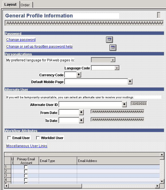
When performing layout for a fluid page, you will notice that design representation in no way resembles the design representation for the classic PIA page.
Image: Fluid page at design time
This example shows a fluid page layout at design time in Application Designer, with various elements contained in nested group boxes and little if any indication regarding how the page might appear at run time to the end user.
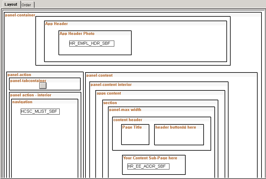
The layout of the fluid application is not what you would call a WYSIWYG approach. If an ender user were to access a page in this state, it would be impossible to complete a transaction. Notice the boxes that are used to indicate levels of containment and to provide visual cues, making each element from high-level to low-level a self contained and discrete. Group boxes are used to achieve this effect. The rectangular boxes within some of the group boxes represent subpages.
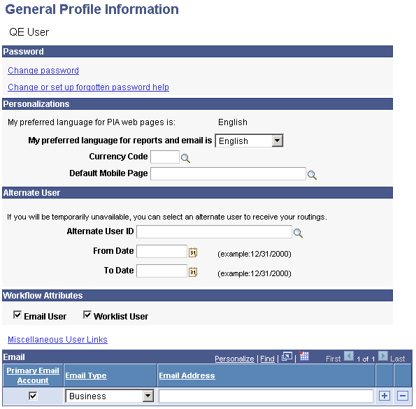
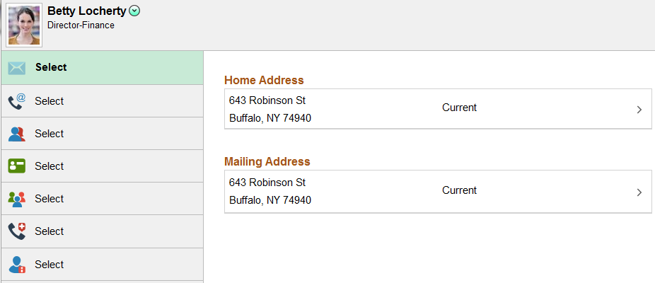
Image: Fluid page at run time
This example illustrates the fluid rendering of this very same page definition (above) in a browser.
The strip running across the top displays the default PeopleTools, or system, header page definition. Because it is a separate page definition entirely, it is not depicted in the layout view of the main page (the content below it) in Application Designer.
At a high-level, you can map the rendering in the browser to the layout as:
The area showing the employee photo is represented in the layout as the App Header Photo group box.
The area showing the navigation on the left is represented in the layout as the Left Side Navigation group box.
The area showing the Name and Addresses fields is represented in the layout as the Content group box. When Names and Addresses is selected from the left hand navigation, it appears in the Content container. When Contact Details is selected, the contact information is displayed in the Content container, and so on.
While there are many factors contributing to the appearance of a fluid page, which will be discussed in this document, the main elements of fluid page layout are:
|
PeopleSoft Design Elements |
Description |
|---|---|
|
group boxes |
Group boxes are the primary control, providing not only visual cues, but, more importantly, it acts as the container for all controls and page elements. For example, subpages must be enclosed in a group box, grids and scroll areas need to be enclosed in a group box, and so on. Each control is comprised of two parts: the label and the control – wrapped in the container of a group box. In fact, the entire page itself must be contained in one super group box: a requirement for fluid rendering. |
|
style sheets |
While group boxes take on the role of discretely containing each and every element on a page, the physical placement of the group boxes within the Layout tab in Application Designer is largely irrelevant. How and where a page element or control renders on the end user device is determined by style sheets. PeopleTools delivers the system-wide PSSTYLEDEF_FMODE style sheet. You can make custom, free form style sheets to extend or override the system-wide style sheet. |
Both group boxes and free form style sheets are discussed in detail in other sections of this document.
Note: Tab order index is determined only by the order in which the fields and controls appear on the page from top-to-bottom and left-to-right.