Defining Container Page Element Properties
This topic provides an overview of container page element properties.
Many properties that you can define for container page elements are also available to define for other page elements. These common properties are described in the topic Common Layout Page Element Properties
This topic discusses using the properties that are unique to container page elements only.
This topic describes how to:
Define collapsible content areas.
Define accordion content areas.
This section also provides an example of creating collapsible content areas and an example of creating accordion content areas.
Understanding Collapsible Content
Collapsible content can be hidden and revealed by tapping a title or button. When you create collapsible content, a header is created based on the value in the Label Text field for the mapcont_start field in the Layout grid on the Layout Designer – Layout page. The header acts as the control that users touch to expand and collapse the content area.
To create collapsible content areas and accordion content areas in the Mobile Application Platform, you create nest containers within a container.
The collapsible content area properties determine how content is initially displayed, collapsed, not collapsed, or as an accordion.
Defining Collapsible Content Areas
Use the Collapsible Content section on the Container Properties page to define collapsible content. To access the page select
Image: Collapsible Content section
This example illustrates the fields and controls in the Collapsible Content section of the Container Properties page. You can find definitions for the fields and controls later on this page.

|
Field or Control |
Definition |
|---|---|
| Collapsible |
Select the property to create collapsible content. |
| Initially Collapsed |
This field is enabled by default when you select the Collapsible property and indicates that the content appears collapsed by default. Clear the field to display content areas expanded by default. |
| Collapse Set |
Use this property to create an accordion. Select the property on the top-level element for the accordion. See the following section for more information about creating accordions. |
Defining Accordions Content Areas
An accordion allows you to group components of collapsible content so that only one panel is visible at a time, and so that when you are viewing one panel (content area) the others are closed.
To define an accordion, in the Collapsible Content section in the Container Properties page, select the Collapse Set check box for the top-level container of the set that you want to appear collapsed by default. Note that the top-level container does not display in an accordion.
Example: Defining Collapsible Content
This section provides a simple example of defining a shell for collapsible content for a top-level container and five (5) nested level 2 containers.
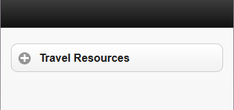
This example shows the finished top-level container as it appears in generated HTML.
Image: Example: Generated HTML of this example showing collapsible content set to display initially collapsed
This example illustrates the generated HTML for the application and how the collapsible content initially appears in the application. The properties for the top-level container are set to display the container initially collapsed on the application page.
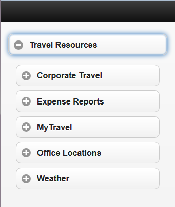
The following example shows the top-level container expanded to reveal additional containers/levels of information.
Image: Example: Generated HTML of collapsible content in this example with the top level expanded
This example shows generated HTML for the application when the user taps or selects the top-level container, revealing five (5) nested containers. As with the top-level container, in this example, the properties for the nested containers are set to display the content initially collapsed on the application page.
To build this example create a top-level container and then create five (5) containers inside the top-level container. The following example shows the Layout grid with the containers for the example created.
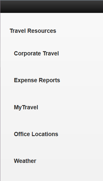
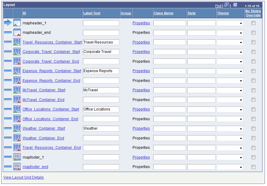
Image: Example: Containers created for the example
This example shows the container Travel Resources in the Layout grid. Defined within the Travel Resources container are five additional containers: Corporate Travel, Expense Reports, MyTravel, Office Locations, and Weather.
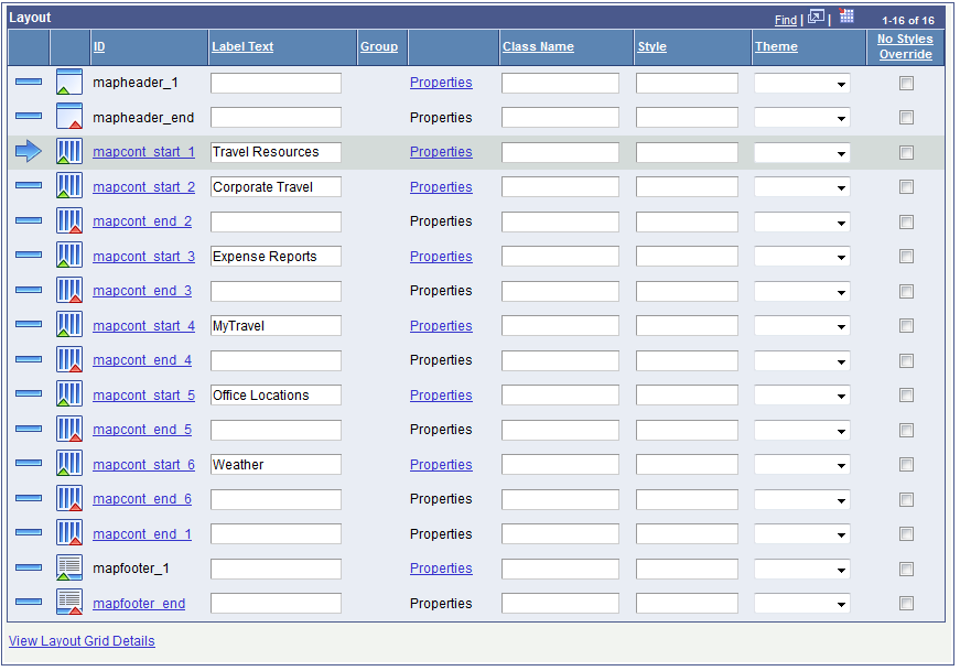
For each container define a value in the Label Text field that will become the label for the content header in the generated HTML. Notice that each container has two page element IDs, a start ID and an end ID. These IDs are similar to open and close tags in HTML and in practice you insert other page elements between the tags to build out the content for each container. So for example, in the Corporate Travel container you could insert an HTML Area page element and define HTML code, insert buttons that link to information on your company’s web site concerning corporate travel, and much more. This example shows only how to create the shell containers for the collapsible content.
The Mobile Application Platform assigns all page elements system-generated IDs. You can use these IDs to reference the elements in any JavaScript you construct for your application. For any element ID that displays in hyperlink text, you can click the link to display the Alternate Label page and rename the ID. If you decide to rename any or all page element IDs it is your responsibility to ensure that they remain unique across your application.
The following example shows the element IDs renamed for this example. Adding alternate IDs is also a means for giving elements more descriptive and meaningful names, as well as making them easier to identify on the Layout grid.
Image: Alternate IDs created for the containers in the example
This example illustrates the page element IDs renamed for each of the container elements
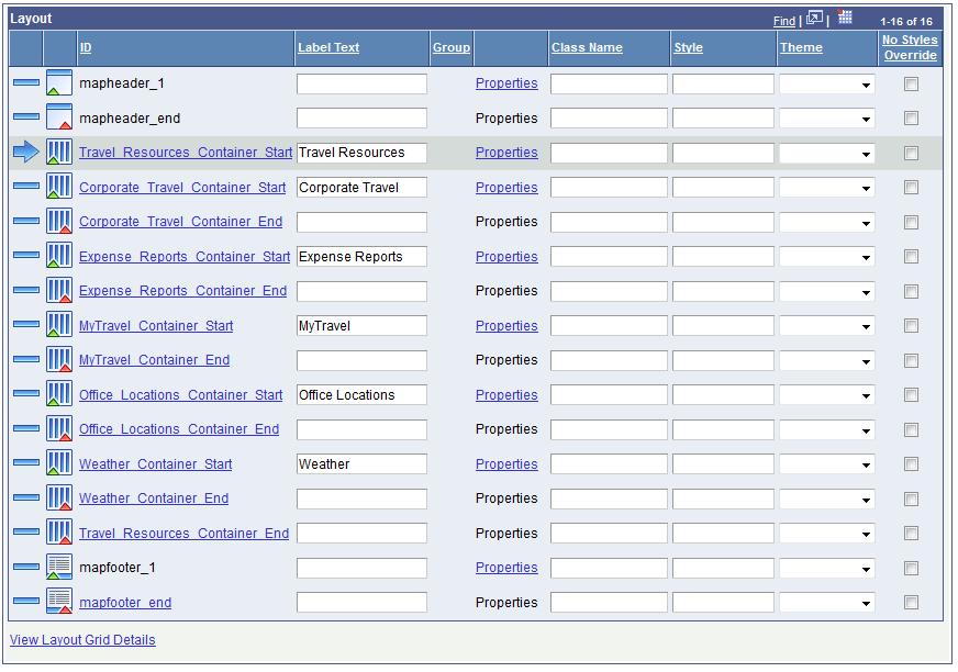
Now that the page element IDs are renamed, it’s easier to see how the Travel Resources container has five containers nested inside of it. The beginning of the Travel Resources container is indicated by the large blue arrow three rows from the top of the grid. The end of the Travel Resources container is three rows from the bottom of the grid. And within the Travel_Resources_Container_Start element ID and the Travel_Resources_Container_End element ID are the other containers that appear nested within the collapsible content.
The next step is to define properties for each container so that they will appear as collapsible content. But first, let’s take a look at how the application renders given what has been developed so far.
(To preview a Mobile Application Platform application click the View Initialization URL link at the top of the Layout Designer — Layout page and copy the URL that displays into a browser.)
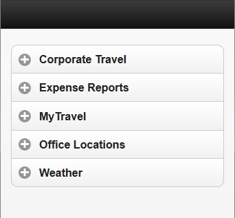
Image: Application preview with no collapsible content properties defined
The following example illustrates a preview of the application so far. Here you can see the top-level Travel Resources container, and under it are the five (5) nested containers. But there are no controls to expand or minimize content. After the container properties are set, the controls for expanding and minimizing the content containers will appear.
Note: The previous example originally opened full-screen in a browser window. In the image shown, the width has been manually adjusted/reduced to roughly simulate how the content might appear in a mobile device.
To set the properties for the containers in the application, in the Layout grid, click the Properties link next to a container name. The Container Properties page appears. The properties to set for this example are in the Collapsible Content section.
Image: Example: Collapsible content properties
This example illustrates the default view of the Collapsible Content section on the Container Properties page.
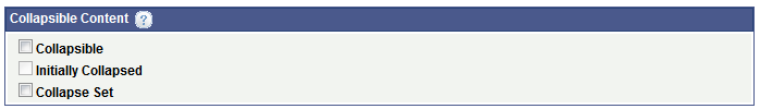
To enable collapsed content for a container, you must select the Collapsible control in the Collapsible Content section of the Container Properties page. When you select the option, by default the system also selects the Initially Collapsed option so that the content in the container appears collapsed by default.
If you try this example on your own, you’ll notice that when you select the Collapsible box a message appears on the screen reminding you to make sure to enter a label in the Label Text field for the container on the Layout grid. As mentioned earlier, the system uses that label for the header label in the generated HTML, so it’s important that you enter a value in the field.
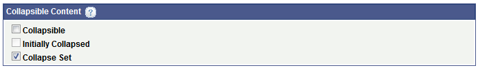
Image: Example: Collapsible content properties set for the example
This example shows the collapsible content properties set for this example. The Collapsible control and the Initially Collapsed control are selected. Selecting the Collapsible property must be set to enable collapsible content to display. The Initially Collapsed property causes the content in the container to display collapsed by default.
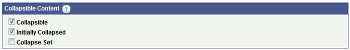
These properties must be set as shown for each container in the example.
After the properties for each container are set and the application is saved, if you preview the application, the collapsed content should appear as shown in the examples at the beginning of this section.
Example: Defining Accordion Content
This section provides a simple example of defining a shell for an accordion. This example uses and builds off the containers used in the previous example.
The information in this section describes how to build the following accordion.
Image: Generated HTML of the accordion in this example
This example illustrates the generated HTML of the accordion content described in this example.
In this example, you use the same container structure as in the previous example for defining collapsible content. The only difference is in the properties you set for the containers.
Image: Example: Containers for the accordion example
This example illustrates the containers for the accordion collapsible content. These are the same containers and container structure used in the previous example.
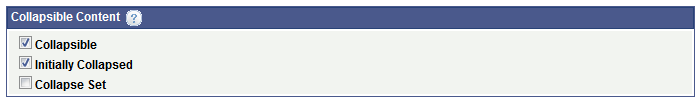
To define accordion collapsible content, for the top-level container only, set the Collapse Set property in the Collapsible Content section on the Container Properties page.
Image: Example: Collapsible content properties set for the top-level accordion
This example illustrates the Collapse Set property selected in the Collapsible Content section on the Container Properties page. To define an accordion, set this property for the top-level container.
For all other containers defined for accordion collapsible content, at a minimum you must set the Collapsible property for each container. To display the content initially collapsed, as shown in the first example in this section, select the Initially Collapsed property for each container as well.
Image: Example: Collapsible content properties set for the second-level accordion containers
This example illustrates the collapsible content properties to set for each second-level container to define accordion collapsible content.
After the properties for each container are set and the application is saved, if you preview the application, the accordion collapsed content should appear as shown in the first example of this section.
When you define a container as a pop-up, the entire container acts as a pop-up with the content appearing on top of other content on the page. You typically invoke a pop-up container using a push button page element or a URL page element.
Use the Popup Options section on the Container Properties page to enable/define the container as a pop-up container, define where the pop-up appears on the page, whether to invoke the pop-up with a button or link, and so on.
To access the Container Properties page select and in the Layout grid click the Properties link for the container you want to define as pop-up content.
Note: You cannot define a pop-up for a container that contains collapsible content.
Image: Popup Options section (Default view)
This example illustrates the fields and controls on the default view of the Popup Options section on the Container Properties page. You can find definitions for the fields and controls later on this page.
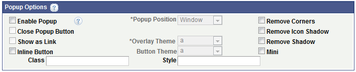
As you select properties in the Popup Options section of the Container Properties page, additional properties appear.
Image: Popup Options section (All properties)
This example illustrates the fields and controls on the Popup Options section. You can find definitions for the fields and controls later on this page.
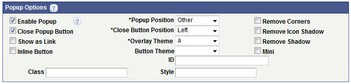
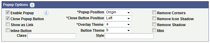
The following table describes the fields and controls that appear in the Popup Options section on the Container Properties page and are listed alphabetical order:
|
Field or Control |
Definition |
|---|---|
| Button Theme |
This drop-down list becomes enabled after you select the Enable Popup control. Choose a jQuery theme from the drop-down list to apply to the button. See Defining jQuery Mobile Theme Properties for more information about defining themes and the values that appear in the list. |
| Class |
Enter the name of a custom CSS3 class to apply to the pop-up. The class must be defined in the Layout Designer – CSS page or in the layout template if a template is applied to the layout. |
| Close Button Position |
This control appears after you select the Close Popup Button control. Select the position of the Close button. The values are:
|
| Close Popup Button |
Select the box to insert a close button for the pop-up content. After you select this control, the Close Button Position drop-down list appears for selecting the position of the close button in the pop-up. |
| Enable Popup |
Select the control to enable a pop-up. After you select this control, the Popup Position, Overlay Theme, and Button Theme fields become enabled. In addition, the Image Properties section appears at the bottom of the Container Properties page for you to optionally define images for the pop-up button. |
| Inline Button |
Select this box to use an inline button to invoke the pop-up content. Inline buttons do not use the whole width of the viewport. |
| Mini |
Create a more compact version of the button element. |
| Overlay Theme |
Choose a jQuery theme from the drop-down list to use as the background for the pop-up content. The theme covers the entire window behind the pop-up content. See Defining jQuery Mobile Theme Properties for more information about defining themes and the values that appear in the list. |
| Popup Position |
By default, pop-up content opens centered vertically and horizontally over the page element/component/object selected (also known as the origin). The Mobile Application Platform framework also applies some basic collision detection rules to ensure that pop-up content appears on-screen, so the ultimate position may not always be centered over the origin. To change the default position of pop-up content, the options are:
|
| Remove Corners |
By default buttons appear with rounded corners. Select this property to remove the rounded corners. |
| Remove Icon Shadow |
By default icons appear with a shadow effect. Select this property to remove the shadow. |
| Remove Shadow |
By default buttons and icons appear with a shadow effect. This option removes the shadow. |
| Show as Link |
Select the option to invoke the pop-up with an image link. When you select this option the Image Properties section appears on the Container Properties page. You can define a static of dynamic link to invoke the pop-up container. |
| Style |
Enter HTML5 styles for the pop-up container. Use a semi-colon (;) to separate multiple style entries. |
Example: Defining Pop-Up Containers
This example illustrates defining a pop-up container in the Mobile Application Platform framework.
The following example illustrates the button that will invoke the pop-up container.
Image: Example: Generated HTML of the button to invoke the contents of the container
This example illustrates the button control that invokes, or pops up, the contents of the container
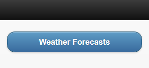
While the example in this section illustrates using a push button page element to invoke the contents of the container, you can define a URL page element as a link or image to invoke the container contents.
In the example in this section, selecting the button will pop-up a container that contains some text and a group of buttons.
Image: Example: Generated HTML of pop-up container contents
This example illustrates the generated HTML of the pop-up container contents created in this example.
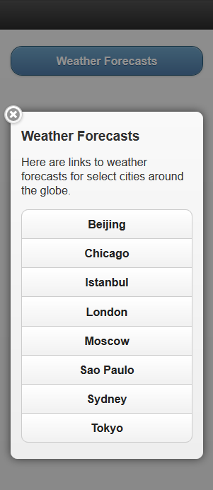
The previous example shows a title, some text, and eight (8) buttons. The title is from the container Label Text field as entered on the Layout grid on the Layout Designer – Layouts page. The display text was created by inserting an HTML Area page element into the container and entering the text in HTML tags. And the buttons were created by inserting a p button page element into the container and then creating a group of eight (8) buttons. After the page elements were defined, properties in the Popup Options section of the Container Properties page were set to enable the pop-up action and to define several display parameters.
Image: Example: Page elements added to the Layout grid for the example
This example illustrates the page elements added to the Layout grid for this example. The example shows a container inserted into the grid, and within the container an HTML Area element has been inserted, as well as a group of push button elements.
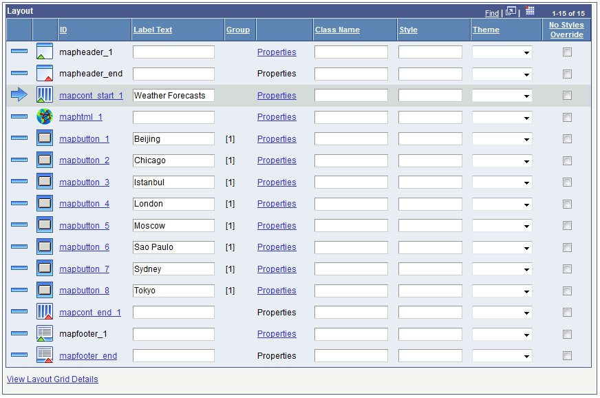
As noted in the example for creating collapsible content, some people may find that defining alternate IDs for page elements can help to more easily identify and manage page elements in the Layout grid. The following example shows the same layout, but with alternate IDs defined for the page element IDs.
Image: Example: Alternate IDs define for the page elements in the example
This example illustrates alternate page element IDs defined for the page elements in this example.
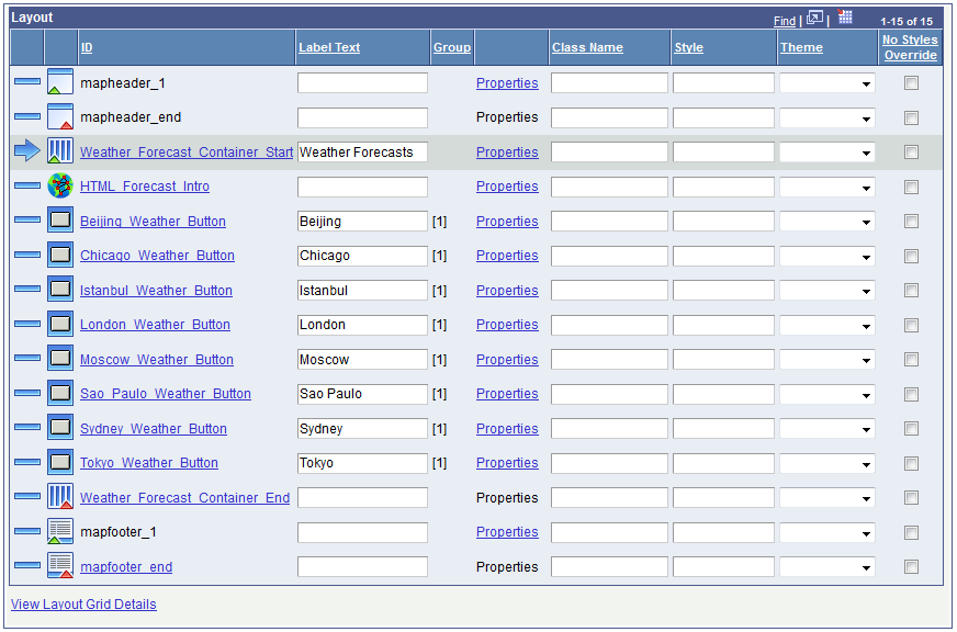
As a reminder, you can define an alternate page element ID for any page element that displays in the Layout grid with a hyperlinked ID value. To define the alternate ID, click the hyperlinked ID to access the Add Alternate Label page and define the alternate ID. Also remember that if you change system-defined page element IDs, you are responsible for ensuring that they remain unique within the application.
The steps to create the layout in the example are:
Insert a Container element into the Layout grid after the mapheader_end element (or end tag of the MAP header).
In the Label Text field enter Weather Forecasts. This is the label that appears on the button that invokes the pop-up container contents, and that also appears at the top of the page when the container content opens.
Insert an HTML Area page element inside the Weather Forecasts container. After you insert the element, the HTML page appears where you enter the following HTML:
<p>Here are links to weather forecasts for select cities around the globe.</p>Note that after you define the HTML element you can easily and quickly modify the HTML by clicking the Properties link for the element in the Layout grid to access the HTML Area Properties page. The page features an HTML Area section where you can modify the HTML that displays on the page.
Define the button elements.
Insert a push button element after the HTML Area element in the Layout grid.
When you insert the element, the “Do you want to create a group?” page appears as shown the following example:
Image: “Do you want to create a group?” page
The example shows the “Do you want to create a group?” page.
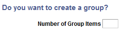
In the Number of Group Items field, enter 8 and click the Yes button.
The Select Button Type page appears for the first button.
Note the Group field at the above the Button Type section. It shows which button in the group with which you are working. For example, Item 1 of 8.
Click the URL radio button and click the OK button.
The Select Button URL page appears.
In the URL radio button.
A long edit box appears on the page.
In the URL field enter the URL to the target content. For this example you could enter a URL to a weather web site or any other site of your choosing.
The URL you enter must be fully-qualified and entered in the following format:
http://www.example.com. Click the OK button.
The Select Button Type page appears and the Group field above the Button Type section displays the next item in the group. For example, Item 2 of 8.
Repeat Step c and Step f until all eight (8) items (URLs for the buttons) in the group are defined.
After you define the last item in the group and click the OK button.
The Layout Designer – Layout page appears.
Define the label to appear on each button at runtime.
Access the Layout grid and for each button enter the text you want to appear in the Label Text field next to the button element ID.
If you need to remind yourself of the URL you entered when you defined a button, click the Properties link in the Layout grid to access the Button Properties page. The URL Properties section on the page displays the URL. Notice how you can also click the Modify URL Mappings link to modify the URL if needed.
The next step is to define properties for the Weather Forecasts container so it appears as a pop-up container. But first, let’s take a look at how the application renders given what has been developed so far.
(To preview a Mobile Application Platform application click the View Initialization URL link at the top of the Layout Designer — Layout page and copy the URL that displays into a browser.)
Image: Example: Application preview with no pop-up container properties defined
The following example illustrates a preview of the application so far. Here, the page title, Weather Forecasts, is from the Label Text field from the container page element ID on the Layout grid. The descriptive text is from the HTML Area element. And the buttons are from the push button element defined as a group of eight (8) items. But the content isn’t appearing as an overlay. After the container properties are set, a button will display to invoke the content. And when the button is selected the content will pop up as an overlay.
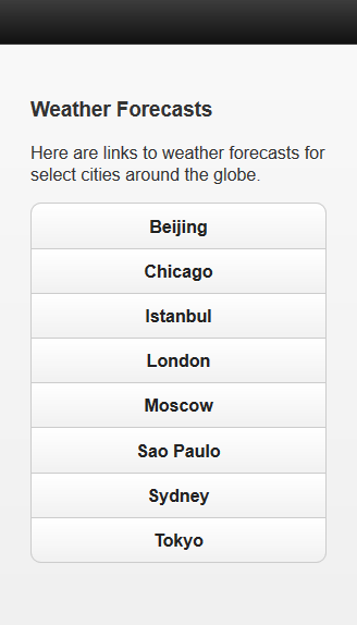
Note: The previous example originally opened full-screen in a browser window. In the example shown, the width was adjusted/reduced to roughly simulate how the content might appear in a mobile device.
To set the properties for the container, in the Layout grid, click the Properties link next the container’s label text, Weather Forecasts. The Container Properties page appears. The properties to set for this example are in the Popup Options section.
Image: Example: Pop-up container properties set for the example
This example illustrations the properties in the Popup Options section of the Container Properties page set for the example. The Enable Popup control must be set for the content to appear as pop-up content.
After you set these properties for the container and save the layout, the content should appear as shown in the first two example in this section when you preview the application.
By default any value you define in the Label Text field for a container in the Layout grid on the Layout Designer – Layouts page displays as a title for the container in the generated HTML.
The Container Properties page features a No Content Label control at the bottom of the page. Select this control to not display the label text defined on the Container. The label text can then be used simply as a reference during development to identify the of the container in the Layout grid.
By default, containers that you create in the Mobile Application Platform contain the following element:
<div data-role="content">...</div>
The following attribute and value in the element are specific to jQuery Mobile:
data-role="content"
jQuery Mobile can insert styles and/or modify HTML for content contained within this element. This is most evident when working with nested containers.
You can omit the attribute and value from Mobile Application Platform containers by selecting the No Content property at the bottom of the Container Properties page for a container element.
If you select the No Content property the element becomes a basic HTML5 Division element, as shown in the following example:
<div>...</div>