Managing Action Sheet Page Elements
This topic describes how to manage action sheet page element.
An action sheet page element in a type of container that at runtime pop ups a layer of content on top of the main application.
You can insert the following elements into an action sheet element:
Check box.
Flip toggle.
List view.
Push button.
Select box.
Select menu.
Static text.
URL.
This section describes how to:
Add action sheet page elements to pages.
Use the Select Icon for Action Sheet page.
View action sheet elements in the Layout grid.
Adding Action Sheet Page Elements to Pages
To add an action sheet page element, in the Layout grid click the Add Action Sheet button on the Layout grid toolbar on the Layout Designer – Layouts page. To access the page select
|
Field or Control |
Definition |
|---|---|
 |
The Add Action Sheet button on the Layout grid toolbar. |
After click the Add Action Sheet button, the Select Icon for Action Sheet page appears for you to define the icon or image for the action sheet.
Using the Select Icon for Action Sheet Page
Use the Select Icon for Action Sheet page to define an image or an icon for the action sheet and to define the location where it displays. You can define a static image or icon or define a dynamic one by defining a primitive value from the PeopleSoft document associated with the layout.
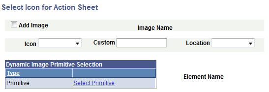
Image: Select Icon for Action Sheet page
This example illustrates the fields and controls on the Select Icon for Action Sheet page. You can find definitions for the fields and controls later on this page.
|
Field or Control |
Definition |
|---|---|
| Add Image |
Select the box to define an image for the icon. When you select this control the Image Selector link appears for you to select an image. |
| Image Selector |
When you select the Add Image control an Image Selector link appears. Click the link to access the Image Selector page to select an image. |
| Image Name |
After you select an image using the Image Selector page, the image name appears in this field. |
| Icon |
Select an icon from the list. The values are:
|
| Custom |
Enter the name of a style class for a custom icon. The class must be defined on the Layout Designer – CSS page. |
| Location |
From the drop-down list select the location for the icon. The values are:
|
| Select Primitive |
Click the link to access the Select Primitive page to define a primitive value. |
| Element Name |
If you have defined a primitive value for the icon, the name of the primitive element appears in the field. |
Viewing Action Sheet Page Elements in the Layout Grid
After you define an icon or image for an action sheet the Layout Designer–Layout page appears.
Action sheet elements are indicated in the Layout grid on the Layout Designer –Layout page by the mapactsht_start and mapactsht_end element IDs.
Image: Action Sheet page element inserted into the Layout grid
This example illustrates the

Enter a value in the Label Text field for the action sheet start element ID to label the element at runtime. By default the field is blank.
To define properties for an action sheet element, click the Properties link to the right of the start ID. Defining properties for action sheet page elements is described in the next section.
To apply custom styles to the element label , use the Class, Style, Theme and No Style Overrides fields and controls. See Defining Styles and Themes for Page Element Labels for more information.
This section describes how to define action sheet page element properties.
Understanding Defining Action Sheet Page Element Properties
This topic describes how to define action sheet page element properties using the Action Sheet Properties page.
Many properties that appear on the Action Sheet Properties page also appear on the properties pages for other page elements. These common properties are described in the topic Common Layout Page Element Properties .
This topic discusses using the properties on the Action Sheet Properties page that are unique to working with action sheet page elements only.
Defining Action Sheet Properties
Action sheet page element properties are located on the Action Sheet Properties page. To access the page, in the Layout grid on the Layout Designer – Layout page click the Properties link next to the action sheet element for which you want to define properties.
Image: Action Sheet Properties section
This example illustrates the fields and controls in the Action Sheet Properties section of the Action Sheet Properties page. You can find definitions for the fields and controls later on this page.
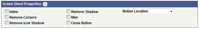
The following table describes the fields and controls in the Action Sheet Properties section of the Action Sheet Properties page. The fields and controls are listed alphabetically.
|
Field or Control |
Definition |
|---|---|
| Button Location |
From the drop-down list select the location for the icon. The values are:
|
| Close Button |
Select the property to add a Close button on the generated action sheet. |
| Inline |
Select the property so that the length of the button label determines the button width. |
| Mini |
Select the property to create a more compact version of the element. |
| Remove Corners |
Select the property to remove the border radius around the button. |
| Remove Icon Shadow |
Select the property to remove the shadow around the icon. |
| Remove Shadow |
Select the property to remove the shadow around the button. |