Managing Flip Toggle Page Elements
This topic describes how to manage flip toggle page elements.
A flip toggle is a switch that provides a great solution for binary data, such as yes/no, on/off, true/false and so on.
When you define a flip toggle page element you map it to a boolean element defined in the PeopleSoft document associated with the layout. You then create the label for the element by assigning message catalog entries to the boolean.
This topic discusses how to:
Add flip toggle elements to pages.
Use the Select Boolean Primitive for Flip Toggle page.
Use the Flip Toggle Option Selection page.
View defined flip toggle page elements in the Layout grid.
Adding Flip Toggle Page Elements to Pages
To add a flip toggle page element to a page:
Access the Layout grid on the Layout Designer – Layout page.
Select to access the page.
Determine the position in the grid to add the page element.
Click the row directly above where you want to add the page element to make it the current row.
The Current Row icon (blue arrow) displays in the first column of the row to indicate that it’s the current row.
Field or Control
Definition

The Current Row button.
Click the Add Flip Toggle button on the Layout grid toolbar.
Field or Control
Definition

The Add Flip Toggle button.
After you click the button the Select Boolean Primitive for Flip Toggle page appears.
Using the Select Boolean Primitive for Flip Toggle Page
Use the Select Boolean Primitive for Flip Toggle page to select the primitive element to map to the toggle.
Image: Select Boolean Primitive for Flip Toggle page
This example illustrates the fields and controls on the Select Boolean Primitive for Flip Toggle page. You can find definitions for the fields and controls later on this page.
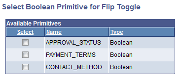
The page displays all the boolean elements defined in the PeopleSoft document associate with the layout.
In the Available Primitive grid, select the boolean to map to the flip toggle element. After you select a primitive element, the Flip Toggle Option Selection page appears:
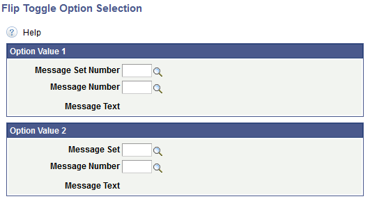
Using the Flip Toggle Option Selection Page
Use the Flip Toggle Option selection page to define the label text for each option of the toggle, where the value you define in the Option Value 1 section is for one of the toggle options, and the value you define in the Option Value 2 section is for the other toggle options.
Image: Flip Toggle Option Selection page
This example illustrates the fields and controls on the Flip Toggle Option Selection page. You can find definitions for the fields and controls later on this page.
|
Field or Control |
Definition |
|---|---|
| Message Set (Number) |
Enter or search for the message set that contains the message to use as a label for the option. |
| Message Number |
Enter or search for the message number that contains the message to use as a label for the option. |
| Message Text |
Displays the message text of the selected message set/message number defined. |
Viewing Defined Flip Toggle Page Elements in the Layout Grid
Defined flip toggle elements appear in the Layout grid of the Layout Designer – Layouts page with an element ID that is the name of the boolean primitive element you selected for the flip toggle when you defined it
Image: Flip toggle element defined in the Layout grid
This example illustrates a flip toggle page element defined in the Layout grid.

By default the system also uses the name of the boolean primitive defined for the page element to populate the Label Text field, APPROVAL_STATUS in this example. This is the same name defined in the Element Name field for the primitive in the PeopleSoft document defined for the layout. This value appears as the label for the flip toggle at runtime. You can keep the default value, enter a different value, or remove it.
To apply custom styles to the element label , use the Class, Style, Theme and No Style Overrides fields and controls to apply custom styles to the element. See Defining Styles and Themes for Page Element Labels for more information.
Click the Properties link to access the Flip Toggle Properties page to define properties for the element. See the next section for more information about defining properties for flip toggles.
This section describes how to define flip toggle page element properties
Understanding Defining Flip Toggle Page Element Properties
To define properties for flip toggle elements use the Flip Toggle Properties page.
Many properties that appear on the Flip Toggle Properties page also appear on the properties pages for other page elements. For more information and links to topics about these common properties, see the topic Common Layout Page Element Properties
This topic discusses using the properties on the Flip Toggle Properties page that are unique to working with flip toggle elements. These properties are located in the Flip Toggle Properties section of the page.
Defining Flip Toggle Properties
To access the Flip Toggle Properties page, in the Layout grid on the Layout Designer – Layout page click the Properties link next to the flip toggle element for which you want to define properties.
Image: Flip Toggle Properties section
This example illustrates the fields and controls in the Flip Toggle Properties section of the Flip Toggle Properties page. You can find definitions for the fields and controls later on this page.
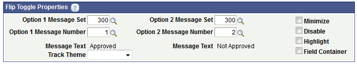
The Flip Toggle Properties section of the Flip Toggle Properties page displays the message catalog entries defined for the element label. You can change the values here as well as define other properties.
|
Field or Control |
Definition |
|---|---|
| Option 1 Message Set / Option 2 Message Set |
Enter or search for the message set that contains the message to use as a label for the option. |
| Option 1 Message Number / Option 2 Message Number |
Enter or search for the message number that contains the message to use as a label for the option. |
| Message Text |
Displays the message text of the selected message set/message number defined. |
| Track Theme |
From the drop-down list select a jQuery theme to apply to the track of the flip toggle. See Defining jQuery Mobile Theme Properties for more information about jQuery mobile themes. |
| Minimize |
Select the option to create a more compact version of the element. |
| Disable |
Set this property so that the default state of the flip toggle is disabled. |
| Highlight |
Set this property so that a highlight appears in the flip toggle track. |
| Field Container |
Select this option to enable a field container for the element to assist in rendering the element on wider screens, such as in table devices. |