Managing Header and Footer Page Elements
This topic discusses how to manage header and footer page elements in the Layout grid.
By default header and footer page elements are defined in the Layout grid on the Layout Designer – Layouts page for every page in a layout. As a result, there is no need to manually add them to a layout page.
You can insert the following page elements into header page elements and footer page elements:
Action sheet.
Container.
HTML area.
Image/static text.
List view.
Mobile grid.
Push button.
Sidebar. (Footer elements only.)
Static text.
URL.
To view header and footer page elements, access the Layout grid on the Layout Designer – Layouts page. To access the page select
The header is designated by the mapheader_n and mapheader_end element IDs. The footer is designated by the mapfooter_n and the mapfooter_end element IDs.
Image: Layout grid (Default view)
This example illustrates the fields and controls on the default view of the Layout grid. By default, header and footer elements are inserted into the Layout grid on any page you create in the Layout Designer.
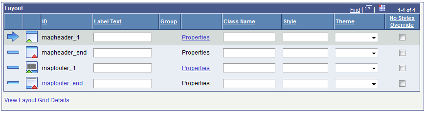
Any text you enter into the Label Text field for the mapheader_n or mapfooter_n elements appears in the application at runtime.
To omit a header in an application page:
Do not insert any text in the Label Text field next to the mapheader_n element ID.
Do not insert any page elements between the mapheader_1 and mapheader_end element IDs.
Similarly, to omit a footer in an application page:
Do not insert any text in the Label Text field next to the mapfooter_1 element ID.
Do not insert any page elements between the mapfooter_1 and mapfooter_end element IDs.
This section discusses how to define header and footer page element properties.
Understanding Defining Header and Footer Page Element Properties
Many properties that you can define for header and footer page elements are also available to define for other page elements. These common properties are described in the topic Common Layout Page Element Properties
This topic discusses the properties that are unique to header and footer page elements only.
Defining Header and Footer Page Element Properties
Use the Header Properties page to define header page element properties and the Footer Properties page to define footer page element properties.
To access these pages:
Select
The Layout Designer appears.
To access the Header Properties page or Footer Properties page:
Field or Control
Definition
Header Properties page In the Layout grid click the Properties link next to the mapheader element ID.
Footer Properties page In the Layout grid click the Properties link next to the mapfooter element ID.
Image: Header Properties section
This example illustrates the fields and controls in the Header Properties section of the Header Properties page. You can find definitions for the fields and controls later on this page.
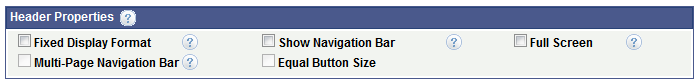
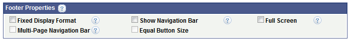
Image: Footer Properties section
This example illustrates the fields and controls on the Footer Properties section. You can find definitions for the fields and controls later on this page.
|
Field or Control |
Definition |
|---|---|
| Fixed Display Format |
If selected as a header property, the header remains at the top of the view port as the user scrolls. If selected a footer property, the footer remains at the bottom of the view port as the user scrolls. |
| Show Navigation Bar |
If selected as a header property, a navigation bar appears in the header. If selected as a footer property, a navigation bar appears in the footer. When you select this property, the system enables the property on all pages of the layout and the navigation bar appears on all pages. You can clear this option on any pages that you don’t want the bar to appear. To call other pages via a URL or button instead of using the header or footer navigation bar, when defining the URL or button use the Layout Page option when defining the link. Be sure to include a link back to the calling page. When omitting a navigation bar in a header, you can enable the Visual Back Button property on the Page Details page of a page to have a link back to calling page accordingly. |
| Full Screen |
If selected as a header property, the header appears within the viewport and stays present as the user scrolls, regardless of where the user is in the content. If selected as a footer property, the footer appears within the viewport and stays present as the user scrolls, regardless of where the user is in the content. |
| Multi-Page Navigation Bar |
For layouts with multiple Internal type pages defined, the pages are shown as buttons on the header toolbar when you select this property as a header property or in the footer toolbar when you select this property as a footer property. The system uses the value defined in thePage Name field on the Page Details page of each page for the navigation button labels. |
| Equal Button Size |
If you enable the Multi-Page Navigation Bar property, this property equalizes the display size of the navigation buttons. |