Managing Mobile Grid Elements in Layout Rapid App Designer
Mobile grids let you position field types next to one another in rows and columns.
Mobile grids are useful for smaller element types like buttons and icons. They are not recommended for large items or chunks of copy, since mobile device resolution is much lower than a desktop and usability is extremely diminished.
You can insert the following Mobile Application Platform page elements into a mobile grid element in Layout Rapid App Designer:
Button.
Image/static text.
Input.
Static text.
URL.
Note: If the mobile grid is defined on the header or footer, only URL, Button, and Container are allowed.
No nested containers are allowed in a Mobile Grid
To define a mobile grid element you use the Layout grid toolbar on the Layout Rapid Application Designer to insert it into the layout page. At the time you define/add a mobile grid page element to your application, there are no other tasks to perform or parameters to specify. After you add the element to a layout grid, use the Mobile Grid Properties page to define styles and options for the page element.
To add a mobile grid to a page in Layout Rapid Application Designer:
Access the Layout grid on the Layout Rapid App Designer page.
Select to access the page.
Determine the position in the grid to add the page element.
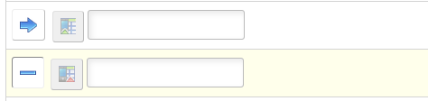
Click the row directly above where you want to add the page element to make it the current row.
The Current Row icon (blue arrow) displays in the first column of the row to indicate that it’s the current row.
Field or Control
Definition

The Current Row button.
Click the Add Mobile Grid button on the Layout grid toolbar.
Field or Control
Definition

The Add Mobile Grid button.
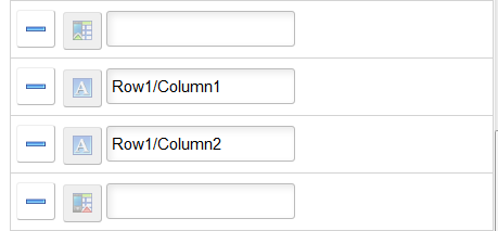
Selection of the Add Mobile Grid will create a start and end Mobile Grid. The developer can then add any other Element Types within the start and stop icons
Image: Mobile grid element inserted into the Layout grid
This example illustrates the fields and controls on the Mobile grid element inserted into the Layout grid. You can find definitions for the fields and controls later on this page.
The Mobile Grid Properties section is where you define the number of columns and rows in the mobile grid .
To define properties for a mobile grid element, click the Mobile Grid starticon in the layout grid.
Image: Mobile Grid Properties page
This example illustrates the fields and controls on the Mobile Grid Properties page. You can find definitions for the fields and controls later on this page.
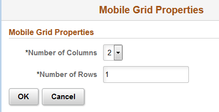
By default, two columns and one row are defined in a mobile grid. A minimum of two columns must defined and a maximum of five columns is allowed. A minimum of one row must be defined and there is no maximum for rows.
After you define the columns and rows click OK.
Note: The number of columns * number of rows must equal the total number of element types added to the Mobile Grid.
Insert your elements into the mobile grid in the layout page.
Image: Example of mobile grid with 2 columns and 1 row added to the layout in Layout Rapid Application Designer.
This example illustrates a mobile grid with 2 columns and 1 row added to the layout in layout Rapid Application Designer. Each column contains a static text field.