Managing Mobile Grid Page Elements
This topic describes how to manage mobile grid page elements.
Mobile grids let you position field types next to one another in rows and columns.
Mobile grids are useful for smaller element types like buttons and icons. They are not recommended for large items or chunks of copy, since mobile device resolution is much lower than a desktop and usability is extremely diminished.
To define a mobile grid insert a mobile grid element into the Layout grid on the Layout grid on Layout Designer – Layout page. After you insert the element you can define a number of properties for it in the Mobile Grid Properties page, including the number of rows and columns in the grid.
You can insert the following Mobile Application Platform page elements into a mobile grid element:
Action sheet.
Button.
Check box.
Container.
Flip toggle.
HTML area.
Image/static text.
Input.
Radio button.
Select box.
Slider.
Static text.
URL.
Note the following about using container elements in mobile grid elements:
If you insert a container element inside a mobile grid element, you can use only the following elements in the container element:
Button.
Check box.
Flip toggle.
HTML area.
Image/static text.
Input.
Radio button.
Select box.
Select menu.
Slider.
Static text.
URL.
You cannot nest container elements inside a mobile grid element.
To define a mobile grid element you use the Layout grid toolbar on the Layout grid on the Layout Designer – Layouts page to insert it into the layout page. At the time you define/add a mobile grid page element to your application, there are no other tasks to perform or parameters to specify. After you add the element to a layout page, use the Mobile Grid Properties page to define styles and options for the page element.
Adding Mobile Grid Page Elements to Pages
To add a mobile grid page element to a page:
Access the Layout grid on the Layout Designer – Layout page.
Select to access the page.
Determine the position in the grid to add the page element.
Click the row directly above where you want to add the page element to make it the current row.
The Current Row icon (blue arrow) displays in the first column of the row to indicate that it’s the current row.
Field or Control
Definition

The Current Row button.
Click the Add Mobile Grid button on the Layout grid toolbar.
Field or Control
Definition

The Add Mobile Grid button.
Viewing Defined Mobile Grid Page Elements in the Layout Grid
Mobile grid elements are indicated in the Layout grid by the mapmobl_start and mapmobl_end element IDs.
Image: Mobile grid element inserted into the Layout grid
This example illustrates a mobile grid element inserted into the Layout grid.

The label text for sidebar elements does not appear on the user interface at runtime, however you may find it useful to enter values in these fields for reference during development.
To define properties for a mobile grid element, click the Properties link to the right of the start ID. Defining properties for mobile grid page elements is described in the next section.
This section describes how to define properties for mobile grid page elements.
Understanding Defining Mobile Grid Page Element Properties
Many properties that you can define for mobile grid page elements are also available to define for other page elements. These common properties are described in the topic Common Layout Page Element Properties
This topic discusses using the properties that are unique to mobile grid page elements only.
Defining Properties for Mobile Grid Page Elements
Use the Mobile Grid Properties section of the Mobile Grid Properties page to define properties for this element.
To access the page select and in the Layout grid click the Properties link next to the mapmobile_start element ID.
Image: Mobile Grid Properties section
This example illustrates the fields and controls in the Mobile Grid Properties section of the Mobile Grid Properties page. You can find definitions for the fields and controls later on this page.
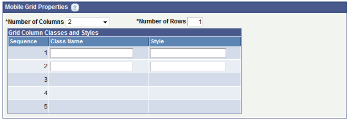
The Mobile Grid Properties section is where you define the number of columns and rows in the mobile grid and where you can apply CSS3 classes and HTML5 styles to each row in the grid.
By default, two columns and one row are defined in a mobile grid. A minimum of two columns must defined and a maximum of five columns is allowed. A minimum of one row must be defined and there is no maximum for rows.
The number or rows that appear in the Grid Column Classes and Styles grid is equal to the number of columns that you define for the grid.
After you define the columns, rows, and any optional styling, save the changes to return to the Layout grid to insert elements into the mobile grid.
When you insert page elements into a mobile grid page element in the Layout grid, you insert elements for each column in row one, followed by elements for each column in row two, and so on.
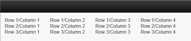
To illustrate how to insert rows and columns in a mobile grid and how they appear in the HTML consider the following grid:
|
Column 1 |
Column 2 |
Column 3 |
Column 4 |
|---|---|---|---|
|
Row 1/Column 1 |
Row 1/Column 2 |
Row 1/Column 3 |
Row 1/column 4 |
|
Row 2/Column 1 |
Row 2/Column 1 |
Row 2/Column 1 |
Row 2/Column 1 |
|
Row 3/ Column 1 |
Row 3/Column 1 |
Row 3/Column 1 |
Row 3/Column 1 |
Omitting the column headings, the example shows a grid with three (3) rows and four (4) columns.
The following example shows a mobile grid element populated with static text elements to create the grid in the previous example:
Image: Mobile grid element populated with static text elements for the example
This example illustrates a partial view of the Layout grid and shows a mobile grid page element inserted into the grid and populated with static text elements for the example.
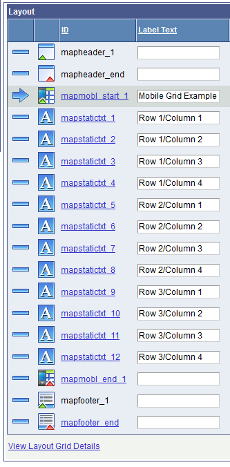
In the example, Mobile Grid Example appears in the Label Text field for the mapmobl_start_1 element ID. The label text serves as a reference only and does not appear in the generated HTML.
A total of 12 static text page elements are inserted between the mapmobl_start_1 and mapmobl_start_2 element IDs and are inserted in the following order:
Static text page elements entered sequentially for all the static text entries in row 1.
Static text page elements entered sequentially for all the static text entries in row 2.
Static text page elements entered sequentially for all the static text entries in row 3.
The text entered in the Label Text field for each static text element is the text that appears in the grid in the generated HTML.
The following example shows the generated HTML for the example:
Image: Generated HTML of the mobile grid example
This example illustrates the generated HTML of the mobile grid example.