Managing Sidebar Page Elements
This topic discusses how to manage sidebar page elements.
Sidebars are content areas that enter the viewport from the right or left side.
Similar to container elements, when you define a sidebar the framework inserts start and end element IDs into the Layout grid. You then define additional page elements inside those element IDs.
When working with sidebar elements consider the following guidelines:
You can position and define sidebar elements only after the mapfooter_end element ID on a page.
You can define multiple sidebar elements on a page, as long as they are all inserted after the mapfooter_end element ID.
You can insert and define any page element in a sidebar element except for another sidebar element; you cannot nest sidebar elements.
You must define a URL type push button or URL page element to open the sidebar.
You can optionally define a URL type push button or standard URL page element to close the sidebar. If you do not define a close control, users can tap outside of the sidebar content area to close the sidebar.
This section discusses how to:
Add sidebar page elements to pages.
View defined sidebar page elements in the Layout grid.
Understanding Defining Sidebar Page Elements
To define a sidebar element you use the Layout grid toolbar on the Layout grid on the Layout Designer – Layouts page to insert it into the layout page.
Note: Sidebar page elements can be defined only after the mapfooter_end element.
At the time you define/add a sidebar page element to your application, there are no other tasks to perform or parameters to specify. After you add the element to a layout page, use the Sidebar Properties page to define styles and options for the sidebar.
Adding Sidebar Page Elements to Pages
To add a sidebar page element to a page:
Access the Layout grid on the Layout Designer – Layout page.
Select to access the page.
Click the mapfooter_end element ID in the Layout grid to make it the current row.
The Current Row icon (blue arrow) displays in the first column of the row to indicate that it’s the current row.
Field or Control
Definition

The Current Row button.
Click the Add Sidebar button on the Layout grid toolbar.
Field or Control
Definition

The Add Sidebar button.
After you click the button the sidebar element appears in the Layout grid.
Viewing Defined Sidebar Page Elements in the Layout Grid
Sidebar page elements are indicated in the Layout grid by the mapsidebar_start and mapsidebar_end element IDs.
Image: Sidebar element defined in the Layout grid
This example illustrates a sidebar element defined in the Layout grid.

The label text for sidebar elements does not appear on the user interface at runtime, however you may find it useful to enter values in these fields for reference during development.
To define properties for a sidebar element click the Properties link to the right of the start element ID. Defining properties for sidebar elements is described in the next section.
Understanding Defining Sidebar Page Element Properties
Many properties that you can define for sidebar page elements are also available to define for other page elements. These common properties are described in the topic Common Layout Page Element Properties
This topic discusses using the properties that are unique to working with sidebar page elements.
Defining Sidebar Element Properties
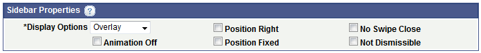
Use the Sidebar Properties section of the Sidebar Properties page to define properties for this element.
To access the page select and in the Layout grid click the Properties link next to the mapsidebar_start element ID.
Image: Sidebar Properties section
This example illustrates the fields and controls in the Sidebar Properties section of the Sidebar Properties page. You can find definitions for the fields and controls later on this page.
|
Field or Control |
Definition |
|---|---|
| Display Options |
From the drop-down list select how the sidebar appears on the page. The values are:
|
| Animation Off |
Select the property to turn off animations. |
| Position Right |
By default a sidebar appears on the left side of the viewport. Select this property to present the sidebar on the right-side of the viewport. |
| Position Fixed |
Select this property so that sidebar contents appear no matter how far down the page the user scrolls. |
| No Swipe Close |
By default swiping wiping left or right, or tapping the Esc key closes the sidebar. Select the property to turn off the swipe-to-close behavior. |
| Not Dismissible |
By default, users can close a sidebar by selecting or tapping the page content outside the sidebar. Set this property to prevent this default behavior. |
In addition, there is a Sidebar Responsive property that you can set on the Page Details page that sets a breakpoint in the sidebar widget to facilitate responsive behavior. See Using the Page Details Page
You must create a button or URL for users to open a sidebar at runtime.
Users can select or tap an area outside of the sidebar content area to close a sidebar, or you can create a button or URL that closes it.
To create a stand-alone icon to open or close a sidebar, use the information in the following sections to create the push button or URL. When defining the control, choose an icon for the image and in the Layout grid leave the Label Text field blank for the element.
Creating Controls to Open Sidebar Content
To create a button or URL to open sidebar content:
Insert a push button or URL element somewhere on the page other than the footer or sidebar.
Define a standard URL for the element.
When defining the URL to open the content, enter it in the following format:
#mapsidebar_start_1Where mapsidebar_start_1 is the starting element ID for the sidebar.
If you want to add a label to the button or URL, in the Layout grid enter a value in the Label Text field for the button or URL element .
Creating Controls to Close Sidebar Content
When you define the URL for the push button or URL element to close a sidebar, you define the page to appear when the user closes the sidebar.
After you create the desired page element, you must go to the associated properties page for the element and enable the Sidebar Close property.
Image: Sidebar Close property
This example illustrates the Sidebar Close property.
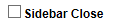
The property appears at the bottom of the Button Properties page and URL Properties page, only when you define one of these elements inside a sidebar element.
To create a button or URL to close sidebar content:
Insert a push button or URL element somewhere in the sidebar element.
Define a standard URL for the element.
When defining the URL to close the content, specify the layout page to appear when the user closes the sidebar. Specify the URL in the following format:
#page3Where page3 is the name defined in the Page Name field on the Page Details page.
If you want to add a label to the button or URL, in the Layout grid enter a value in the Label Text field for the element.
Enable the Sidebar Close property.
In the Layout grid, click the Properties link next to the button or URL element.
The properties page for the element appears.
Select the Sidebar Close property at the bottom of the page.
Click the Save button.