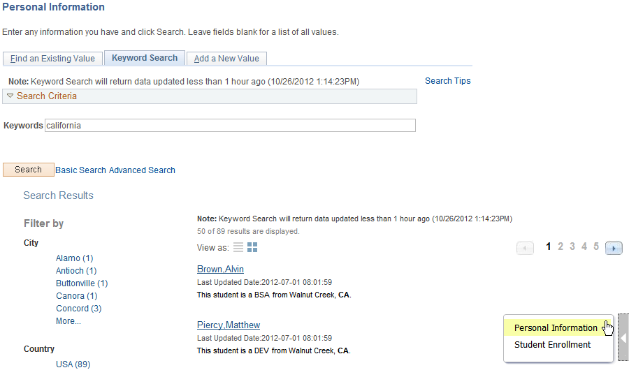
Working with the Search Results
After running a search using Keyword Search, the system presents the search results in an intuitive display, enabling interactive filtering and further navigation.
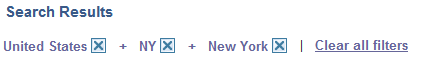
Image: Search Results
This example illustrates the fields and controls on the Search Results. You can find definitions for the fields and controls later on this page.
|
Field or Control |
Definition |
|---|---|
| Filter by |
This is the facet pane, which is the area to the left of the search results. Using the facets defined for the current search definition, the end user can filter the search results and drill down closer to the desired information. If searching the All category, you initially see the various search categories represented in the search results. By drilling into the category, you view the facets associated with attributes in the search index. |
| Title |
The title, which is the clickable link, enables the user to identify the search result and navigate to the associated component. The title is defined using the Title edit box on the General tab of the Search Framework, Search Designer Activity Guide, Search Definition component. |
| Summary |
Displays a general overview of the target data. The summary is defined using the Summary edit box on the General tab of the Search Framework, Search Designer Activity Guide, Search Definition component. |
| Related Actions Indicator |
If the search definition is mapped to a component, and if there are any defined related actions associated with that component, the related actions indicator appears to the right of the search result. Clicking the related actions indicator displays a popup containing the defined related actions. |
A facet is an attribute that may be part of one or more search definitions. It provides an alternate representation of the list of values for a given attribute. Facets are attributes used to filter and narrow down a set of search results.
Image: Filter by: Facets
This example illustrates the fields and controls on the Filter by: Facets. You can find definitions for the fields and controls later on this page.
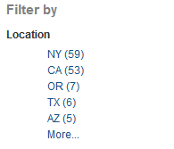
Facets:
Show search results across each index.
When clicked show only results in that index related to that facet value.
Can further narrow results using sub-facets in that index.
For example, assume the Customer component has a faceted attribute of Customer Level with values of L1, L2, and L3. By selecting the L1 facet link, L2 and L3 values will be removed from the search results list, leaving only the L1 for viewing.
For component Keyword search, the system determines facets associated with the search category to which the component is associated and renders them accordingly.
For Global Search, because the search results might span across multiple indexes that are not related to each other, each search definition within a specific search category should have common attributes marked as facets. These attributes should be generic so search results can be classified under one of these attributes. If non-common attributes are marked as facets in the search category, results not having that attribute will not be displayed.
Note: If an attribute is marked as a facet, and if for a given search document that facet attribute does not have a value, then the query is dynamically modified to return No Value as the title of the facet.
Facets display five values by default. If a particular facet has results for more than five facets, More.... appears at the bottom of the list.
Image: Facet displaying More... control
This example illustrates the More... control used to reveal more facet values.
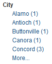
Click More... to expand the list.
Note: For any facet, the maximum number of values displayed is restricted to 100 for performance reasons.
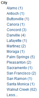
Image: Facet displaying Less... control
This example illustrates the Less... control used to reduce the facet values displayed.
Once the entire list of facet values is expanded, click Less... to collapse the list, showing only five again.
As you drill into a set of facets, your path is expressed in the form of facet breadcrumbs.
Image: Facet filter breadcrumbs
This example illustrates the fields and controls on the Facet filter breadcrumbs.
You can deselect the check box for a filter to remove its effect on the search results, or to reverse the direction of your filtering and expand the results.
Click Clear all filters to remove all applied filters, returning the search results to the state prior to faceted filtering.
Use the View As control to toggle between the grid format and the list format for viewing search results.
|
Field or Control |
Definition |
|---|---|
 |
Enables you to switch the view of the search results between list format and grid format. The icon representing the current view is greyed out. |
Working with the Grid Format
The following example displays the grid format:
Image: Search Results in grid format
This example illustrates the fields and controls on the Search Results in grid format. You can find definitions for the fields and controls later on this page.
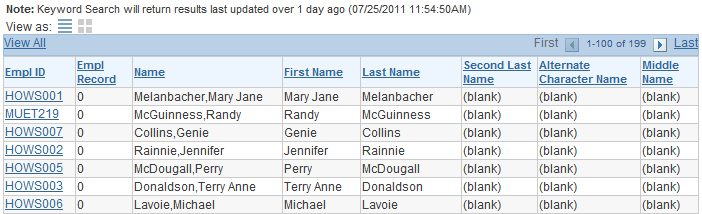
To navigate to the PIA page loading the desired data, click the key column with the link.
The Related Actions link does not appear for search results in the grid format.
Note: The default search result display format for Keyword Search is the grid format.
Working with the List Format
The following example displays the list format:
Image: Search Results in list format
This example illustrates the fields and controls on the Search Results in list format. You can find definitions for the fields and controls later on this page.
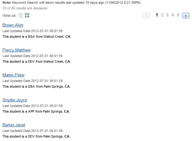
To navigate to the PIA page loading the desired data, click the Title line of the search result.
The Related Actions link appears only for search results in the list format.
Note: The default search result display format for Global Search is the list format.
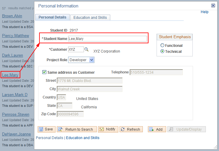
For components mapped to search definitions, end users can navigate to related actions defined for that component from search results without accessing the main result document. For every search result that has related actions defined for it, you see a related actions indicator to the right of the search result. The related actions indicator is a greybar with a white triangle within it pointing to the search result.
Note: The related actions indicator appears only for component-level related actions. It does not appear for page-level related actions or for related content. Also, end users will only view related actions to which they have access. If there are none for that search result, the related actions indicator does not display.
Image: Related actions indicator
This example illustrates the fields and controls on the Related actions indicator. You can find definitions for the fields and controls later on this page.
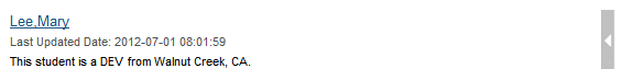
Note: The related action indicator appears only in Global Search results and in Keyword Search results when viewing the list format.
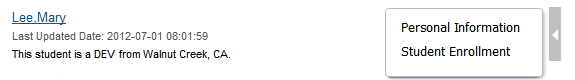
By clicking on the related actions indicator, a related actions popup appears, showing the possible related actions for that user, according to security access.
Image: Related action indicator popup
This example illustrates the fields and controls on the Related action indicator popup. You can find definitions for the fields and controls later on this page.
After clicking a related action, the system displays the target related action as configured by the application (as in, in a modal window, a new browser window, and so on). The system displays the related action interface with the information associated with the search result displayed.
Image: Related action from a search result
This example illustrates the user accessing the related action from the search result, with no navigation.