Organizational Analysis Model
Suppose you create an Organizational Analysis model showing values (count of employees, average salaries based on different attributes such as employee information, location, department, pay grade, and so on) in a chart format using Pivot Grid. You construct a view that represents a join of all the SQL tables required for getting the data. This view is a base for forming the PSQuery. You use this PSQuery as the Data Source for this Pivot Grid model.
To create an organizational analysis model:
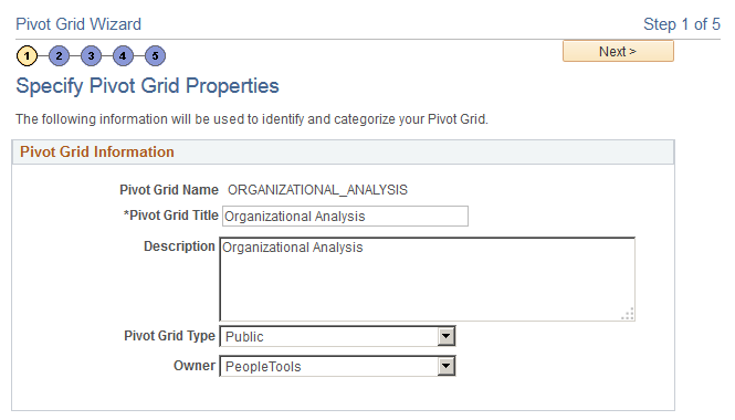
Access the Pivot Grid Wizard, Specify Pivot Grid Properties page.
Image: Specify Pivot Grid Properties page
This example illustrates the fields and controls on the Specify Pivot Grid Properties page.
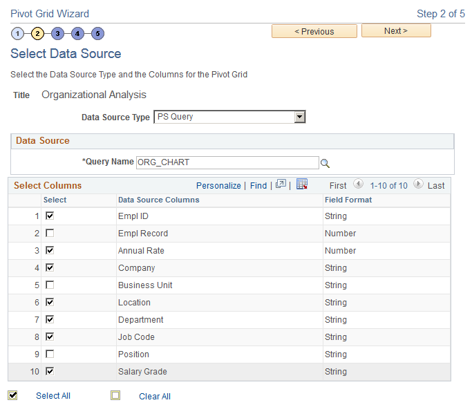
Access the Pivot Grid Wizard, Select Data Source page.
In this step, you select the PSQuery and output columns from the PSQuery that you will plot. The attributes to be plotted are Employee ID, Annual Rate, Location, Department ID, Job Code, Company, and Pay Group.
Image: Select Data Source page
This example illustrates the fields and controls on the Select Data Source page.
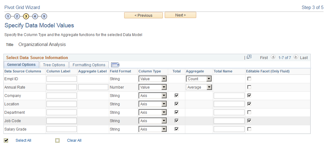
Access the Pivot Grid Wizard, Specify Data Model Values page.
In this step, you define the Pivot Grid model core, including the axis and values, All members, aggregate functions, and so on.
You select Department, Job Code, Location, Company, and Paygroup as the axis columns; and Employees and Annual Rate as the Values.
All the axis columns have an All (Total) attribute associated with them. The aggregate function for the value member Annual Rate is AVERAGE, and the aggregate function for the value member Employees is COUNT.
Business Unit is the runtime prompt for the PSQuery. The default values for this prompt are provided.
Image: Specify Data Model Values page
This example illustrates the fields and controls on the Specify Data Model Values page.
Access the Pivot Grid Wizard, Specify Data Model Options page.
In this step, you define the initial layout of the grid and the chart. Note that even though you are plotting only a chart, grid layout is mandatory.
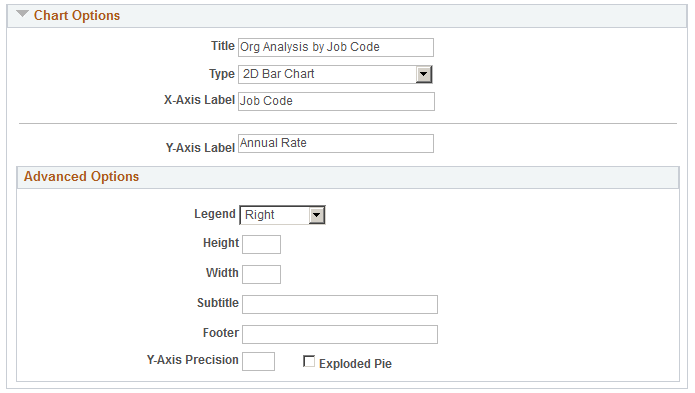
For the chart, Job Code is selected as the X axis from the value type members; Employees is selected to be on the Y axis; Department is selected as a filter for the chart; chart title and axes labels are specified; and chart type is selected as the 2D Bar.
Image: Specify Data Model Options page
This example illustrates the fields and controls on the Specify Data Model Options page.
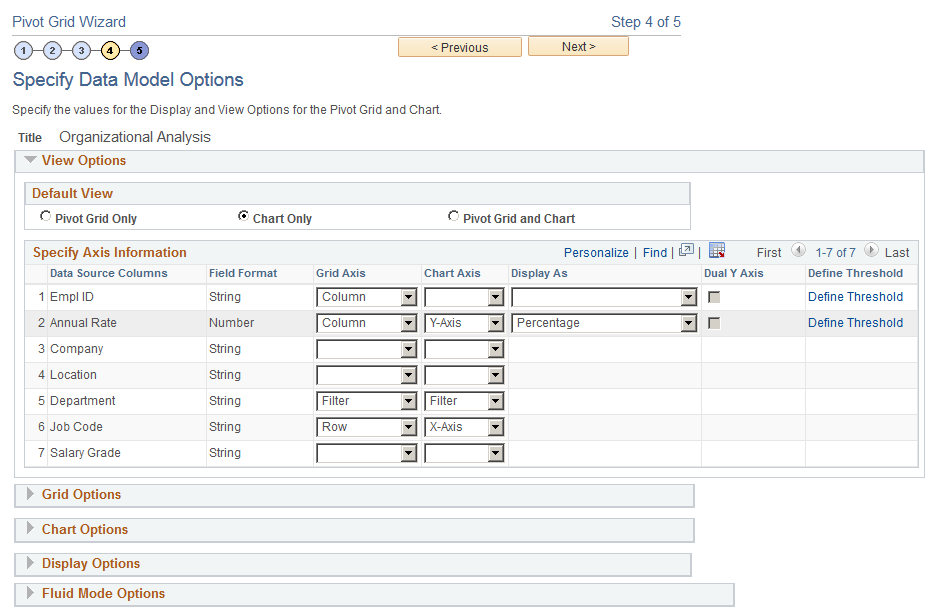
Image: Specify Data Model Options page, Chart Options section
This example illustrates the fields and controls on the Specify Data Model Options page, Chart Options section.
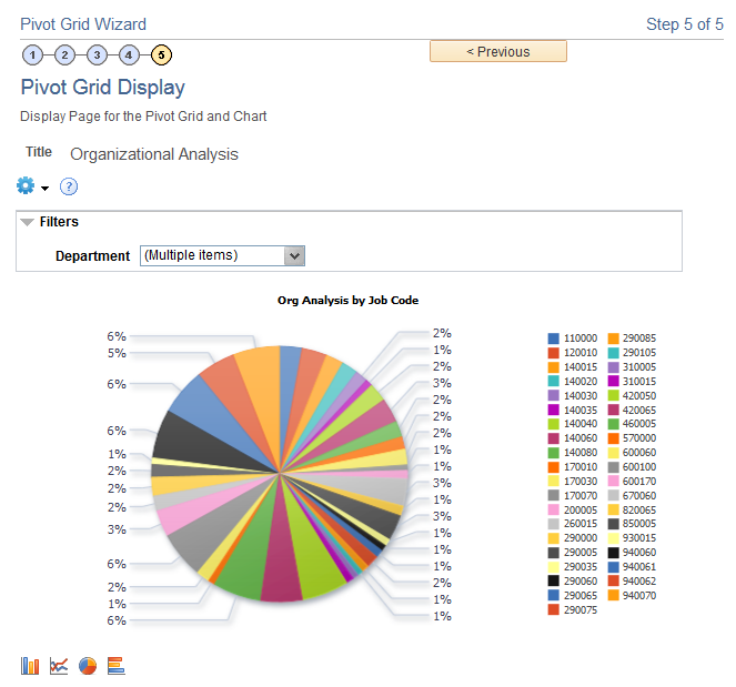
Access the Pivot Grid Wizard, Pivot Grid Display page.
The system displays the Pivot Grid model based on the options previously selected. On the chart, the actual value plotted can be seen as a hover item if you bring the mouse close to the bars in the 2D Bar chart.
Image: Pivot Grid Display page
This example illustrates the fields and controls on the Pivot Grid Display page.