Performing Actions on the Chart Only View
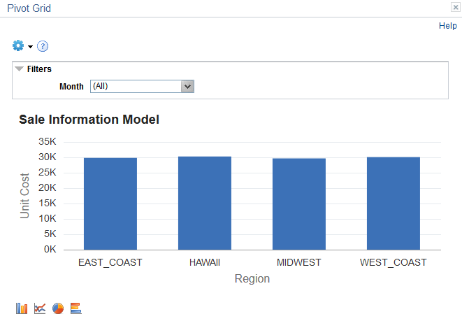
When you create a Pivot Grid model, you also define its initial layout. The initial layout used in the following example uses the PS_QE_BAM_FACT_TBL record that stores Unit Sales, Unit Cost, and Product Sales for a set of regions and products, monthly.
Image: Example chart displaying Chart Only view
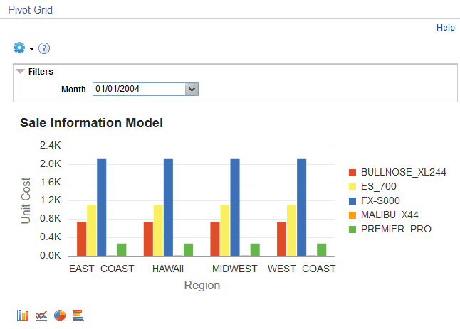
This example displays the chart using the initial layout.
In the following example, you drill down on the Region, and the Drilldown Field selected is Product. The following actions are performed:
Execute the PSQuery to retrieve (1) totals of aggregate values for the Unit Cost member for each product for the selected region and month and (2) the unique list of all the Filter Values - Month and Region.
Set the X axis of the chart to the Product field and the Y axis of the chart to the Unit Cost field.
Plot the chart.
The chart includes locator links from the drill-down.
Image: Drilldown To menu
When you click the bar, the Drilldown To menu appears, as shown in this example.
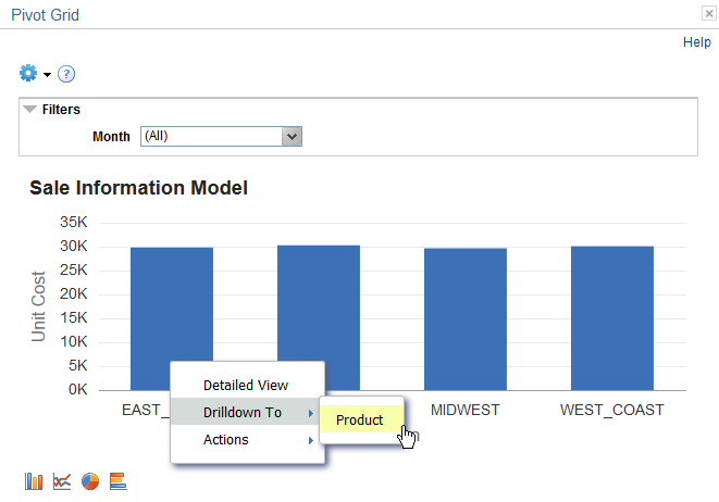
Image: Chart showing drilldown on Product
When you select a value from the Drilldown To drop-down list, the drilldown appears with locator links (Region as in this example) to drill out.
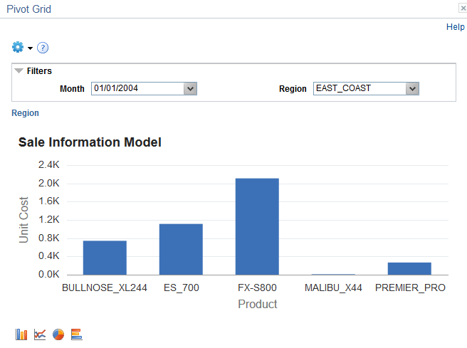
You can drill out of the chart to the original view using the locator links displayed at top left of the Chart display area. In the above example Region link is generated as a locator link, clicking which will revert the display .
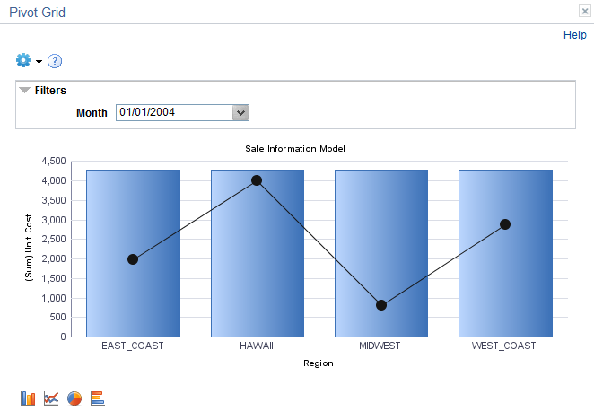
In this example, the Product field is defined as a Series in the data model. The following actions are performed:
Retrieve the axis information for the selected model.
Execute the PSQuery to retrieve (1) totals of aggregate values for the Unit Cost member for each region and product for the selected month and (2) the unique list of all the filter values for Month.
Set the X axis of the chart to the Region field and the Y axis of the chart to the Unit Cost field.
Plot the chart.
Image: Chart displaying Product as a series
This example illustrates a chart with Product as a series.
In this example, the Unit Sales field is defined as an Overlay in the data model. The following actions are performed:
Retrieve the axis information for the selected model.
Execute the PSQuery to retrieve (1) totals of aggregate values for the Unit Sales member for each region for the selected month, (2) totals of aggregate values for the Unit Cost member for each region for the selected month for overlay, and (3) the unique list of all the filter values for Month.
Set the X axis of the chart to the Region field and the Y axis of the chart to the Unit Cost field.
Plot the chart.
Image: Example chart with Unit Cost as an overlay
This example displays a chart with Unit Sales as an overlay.
Note: Overlay fields are only supported for the bar charts. All other chart types do not work properly if overlay fields are selected.
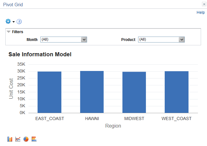
In this example, Product is added as a second filter in the data model. The following actions are performed:
Retrieve the axis information for the selected model.
Execute the PSQuery to retrieve (1) totals of aggregate values for the Unit Cost member for each region for the selected month and product and (2) the unique list of all the filter values - Month and Product.
Set the X axis of the chart to the Region field and the Y axis of the chart to the Unit Cost field.
Plot the chart.
Image: Example chart with filters on Month and Product
This example displays a chart with two filters, Month and Product.
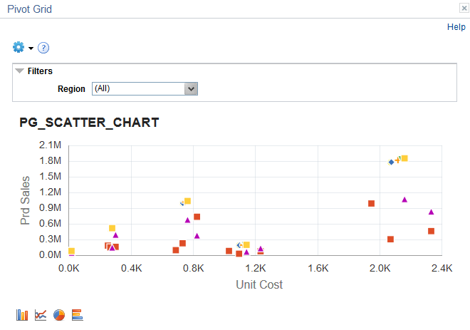
The Scatter and Bubble chart types are available for the Chart Only models. These chart types apply for the classic Pivot Grid Viewer, Pivot Grid Fluid Viewer, and search pages. You can select the chart types at the model level or at the view level. In addition, end users can set this chart type using the chart options.
When you set the chart type as Scatter or Bubble, note that:
Only a numeric dimension is available for the x-axis of the chart.
Bubble charts require an overlay in the Pivot Grid model.
The overlay determines the weight of the bubble. That is, the overlay dimension determines the diameter of the bubbles.
If no Series is available in the Pivot Grid model, the scatter or bubble chart enables you to drill to only numeric dimension. When a Series is available, the drill to dimension on the scatter or bubble chart behaves as any other chart type.
Pivot Grid Wizard displays an error message in the following cases:
When the chart x-axis is non-numeric with the chart type set to Scatter Chart or Bubble Chart.
When the chart type is set to Bubble Chart with no overlay set.
When the chart has an overlay, but the chart type is not Bar or Bubble Chart type.
Image: Specify Data Model Options page, the Type field is set to Bubble Chart
In this example of the Specify Data Model Options page - Chart Options, the Type field is set to Bubble Chart.
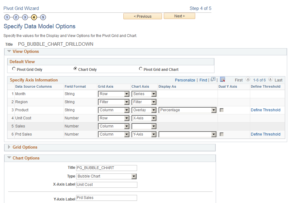
Image: Pivot Grid Viewer page, Bubble chart type
This example illustrates the Pivot Grid Viewer page showing a bubble chart.
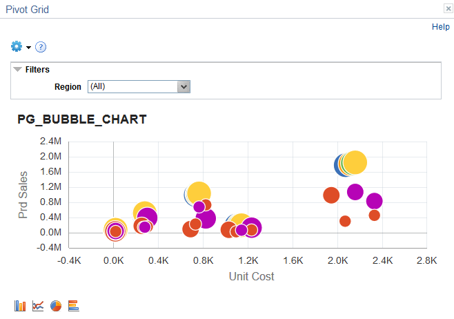
Image: Specify Data Model Options page, the Type field is set to Scatter Chart
In this example of the Specify Data Model Options page - Chart Options, the Type field is set to Scatter Chart.
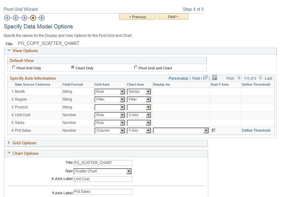
Image: Pivot Grid Viewer page, Scatter chart type
This example illustrates the Pivot Grid Viewer page showing a scatter chart.