Personalizing Pages
This section discusses how to personalize pages.
Note: The information provided in this section applies to PeopleSoft Classic User Interface.
The page personalization feature helps you tailor your transactions to specific business processes and to your personal data entry style. The Personalize Page option in the pagebar located just below the navigation header is available for most PeopleSoft pages.
Note: Page personalizations may be superseded if the order of the grids in the underlying page definition is changed in Application Designer.
Image: Pagebar
This example shows the pagebar.

Select the Personalize Page link to open the Page Personalization page for the current page.
Image: Page Personalization page (1 of 2)
This example illustrates the fields and controls on the Page Personalization page.
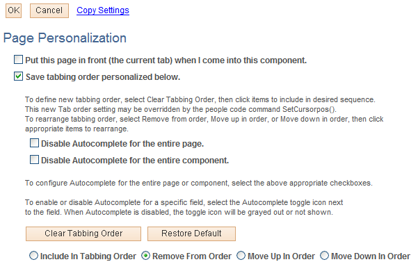
Image: Page Personalization page (2 of 2)
This example illustrates the fields and controls on the Page Personalization page.
Note: Your system administrator can disable the page personalization feature. Disabling this feature may be necessary if your company is concerned about database growth.
The Page Personalization page includes four settings that enable you to control how the current page initially looks when you open it:
|
Field or Control |
Definition |
|---|---|
| Put this page in front (the current tab) when I come into this component. |
Defines the current page as the initial default page for the component. Only one page within a component can be set as the front page. Search pages and secondary pages cannot be identified as front pages. This option appears only if the current component for the page contains more than one page based on your security profile. This option is deselected by default. |
| Save the state of the expanded/collapsed sections on this page. |
Enables you to personalize the initial appearance of collapsible sections on the current page. Before selecting Personalize Page and then selecting this option, ensure that the collapsible sections on the page display exactly as desired. This option takes a snapshot of the current state of the collapsible sections on the page. You can also preserve the initial appearance of nested collapsible sections whether or not the parent collapsible section is expanded. This option is deselected by default. When it is disabled, the application determines the initial appearance of all collapsible sections unless you defined this option previously. This option only appears if the current page contains page elements that you can expand or collapse. |
| Save the state of the View All settings on this page. |
Enables you to personalize the initial View All appearance of scroll areas and grids. This option takes a snapshot of the current View All status of the grids and scroll areas on the page. This option is deselected by default. When it is disabled, the application determines the initial View All display unless you defined this option previously. This option only appears if the current page contains a grid or scroll area with a View All setting. This option is not supported for grids in scroll areas. |
| Save tabbing order personalized below. |
Saves the tabbing order that you designate on the current page. You can modify the existing field tabbing order as well as remove page elements from the tabbing order so that the cursor skips those fields as you tab through the page. |
By default, the system helps you enter data into fields using a built-in autocomplete feature. That is, based on what you have entered, the system “guesses” to help you complete your entry in a prompt field so that you don’t have to type all of the characters into the field. For some prompt fields, this is a great benefit, while for others it can be unnecessary, and in many cases it depends on the user preference. The system enables you to decide if you want to enable or disable autocomplete for an entire component (group of pages), a single page, or a single prompt field.
|
Field or Control |
Definition |
|---|---|
| Disable Autocomplete for the entire page |
Turns off the autocomplete feature for all prompt fields on a single page. |
| Disable Autocomplete for the entire component |
Turns off the autocomplete feature for all prompt fields, for all pages, within a single component (group of pages). |
 |
Click to toggle between enabling and disabling autocomplete for a single prompt field. |
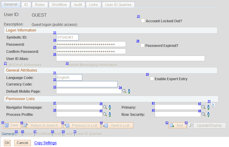
The tabbing order is the order in which you move from page element to page element when you press the Tab key. You can change and save the default tabbing order of a page from the Page Personalization page, which displays an image of the current page with tabbing order numbers in the upper-left corner of each page element that you can change. (Page elements with smaller numbers precede page elements with larger numbers in the tabbing order.) You can modify collapsible section buttons and page elements within collapsed sections as long as the collapsed section is expanded when you select the Personalize Page option.
Note: Tab order numbering may not begin with 1 and may appear to have gaps for page elements that are not currently visible.
|
Field or Control |
Definition |
|---|---|
| Clear Tabbing Order |
Click this button to define a new tabbing order. Clicking this button clears the current tabbing order and replaces the numbers for each relevant element (any element that you can tab to) with an X. The X indicates that no tab sequence number is applied for that field. You can then assign a new tabbing order to the page elements using the Include In Tabbing Order, Remove From Order, Move Up In Order, and Move Down In Orderbuttons. |
| Restore Default |
Removes all tabbing order personalizations defined for the page and restores the original tabbing order. |
| Include In Tabbing Order, Remove From Order, Move Up In Order and Move Down In Order |
These options enable you to control the tabbing order. Click the appropriate radio button and then click the page element you want to change. |
To change the tabbing order:
Select the Clear Tabbing Order button to remove all tabbing order settings for the page.
The system replaces each tabbing order number with an X, indicating that the page element is no longer included in the tabbing order.
Select the Include In Tabbing Order radio button.
Select the page elements in the tabbing order you want.
The system numbers each field that you select sequentially, beginning with 1.
(Optional) If necessary, select the Move Up In Order or Move Down In Order radio buttons and click the page elements as needed to adjust the tab order you just set.
These options either promote or demote a page element one step in the tabbing order sequence. The system automatically adjusts all other page element tabbing order numbers accordingly.
To remove specific fields from the current tabbing order:
Select the Remove From Order radio button.
Click each page element that you want to remove from the tabbing order.
The tabbing order number for each element that you click is replaced with an X. At runtime, the system skips this page element as you tab through the page.
To save the new tabbing order:
Make sure the Save tabbing order personalized below option is selected.
Click the OK button.
The original page appears with your new tabbing order and other personalizations applied.
Tabbing Order Exclusions
Tabbing order personalization applies only to elements within the page, such as edit boxes, grids, drop-down list boxes, push buttons, and so on. You cannot personalize the tabbing order for these elements:
Header icons.
Browser elements.
Page and related page links.
HTML areas.
Charts.
Grid columns that you hid using the grid personalization feature.
If you unhide a column after you set the tabbing order personalization, you must personalize the page again to include that field in the tabbing order.
Collapsible Sections
You must expand all collapsible sections on a page before clicking the Personalize Page link for page elements in those sections to be available for tab ordering.
You can personalize the tabbing order of any allowed page elements within a collapsible area. However, if you then collapse this section, the system skips the page elements contained in the collapsed area. Collapsing an area effectively removes any of its page elements from the tabbing order.
Grids and Scroll Areas
Page elements within a grid are treated as a group at runtime, even if they are not numbered consecutively. For example, if a page has four fields, two of which are in a grid, then the tabbing sequence will keep the grid fields together regardless of the tabbing order that you specify. If fields A and B are outside the grid, fields C and D are inside the grid, and you set the tabbing order to be A, C, B, and D, then the system will automatically revert to an A, C, D, and then B tabbing order to keep the items within the grid (C and D) together.
Note: If you select View All from the navigation bar when multiple levels of scroll areas exist, then the page tabbing order may not behave as you would expect after tabbing through the page for the first time.
Grid and scroll area navigation bar elements such as First, Previous, View All, and so on are included in tabbing order personalization.
Access the Page Personalization page by clicking the Personalize Page link on the page you want to personalize. The page personalization toolbar at the top and bottom of the Page Personalization page enables you to save, cancel, copy, share, and delete your page personalization settings. The share and delete options appear only after you have personalized and saved the page.
Image: Page personalization toolbar
This example illustrates the controls on the page personalization toolbar.

|
Field or Control |
Definition |
|---|---|
| Copy Settings |
Opens the Copy Settings secondary page, where you can copy the public profiles from other users. A lookup button enables you to search all available public profiles for that page. Selecting the OK button on the Copy Settings page copies the settings and returns you to the Page Personalization page. Note: You may need to adjust the tab order numbering if page elements based on your security profile are different from the public profile you are copying. |
| Share Settings |
Opens the Share Settings secondary page, where you can publicly share the page personalization settings you created. You can make your profile Public or Private. The default setting is Private. If you make the personalization settings of one page in a component public, then all personalization settings for all pages in that component will be public. The Name field is only required if you choose to make your personalization settings public, in which case you must have a unique profile name. The profile name you enter is the same for all pages and shared grid personalizations across all components. If you modify the profile name, it will be modified for all pages and grid personalization settings across all components. After you save the first profile name, the Name field is prepopulated when you open the Share Settings page for other pages or grids. The Name field can be a string up to 30 characters long, for example, OSC_16AR. The system automatically converts alphabetical characters to uppercase. |
| Delete Settings |
Opens the Delete Settings secondary page, where you can delete all page personalization settings for the page or component. Click the Delete button to delete the settings for the current page only. Select the Delete Settings for All Pages within Component check box and click Delete to remove all personalized settings for the entire component. |
Note: If you make changes to any of these pages, you must also click the Save button on the Page Personalization page for your changes to take effect.