Using Activity Guides
Activity guides are a PeopleTools feature that allow you to define guided procedures for a user or group of users to complete. An activity guide divides related action items into a series of tasks or steps. It enables users to see exactly where they are in a process as they progress towards completion. Activity guides track the status of your tasks or steps. Activity guides can be useful in a number of procedural scenarios. For example:
The on-boarding of a new employee.
Benefits enrollment.
A life change event, such as a marriage or the birth of a child.
Period end closing.
System or feature configuration.
There are several mechanisms for users to access and display an activity guide:
Classic activity guides require an activity guide pagelet, which is the interface that presents the activity guide and its action items to a user. The pagelet lists tasks in order and can optionally include a status bar indicating completion progress. Activity guide pagelets must be accessed through a classic WorkCenter.
Fluid activity guides can be accessed in a number of ways:
Through a tile that opens the specified activity guide instance.
Through a tile that opens the My Activity Guide Instances page listing all activity guide instances for that template that the user is contributor to.
Through a menu item.
Through a button or link that programmatically generates the URL for the activity guide.
Activity Guide Process Types
There are seven activity process types. Depending on the process type used by the developer to create the activity guide, the display and use of the activity guide will differ. Some process types are only supported in Fluid mode and are not available in Classic Mode.
|
Activity Guide Template Type |
Description |
|---|---|
|
Horizontal optimized guided sequential |
Presents the numbered steps horizontally. Uses the guided mode banner to present navigation buttons. Used for simple sequential procedures. |
|
Vertical optimized guided sequential |
Presents the numbered steps vertically in the left panel. Uses the guided mode banner to present navigation buttons. Used for complex sequential procedures. |
|
Vertical optimized guided non-sequential |
Presents the numbered steps vertically in the left panel. Uses the guided mode banner to present navigation buttons. Used when users can complete the tasks in which ever order they choose or as events dictate. |
|
Vertical optimized non-guided non-sequential |
Presents unnumbered tasks vertically in the left panel. Displays the standard fluid banner without navigation buttons. |
|
Vertical non-optimized guided sequential |
Presents the numbered steps vertically in a drop-down list in the guide mode banner. Uses the guided mode banner to present navigation buttons. |
|
Vertical non-optimized guided non-sequential |
Presents unnumbered tasks vertically in a drop-down list in the guided mode banner. Uses the guided mode banner to present navigation buttons. |
|
Vertical non-optimized non-guided non-sequential |
Presents unnumbered steps vertically in a drop-down list in the fluid banner. Displays the standard fluid banner without navigation buttons. |
Activity guides provide a hierarchical organization of dependent and sequential tasks. An activity guide lists the tasks, also referred to as action items, that you need to complete. Each action item is linked to a specific local or remote transaction or external URL. Some activity guides may include a questionnaire that includes questions used to determine which steps or tasks will be included in the action items.
How the lists and navigations is presented on the page depends on whether you are accessing a classic activity guide or a Fluid activity guide.
Classic – As you use an activity guide, you see the lists of action items that you need to complete in the pagelet area. When you click an action item, the associated page appears in the target content area of the WorkCenter. To complete an action item, complete the associated page, and save your work; the status of the action item will update to complete. The activity guide pagelet remains visible as you move from step to step, with the current action item highlighted, and you can see your progress by viewing the Task Progress bar, if included, that is located at the top of the activity guide pagelet. An icon appears next to each activity item to indicate its status.
A navigation frame appears above the target content area, which includes buttons that enable you to navigate through each action item. Next and Previous buttons are provided; additional buttons and controls may also appear, if defined by the Activity Guide developer, such as the Mark as Complete button that you see in some of the examples we provide below. Typically, these additional buttons enable you to mark an action item as complete or cancel your actions.
Fluid — Action items may be displayed either vertically or horizontally on the page depending on the activity guide template used by the developer to create the page.
Guided activity guides include Next, Previous, and Submit for navigation in the guided mode fluid banner. The guided mode, may also include additional action list controls, such as Save for Later or Home. Non-guided activity guides do not include any navigation buttons; in addition, non-guided activity guides display the standard fluid banner.
Action items can include the following characteristics:
Action items can be required or optional.
An asterisk designates a required action item. For an activity guide status to be designated as complete, all required action items must have a complete status.
Action items can be organized hierarchically with a parent (summary) action item composed of child (detail) action items.
All required child action items must be complete before the parent item is considered complete.
Note: Parent action items are collapsible/expandable headings which groups related tasks; they do not load content in the target area when clicked.
Action items can be date-dependent and include required start or completion dates.
Action items can include dependencies; for example, one action item can be set to be dependent on the status of another action item.
Action item access can be controlled by role. If you do not have permission to access an action item, it will be disabled and you will not be able to access it.
Classic activity guides require an activity guide pagelet, which is the interface that presents the activity guide and its action items to a user. The pagelet lists tasks in order and can optionally include a status bar indicating completion progress. Activity guide pagelets must be accessed through a classic WorkCenter.
Activity Guide Icons and Controls
This table describes the icons and controls for an activity guide:
|
Field or Control |
Definition |
|---|---|
 Task is not started Task is not started |
Indicates the task has not been started. |
 Task is visited Task is visited |
Indicates you have accessed the task, but not completed it. |
 Task is completed Task is completed |
Indicates you have completed the task. |
 Task is In-Progress Task is In-Progress |
Indicates an in progress summary task, which has required subordinate or dependent tasks that are not yet complete. |
 Task is Overdue Task is Overdue |
Indicates a task that is late. |
 Task is Dependent Task is Dependent |
Indicates that the task is dependent on the completion of one or more tasks or steps. Click the task to view the dependencies. |
 Expand Expand |
Click to expand a summary (parent) action item, and view its subordinate tasks. |
 Collapse Collapse |
Click to collapse a summary (parent) action item, and hide its subordinate tasks. |
 |
Click this button to navigate to the next step. |
 |
Click this button to navigate to the previous step. |
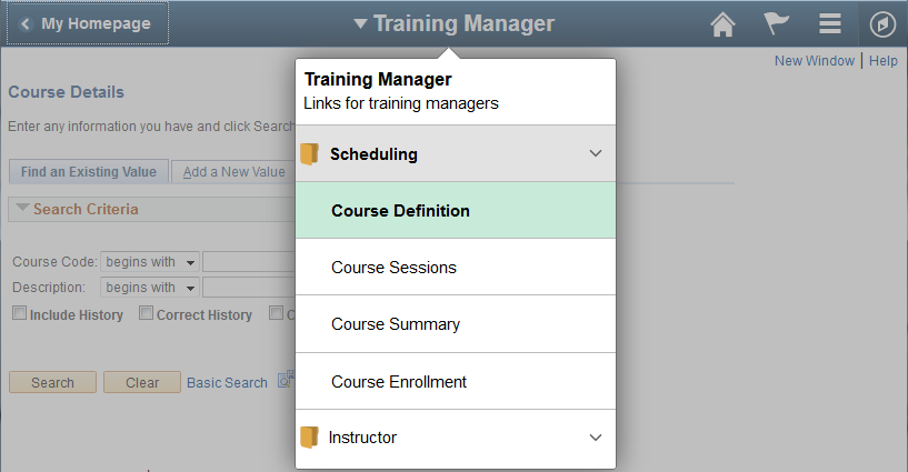
Classic Activity Guide Examples
This section shows several examples of classic activity guides.
Image: IB Configure Network Activity Guide
This activity guide contains tasks to configure PeopleSoft Integration Broker (IB). In this example, the IB Configure Network Activity Guide pagelet appears in the pagelet area of the Integration Network WorkCenter page, with the Gateways page in the target content area:
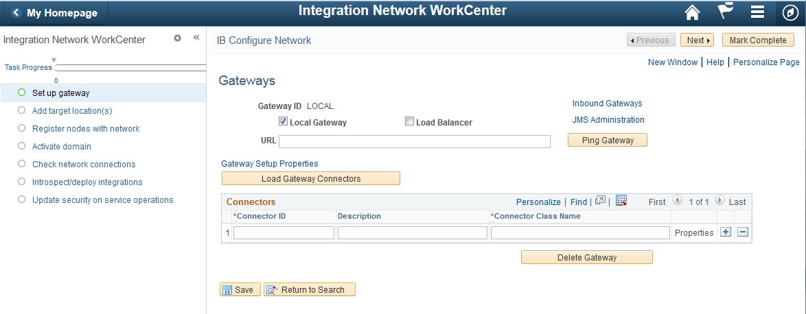
Here is an example where four out of seven action items are now complete, and the Check network connections action item, which uses the Network Status page, is in progress.
Image: IB Configure Network Activity Guide with completed tasks.
Activity Guide example showing four completed action items.
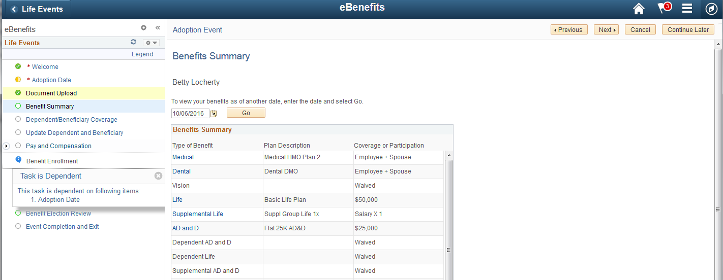
This example shows the Life Events Activity Guide. This activity guide includes required tasks, which are indicated by an asterisk, as well as the summary task Pay and Compensation (expanded) and a dependent task Benefit Enrollment. Benefit Enrollment task is dependent on the completion of Adoption Date which is currently in progress.
Image: Life Events Activity Guide
Activity Guide example showing required action items, summary task and dependent task.
Personalizing Your Pagelet Area
You can set preferences to personalize your WorkCenter page experience. Changes are visible when you click the Save button.
Access the Personalize page (select the Personalize option from the Pagelet Settings menu).
Note: Your page title reflects the label that your WorkCenter administrator enters. The page name always begins with Personalize.
Image: Personalize page
This example illustrates a sample Personalize page.
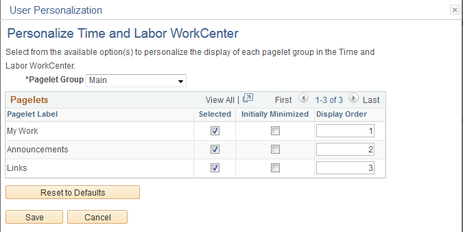
|
Field or Control |
Definition |
|---|---|
| Pagelet Group |
Select the tab (group) for which you want to set your preferences. |
| Pagelet Label |
Displays the names of the pagelets in the group. |
| Selected |
Select to make the pagelet visible in this pagelet group. Deselect the check box to hide the pagelet. Deselecting this check box does not remove the pagelet from the group. The check box is disabled if the administrator requires that the pagelet appear. |
| Initially Minimized |
Select to collapse the pagelet so that only the pagelet header is visible when you access the WorkCenter page. |
| Display Order |
Enter a number between 0 and 999 to specifically determine the position of the pagelets in the group. This field is empty by default and pagelets appear in the order configured by the administrator. Pagelets for which you leave the Display Order field blank precede pagelets for which the field contains a value. |
| Reset to Defaults |
Click to set all fields to their original settings as specified by the administrator who configured the WorkCenter page. |
Guided processes use a guided mode banner to present navigation buttons: Exit, Previous, Next, and Action List. Non-guided activity guides do not include any navigation buttons; in addition, non-guided activity guides display the standard fluid banner.
Fluid Activity Guide Icons and Controls
This table describes the icons and controls for a Fluid activity guide:
|
Field or Control |
Definition |
|---|---|
 or or  Next Next |
Click this button to navigate to the next step. |
 or or  Previous Previous |
Click this button to navigate to the previous step. |
 Action Item
List Action Item
List |
When viewing on small form factor device, the action item list will be hidden. Click the action item list icon to display the tasks or steps in the activity guide. |
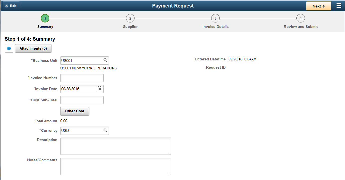
Example Horizontal Guided Sequential Activity Guide
In a horizontal sequential guided activity guide, the steps are presented across the top of the page, with the current step shaded in green. When the page is displayed on a phone or tablet, the task bar will show the current progress and the step number. The Payment Request activity guide is an example of a horizontal guided sequential activity guide. Each task must be completed in order. The current step or task number is shaded green. Click the Next button to move to the next task.
Image: Payment Request activity guide
The Payment Request activity guide is an example of a horizontal guided sequential activity guide. The current task is displayed on the page and the current task number is displayed in the Task Progress bar across the top of the page.
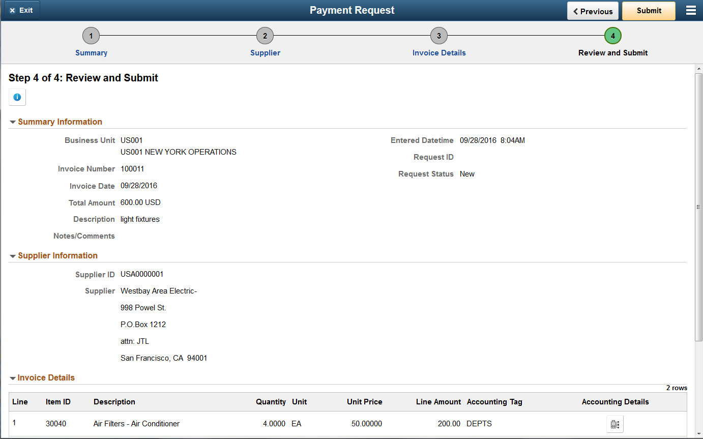
The final step or task in a horizontal guided sequential activity guide will include a Submit button.
Image: Payment Request task 4
This example shows the last task for a Payment Request, when all of required information has been entered, the navigation bar will contain a Submit button.
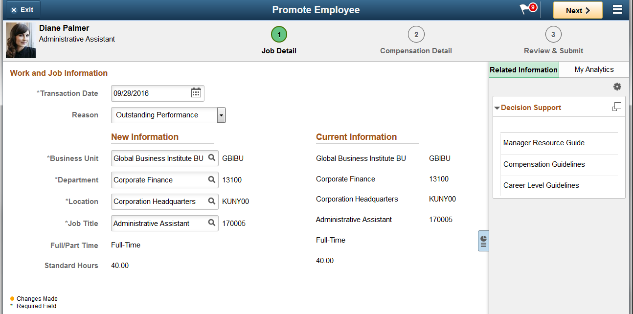
If the activity guide has related content, use the Supplementary Panel icon to expand the panel.
Image: Promote Employee activity guide with supplementary panel
This example illustrates a horizontal guided sequential activity guide that contains a supplementary panel for decision support with the panel expanded.
Example Vertical Guided Sequential Activity Guide
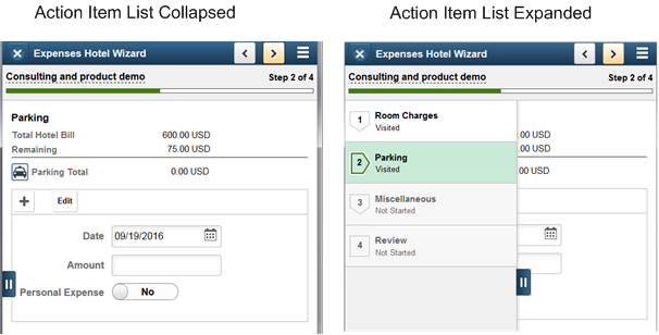
In a vertical guided sequential activity guide the numbered steps are presented vertically in the left panel. The current step is shaded in green and the step status is displayed for each step. When the page is displayed on a phone or tablet, the left panel is collapsed and the progress bar is displayed at the top of the page along with the step number.
Image: Expenses Hotel Wizard with some tasks complete
This example illustrates a vertical guided sequential activity guide. In this example, the tasks are displayed vertically on the left-hand side of the page. When you complete the task and click Next, the next task will be displayed.
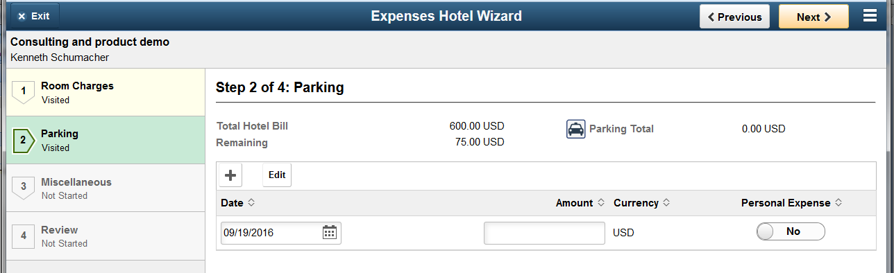
Image: Expenses Hotel Wizard on phone
This example illustrates an example of a vertical guided sequential activity guide as it displays on a phone. The action item list will be collapsed and the task bar will indicate the step.
Example Vertical Guided Non-Sequential Activity Guide
In a vertical guided non-sequential activity guide the numbered steps are presented vertically in the left panel. The current step is shaded in green and the step status is displayed for each step. When the page is displayed on a phone or tablet, the left panel is collapsed.
The following icons and controls are used with the vertical guided non sequential activity guides:
|
Field or Control |
Definition |
|---|---|
 Not Started Not Started |
Indicates the task or step has not been started.. |
 Visited Visited |
Indicates you have accessed the task or step, but not completed it.. |
 In Progress In Progress |
Indicates an in progress summary task, which has required subordinate tasks or dependent tasks that are overdue or incomplete. |
 Complete Complete |
Indicates you have completed the task. |
 Required Required |
A red asterisk displays to the left of each required step. If a step is not required, the status can be changed from Not Started to Visited. |
 Expand Expand |
Click to expand a summary (parent) action item, and view its substeps. |
 Collapse Collapse |
Click to collapse a summary (parent) action item, and hide its substeps. |
| Locked |
Steps that have a dependency will be grayed out and the status will indicate Locked (View Dependency). Click or tap on the step and a modal will open to show the dependencies. |
| Pending Approval |
Indicates the task or step is waiting for approval through the approval framework. |
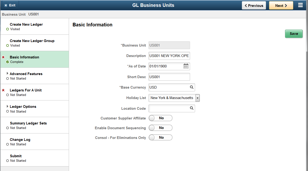
Image: GL Business Units activity guide
This example illustrates a vertical guided non-sequential activity guide. Required steps are indicated by an asterisk.
Example Non-Optimized Activity Guide
Non-optimized activity guides list the steps or tasks in a dropdown from the middle of the banner (or guided mode banner) versus the left hand panel.
Image: Example Non-Optimized Activity
This example illustrates how a non-optimized activity guide is displayed. This example uses a navigation collection.