Using Buttons and Links
This section discusses how to use buttons and links.
PeopleSoft Pure Internet Architecture provides buttons and links to help you navigate and process transactions. In general, if an action is related to navigating, then it appears as a link. If the action is truly an action, such as save or process, then it appears as a button. Click a button or link to carry out a command.
If a button appears grayed out, then that action is currently disabled. For example, when working in a transaction for the first dataset from a search list, you might see the following:
Image: Enabled and disabled buttons
This example illustrates enabled and disabled buttons for a search list.
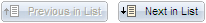
Your only option in this case is to click the Next in List button. After you click Next in List, however, the Previous in List button will become available.
Similarly, links at the bottom of a page often enable you to move to another component page. In the following example, you can use the ID, Roles, and other links to navigate to other pages. Notice that Workflow is not a link (it is not underlined) because it is the current page:
Image: Page Links in a Component
This example illustrates page links in a component.

Tool Tips
Tool tips are pop-up text messages that appear when your mouse pointer hovers over a button or link. Sometimes called hover text, tool tips display additional information about the action that the button or link performs. Typically, tool tips display what a button or link will do and may list its keyboard hot key, if applicable.
The following buttons process transactions.
|
Field or Control |
Definition |
|---|---|
 |
Click to look up the data input without returning to the main page. Useful if you want to perform additional searches. Usually found on a page that you open by clicking a prompt button. |
 |
Click to accept the data entered on an auxiliary page and return to the main page. |
 |
Click to clear the page and any data that you may have entered or changed without saving. When you click Cancel, the system does not warn you to save changes. Click Cancel if you entered data incorrectly and want to begin again. |
The toolbar appears at the bottom of most pages. It can include search list navigation buttons, page navigation buttons, and page action buttons. It changes depending on the type of page that is active or the settings that the developer has put into place for a particular transaction. Not all buttons shown in the following table appear on every page. Likewise, some buttons may be unavailable for selection.
Note: In some cases, you may see different representations of a button, but the action is the same.
|
Field or Control |
Definition |
|---|---|
 |
Click to send the information that you entered on the page to the database. Generally, you save when you come to the end of a component. The Save button updates the data for all pages in a component. When activated, the system displays the saved message in the upper-right corner of the page. |
 |
Click to return to the search page. |
 |
Displays the data for the previous data row in your search results grid. This button is unavailable if you did not select the data row from the search results grid, if the grid had only one row, or if the data that appears is the first row in the grid. |
 |
Displays the information for the next data row in your search results grid. This button is unavailable if you did not select the data row from a search results grid, if the grid had only one row, or if the data that appears is the last row in the grid. |
 |
Displays the next page in the current component. If you are in the last page of the component, this button is unavailable. |
 |
Displays the previous page in the current component. If you are in the first page of the component, this button is unavailable. |
 |
Click to access existing rows of data in the database. If data is effective-dated, only current and future rows appear. |
 |
Click to display all rows of data: current, future, and history. |
 |
Click to access existing rows of data in the database and display all effective-dated rows. This button enables you to update all rows, including history rows. Note: This button is available only if you have the proper permission. |
 |
Click to add a high-level key row of data to the database for the current transaction. |
 |
Click to force a trip to the server, validating any data that was entered and processing any deferred PeopleCode changes. Note: This button iappears only for components that are enabled for deferred mode processing. |
 |
Appears when several pages are related to the current page. Click to access a new page containing a list of related page links. |
 |
Click to open the Send Notification page, where you can specify names, email addresses, or worklists to which to send notifications. |
 |
Click to activate the spell check feature for all spell check-enabled fields on the page. Spelling is checked for each field individually. As spelling is checked for each field, processing continues to the next field, displaying the spell check page if errors occurred. If no errors occur, then the No misspellings found message appears. See Using Spell Check. |
Pop-up menu buttons appear next to fields on a page.
|
Field or Control |
Definition |
|---|---|
 |
Click to access a new page where you can select from among the menu items listed. Appears if the pop-up menu contains more than one item. |
 |
Click to access the new transaction page directly. Appears if the pop-up menu contains only one menu item. |