USER INTERFACE REFERENCE style guide
The user interface style guide consists:
Primary Elements
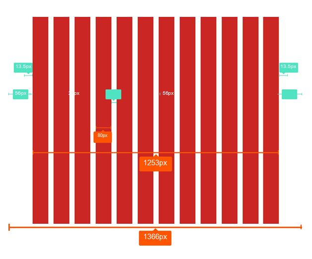
Grid
The application follows a responsive bootstrap grid system which allows uotp 12 columns acoss the page. All the designs are created within and around the grid and breakpoints. They have a minimum of 10px outer margin.
Why 1200?
The modern monitors (mostly wide-screen) support at least 1280 x 1024 pixel resolution. 1200 is divisible by 2, 3, 4, 5, 6, 8, 10, 12, 15, 16, 20, 24, 30, 40, 48, 60, 80, 120, 150, 200, 240 and 400. This makes it a highly flexible base number to work with.
Desktop
• Grid size: 1366px, 12 column • Maximum width: Website locks at 1400px
Tablet
• Grid size: 768px, 12 column • Maximum width: Website locks at 1400px
Phone
• Comp size: 320px, 12 column
Grids are used to structure the page layout. They allows elements to be aligned horizontally and vertically, which creates columns that keep things organized. Optimal spacing, type sizes and layout relationships should be maintained throughout.
The following grid examples show the transition from desktop designs to tablet and down to phone.
Note: Some images in the style guide have been reduced in size to fit the dimensions of this guide’s layout.
Grids Details
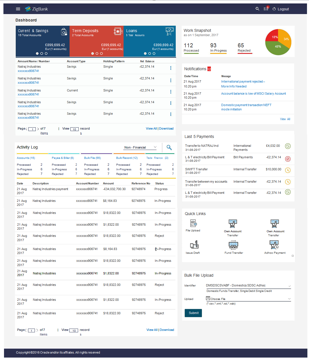
Grids Example
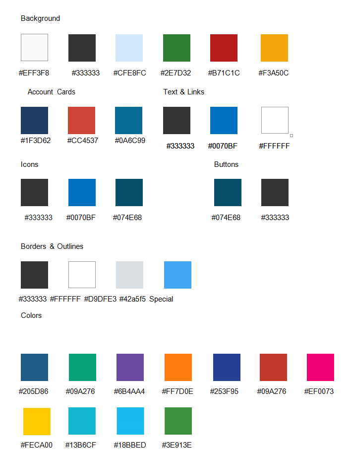
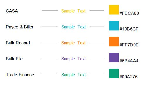
Color Palette
Typography
Family
Lato, a free google font, has been set for the type. The following weights for the font have been used: Light, Regular, Italic Regular, Bold.
Lato Specimens
Lato Light
ABCDEFGHIJKLMNOPQRSTUVWXY Z abcdefghijklmnopqrstuvwxyz 1234567890!@#$%^&*
Lato Regular
ABCDEFGHIJKLMNOPQRSTUVWXYZ abcdefghijklmnopqrstuvwxyz 1234567890!@#$%^&*5
Lato Bold
ABCDEFGHIJKLMNOPQRSTUVWXYZ abcdefghijklmnopqrstuvwxyz 1234567890!@#$%^&*
Lato Italic Regular
ABCDEFGHIJKLMNOPQRSTUVWX YZ abcdefghijklmnopqrstuvwxyz 1234567890!@#$%^&*
Color Palette - Font Colors (generic)
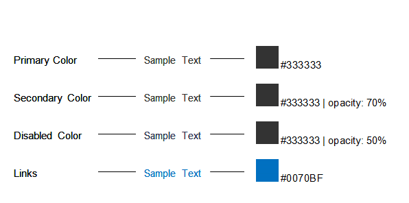
Color Palette - Font Colors (secondary)
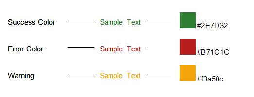
Color Palette - Font Colors (exceptional)
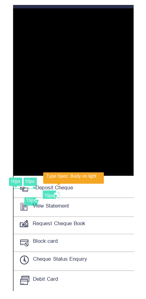
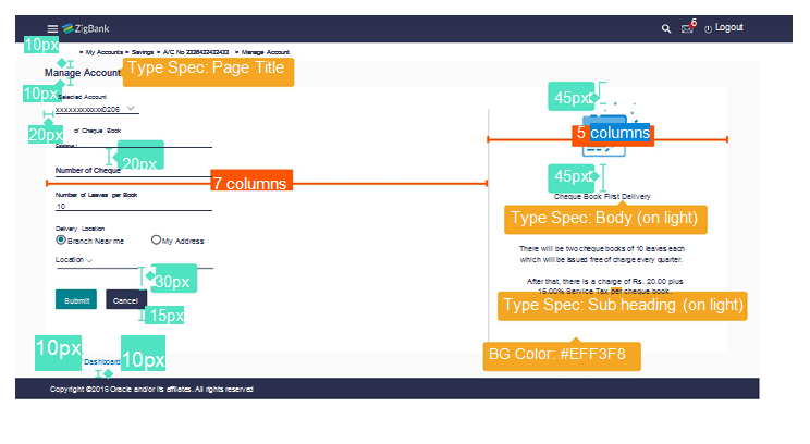
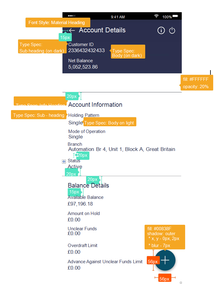
Typographgy Styles
Below are visual examples of specific text items styled throughout the site. The specs apply for both desktop and mobile, unless otherwise mentioned.
|
Page Title |
Body (on light) |
|
Manage Account |
Principal Liquidation |
|
Desktop Lato Bold | 18px | #333333 Mobile Lato Light | 16px | #333333 |
Desktop Lato Regular | 14px | #333333 Mobile Lato Regular | 14px | #333333 |
|
Card Title |
Sub Heading (on light) |
|
Quick Access |
Holding Pattern |
|
Desktop Lato Bold | 18px | #333333 Mobile Lato Light | 16px | #333333 |
Desktop Lato R | 13px | #333333 70% Mobile Lato R | 13px | #333333 70% |
|
Info Heading |
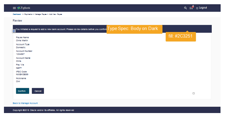
Body (on dark) |
|
Account Information |
Principal Liquidation |
|
Desktop Lato Regular | 16px | #333333 Mobile Lato Regular | 16px | #333333 |
Desktop Lato Regular | 14px | #ffffff Mobile Lato Regular | 14px | #ffffff |
|
Text Links |
Sub - Heading (on dark) |
|
Back to Dashboard |
Holding Pattern |
|
Desktop Lato R | 14px | #0070BF Mobile Lato R | 14px | #0070BF |
Desktop Lato R | 13px | #ffffff Mobile Lato R | 13px | #ffffff |
|
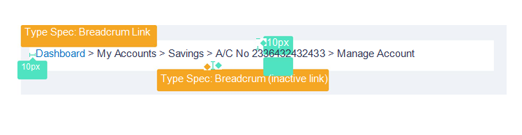
Table Header |
Breadcrums (inactive text) |
|
Amount Name / Number |
> My Accounts > Savings |
|
Desktop Lato R | 13px | #333333 70% Mobile Lato R | 13px | #333333 70% |
Desktop Lato R | 13px | #333333 70% Mobile Lato R | 13px | #333333 70% |
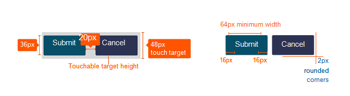
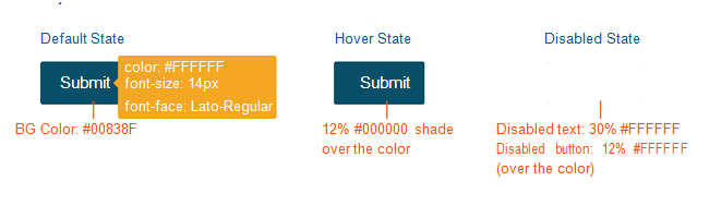
Primary Button
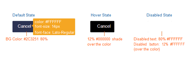
Secondary Button
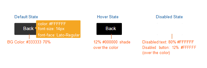
Tertiary Button
Specific Elements
Font Icons
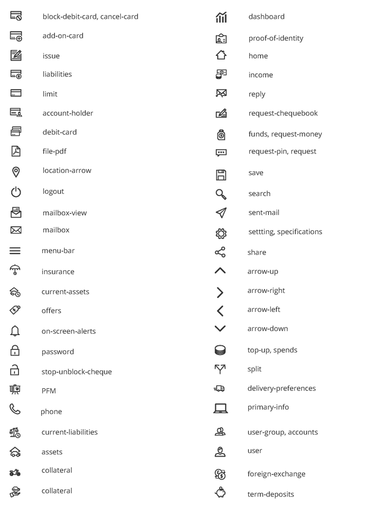
Icons
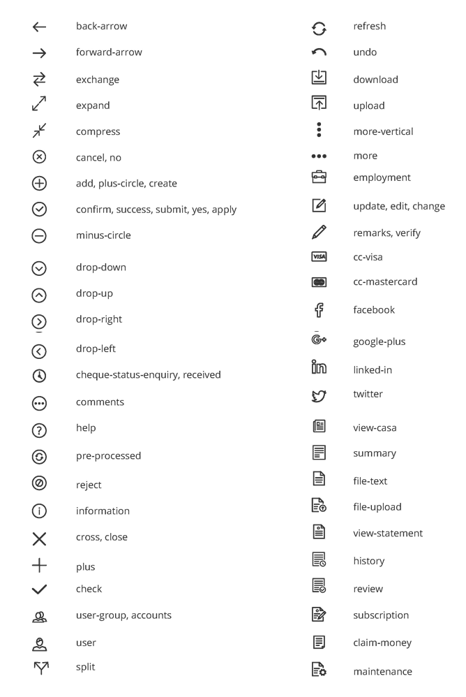
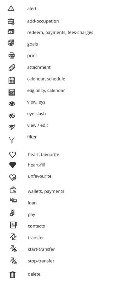
Icons (contd.)
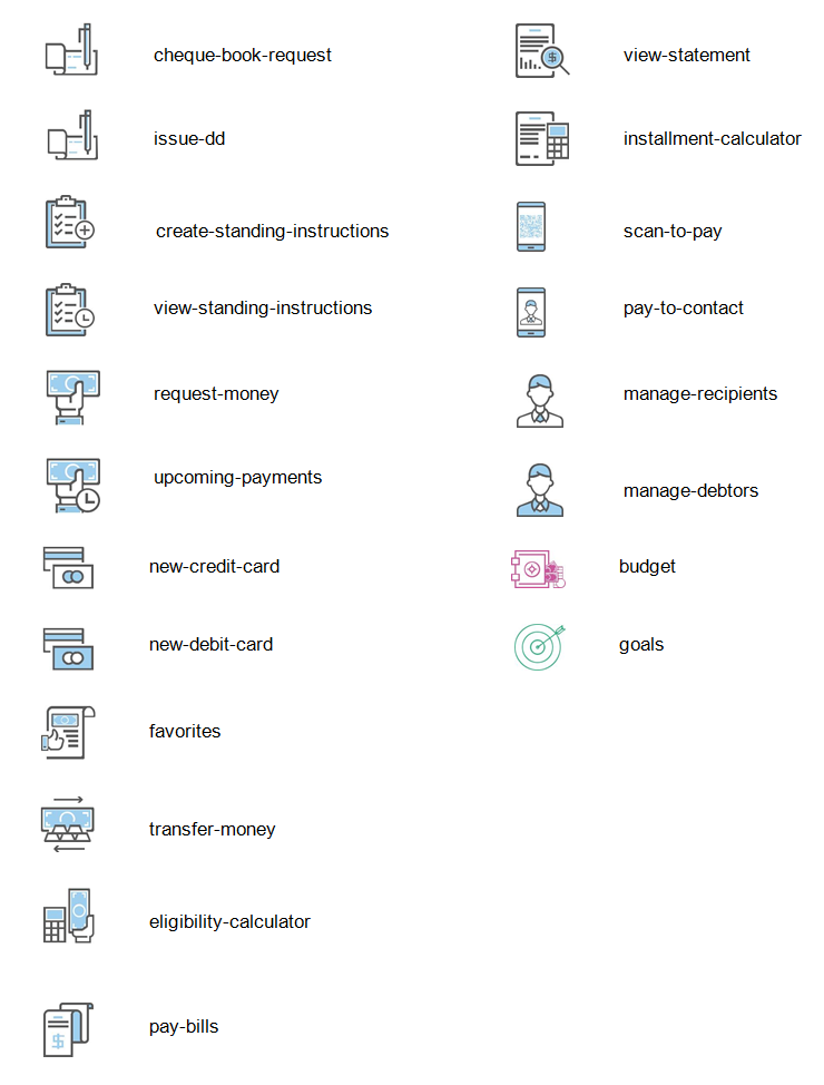
Icons (contd.)
Colored Icons
Colored Icons
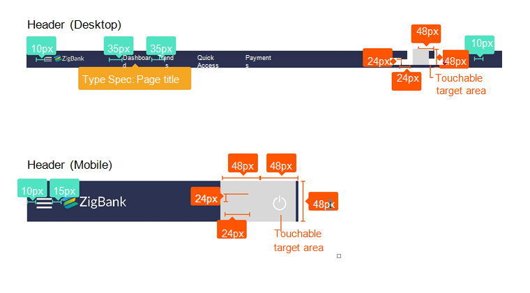
Header & Footer
Breadcrums
Footer (Desktop)

Common Components
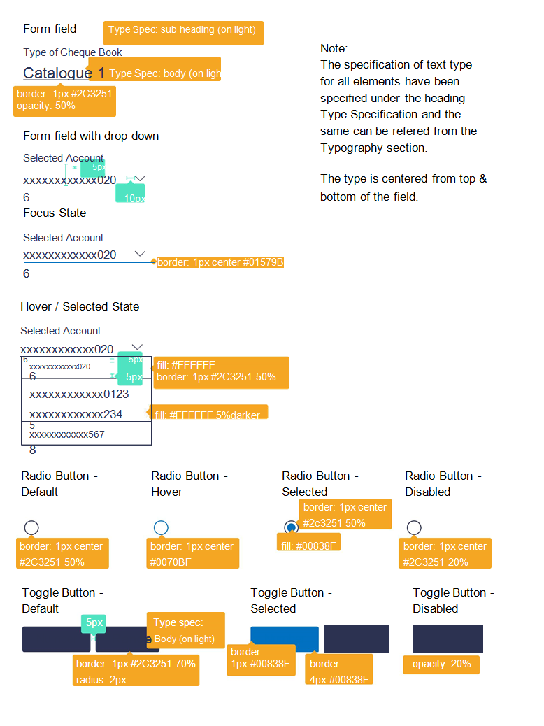
Form Fields, Dropdowns & Button Types
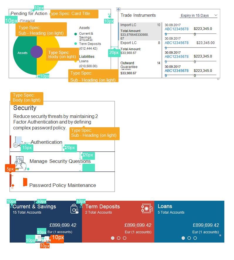
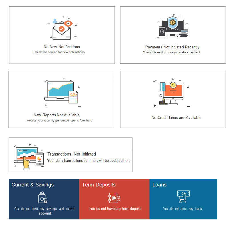
Placeholder Cards / Widgets
Transaction Pages
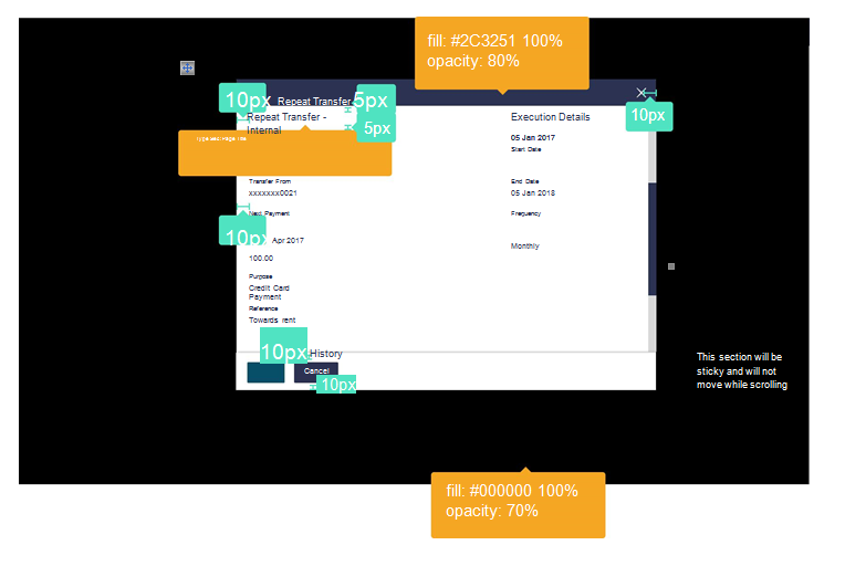
Modal Window
Accordions
Review Page
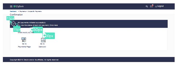
Confirmation Page
Mobile Screens
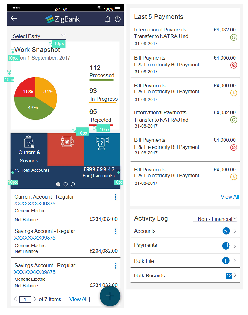
Mobile Cards
Mobile Inside Page
Mobile Overlay