Configuring a Chart

Studio creates a new Chart component based on a set of default values. You can re-configure the defaults with different chart data and chart display options. This is often necessary to change the X and Y-axis settings.

The default Chart component configuration starts with:
  • A vertical Bar chart
  • The base view of the default project data set
  • For the chart metrics, the first 20 available metrics in the view.

    Each metric uses its default aggregation method. The available metrics also include the Record Count system metric, which is selected by default.

  • For the chart group (category axis) and series (color) dimensions, allows end users to select from the first 20 available dimensions in the view.

    By default, the category axis displays the first dimension. The chart is initially displayed with no color dimension selected or trellis dimension selected. You can then select a color dimension and trellis dimension if desired.

To configure a Chart component:

  1. In the Discover page of your project, locate the chart you want to configure, and click the pencil icon to display the Chart Settings panel.
  2. From the Data View list, select a data set view to associate with the chart.
  3. From the Chart Type list, select a chart type.
    • Bar - Bar charts can display multiple metrics at the same time. Bar charts support both group dimensions (category axis) and series (color) dimensions.
    • Line - Line charts can display multiple metrics at the same time. Line charts support both group dimensions (category axis) and series (color) dimensions.
    • Pie - Pie charts display one metric at a time and only support group dimensions (wedge colors). Sunburst charts display multiple metrics and only support group dimensions (ring segments).
    • Scatter - Scatter charts both support X-axis and Y-axis metrics. Only one X-axis and Y-axis metric can be used at a time. Scatter charts support color and detail dimensions.
    • Bar-Line - Bar-Line charts can display multiple bar and line metrics at the same time. Bar-Line charts only support group dimensions (category axis). They do not support series dimensions.
    1. If applicable, select a chart sub-type.
      Charts have the following sub-types:
      • Bar - Bars, Clustered Bars, Stacked Bars, Percentage Stacked Bars.
      • Line - Line, Area, Colored Lines, Stacked Area, Percentage Stacked Area.
      • Pie - Pie, Sunburst.
      • Scatter - Scatter, Grouped Scatter, Bubble.
      • Bar-Line - No subtypes.

      Many sub-types require a Color attribute for rendering, and Bubble charts require a Size attribute.

    The chart type you select determines the subsequent configuration options. Required zones display in the attribute list with a solid outline if they are not configured.

    You can drag configured attributes between zones as long as they are valid for the new location, and any aggregation, sorting, or formatting is preserved as part of the transition. Dragging an attribute over another attribute in a zone will swap them.

  4. Configure and format the X-axis or Slice / Segment size value:
    Pie / Sunburst charts scale all wedges or ring segments based on the configured value.
    1. Type an attribute name or select one from the dropdown to set the attribute to plot on the horizontal axis.
      To remove an attribute, mouseover it and click the X in the corner of the zone. You can change attributes by removing the current selection and adding the new attribute.
    2. For attributes with multiple grouping options, select an option from the dropdown:

      Shows the Format options under X-axis.

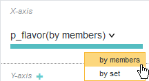
      • by members - Default. Each individual value displays as a mark on the X-axis. Any records that include a value count towards the Y-axis value.
      • by set - Each individual value and each unique combination of values displays as a mark on the X-axis. Any records with the value or with the specified combination of values count towards the Y-axis value.

      For example, a wine with the flavors "Berry" and "Cherry" is included in both the "Berry" and "Cherry" Y-axis totals when displaying flavor by members. If the chart displays flavor by set, then the wine is included in the "Berry", "Cherry", and "Berry, Cherry" Y-axis totals.

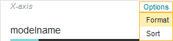
    3. Mouseover the X-axis value and select Options and then Format in the upper right corner:

      Shows the Format options under X-axis.

    4. Specify X-axis Title text, font size, and Labels font size.
  5. If available, configure X-axis sorting:
    1. Mouseover the X-axis zone and select Options and then Sort in the upper right corner.
      Some attribute types do not support sorting configuration.
    2. Configure Ascending or Descending sorting either by Alphabetic/Sequential values for the X-axis attribute, or you can sort based on a selected attribute.
    3. Configure the number of marks to display from the Show up to: ... marks dropdown.
      This value is approximate. Studio adjusts the setting internally to ensure even breakpoints and a reasonable visualization.
    4. Optionally, display any results that don't fit on the first page of the visualization as a consolidated Others mark on the X-axis.
      You can use the pagination controls to see additional pages if you do not display an Others value. This can help you decide whether consolidating the values is worthwhile, or if doing so hides too much useful information.
  6. Configure and format the Y-axis or Rings value(s):

    Pie charts instead use the Color metric for displaying dependent values. See Step 7.

    For Bar-Line charts, repeat these steps for both the Left Y-Axis (Bar) and Right Y-Axis (Line).

    1. Type an attribute name or select one from the dropdown to set the attribute to plot on the vertical axis.
      To remove an attribute, mouseover it and click the X in the corner of the zone. You can change attributes by removing the current selection and adding a new attribute. Some chart types, such as Stacked Bar charts, support multiple Y-axis values.
    2. If required, select an aggregation method from the dropdown:

      Shows aggregation options for the Y-axis.

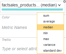
      By default, aggregation is set to sum.
    3. Mouseover the Y-axis zone and click Format in the upper right corner.
    4. Specify Y-axis Title text, font size, and Labels tick mark number and size:
    5. Specify additional Y-axis Scale, Range, Symbol, and Decimal configuration.
      By default, the Y-axis scales linearly. Log (logarithmic) scaling is useful for values with an extreme range of values, where relatively small values may be hard to differentiate from each other when compared to a few much larger values.
  7. Configure and format the Color value.
    1. Select an attribute to plot as colors.
      If you are plotting multiple Y-axis values (for example, plotting manufacturing price and shipping price as a single bar in a stacked Bar chart), the Y-axis values are automatically mapped to the color of the visualization. You cannot assign a separate Color attribute.
    2. Mouseover the Color zone and select Options and then Format in the upper right corner.
    3. Select the color scheme from the Scheme dropdown.
    4. Enable or disable the Legend display using the Show legends check box.
    5. Specify Legend Title text, font size, and Labels font size.
  8. If available, configure Color sorting:
    1. Mouseover the Color zone and select Options and then Sort in the upper right corner.
    2. Configure Ascending or Descending sorting either by Alphabetic/Sequential values for the Color attribute, or you can sort based on a selected attribute.
    3. Optionally, display the final color in the palette as a consolidated Others color.
      Pie charts always include an Others color.
  9. For a Bubble chart, configure and format the Size value.
    This value determines which attribute scales Bubble size. Specifying a Size value for any other type of Scatter chart converts it to a Bubble chart.
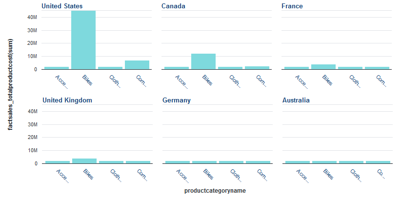
  10. For Bar, Line, and Pie charts, optionally specify a Trellis attribute.

    Specifying a trellis attribute splits the visualization into a set of smaller charts. For example, a Bar chart that plots product cost based on category can be displayed as a Trellis based on region, so that it shows separate charts for data from the United States, Canada, France, etc:


    Stacked bar chart displayed using a trellis for the series dimension

    1. Mouseover the Trellis zone and select Sort in the upper right corner.
    2. Configure Ascending or Descending sorting for the charts either by Alphabetic/Sequential values for the Trellis attribute, or sort based on another attribute.
  11. Expand and configure the Display Settings:
    1. Set the Chart width, in pixels.
    2. Set the Chart height, in pixels.
    3. Enable or disable Show chart title to show or hide title text. If enabled, select Automatic or Custom text to display.
    4. For Bar charts, select between Vertical Bars and Horizontal Bars.
    5. For Sunburst charts, select a Color pattern.
      Note that depending on configured data, the Hierarchical (fan gradient) option may display metric values multiple times in outer rings. For example, using Month as an inner ring and Day of the Week as an outer ring results in all 7 days of the week rendering 12 times (once per month).
    6. For Scatter charts, configure binning behavior:

      With the Automatic option, the chart displays points if there are fewer than 1000 data points, and bins if there are more. You can adjust this threshold in the Maximum number of points to show field.

      You can also configure the number of bins per axis to control how granular the display is.

    7. For Scatter charts, set the Point opacity.
    8. For Scatter charts, enable or disable Show line of best fit and Show coefficient.
      Show line of best fit displays a line that approximates the linear relationship of the plotted points. Show coefficient displays the correlation of data with the approximated line when a user mouses over the line in the chart.
  12. When you are finished, click Save as default state.