1. Navigation
This document provides an overview of the basic template, navigation, common operations that can be performed, and keyboard short cuts available in Oracle Financial Services Lending and Leasing. Since this section details the general options available in the User Interface, some or all the parts of this section are applicable to you as per access provisions & licensing.
The document is organized into below topics:
- Logging In
- Template and Navigation
- Common Operations
- Hot Keys
Note
The application can be best viewed in 1280 x 1024 screen resolution.
1.1 Audience
This document is intended to all Prospective Users who would be working on the application.
1.2 Conventions Used
Term |
Refers to |
The system/application |
Oracle Financial Services Lending and Leasing |
Mnemonic |
The underlined character of the tab or button |
1.3 Logging In
The pre-requisites to log into the system are a valid user ID and a password, defined by the system administrator in Administration > User screen.
You can login to the system using a valid user ID and a password defined by the system administrator, in Administration > User screen. A User ID is disabled automatically by the system if it is inactive for a specified number of days.
When you invoke the application, the Sign In screen is displayed.
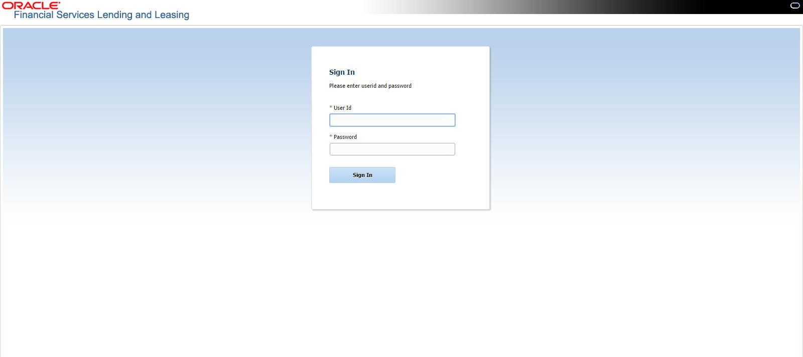
- User ID – Specify a valid User ID.
- Password – Specify a valid password for the specified User ID.
The system accepts the User ID and password in upper case only. After specifying valid credentials, click Sign In to sign into the application.
1.4 Template and Navigation
This section provides a brief input on the template and navigation of the system. Details are grouped into two categories to enable easy understanding. These include:
- Home screen
- Screens
1.4.1 Home Screen
Once you login to the application with valid credentials, the system authenticates the details and displays the Home screen.
The Home screen consists of the following components:
- Header
- Left Pane
- Right Pane/Work Area

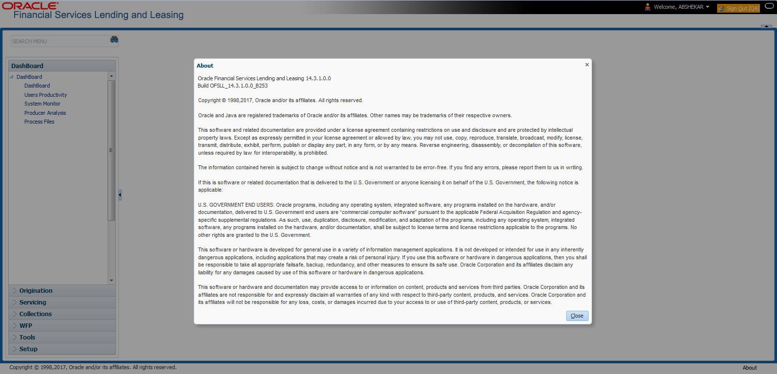
You can view the application version details and copyright information by clicking About link at the right corner of the screen.
Header
In the Header, system displays the following:
- User ID that you have currently logged/Signed in. Click the adjoining drop-down arrow, the system displays the following options:
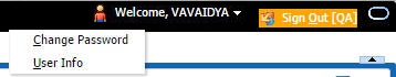
- Change Password – Click to change the current password.

- Change Password – Click to change the current password.
Specify the current password in the Current Password field and a valid password, you wish to maintain as a new password, in the New Password field. Re-enter the password in Confirm Password field and click Submit to change the password.
- User Info – Click to view the current user info.
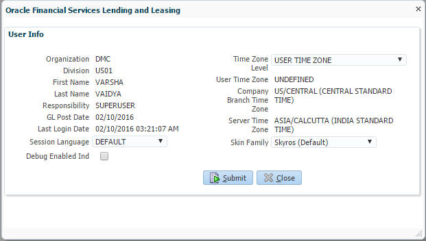
In this screen, apart from viewing the user info, you can also set Session Language, enable error log, and specify the time zone preference.
Session Language – Select a language that you need to set for the session, from the drop-down list.
Debug Enabled Ind – Check this box to enable the debug indicator.
On selection, system records all the debugs into logs files depending on the following two types of system parameters:
System Parameter |
Condition to record debug data |
CMN_DEBUG_METHOD |
If parameter value is 1, then debug data is recorded into a file in Database Server. If parameter value is 4, then debug data is recorded into the table LOG_FILES_HEADER. |
CMN_DEBUG_LEVEL |
If parameter value is greater than 0, only then the debug data is recorded. |
The debug data can be viewed from Dashboard > System Monitor > Database Server Log Files.
You can click on  List Files button to view the list of logged files.

Click on  Show File button to view the selected file contents in the ‘File Content’ section. You can also click
  Download File button to extract a copy of debug details.
Time Zone Level - Select the time zone preference as User/Company Branch/Application Server Time Zone from the adjoining options list.
For more details on time zone selection, refer to Time Zone Preference section of this user manual.
Click Submit to save the changes or Close to close the screen without changes.
- Accessibility – Click the link to view accessibility features of the system.
Refer accessibility document for further details.
- Sign Out – Click the link to sign off from the application. You can also click on
 icon to sign off from the application.
Left Window
In the left pane, system lists and provides drop-down links for various modules available in the product. Click  to expand the Module Master Tabs and
  to collapse them.

To open a screen, navigate to Module Master Tab to which the screen belongs, expand the tabs, and click the screen link you wish to open.
Menu Search in Left Window
In the left window you can make use of the search option to directly search and open the screen that you are familiar with, and avoid multiple steps of navigation from the LHS menu.
The Search box in the LHS facilitates for an intuitive search of required screens in Oracle Financial Services Lending and Leasing. For example, on typing the first letter of the screen, the search box displays a list of all available screens starting with the letter entered in alphabetical order. You can click on the required screen and press ‘Enter’. The screen is displayed in the main window/work area.
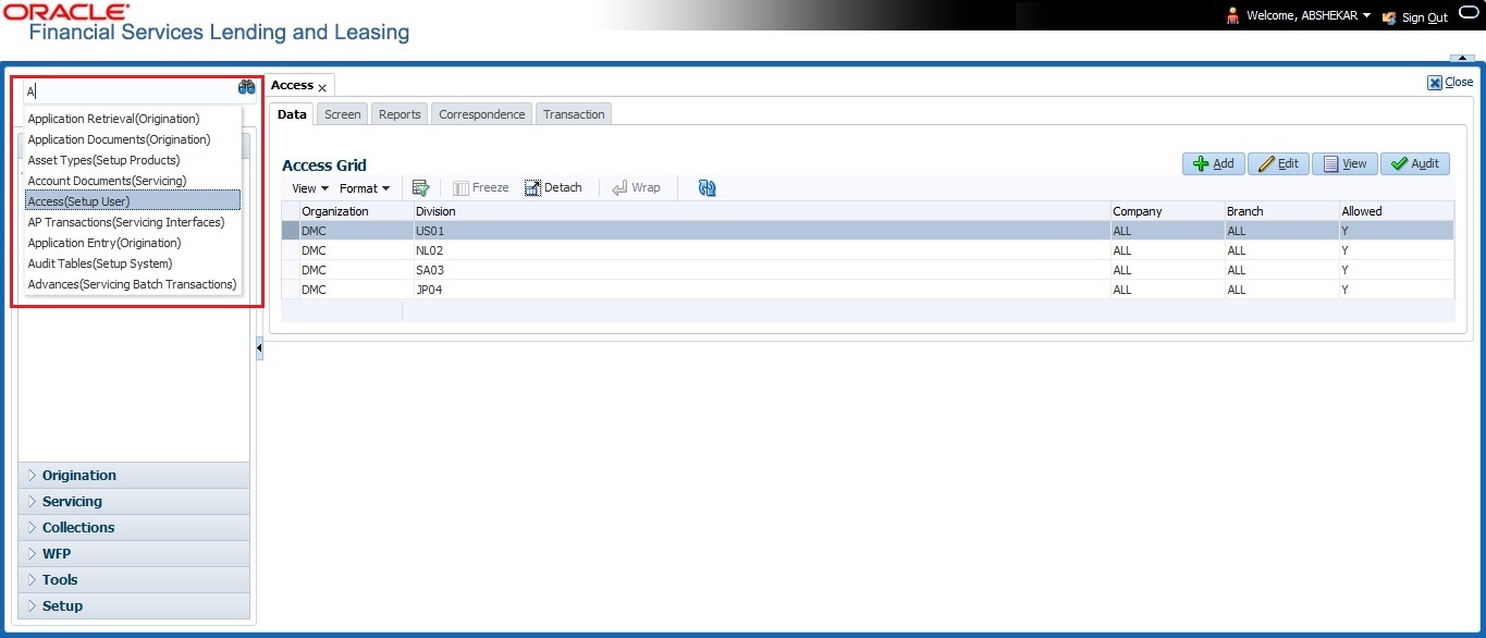
When there are multiple matches with same screen name, you can filter the results through the module from which the screen is accessed which is indicated in angular brackets. For example typing 'VEN' displays the following options for selection - Vendors(Collections), Vendors(Origination), Vendors(Servicing), Vendors(Setup System). For subsequent search, you need to clear the data in the search field.
Right Window
The Right Window can also be termed as work area. When you click the screen link on left pane, system displays the corresponding screen in the right pane.
You can open a maximum of 15 screens at a go. Once the maximum limit is reached, the system displays an error message.

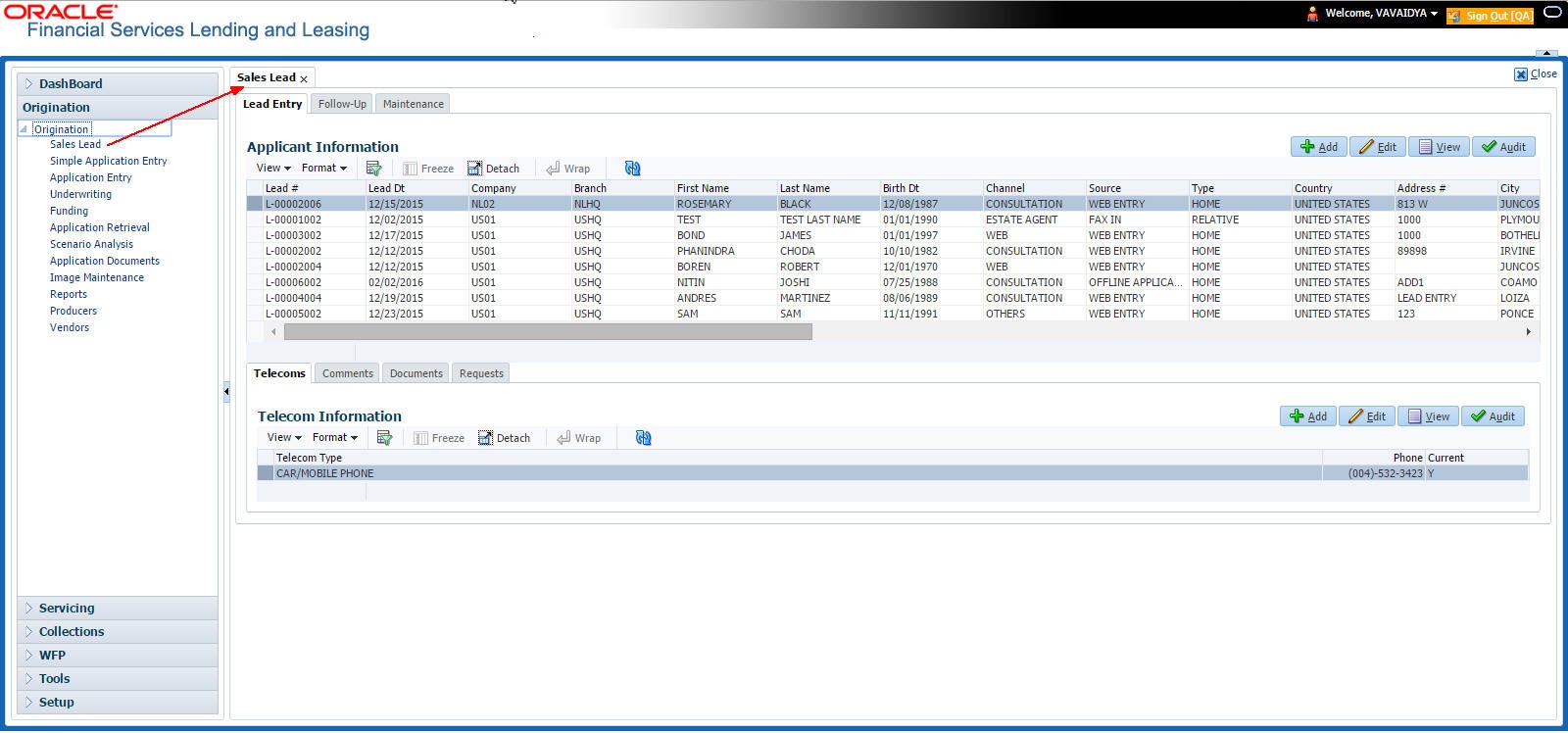
Each active screen is displayed as a tab at the top of right pane, across its width. To view a screen, click the screen tab. You can identify the active screen with its white background. Also, operation on any of the screen will not affect the data in other screens.
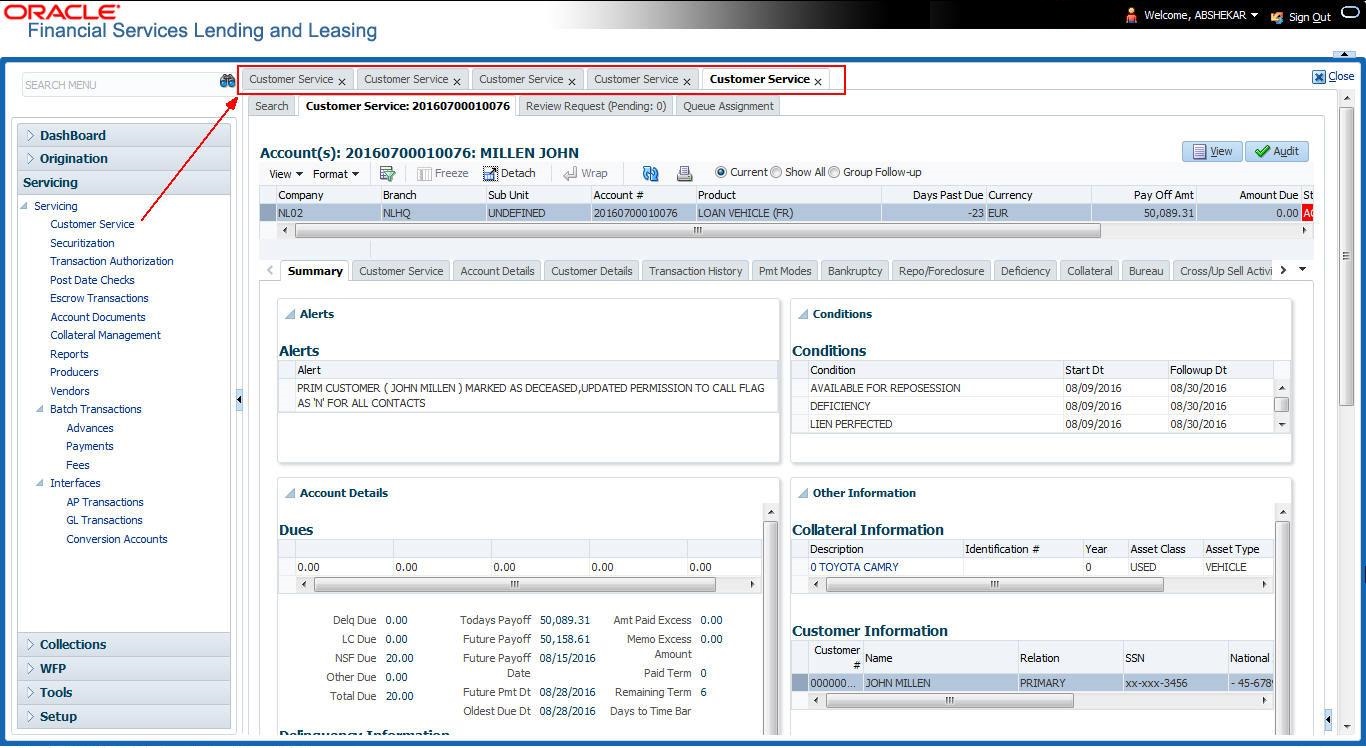
You can also open multiple Accounts at the same time as separate tabs in the right window, provided your system administrator has enabled the option 'Mac_Multi_tab_Ind' = 'Y’ in MENU_ACCESS table.
Having this option enabled you can view and update a maximum of 15 Accounts in parallel tabs and Oracle Financial Services Lending and Leasing renders dynamic data across all the opened tabs.
However, this option is restricted only to the following screens in Servicing Module Master Tab. In the Left Menu of Servicing Module Master Tab, you can open multiple accounts by clicking on the Customer Service link. Each successive click, opens a new Customer Service tab.
Few screens in Servicing and Collections are identical and are linked. Hence, when multi tab option is not enabled, you can open only one screen at a time from the group. A sample of the grouping structure is given below, based on stages of the screens:
Collection:
- Collection
- Bankruptcy
- Repossession
- Deficiency
As per the above listing, you will be able to open only one screen in the corresponding list and need to close the same to open any other screen.
Right Splitter/Action Window
The Right Splitter/Action Window has quick access to search and other options to avoid switching between tabs or navigating into sub tabs periodically. You can access the Right Splitter/Action Window while working on an Application or Customer Service screens. You can click  and
and  to toggle the view of Right Splitter/Action Window.
Origination Screens
In Origination > Application screens, you can use the Right Splitter/Action Window to do the following:
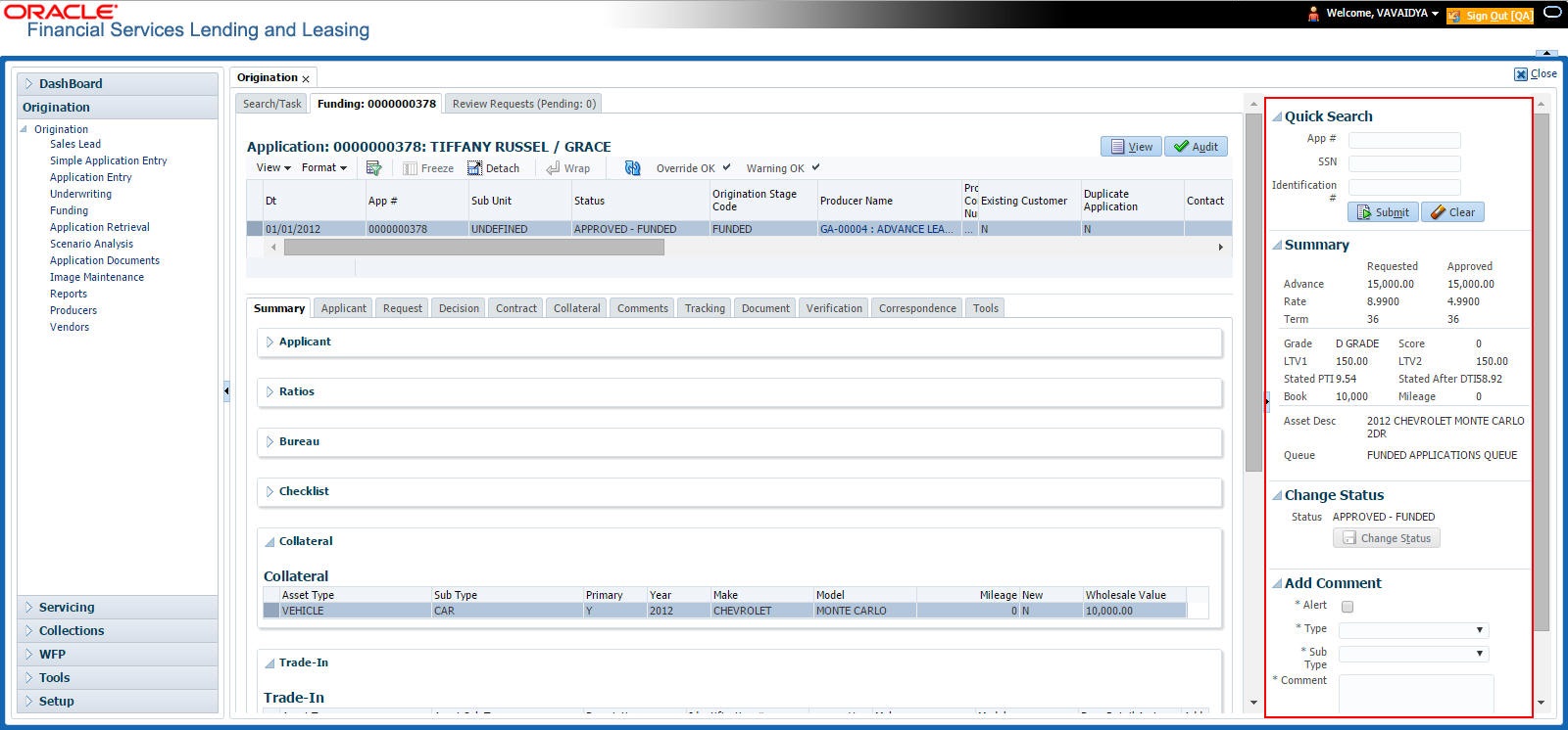
- Use Quick Search to search for an application based on application number, last 4 digits of SSN (SSN of the primary applicant) or identification number. If multiple applications or accounts are found during ‘Identification #’ search, the system displays an error message as “Multiple Matches found for the Identification #, Please use normal Search”.
- Summary section displays critical information that has to be referred repeatedly during origination like – DTI, PTI, Book Value, Grade, FICO Score, Approved Advance, Rate and Term.
- Use Change Status section to change the application status to next level. If the application edit status is restricted, then the ‘Change Status’ will be read-only.
- Use Add Comment section to post an alert or comment during Underwriting and Funding stages.
For detailed information on the above options, refer to respective sections in the document.
Servicing and Collection Screens
In Servicing and Collection > Customer Service screens, you can use the Right Splitter/Action Window to do the following:

- Use Quick Search to search for an account based on account number, or customer Id, or last 4 digits of SSN (SSN of the primary applicant) or identification number. If multiple applications or accounts are found during ‘Identification #’ search, the system displays an error message as “Multiple Matches found for the Identification #, Please use normal Search”. You can also select the Queue Condition and Auto Run options during search. Clicking ‘Next Account’ button opens the subsequent account listed in search and clicking ‘Filtered Account’ opens the subsequent account fetched during a queue search and listed in Queue Assignment section.
- Use Add Comment section to post an alert or comment based on Type and Sub Type.
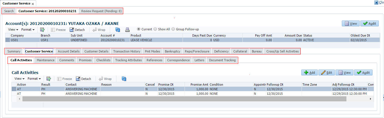
- Use Add Call Activity section to post all types of call activities including promise to pay, account conditions and so on, irrespective of the screen you are working on. This is similar to the option available in ‘Call Activities sub tab’ under Customer Service tab.
For detailed information on the above options, refer to respective sections in the document.
The height of Header and width of the Left and Right Panes do not change, with resizing of application screen.
The system facilitates toggling Header and Left and Right Panes of the home screen to increase the visible area of the screens. Click  to toggle upper pane and to toggle left pane. To un-toggle click
  and respectively.
1.4.1.1 Time Zone Preference
You can select any of the following three time zones from the User Info screen:
- Application Server Time Zone
- Company Branch Time Zone
- User Time Zone
The time zones set up at each of these levels are displayed in the user info screen. However, data is always stored in the application server time zone and based on the user preference of time zone, the display time would be User or Company or Application Server time zone. Any time zone related changes done at UI does not impact the other time bound activities which are dependant on database time.
Application Server Time Zone (Server Time Zone)
The Application Server Time Zone by default is the Production Server Time Zone. Selecting this time zone will have all date and time fields defined as per the time stored in application server. There is no offset in time if both storage (database server) and display (application server) are in the same time zone.
Company Branch Time Zone (Organization - Division Time Zone)
This is the Company time zone and is setup at the organization - division definition level. The various divisions defined under an organization can be set up with different time zones depending on geographical locations. This time can be modified as per requirement.
To modify the Company Branch Time Zone:
- Navigate to Setup > Administration > User > Organization and select the company or division listed under 'Division Definition'.
- In the Display Formats tab, select Time Zone and click ‘Edit’.
- In the Format field, select the required time zone from the adjoining options list and click ‘Save’.
If 'Company Branch Time Zone' is selected as the time zone in User Info screen, then on save, all the time and date fields are automatically updated with the time zone of the company branch.
User Time Zone
User Time Zone or User Preference Time Zone can be set up at the User Level in the User Definition screen. Various Users under same divisions defined under an organization can be set up with different time zones depending on geographical locations.
To modify the User Time Zone:
- Navigate to Setup > Administration > User > Users.
- Select the required User record listed in “User Definition” section and click Edit.
- In the Time Zone field, select the required time zone from the adjoining options list and click Save.
If 'User Time Zone' is selected as the time zone in User Info screen, then on save, all the time and date fields are automatically updated with the current updated time.
1.4.2 Screens
Details in few main screens are grouped into different sections. These sections are displayed as tabs, horizontally within the screen. In turn, details in few of these tabs are again grouped horizontally. The details are displayed when you click the tab under which they are grouped. As similar to the main screen tabs, you can identify the active tab with its white background.
For example, Customer Service main screen has four main tabs. When you click on ‘Customer Service’ tab, the corresponding tabs are displayed.
You can click  to view the hidden tabs, if any.
1.5 Common Operations
Some of the operations are common to most of the screens. These are grouped into three categories, based on their features.
- Basic Operations
- Basic Actions
- Personalization Options
1.5.1 Basic Operations
All the screens contain buttons to perform all or few of the basic operations. The four basic operations available are:
- Add
- Edit
- View
- Audit

When you click any of the operation tabs, system displays the corresponding records inline, below the respective setup tables.
The table below gives a snapshot of them:
Basic Operation |
Description |
Add |
Click to add a new record. When you click Add, the system displays a new record enabling you to specify the required data. It is mandatory to specify details for the fields marked with ‘*’ symbol. |
Edit |
Click to edit an existing record. Select the record you want to edit and click ‘Edit’. The system displays an existing record in editable mode. Edit the required details. |
View |
Click to view an existing record. Select the record you want to view and click ‘View’. The system displays the record details in display mode. |
Audit |
Click to view audit info. If an audit is set for a field, then the system tracks the changes for that field. Select the record for which you want to view the audit info and click ‘Audit’. The system displays the details tracked for that field. |
Close |
Click to close a screen or a record. When you try to close an unsaved, modified record, then the system alerts you with an error message. You can click ‘Yes’ to continue and ‘No’ to save the record. |
1.5.2 Basic Actions
Most of the screens contain buttons to perform all or few of the basic actions.
All or few of these actions are enabled when you select any of the Basic Operations.

The table below gives a snapshot of them:
Basic Actions |
Description |
Save And Add |
Click to save and add a new record. This button is displayed when you click ‘Add’ button. |
Save and Stay |
Click to save and remain in the same page. This button is displayed when you click 'Add/Edit' button. |
Save And Return |
Click to save and return to main screen. This button is displayed when you click ‘Add’ or ‘Edit’ buttons. |
Return |
Click to return to main screen without modifications. This button is displayed when you click ‘Add’, ‘Edit’ or ‘View’ buttons. |
The Payment maintenance screens consist of the following actions.

The table below gives a snapshot of them:
Basic Actions |
Description |
Post and Stay |
Click to post the transaction and remain in the same section. This button is displayed when you click 'Modify Payment/Modify Payment Transaction' button. |
Post and Return |
Click to save and return to main section. This button is displayed when you click ‘Modify Payment/Modify Payment Transaction’ buttons. |
Return |
Click to return to main section without modifications. This button is displayed when you click ‘Modify Payment/Modify Payment Transaction’ buttons. |
The summary screens consist of the following navigations. The table below gives a snapshot of them:
Basic Actions |
Description |

|
Click to navigate to the first record. |

|
Click to navigate to the previous record. |

|
Click to navigate to the next record. |

|
Click to navigate the last record. |
Along with the basic actions, the following buttons are available for specific actions. The table below gives a snapshot of them:
Basic Actions |
Description |
|
Show File - Click to view the details of selected file. |
|
List Files - Click to generate and view the list of files maintained in the system. |
|
Download File - Click to download the details of selected data. |
1.5.3 Personalization Options
You can personalize the data displayed in setup tables. Once personalized, system saves the settings for that User ID until next personalization.

The table below gives a snapshot of them:
Options |
Description |
View |
Click to personalize your view. The drop-down list provides the following options of customization:
Additionally, the drop-down list provides selection of options adjoining ‘View’.
|
Format |
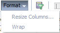
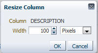
Click to resize columns or wrap a data in the table cells.
Select the column you need to resize and select Resize Columns option from the Format drop-down list.
Specify the Width and unit for the selected column. Click OK to apply changes and Cancel to revert. |
Query by Example |
Click to query for the data by an example. When this option is selected, the system displays an empty row above column heads. You can specify all or any of the details of the record you wish to query.
|
Freeze |
Select the column at which you need to freeze the table and click Freeze. Function is similar to the freeze option in MS excel. |
Detach |
Click to detach the setup table from the screen. An example of the detached table is provided below. |
Wrap |
Select the column in which the data needs to be wrapped and click Wrap.
|

|
Click to refresh the data in the table. |
View Last |
For usability and performance, some of the data intensive screens have ‘View Last’ option to sort the volume of data being displayed on screen based on elapsed days.
You can select the ‘View Last’ option as 1 Day / 1 Week / 1 Month / By Date. When ‘By Date’ is selected you can specify a date range (within 3 months) in ‘Start Dt’ and ‘End Dt’ fields using the adjoining calendar and clicking ‘Search’. |


Print option in Customer Service screen
The Print button  option in Customer Service/Collection screen facilitates you to print the contents on the screen as is without scroll bars. This button is available along with other options in the Action block. Clicking on this provides a browser print functionality and a new tab is opened where the print content is displayed.
Detach

Click ‘Add’, ‘Edit’ or ‘View’ button to open a new screen in expanded mode with details.
Drop-down List
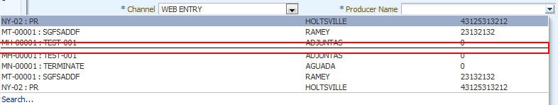
The system provides an option to select the required data from LOV, for few fields. You can either select the record from list or enter first alphabet of the value you want. When you provide the alphabet, system limits the selection to the values starting with the specified alphabet. These lists are grouped into two types:
- Drop-down list – Provides the selection option. You can either select a record from the list or enter first alphabet of the required value.
- Combo drop-down list – The LOV contains huge data and provides both selection and search option. These drop-down arrows are smaller in size, when compared to normal drop-down arrows, thus enabling easy identification.

Click the arrow button available before ‘Search’ to toggle the search options.
Buttons/Menu |
Do this |
Basic |
Click ‘Basic’ for normal search. |
Advanced |
Click ‘Advanced’ for advanced search. In this mode, you can select the search option from drop-down list adjoining the search criteria. Selected record will be highlighted (Hover to select). |
Match |
Select ‘All’ to display results exactly matching the specified characters. Select ‘Any’ to display results matching any of the specified characters. |
Search |
Click to search for values based on the specified search criteria. The search results are displayed below with the details in respective columns. |
Reset |
Click to reset the search criteria. |
Add Fields |
Click to add additional fields to search criteria. |
The search criteria are provided below the ‘Match’ field. These criteria vary based on the Field for which the search is executed.
Also, the system remembers your recent search options and demarcates them from the actual ones.
Comments
In all the user input screens wherever comments are accepted, the system allows an input of 4000 characters of information in the comment(s) field.
1.6 Keyboard Compatibility
The system facilitates keyboard compatibility. You can perform most of your tasks using keyboard short cuts also termed as ‘Hot Keys’. These hot keys are single keyboards or a combination of keyboards. The available options are listed below:
- Shift + Alt + mnemonic to activate buttons in the screen. For example, to open ‘Accessibility’ screen, press ‘Shift + Alt + y’.
- Tab for forward navigation in the application. Shift + Tab for backward navigation in the application. When the required link/tab/button/field is highlighted, press enter on the keyboard to edit.
- Space bar to check or uncheck ‘Check Box’.
- Arrow Keys to hover within the drop-down list.
1.6.1 Keyboard Compatibility
The application is made compatible with keyboard only-operations. However, there is a change in key combination based on the browser on which the application is running.
Browser |
Operating System |
Key Combination |
Action |
Google Chrome |
Linux |
Alt + mnemonic |
Click |
Google Chrome |
Mac OS X |
Control + Option + mnemonic |
Click |
Google Chrome |
Windows |
Alt +mnemonic |
Click |
Mozilla Firefox |
Linux |
Alt + Shift + mnemonic |
Click |
Mozilla Firefox |
Mac OS X |
Control + mnemonic |
Click |
Mozilla Firefox |
Windows |
Alt + Shift + mnemonic |
Click |
Microsoft Internet Explorer 7 |
Windows |
Alt + mnemonic |
Set focus |
Microsoft Internet Explorer 8 |
Windows |
Alt + mnemonic |
Click or set focus |
Apple Safari |
Windows |
Alt + mnemonic |
Click |
Apple Safari |
Mac OS X |
Control + Option + mnemonic |
Click |
Also, one can use the following keyboard shortcuts in order to increase or decrease the zoom level.
Shortcut |
Action |
Ctrl++ |
To increase zoom level. |
Ctrl+- |
To decrease zoom level. |
Ctrl+0 |
To set zoom level to default level. |
1.7 Tool Tips
The system is facilitated with tool tip option. When the cursor is moved to any of the field in the screen, a popup is displayed with a tip on the action to be performed.
1.8 Accessibility
1.8.1 Understanding Accessibility
Accessibility is making the application usable for multiple user groups, which includes users with physical challenges. One of the most important reasons to make the application accessible is to provide them the opportunity to work. The four main categories of disabilities are visual, hearing, mobility and cognitive.
A person with disability might encounter one or more barriers that can be eliminated or minimized by making the electronic information user-friendly and approachable.
1.8.2 Application Accessibility Preferences
Oracle Financial Services Lending and Leasing is facilitated with the feature of Accessibility to make the application more usable for the people who are differently abled.
By default, the following accessibility options are provided and there is no need to define special accessibility preference in the application:
- The application user interface contents are readily accessible for all types of users without the need to select special accessibility modes.
- The components within the user interface are optimized for use with a screen reader by default.
- The contents are zoomable by default, eliminating the need for an application large fonts mode.
- The user interface components auto-detect if operating system (OS) is set to high contrast mode and automatically render content that is compatible with OS high contrast, eliminating the need for an application high contrast mode.
Note that, Oracle Financial Services Lending and Leasing application user interface is built on Oracle Application Development Framework (ADF) version and the default accessibility feature supported by ADF are made available. For additional information, refer to ADF documentation on accessibility preferences.
1.8.3 Documentation Accessibility Preferences
Apart from assigning the logical sequence and organizing topics, the following techniques are used to enhance the accessibility of documentation.
- Addition of text equivalent to all graphics
- Usage of standard fonts and avoiding shadow or reversed text
- Usage of strong foreground and background color contrast
- Color usages as per Oracle Accessibility guidelines have been ensured
- Usage of styles and formatting elements
- Documentation in simple language to ensure easy understanding
- Including accurate and effective navigational features, such as cross-reference, tables of content and bookmarks as appropriate