| Oracle® Retail Store Operations Cloud Service User Guide Release 17.0 E88477-05 |
|

 Previous |
 Next |
| Oracle® Retail Store Operations Cloud Service User Guide Release 17.0 E88477-05 |
|
Previous |
Next |
This chapter describes the method by which you log in, and log out, and navigate. It also describes the common User Interface (UI) controls that are used throughout the mobile UI.
Features:
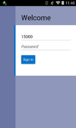
Upon launching the mobile UI application, the welcome screen is displayed. The first time a user logs into the system, if logon is successful, the system will log in to the user's first assigned store. The system will remember the store the user was last logged into and log in to that store until the store is changed. Upon successful login, the system will navigate you to the Open Transactions dialog.
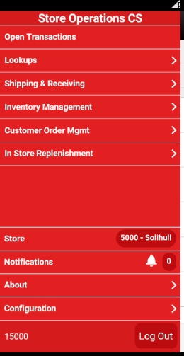
The mobile drawer is displayed as the menu panel on the left side of the screen upon tapping the drawer (hamburger stack which looks like three horizontal lines in the upper left-hand corner of the application). From the menu/drawer, you have access to various functionality of the application.
The change stores function is available from the drawer/menu by tapping the store option. The user is directed to the store list screen with an option to change stores.
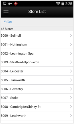
The store list displays all of the stores that the user is authorized for. If needed, the user can search for a store by either the store ID or store name. The store list is narrowed down based upon the search. Selecting a store will display the new store in the store field of the drawer/menu as well as in the footer on Open Transactions. The user is then officially logged in to the new store. All data and transactions will be for the newly selected store. Every time the user logs in to the system, it will be for the store selected until a new store is selected. The system remembers/saves the store for the user.
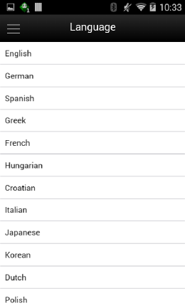
The language screen is displayed by selecting the Language menu option within Configurations from the drawer/menu. Initially when user is logging into the mobile for the first time ever it will use the language of the device. The Language screen will display with a list of the available languages supported in the system. User selects a language and the language will change in the application to the language selected and user will navigate to the Open Transactions. That language will remain for the user (saved on the user) until the user changes languages. The locale of the device (date format, currency format, and so on) will remain that of the device.
The Scan type is a found in the mode bar. It is used whenever an item can be entered or scanned within a Scan Bar. The scan type allows you to tell the system what type of item or barcode is being entered. At this time there is only one value, of Auto for the scan type and therefore the scan type is disabled as there is nothing to change. Auto assumes that you can enter or scan any of the supported barcode types such as SKU, type 2, UPC E, GS1, and so on, and the system will parse through the various algorithms to derive the item.
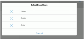
The Scan mode is a found in the mode bar. It is used whenever an item can be entered or scanned and the quantity is captured. The scan mode defines if the quantity from the barcode should be:
Added to the existing item quantity, indicated by Increase with a plus icon.
Removed from the exiting quantity indicated by reduce with a minus sign.
No change to the quantity, which is review mode represented by a barcode.
The default scan mode is set to Increase.
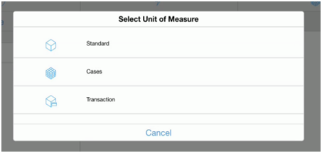
The Unit of Measure selection is a found in the mode bar. It is used whenever a quantity is captured. The unit of measure defines if the quantity displayed is going to be represented in the item's standard unit of measure, cases, or transaction unit of measure. When switching the Unit of Measure, the quantity on the screen will convert to that unit of measure. The default unit of measure will be set based upon the system configuration Default Unit of Measure. Transaction Unit of Measure will only be used where applicable which is in Customer Orders as well as Shipping and Receiving for a Customer Order. If Transaction UOM is selected in dialogs where it is not applicable, the system will use the Standard Unit of Measure even though the Transaction UOM may be selected.
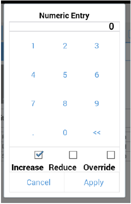
The Numeric Entry popup is used whenever there is an editable numeric field such as an item quantity field. The quantity that gets entered into the numeric entry popup will increase, reduce, or override the existing quantity on the screen. The mode on the Numeric Entry will be defaulted per the Scan Mode that is in the header bar (see "Scan Mode").
Examples:
Qty = 15, enter in 3 increase, Qty = 18
There is a quantity of 15 on the UI. In the popup, the user enters a quantity of three, selects the increase option, and apply. The new quantity is 18.
Qty = 15, enter in 3 reduce, Qty = 12
There is a quantity of 15. In the popup, the user enters a quantity of three, selects the reduce option, and apply. The new quantity is 12.
Qty = 15, enter in 3 override, Qty = 3
There is a quantity of 15. In the popup, the user enters a quantity of three, selects override, and apply. The new quantity is three.
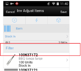
The Filter bar is used to narrow down a list of things such as items, containers, child stock counts, and so on.
You can tap and type into the filter bar, or tap and scan into a filter bar. By default, the Filter bar will be displayed on the top of the list. When scrolling down in the list, the filter bar disappears and it reappears when scrolling back up in the list. The criteria that a user can filter on will be unique per functional area. For example, inventory adjustments the user can filter on Item ID, Item Description, reason code, and UOM. The search is not case sensitive. The filter can be cleared out to return the full list. The filter will retain the entered criteria until leaving the screen in which it will be cleared out.
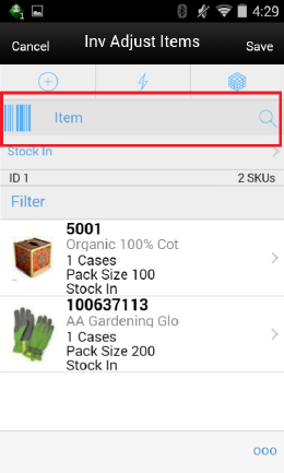
The Scan bar is at the top of the transaction lists, Item Lists, other lists such as Child Count and Container Lists, and Item Detail screens. It will be anywhere an item or some other attribute can be entered or scanned to be viewed or edited on a transaction.
This bar allows for one defined attribute to be scanned and that attribute will be stated in the text of the bar. For example: Item, Container or Customer Order ID.
In the Transaction List screens, the Scan bar will further filter or funnel down the list of transactions when doing a scan. The scanned attribute will be added in addition to the existing search criteria. It will appear in the search criteria, eye glasses field.
In other areas such as lists, item lists, container lists, as well as Item Detail, and soon, the scan bar will go to the details for what was scanned. Quantity may be updated and the item may be added to the transaction depending on functionality.
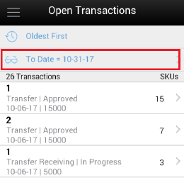
The Search Criteria field is represented by an eye glasses icon in the header of the screen. Search criteria will be found on all transaction list screens, such as Inv Adjust List shown in this figure. Criteria will be listed. If there is more than one criteria, they will be separated by a pipe symbol. Initially when entering the dialog, the default search criteria for the functional area will be displayed. For example: in inventory adjustments it would show: Status = In Progress. If there is no default search criteria, the eye glasses will be displayed and the words 'Search Criteria' will be listed.
Tapping the Search Criteria field, eye glasses, will navigate to the Search Criteria screen to select and or change criteria to search with. The search criteria field gets updated with the newly selected search criteria fields from the Search Criteria screen. When leaving the dialog, the search criteria will be reset back to the default search criteria.
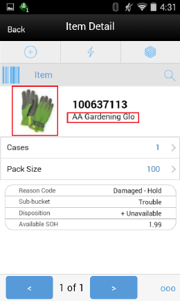
The item image is displayed throughout the application wherever an item is displayed. The item image will be displayed next to the Item ID and Item Description in all applicable screens. Each functional area has a parameter called Display Item Image. If it is set to 'Yes', the image will be displayed in that functional dialog. If it is set to No, the image will not be displayed.
The Item Description will display with the first line displaying the short or long description based upon as system configuration. The second line will display the diffs, diff1, diff2, diff3, diff4. If there are no diffs for the item, the second line will be blank. The second line is also displayed per a system configuration.
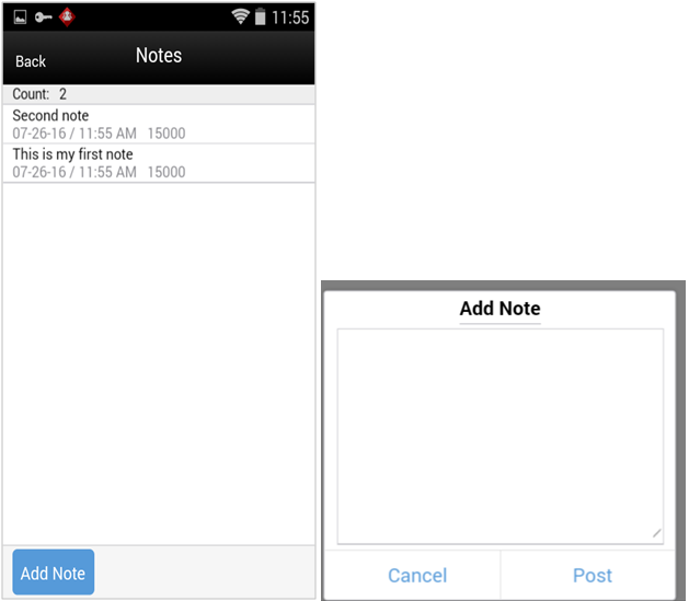
The Notes function is used to capture one or more notes about the transaction. It also allows you to view history or a trail of notes for a transaction. It is an optional process. The notes feature will be accessed from the footer menu within a transaction using the Notes menu option. Notes is available from within all transactions.
To add a note, select the Add Note button. The Add Note popup displays. Enter the note and then select post. The note will be posted to the top of the list of notes in the Notes dialog. All notes will be listed in read-only mode with the user who created them and the creation date. Notes will always be available and the user will always be able to add notes regardless of the transaction status. The user must have Create Notes permission to add notes.
Within the footer menu (ellipsis) on most Item Detail screens will be options for reset, remove, and restore. The Remove and restore are also displayed on most list of items screens, that is, Inv Adjust Items.
Reset Item will take all changes that have been made during the session and "undo" them back to the way the item was prior to entering the session. This option is only available for items that were added previous to the current session and only applicable to items where updates can be made to the item.
Remove item will allow for the removal of the item from the transaction. Once selecting Remove the item will remain on the transaction, however it will be grayed out/disabled and changes cannot be made to the item. The item will remain on the transaction until it is saved/completed, which at that time the item will be deleted from the transaction.
Once an item has been marked for removal a restore option will be available. Restore item allows for an item that is marked for removal to be unmarked. It will no longer be grayed out and the user will be able to edit the item where applicable.