| Oracle® Retail Enterprise Inventory Cloud Service User Guide Release 19.3 F44222-02 |
|

 Previous |
 Next |
| Oracle® Retail Enterprise Inventory Cloud Service User Guide Release 19.3 F44222-02 |
|
Previous |
Next |
This chapter describes the method by which you log in, and log out, and the menu and how to navigate. It also describes the common User Interface (UI) controls that are used throughout the desktop application.
Features:
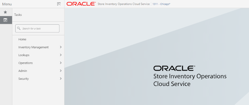
Upon launching the application, the welcome screen is displayed. The first time you log into the system, if the logon is successful, the system will log in to your first assigned store. The system will remember the store you last logged into and log in to that store automatically until you change the store. Upon successful login, the system navigates to the main page with the menu displayed.
The menu panel on the left side of the screen is displayed upon tapping the drawer (hamburger stack which looks like three horizontal lines in the upper left-hand corner of the application). The tasks/menu options are displayed. From the menu there are sub-menus which give you access to various functionality of the application. Tasks can also be searched and the user will be taken into the dialog that was searched.
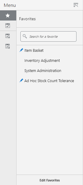
A favorite is a way of creating a shortcut for a task/menu that the user frequents often. A user's favorites are accessed by selecting the Favorites (star) option. The system will list all of the favorites. Selecting a favorite will navigate into that dialog. The user can also search for a favorite and select the searched favorite and navigate into the dialog.
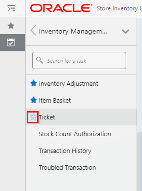
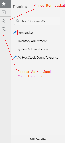
A favorite c an be added by hovering over the task menu option. The unselected star will appear. Selecting the star will mark that task as a favorite and it will appear in the favorites list. Unselecting the star will remove the task from the favorites list. In the screenshot above you can see that Inventory Adjustment and Item Basket are already favorites. The user has hovered over Ticket and can select that star to add Ticket to the favorites.
A favorite can be pinned, as you can see by the 'pin' icon (Item Basket and Ad Hoc Stock Count Tolerance have pins). A favorite that is pinned will appear as its own menu option below the tasks. To pin a favorite you hover over the favorite and the pin icon will appear and it can be selected. To unpin a favorite you unselect the pin.
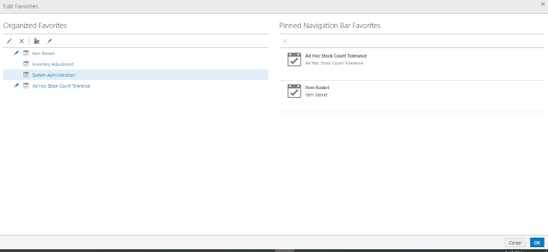
The Edit Favorites screen is accessed by selecting the Edit Favorites option from the bottom of the favorites list.
On the screen the user can:
Rename a Favorite - it will only rename the item in the favorites list not in the task list.
Reorder the Favorites
Remove a Favorite
Pin and Unpin Favorites
Create folders to group Favorites
Reorder Pins
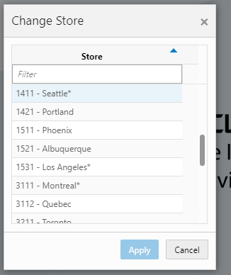
The Change Store dialog is available two ways. One, it is accessed by selecting the store in the upper right hand corner. Secondly, it is accessed by selecting Change Store from the menu found in the upper right hand corner labeled with your name.
Change Store displays all of the stores that you are authorized for. If needed, filter down the list by entering any characters from the store ID or store name. Selecting a store and choosing Apply will display the new store in the store field in the upper right hand corner of the application. You are then officially logged in to the new store. All data and transactions will be for the newly selected store. Every time you log in to the system, it will be for the store selected until a new store is selected. The system remembers/saves the store for you.
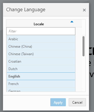
The Change Language screen is displayed by selecting the Change Language menu option within the menu found in the upper right hand corner labeled with your name. The screen will display with a list of the available languages supported in the system. Select a language and the language will change in the application to the language selected and you will navigate back to the main screen. That language will remain until you change language. The locale of the device (date format, currency format, and so on) will remain that of the browser.
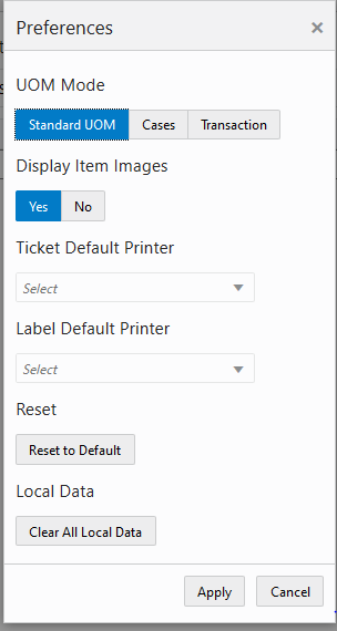
The Preferences menu option is located within the menu found in the upper right hand corner labeled with your name. The Preferences menu contains option such as the UOM mode, display item images, Ticket default printer and Label default printer.
The ticket and label printer set as default here for the respective type is used in the application and shown as default printer.
When changing preferences, the selection will be applicable immediately after applying. The current preference settings will remain until you choose a new setting, Clear All Local Data, or Reset to Default. It does not reset automatically upon re-logging in.
UOM Mode enables you to set the UOM that would be used across the application for that session. The UOM will not be editable on the line item level. When you log in, the default UOM setting would be the UOM that is defined in the Default UOM system configuration and you can change it subsequently.
Display Item Images will enable you to switch on and off item image display in the entire application. This preference setting works in addition to the system configurations which control image display within each functional dialog, Display Item Image for <functional area> -Operations. So for example, if the system setting Display Item Image for <functional area> -Operations is set to 'Yes', this means that Inventory Adjustments have images enabled at a system level. If you choose you can turn on or off the images via the display item image preference. If the system setting for the functional area is set to 'No', then the preference would not allow for images to be displayed in that functional area.
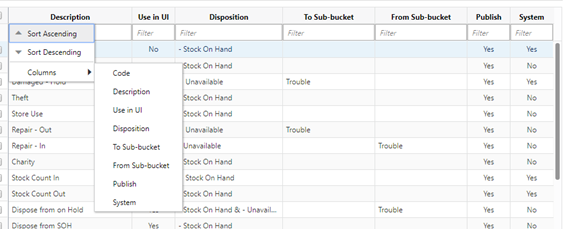
Grid View can be configured by right clicking on the menu header of any grid / table. Sorting can be done in ascending or descending order for that column by selecting the option from the menu. Sorting can also take place just by clicking on the menu header. You can configure what columns to display or hide from within the menu. In addition columns can be made smaller / larger as well as moved by dragging them. These configurations are per user and device and are remembered forever.
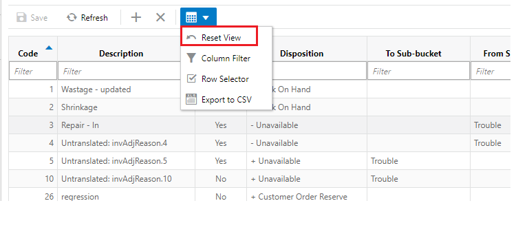
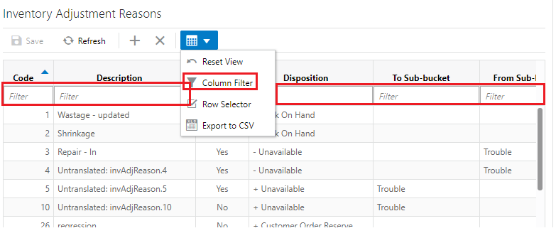
Grid View can be reset back to the default by selecting the Reset View option from the Grid View menu on the header menu.
The filter option is represented by a funnel icon located in the Grid View menu in the header of buttons. The filter is at the top of all lists. When the funnel is selected there will be a row below the column headers in the list that will allow for entry to filter/narrow down the list. When the funnel is unselected then the row below the header for filtering will not be present. The default when viewing a list is for the funnel to be active.
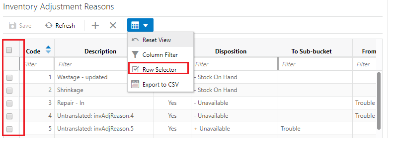
Most lists have a Row Selector menu option in the grid view menu on the header of buttons. By selecting the Row Selector option icon, the system will display/enable the check box next to each record in the list allowing you to select multiple records. Being able to multi-select allows you to perform a function to more than one record at a time, such as deleting more than one record at the time. Not all lists will have a check box option, because doing a multi-select is not applicable in all areas of the application. The default for list screens is to have the check box not displayed.
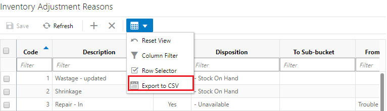
Export to CSV is in the Grid View menu. Selecting this option will export the results from the grid to a CSV file (spreadsheet).
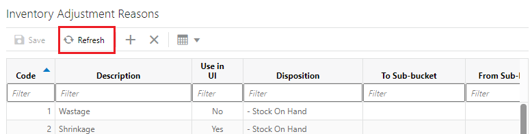
The Refresh button is found throughout the application mainly in the header of list screens. This button simulates what happens when you first navigate to the screen by refreshing the screen to how it was prior to making any changes. If there are pending changes, a confirmation message to discard the changes is shown before the data is reloaded with a fresh copy.
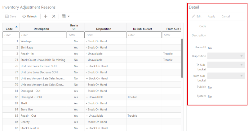
For the most part, lists cannot be updated directly in the table (list). All updates to values in a list must be done via the Detail (Apply) block. Where applicable, new records can be created and existing records can be updated via the detail block. Once applied the data is updated into the table. Stock Count Authorization is an exception to this allowing for updating directly in the list (table) itself.