USER INTERFACE REFERENCE style guide
The user interface style guide consists:
Primary Elements
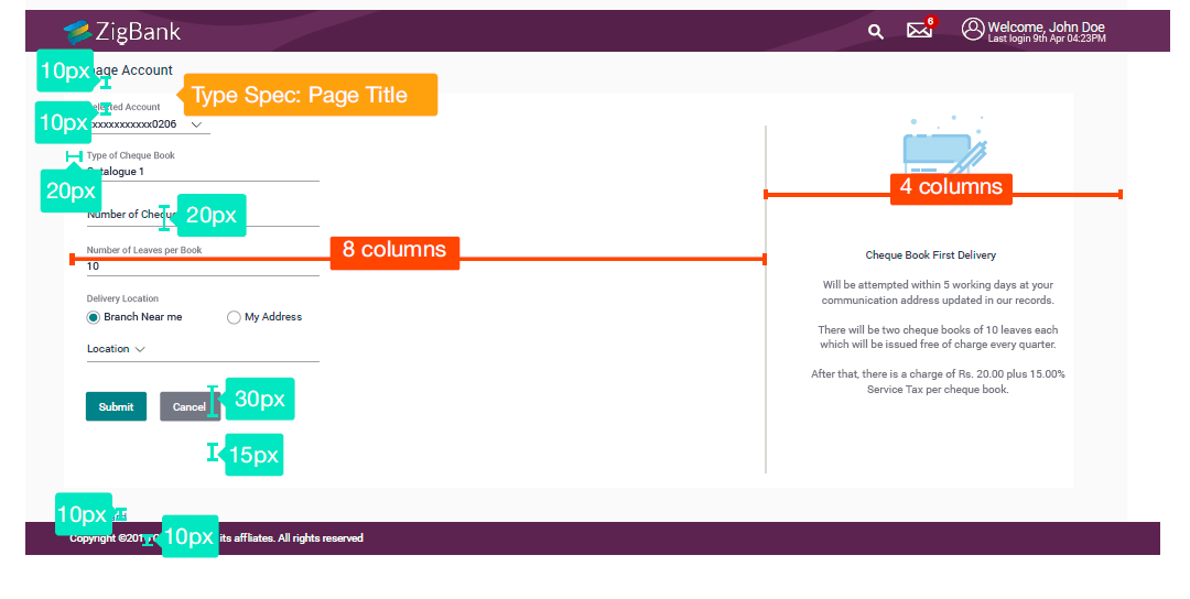
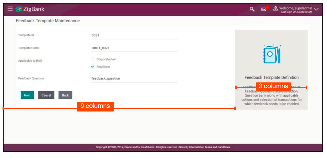
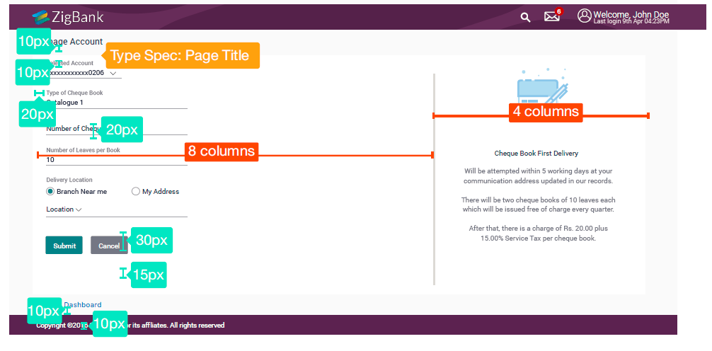
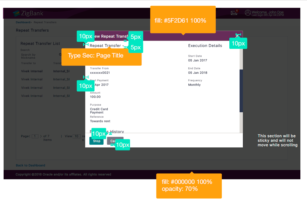
Grid
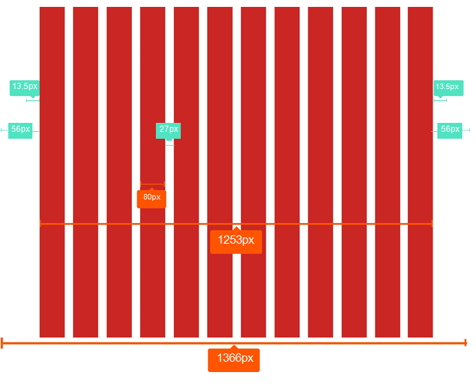
The application follows a responsive bootstrap grid system which allows uotp 12 columns acoss the page.
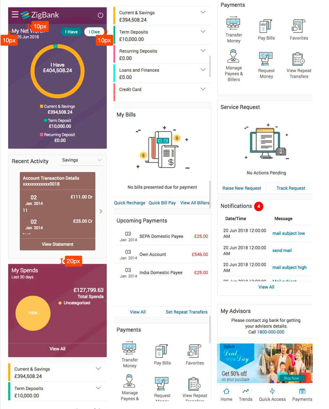
All the designs are created within and around the grid and breakpoints. They have a minimum of 10px outer margin.
Why 1200?
The modern monitors (mostly wide-screen) support at least 1280 x 1024 pixel resolution.
1200 is divisible by 2, 3, 4, 5, 6, 8, 10, 12, 15, 16, 20, 24, 30, 40, 48, 60, 80, 120, 150, 200, 240 and 400. This makes it a highly flexible base number to work with..
Desktop
Tablet
Phone
• Comp size: 320px, 12 column
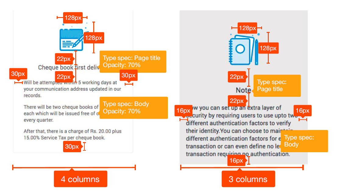
Grids are used to structure the page layout. They allows elements to be aligned horizontally and vertically, which creates columns that keep things organized. Optimal spacing, type sizes and layout relationships should be maintained throughout.
The following grid examples show the transition from desktop designs to tablet and down to phone.
Note: Some images in the style guide have been reduced in size to fit the dimensions of this guide’s layout.
Grids Details
Grids Example
Grids Example (Administrator)
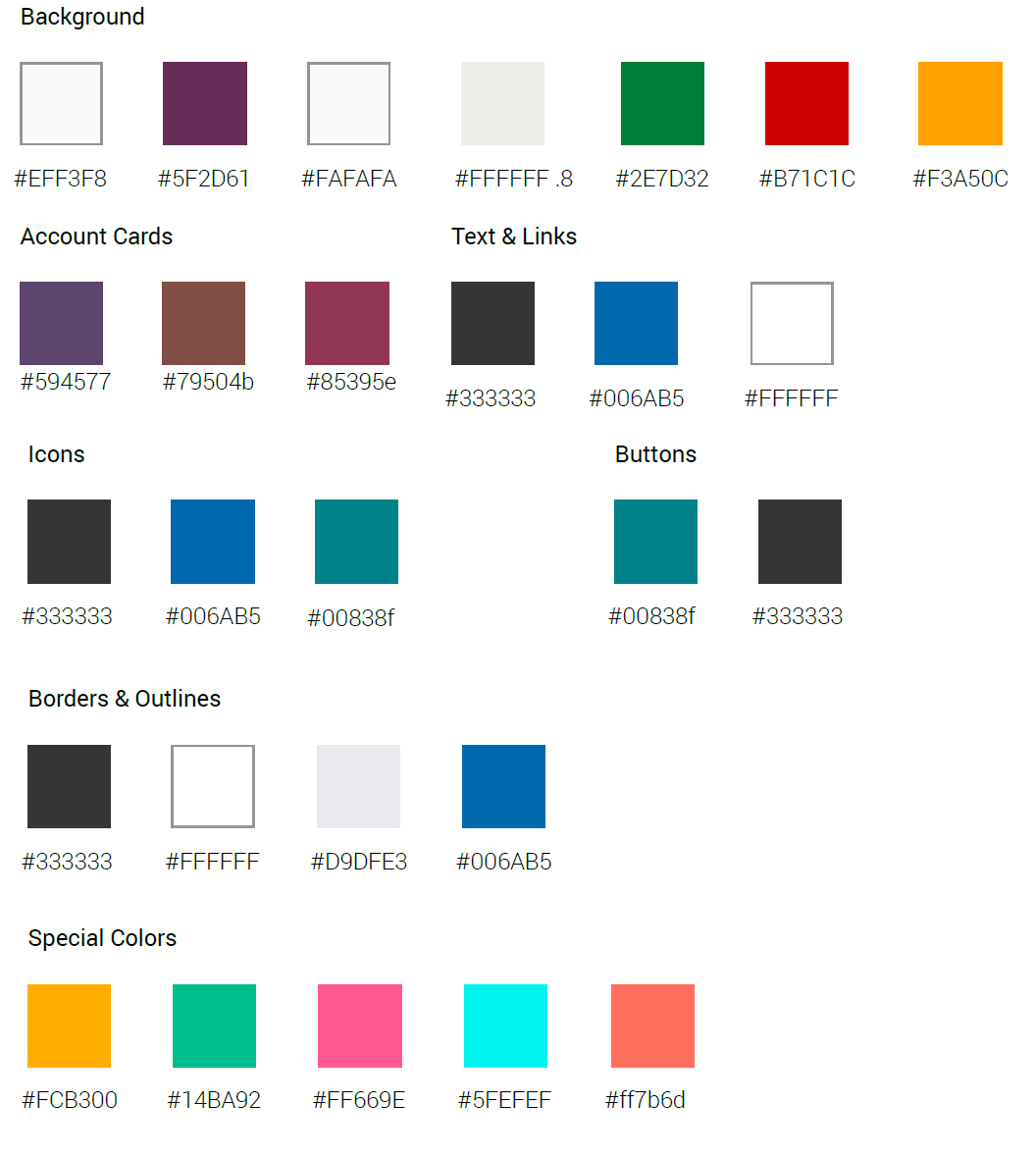
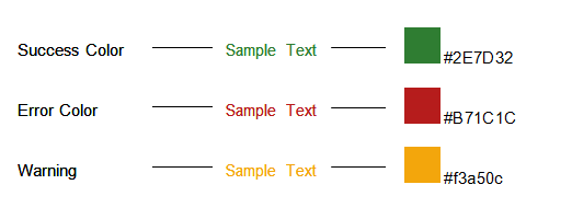
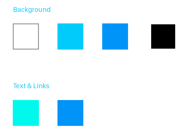
Color Palette
Typography
Family
Roboto, a free google font, has been set for the type. The following weights for the font have been used: Light, Regular, Italic Regular, Bold.
Roboto Specimens
Roboto Light
ABCDEFGHIJKLMNOPQRSTUVWXYZ
abcdefghijklmnopqrstuvwxyz
1234567890!@#$%^&*
Roboto Regular
ABCDEFGHIJKLMNOPQRSTUVWXYZ
abcdefghijklmnopqrstuvwxyz
1234567890!@#$%^&*
Roboto Bold
ABCDEFGHIJKLMNOPQRSTUVWXYZ
abcdefghijklmnopqrstuvwxyz
1234567890!@#$%^&*
Roboto Italic Regular
ABCDEFGHIJKLMNOPQRSTUVWXYZ
abcdefghijklmnopqrstuvwxyz
1234567890!@#$%^&*
Color Palette - Font Colors (generic)
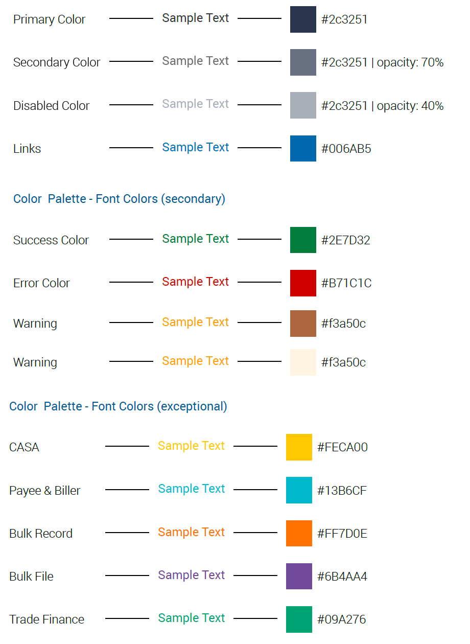
Color Palette - Font Colors (secondary)
Typographgy Styles
Below are visual examples of specific text items styled throughout the site.
The specs apply for both desktop and mobile, unless otherwise mentioned.
The unit used for fonts is REM where 1rem = 16px.
|
Page Title |
Body (on light) |
|
Manage Account |
Principal Liquidation |
|
Desktop Roboto Bold | 18px | #2c3251 Mobile Roboto Light | 16px | #2c3251 |
Desktop Roboto Regular | 14px | #2c3251 Mobile Roboto Regular | 14px | #2c3251 |
|
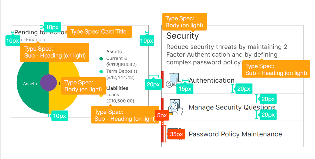
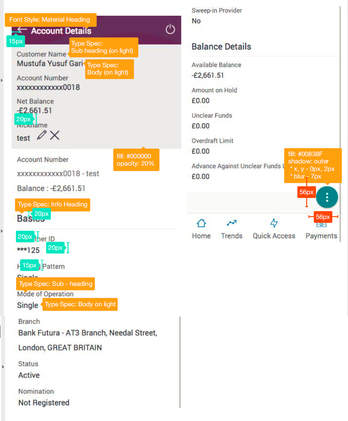
Card Title |
Sub Heading (on light) |
|
Quick Access |
Holding Pattern |
|
Desktop Roboto Bold | 18px | #2c3251 Mobile Roboto Light | 16px | #2c3251 |
Desktop Roboto R | 13px | #2c3251 70% Mobile Roboto R | 13px | #2c3251 70% |
|
Info Heading |
Body (on dark) |
|
Account Information |
Principal Liquidation |
|
Desktop Roboto Regular | 16px | #2c3251 Mobile Roboto Regular | 16px | #2c3251 |
Desktop Roboto Regular | 14px | #2c3251 Mobile Roboto Regular | 14px | #2c3251 |
|
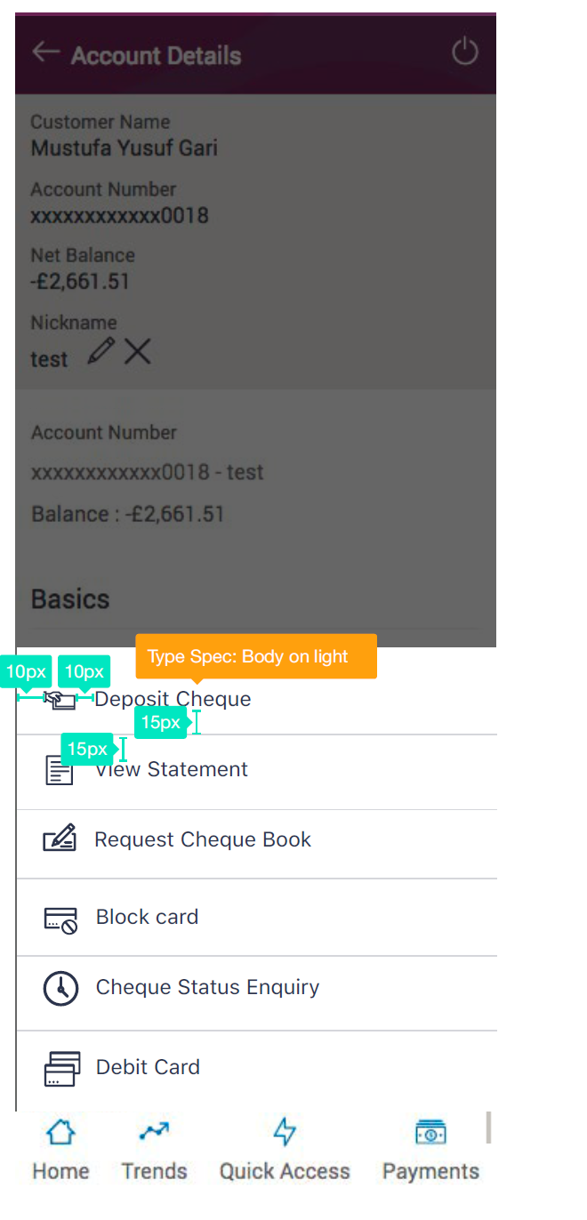
Text Links |
Sub - Heading (on dark) |
|
Back to Dashboard |
Holding Pattern |
|
Desktop Roboto R | 14px | #006AB5 Mobile Roboto R | 14px | #006AB5 |
Desktop Roboto R | 13px | #2c3251 Mobile Roboto R | 13px | #2c3251 |
|
Table Header |
Breadcrums (inactive text) |
|
Amount Name / Number |
> My Accounts > Savings |
|
Desktop Roboto R | 13px | #2c3251 70% Mobile Roboto R | 13px | #2c3251 70% |
Desktop Roboto R | 13px | #2c3251 70% Mobile Roboto R | 13px | #2c3251 70% |
Specific Elements
Font Icons
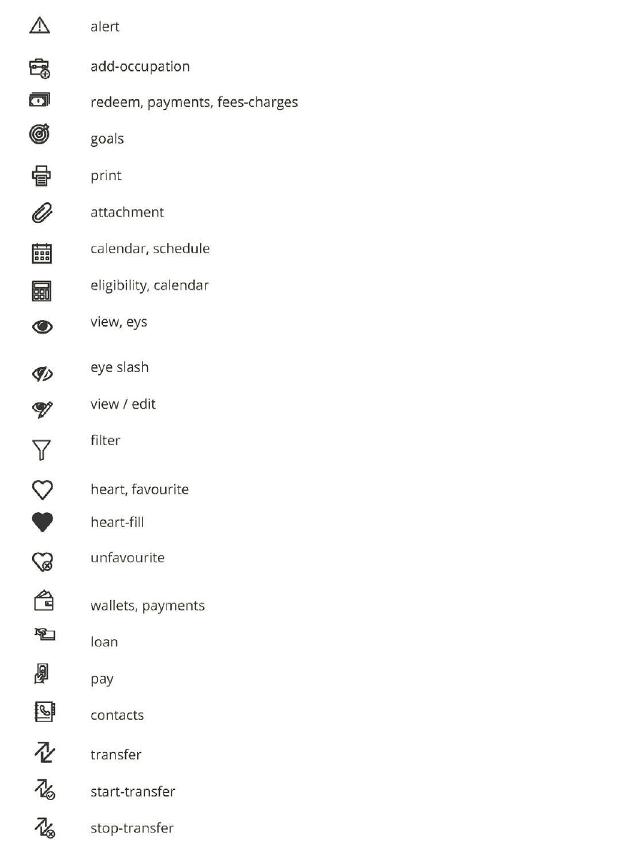
Icons
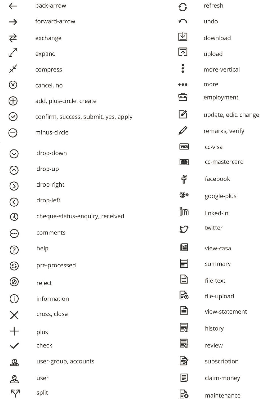
Icons (contd.)
Icons (contd.)
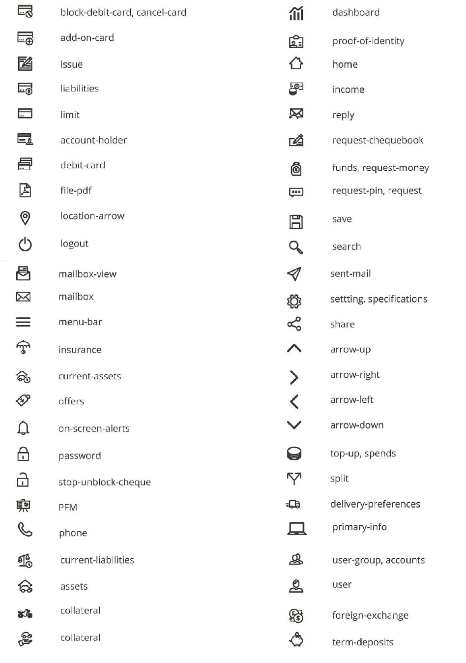
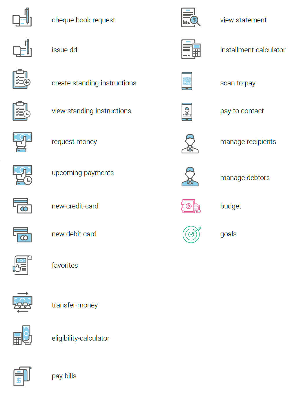
Colored Icons
Colored Icons
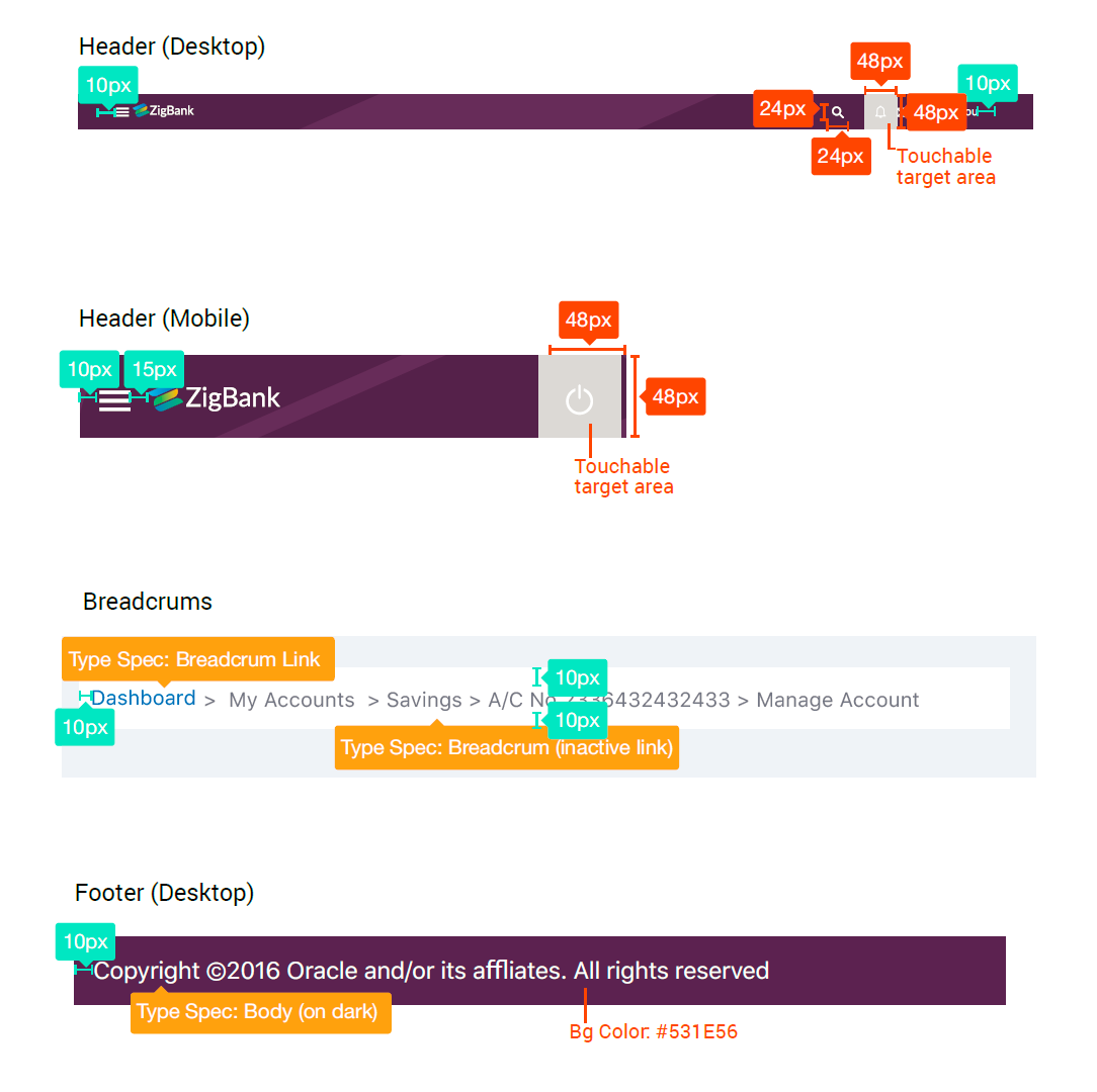
Header & Footer
Common Components
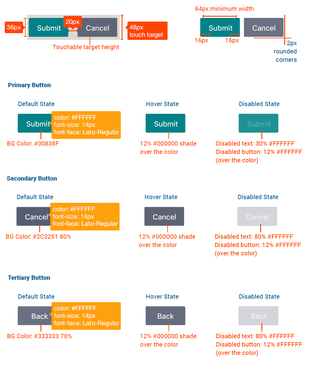
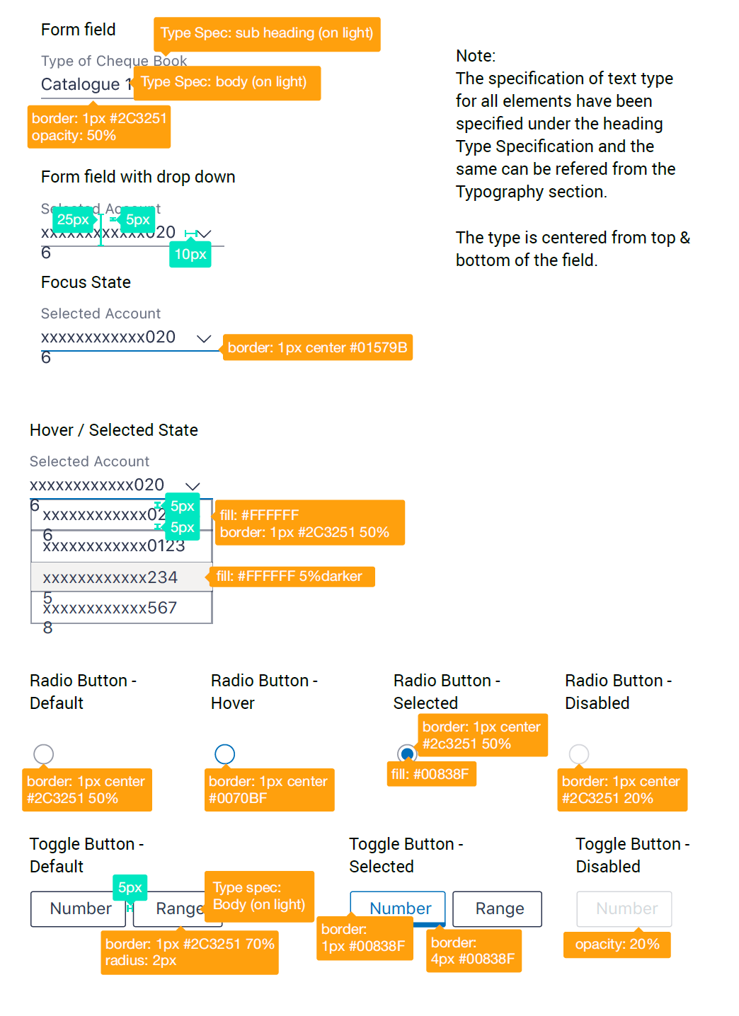
Form Fields, Dropdowns & Button Types
Information Panel
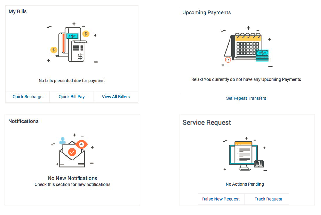
Placeholder Cards / Widgets
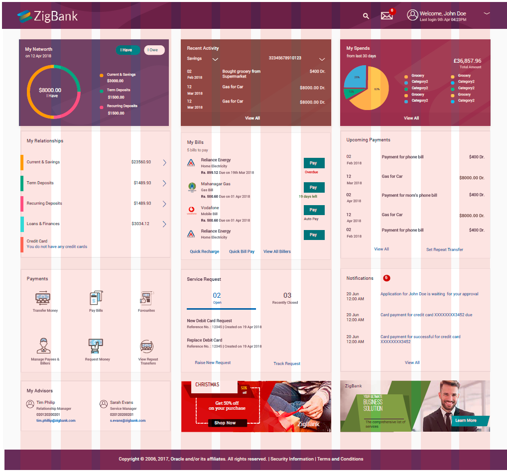
Landing Pages (Retail & Corporate)
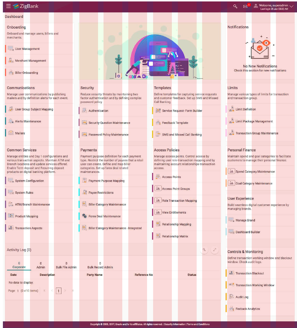
Landing Pages (Administrator)
Transaction Pages
Modal Window
Accordions
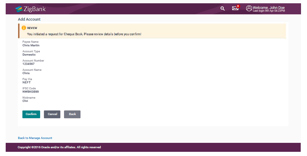
Review Page
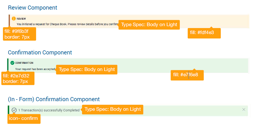
Review Page
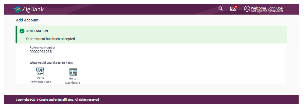
Confirmation Page
Mobile Screens
Mobile Cards
Mobile Inside Page
Mobile Overlay
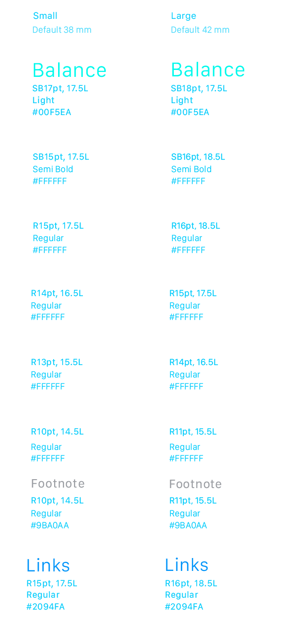
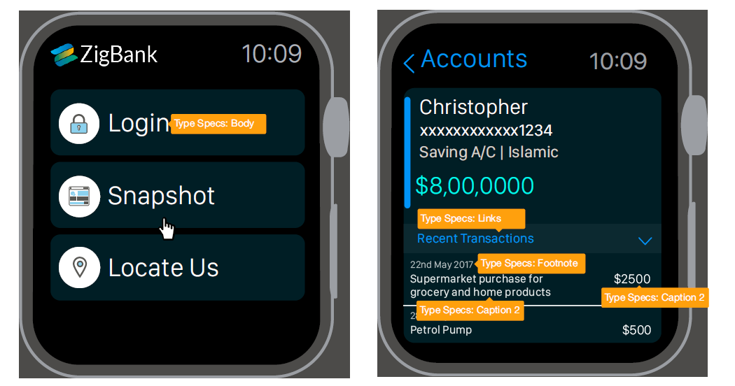
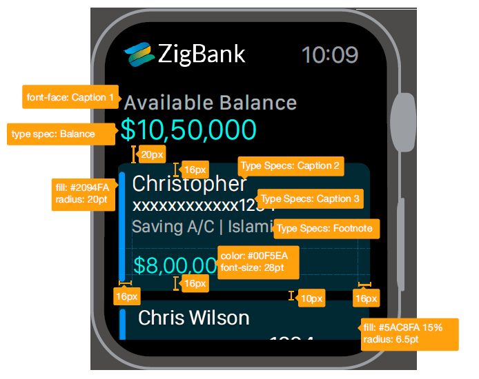
Apple Watch
Designed for 42mm screen. Specifications provided for both 38mm and 42mm.
Color Palette
Typography
San Francisco (SF) is the system typeface in iOS. The fonts of this typeface are optimized to give your text unmatched legibility, clarity, and consistency.
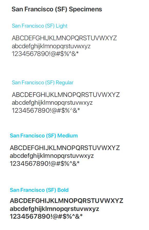
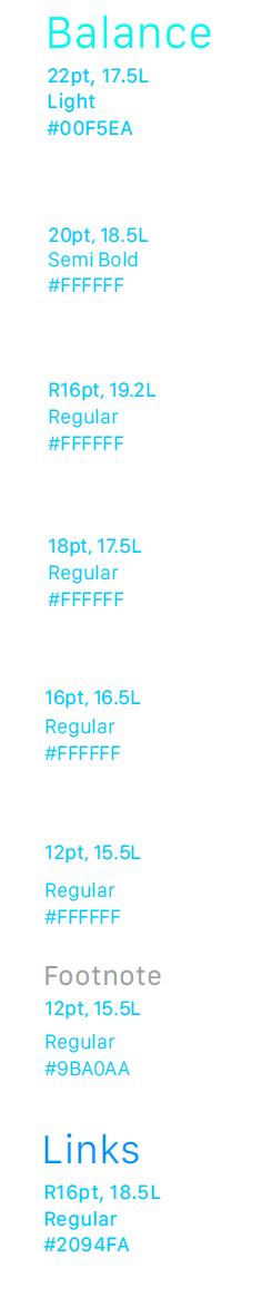
Font weight, size, and leading values for dynamic text sizes at all size settings. Font values in points (@2x resolution).
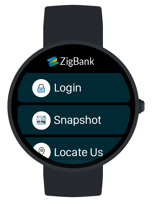
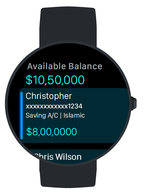
Android Wear
Designed for 42mm screen. Specifications provided for both 38mm and 42mm.
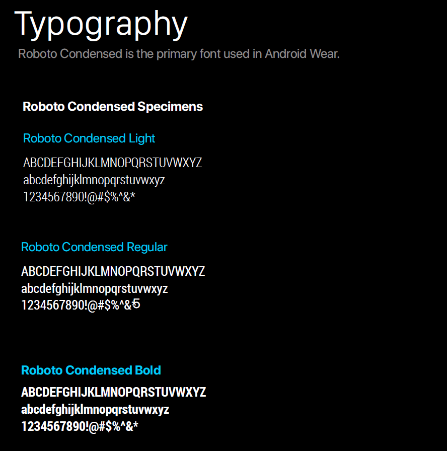
Font weight, size, and leading values for dynamic text sizes at all size settings.