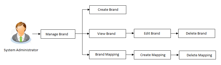
Manage Brand
Banks can have varied requirements with regards to the theme and for look and feel of the application.
Manage Brand is an administrative maintenance that allows the System Administrator Administrator is a set of individuals that administer the applicant/Affiliate entity. For example, Accountants, Authorized Signatories for organizations, Power of Attorney for individuals. to define the theme using brand logo, colors, fonts and font sizes.
System Administrator can configure the style / theme by selecting brand logo, header, background, label, button and font colors, font type and sizes for header text, menu, buttons etc. The administrator can define multiple themes with the above-mentioned attributes and once defined, the administrator can activate one of the themes from the available list. The administrator defines brand attributes for user segments.
This function also enables the System Administrator to create themes which will be available for Retail user for personalizing his view.
At any point in time, the administrator can deactivate a theme and activate another one.
Prerequisites
- Transaction access is provided to System Administrator
Features supported in application
 How to reach here:
System Administration Dashboard > User Experience > Manage Brand
OR
System/ Bank Administration Dashboard > Toggle menu > User Experience > Manage Brand
Manage Brand – Summary
Field Description
|
Field Name |
Description |
|---|---|
|
Brand Name |
Displays the theme name as defined. |
|
Brand Description |
Displays the theme description as defined. |
|
Date Created |
Displays the date of theme creation. |
|
Actions |
The available action buttons against the theme are displayed. The action button can be:
|
- In the Action column, click the link to view the already created theme.
OR
Click Create to create a new theme.
Manage Brand - Create
Using this option, System Administrator can create a new theme for retail, corporate and administrator users.
To create a brand:
- In the Manage Brand screen, click . The Create Brand screen appears.
Field Description
|
Field Name |
Description |
|---|---|
|
Brand Name |
Enter a name for the brand being created. |
|
Brand Description |
Enter a description for the brand being created. |
|
Available for Business Users |
The toggle button to define whether the brand will be available to business users or not for personalization. If this toggle is enabled, then the created theme will be available for Retail users for personalization. Retail user can select from the available themes and can personalize his view.. |
|
Customized Brands |
|
|
Assets |
Upload a zip file which contains the icons and logo for the brand. The name of the assets uploaded should be same as the ones available in the application. For e.g. if the logo is available in the application with the name “logo.svg”, the updated logo should be uploaded with the same name. The file path should be like “common/logo.svg”. Note: For mac users, create the zip file using command line to exclude DS_Store files. |
|
Typography |
The typography of the brand being created is defined in this section. The typography includes:
|
|
Base Font URL |
The URL for the base font that is to be used in the brand. This field appears if you click |
|
Base Font Family |
The name of the base font family that is to be applied for creating the brand. This field appears if you click |
|
Header A header of the application is the most valuable area. It runs across the top of the page and has important information and links, which make the navigation across the application easier and quick. The application header related attributes are defined in this section. A preview of how the header will be displayed, based on brand definition is focused and appears on the right-hand side of the screen. Below fields appear if you click |
|
|
Background |
The header background color is defined in this section. The color includes:
|
|
Icon Size |
The size of the header icon is defined in this section. |
|
Typography |
The typography color, font size and weight for the header is defined in this section. |
|
Header Height |
The height of the brand header is defined in this section. |
|
Border |
The color of the border for the header is defined in this section. |
|
Footer The area that appears at the bottom on every page of the application is known as the footer. It contains site information for e.g. the copyright details and the release year of the application. The application footer related attributes are defined in this section. A preview of how the footer will be displayed, based on brand definition is focused and appears on the right-hand side of the screen. Below fields appear if you click |
|
|
Background |
The footer background color is defined in this section. The color includes:
|
|
Typography |
The typography color, font size and weight for the footer is defined in this section. |
|
Footer Height |
The height of the brand footer is defined in this section. |
|
Help Panel The area that appears on the right side of the form on every page of the application is the Help Panel. It contains brief information related to the module it appears on. The application help panel related attributes are defined in this section. A preview of how the help panel will be displayed, based on brand definition is focused and appears on the right-hand side of the screen. Below fields appear if you click |
|
|
Background |
The typography color, size and weight for the header is defined in this section. The color includes:
|
|
Typography |
The typography color, body and header font size and weight for the help panel is defined in this section. |
|
Header |
The font size and color of the help panel is defined in this section. |
|
Icon Size |
The size of the header icon is defined in this section. |
|
Menu The collapsible area that appears on the click of the Hamburger menu icon The application Menu related attributes are defined in this section. A preview of how the menu will be displayed, based on brand definition can be viewed. By clicking on the hamburger icon on the top left corner of the header. Below fields appear if you click |
|
|
Background |
The menu background color is defined in this section. The color includes:
|
|
Typography |
The typography color, body and header font size and weight for the Menu is defined in this section. |
|
Hover |
The mouse hover color on the menu items is defined in this section. |
|
Interaction |
The type of menu interaction is selected from this section. The options are:
|
|
Table A formatted structure with rows and columns to represent the data is known as the table. The application table related attributes are defined in this section. A preview of how the table will be displayed, based on brand definition is focused and appears on the right-hand side of the screen. Below fields appear if you click |
|
|
Header |
|
|
Background |
The background color of the table header is defined in this section. The color includes:
|
|
Typography |
The typography color, body and header font size and weight for the Menu is defined in this section. |
|
Body |
|
|
Background |
The background color of the table body is defined in this section. The color includes:
|
|
Typography |
The typography color, body and body font size and weight for the Menu is defined in this section. |
|
Border |
The color of the border for the table is defined in this section. |
|
Hover |
The color of the hover on the table is defined in this section. |
|
Form A structural representation of user related input fields is known as a form. The application form related attributes are defined in this section. A preview of how the form will be displayed, based on brand definition is focused and appears on the right-hand side of the screen. Below fields appear if you click |
|
|
Form Section Header |
|
|
Background |
The background color of the section header of the form is defined in this section. The color includes:
|
|
Typography |
The typography color, body, font size and weight for the section header of form is defined in this section. |
|
Label |
|
|
Typography |
The typography color, body, font size and weight for the Label of form is defined in this section. |
|
Information Text |
|
|
Typography |
The typography color, body font size and weight for the Information text of form is defined in this section. |
|
Icon |
|
|
Dimension |
The color, font size and weight for the icons in the form is defined in this section. |
|
Hover |
The color of the hover in the form is defined in this section. |
|
Disabled Input |
|
|
Background |
The background color of the of the disabled input is defined in this section. The color includes:
|
|
Typography |
The typography color, body font size and weight for the disabled text of form is defined in this section. |
|
Link |
|
|
Typography |
The typography color, body font size and weight for the links in form is defined in this section. |
|
Hover |
The color of the hover of disabled field in the form is defined in this section. |
|
Button An element that allows the user to take actions with a single tap and interact with them is known as the button. The application buttons related attributes are defined in this section. A preview of how the buttons will be displayed, based on brand definition is focused and appears on the right-hand side of the screen. Below fields appear if you click |
|
|
Primary / Secondary / Tertiary/ Help |
|
|
Border |
The color of the border for the buttons is defined in this section. The border attribute includes:
|
|
Background |
The background color of the Primary, Secondary, Tertiary and Help button is defined in this section. The color includes:
|
|
Typography |
The typography color, font size and weight for button text is defined in this section. |
|
Icon Size |
The size of the icon used in the button. |
|
Button Set A preview of how the button set for e.g. Toggle buttons, Switch buttons will be displayed, based on brand definition is focused and appears on the right-hand side of the screen. Below fields appear if you click |
|
|
Border |
The color of the border for the buttons set is defined in this section. The border attribute includes:
|
|
Background |
The background color of the button set is defined in this section. The color includes:
|
|
Typography |
The typography color, font size and weight for the button text in the button set is defined in this section. |
|
Selected |
|
|
Border |
The color of the border for the selected button in the button set is defined in this section. The border attribute includes:
|
|
Background |
The background color of the selected button in the button set is defined in this section. The color includes:
|
|
Typography |
The typography color, font size and weight for the selected button in the button set text is defined in this section. |
|
Generic Components The accordion includes components which are generic to the application. Below fields appear if you click |
|
|
Background |
The background color of the application is defined in this section. The color includes:
|
|
Page Title |
|
|
Typography |
The typography color, font size and weight for the Page Title text is defined in this section. |
|
Default Base Border |
|
|
Border |
The color of the border for the application in general is defined in this section. |
|
Font Size Small/ Medium / Large/ Larger/ Default |
The size of the small, medium, large, larger and default fonts to be used in the brand application is defined in this section. |
|
Modal Window An element that appears as a subordinate to the main page where an action is to be taken or information is provided is known as the Modal Window. The window disables the main page which it is on, making it it’s child. The application modal window related attributes are defined in this section. A preview of how the modal window will be displayed, based on brand definition can be viewed by clicking on the Show Modal Window button on the right-hand side of the screen. Below fields appear if you click |
|
|
Header |
|
|
Background |
The background color of the Modal Window header is defined in this section. The color includes:
|
|
Typography |
The typography color, font size and weight for the Modal Window header text is defined in this section. |
|
Body |
|
|
Background |
The background color of the Modal Window body is defined in this section. The color includes:
|
|
Typography |
The typography color, font size and weight for the Modal Window body text is defined in this section. |
|
Navigation List An element that appears as quick links which makes switching between different pages of the same component easier is known as the Navigation List. The application Navigation List related attributes are defined in this section. A preview of how the Navigation List will be displayed, based on brand definition is focused and appears on the right-hand side of the screen. Below fields appear if you click |
|
|
Default |
|
|
Typography |
The default typography color, font size and weight for the Navigation List body text is defined in this section. |
|
Hover |
|
|
Typography |
The hover typography color, font size and weight for the Navigation List body text is defined in this section. |
|
Border |
The hover color of the border for the Navigation List is defined in this section. The border attribute includes:
|
|
Background |
The hover background color for the Navigation List is defined in this section. The color includes:
|
|
Selected |
|
|
Typography |
The selected typography color, font size and weight for the Navigation List body text is defined in this section. |
|
Border |
The selected color of the border for the Navigation List is defined in this section. The border attribute includes:
|
|
Information Banner An area where the information summary about any transaction is available in the application is known as the Information Banner. The application Information Banner related attributes are defined in this section. A preview of how the Information Banner will be displayed, based on brand definition is focused and appears on the right-hand side of the screen. Below fields appear if you click |
|
|
Background |
The background color for the Information Banner is defined in this section. The color includes:
|
|
Typography |
The typography color, font size and weight for the Information Banner body text is defined in this section. |
|
Review Banner A preview of how the Review Banner will be displayed, based on brand definition is focused and appears on the right-hand side of the screen. Below fields appear if you click |
|
|
Background |
The background color for the Review Banner is defined in this section. The color includes:
|
|
Border |
The color of the border for the Review Banner is defined in this section. The border attribute includes:
|
|
Typography |
The typography color, font size and weight for the Review Banner body text is defined in this section. |
|
Confirmation / Error Banner A preview of how the Confirmation/ Error Banner will be displayed, based on brand definition is focused and appears on the right-hand side of the screen. Below fields appear if you click |
|
|
Border |
The color of the border for the Confirmation/ Error Banner is defined in this section. The border attribute includes:
|
|
Typography |
The typography color, font size and weight for the Confirmation/ Error Banner body text is defined in this section. |
|
Success |
|
|
Background |
The background color for the Confirmation Banner is defined in this section. The color includes:
|
|
Border |
The color of the border for Confirmation Banner is defined in this section. The border attribute includes:
|
|
Error |
|
|
Background |
The background color for the Error Banner is defined in this section. The color includes:
|
|
Border |
The color of the border for Error Banner is defined in this section. The border attribute includes:
|
|
Scroll Bar An example of how the scroll bar will be displayed, based on brand definition appears in the scroll bar on the form section (right hand side) of the screen. Below fields appear if you click |
|
|
Scroll Track |
|
|
Border |
The color of the border for the Scroll track is defined in this section. |
|
Scroll Thumb |
|
|
Border |
The color of the border for the Scroll Thumb is defined in this section. |
|
Accordion A vertically stacked element which allows the user to toggle between sections of content. The application Accordion related attributes are defined in this section. A preview of how the Accordion will be displayed, based on brand definition is focused and appears on the right-hand side of the screen. Below fields appear if you click |
|
|
Border |
The color of the border for Accordion is defined in this section. The border attribute includes:
|
|
Header |
|
|
Background |
The background color for the Accordion header is defined in this section. The color includes:
|
|
Typography |
The typography color, font size and weight for the Accordion header text is defined in this section. |
|
Body |
|
|
Background |
The background color for the Accordion body is defined in this section. The color includes:
|
|
Typography |
The typography color, font size and weight for the Accordion body text is defined in this section. |
|
Disabled Accordion Header |
|
|
Background |
The background color for the Disabled Accordion header is defined in this section. The color includes:
|
|
Typography |
The typography color, font size and weight for the Disabled Accordion header text is defined in this section. |
|
Overlay An element that appears as a subordinate to the main page overlaying the same where an action is to be taken or information is provided is known as the Overlay. The window disables the main page which it is on, making it it’s child. The application overlay related attributes are defined in this section. A preview of how the Overlay will be displayed, based on brand definition can be viewed by clicking on the Show Overlay button on the right-hand side of the screen. Below fields appear if you click |
|
|
Background |
The background color for the Overlay header is defined in this section. The color includes:
|
|
Header |
|
|
Typography |
The typography color, font size and weight for the Overlay header text is defined in this section. |
|
Alert Message The application Alert Message related attributes are defined in this section. A preview of how the Alert Message will be displayed, based on brand definition can be viewed by clicking on the Show Alert Message button on the right-hand side of the screen. Below fields appear if you click |
|
|
Border |
The color of the border for Alert Message is defined in this section. The border attribute includes:
|
|
Header |
|
|
Typography |
The typography color, font size and weight for the Alert Message header text is defined in this section. |
|
Body |
|
|
Typography |
The typography color, font size and weight for the Alert Message body text is defined in this section. |
|
Welcome Panel An element that appears on the top of the Menu Panel by clicking the menu icon The application Welcome Panel related attributes are defined in this section. A preview of how the Welcome Panel will be displayed, based on brand definition can be viewed by clicking on the Menu Below fields appear if you click against the Welcome Panel field. Background Color - The background color for the Overlay header is defined in this section. The color includes:
|
|
|
Form The following section displays a preview of all the components comprising of the brand theme as defined under the Customize Brand section. |
|
|
Font Color |
Text displaying the color of the font, as defined. |
|
Anchor Text Color |
The anchor text color of the brand. |
|
Label Color |
The label color, as defined. |
|
Input Properties |
An example of how an input field will be displayed. |
|
Primary Button Properties |
An example of how a primary button will be displayed. |
|
Secondary Button Properties |
An example of how a secondary button will be displayed. |
|
Tertiary Button Properties |
An example of how a tertiary button will be displayed. |
|
Help Button Properties |
An example of how a help button will be displayed. |
|
Option 1, 2, 3 |
An example of how the navigation list will be displayed, based on brand definition. |
|
Table Example |
An example of how the table will be displayed, based on brand definition. |
|
Button Sets |
An example of how the button sets will be displayed, based on brand definition. |
|
Show Modal Window |
Clicking on the button displays how the modal window will appear, based on brand definition. |
|
Show Overlay |
Clicking on the button displays how the overlay will appear, based on brand definition. |
|
Show Alert Box |
Clicking on the button displays how the alert box will appear, based on brand definition. |
|
Help Panel |
An example of how the help panel will be displayed, based on brand definition. |
|
Information Banner |
An example of how the information banner will be displayed, based on brand definition. |
|
Review Banner |
An example of how the review banner will be displayed, based on brand definition. |
|
Confirmation Banner |
An example of how the confirmation banner will be displayed, based on brand definition. |
|
Error Banner |
An example of how the error banner will be displayed, based on brand definition. |
|
Footer |
An example of how the footer will be displayed, based on brand definition. |
|
Welcome - Panel |
An example of how the Welcome Panel will be displayed, based on brand definition. |
 on the top left corner of the application is known as the menu. It contains links to navigate across application.
- In the Brand Name field, enter the name of the theme.
- In the Brand Description field, enter the description for the theme.
- Under the Customized Brands section:
- In the Asset section, click Choose File to browse and upload the assets like the logo, icons, images for brand.
- In the Typography section, enter the base font family name and base font URL.
- In the Header/ Footer section, enter the values for background color, icon size and header/ footer size.
- In the Help Panel section, enter the required details for help panel.
- In the Menu section, select the background, typography, menu hover color and interaction type for the menu to be defined.
- In the Table section, select the background, typography of table header and table body.
- In the Form section, select the form background color and typography for form header, form disabled input, label, info text icon and links.
- In the Button/ Button Sets section, select the values for border, background and typography for primary, secondary, tertiary, help button and other buttons.
- In the Generic Components section, define the background color and font size for various components in the application.
- In the Modal Window section, select the values for modal window header, and modal window body.
- In the Navigation Bar section, colors to be assigned to the various components that form part of the navigation bar.
- In the Information Banner section, select the colors and dimension to be assigned to the various components that form part of banners.
- In the Review Banner section, select the colors and dimension to be assigned to the various components that form part of review banner.
- In the Confirmation/ Error Banner section, select the colors and dimension to be assigned to the various components that form part of confirm /error banner.
- In the Scroll Bar section, click and select the border colors for scroll track and scroll thumb.
- In the Accordion section, select the colors and typography to be assigned to the various components of accordion.
- In the Overlay section, select the background colors and header typography to be assigned to the various components of overlay window.
- In the Alert Message section, select the colors and typography to be assigned to the various components of alert messages.
- s. In the Welcome Panel section, select the background colors to be assigned to the various components of alert messages.
- An example of how the various components of the brand will be displayed, based on brand definition appears in the form section (right hand side) of the screen.
Click to view the defined modal window.
OR
Click to view the defined overlay window.
OR
Show to view the defined alert box. - Click to save the details.
OR
Click to preview the defined brand.
OR
Click to cancel the maintenance and to navigate to the 'Dashboard'.
OR
Click to clear the entered values entered in all sections under Customize Brand.
OR
Click to navigate to the previous screen. - The Review screen appears. Verify the details, and click .
OR
Click to make the changes if any.
OR
Click to cancel the maintenance. - The success message appears along with the status of maintenance. Click to return to the dashboard.
Manage Brand - View
Using this option System Administrator can view the created theme or brand.
To view the brand:
- In the Action column, click View against the brand which you want to view . The Manage Brand - View screen appears.
- Click to edit the theme. The Manage Brand - Edit screen appears.
OR
Click to delete the brand.
OR
Click to navigate to the previous screen.
Manage Brand - Edit
If the defined theme does not suit the requirement, then system administrator can edit the defined theme using the Update option.
To edit the brand:
- In the Action column, click View against the brand which you want to edit. The Manage Brand - View screen appears.
- Click to edit the brand. The Update Brand screen appears.
OR
Click to delete the brand.
OR
Click to navigate to the previous screen
Field Description
|
Field Name |
Description |
|---|---|
|
Brand Name |
Name for the brand is displayed in editable form. |
|
Brand Description |
Description for the brand is displayed in editable form. |
|
Available for Business Users |
The toggle defining whether the brand is available to business users or not for personalization. If this toggle is enabled, then the created theme will be available for Retail users for personalization. Retail user can select from the available themes and can personalize his view. |
|
Customized Brands |
|
|
Assets |
Upload a zip file which contains the icons and logo for the brand. The name of the assets uploaded should be same as the ones available in the application. For e.g. if the logo is available in the application with the name “logo.svg”, the updated logo should be uploaded with the same name. Note: For mac users, create the zip file using command line to exclude DS_Store files. |
|
Typography |
The typography of the brand is defined in this section and available for edit. The typography includes:
|
|
Base Font URL |
The URL for the base font that is used in the brand is displayed in the editable form. This field appears if you click |
|
Base Font Family |
The name of the base font family that is to be applied for creating the brand. This field appears if you click |
|
Header A header of the application is the most valuable area. It runs across the top of the page and has important information and links, which make the navigation across the application easier and quick. The application header related attributes are defined in this section. A preview of how the header will be displayed, based on brand definition is focused and appears on the right-hand side of the screen. Below fields appear if you click |
|
|
Background |
The header background color is defined in this section and is displayed in editable form. The color includes:
|
|
Icon Size |
The size of the header icon is defined in this section and is displayed in the editable form. |
|
Typography |
The typography color, font size and weight for the header is defined in this section and is displayed in the editable form. |
|
Header Height |
The height of the brand header is defined in this section and is displayed in the editable form. |
|
Border |
The color of the border for the header is defined in this section and is displayed in the editable form. |
|
Footer The area that appears at the bottom on every page of the application is known as the footer. It contains site information for e.g. the copyright details and the release year of the application. The application footer related attributes are defined in this section. A preview of how the footer will be displayed, based on brand definition is focused and appears on the right-hand side of the screen. Below fields appear if you click |
|
|
Background |
The footer background color is defined in this section and is displayed in the editable form. The color includes:
|
|
Typography |
The typography color, font size and weight for the footer is defined in this section and is displayed in the editable form. |
|
Footer Height |
The height of the brand footer is defined in this section and is displayed in the editable form. |
|
Help Panel The area that appears on the right side of the form on every page of the application is the Help Panel. It contains brief information related to the module it appears on. The application help panel related attributes are defined in this section. A preview of how the help panel will be displayed, based on brand definition is focused and appears on the right-hand side of the screen. Below fields appear if you click |
|
|
Background |
The typography color, size and weight for the header is defined in this section and is displayed in the editable form. The color includes:
|
|
Typography |
The typography color, body and header font size and weight for the help panel is defined in this section and is displayed in the editable form. |
|
Header |
The font size and color of the help panel is defined in this section and is displayed in the editable form. |
|
Icon Size |
The size of the header icon defined in this section and is displayed in the editable form. |
|
Menu The collapsible area that appears on the click of the Hamburger menu icon The application Menu related attributes are defined in this section. A preview of how the menu will be displayed, based on brand definition can be viewed. By clicking on the hamburger icon on the top left corner of the header. Below fields appear if you click |
|
|
Background |
The menu background color is defined in this section and is displayed in the editable form. The color includes:
|
|
Typography |
The typography color, body and header font size and weight for the Menu is defined in this section and is displayed in the editable form. |
|
Hover |
The mouse hover color on the menu items is defined in this section and is displayed in the editable form. |
|
Interaction |
The type of menu interaction is selected from this section, and is displayed in the editable form. The options are:
|
|
Table A formatted structure with rows and columns to represent the data is known as the table. The application table related attributes are defined in this section. A preview of how the table will be displayed, based on brand definition is focused and appears on the right-hand side of the screen. Below fields appear if you click |
|
|
Header |
|
|
Background |
The background color of the table header is defined in this section and is displayed in the editable form. The color includes:
|
|
Typography |
The typography color, body and header font size and weight for the Menu is defined in this section and is displayed in the editable form. |
|
Body |
|
|
Background |
The background color of the table body is defined in this section and is displayed in the editable form. The color includes:
|
|
Typography |
The typography color, body and body font size and weight for the Menu is defined in this section and is displayed in the editable form. |
|
Border |
The color of the border for the table is defined in this section and is displayed in the editable form. |
|
Hover |
The color of the hover on the table is defined in this section and is displayed in the editable form. |
|
Form A structural representation of user related input fields is known as a form. The application form related attributes are defined in this section. A preview of how the form will be displayed, based on brand definition is focused and appears on the right-hand side of the screen. Below fields appear if you click |
|
|
Form Section Header |
|
|
Background |
The background color of the section header of the form is defined in this section and is displayed in the editable form. The color includes:
|
|
Typography |
The typography color, body, font size and weight for the Section header of form is defined in this section and is displayed in the editable form. |
|
Label |
|
|
Typography |
The typography color, body, font size and weight for the Labels of form is defined in this section and is displayed in the editable form. |
|
Information Text |
|
|
Typography |
The typography color, body font size and weight for the Information text of form is defined in this section and is displayed in the editable form. |
|
Icon |
|
|
Dimension |
The color, font size and weight for the icons in the form is defined in this section is and displayed in the editable form. |
|
Hover |
The color of the hover in the form is defined in this section and is displayed in the editable form. |
|
Disabled Input |
|
|
Background |
The background color of the disabled input is defined in this section and is displayed in the editable form. The color includes:
|
|
Typography |
The typography color, body font size and weight for the disabled text of form is defined in this section and is displayed in the editable form. |
|
Link |
|
|
Typography |
The typography color, body font size and weight for the links in form is defined in this section and is displayed in the editable form. |
|
Hover |
The color of the hover of disabled field in the form is defined in this section and is displayed in the editable form. |
|
Button An element that allows the user to take actions with a single tap and interact with them is known as the button. The application buttons related attributes are defined in this section. A preview of how the buttons will be displayed, based on brand definition is focused and appears on the right-hand side of the screen. Below fields appear if you click |
|
|
Primary / Secondary / Tertiary/ Help |
|
|
Border |
The color of the border for the buttons is defined in this section and is displayed in the editable form. The border attribute includes:
|
|
Background |
The background color of the Primary, Secondary, Tertiary and Help button is defined in this section and is displayed in the editable form. The color includes:
|
|
Typography |
The typography color, font size and weight for button text is defined in this section and is displayed in the editable form. |
|
Icon Size |
The size of the icon used in the button and is displayed in the editable form. |
|
Button Set A preview of how the button set for e.g. Toggle buttons, Switch buttons will be displayed, based on brand definition is focused and appears on the right-hand side of the screen. Below fields appear if you click |
|
|
Border |
The color of the border for the button set is defined in this section and is displayed in the editable form. The border attribute includes:
|
|
Background |
The background color of the button set is defined in this section and is displayed in the editable form. The color includes:
|
|
Typography |
The typography color, font size and weight for the button text in the button set is defined in this section and is displayed in the editable form. |
|
Selected |
|
|
Border |
The color of the border for the selected button in the button set is defined in this section and is displayed in the editable form. The border attribute includes:
|
|
Background |
The background color of the selected button in the button set is defined in this section and is displayed in the editable form. The color includes:
|
|
Typography |
The typography color, font size and weight for the selected button in the button set text is defined in this section and is displayed in the editable form. |
|
Generic Components The accordion includes components which are generic to the application. Below fields appear if you click |
|
|
Background |
The background color of the application is defined in this section and is displayed in the editable form. The color includes:
|
|
Page Title |
|
|
Typography |
The typography color, font size and weight for the Page Title text is defined in this section and is displayed in the editable form. |
|
Default Base Border |
|
|
Border |
The color of the border for the application in general is defined in this section and is displayed in the editable form. |
|
Font Size Small/ Medium / Large/ Larger/ Default |
The size of the small, medium, large, larger and default fonts to be used in the brand application is defined in this section and is displayed in the editable form. |
|
Modal Window An element that appears as a subordinate to the main page where an action is to be taken or information is provided is known as the Modal Window. The window disables the main page which it is on, making it it’s child. The application modal window related attributes are defined in this section. A preview of how the modal window will be displayed, based on brand definition can be viewed by clicking on the Show Modal Window button on the right-hand side of the screen. Below fields appear if you click |
|
|
Header |
|
|
Background |
The background color of the Modal Window header is defined in this section and is displayed in the editable form. The color includes:
|
|
Typography |
The typography color, font size and weight for the Modal Window header text is defined in this section and is displayed in the editable form. |
|
Body |
|
|
Background |
The background color of the Modal Window body is defined in this section and is displayed in the editable form. The color includes:
|
|
Typography |
The typography color, font size and weight for the Modal Window body text is defined in this section and is displayed in the editable form. |
|
Navigation List An element that appears as quick links which makes switching between different pages of the same component easier is known as the Navigation List. The application Navigation List related attributes are defined in this section. A preview of how the Navigation List will be displayed, based on brand definition is focused and appears on the right-hand side of the screen. Below fields appear if you click |
|
|
Default |
|
|
Typography |
The default typography color, font size and weight for the Navigation List body text is defined in this section and is displayed in the editable form. |
|
Hover |
|
|
Typography |
The hover typography color, font size and weight for the Navigation List body text is defined in this section and is displayed in the editable form. |
|
Border |
The hover color of the border for the Navigation List is defined in this section and is displayed in the editable form. The border attribute includes:
|
|
Background |
The hover background color for the Navigation List is defined in this section and is displayed in the editable form. The color includes:
|
|
Selected |
|
|
Typography |
The selected typography color, font size and weight for the Navigation List body text is defined in this section and is displayed in the editable form. |
|
Border |
The selected color of the border for the Navigation List is defined in this section and is displayed in the editable form. The border attribute includes:
|
|
Information Banner An area where the information summary about any transaction is available in the application is known as the Information Banner. The application Information Banner related attributes are defined in this section. A preview of how the Information Banner will be displayed, based on brand definition is focused and appears on the right-hand side of the screen. Below fields appear if you click |
|
|
Background |
The background color for the Information Banner is defined in this section and is displayed in the editable form. The color includes:
|
|
Typography |
The typography color, font size and weight for the Information Banner body text is defined in this section and is displayed in the editable form. |
|
Review Banner A preview of how the Review Banner will be displayed, based on brand definition is focused and appears on the right-hand side of the screen. Below fields appear if you click |
|
|
Background |
The background color for the Review Banner is defined in this section and is displayed in the editable form. The color includes:
|
|
Border |
The color of the border for the Review Banner is defined in this section and is displayed in the editable form. The border attribute includes:
|
|
Typography |
The typography color, font size and weight for the Review Banner body text is defined in this section and is displayed in the editable form. |
|
Confirmation / Error Banner A preview of how the Confirmation/ Error Banner will be displayed, based on brand definition is focused and appears on the right-hand side of the screen. Below fields appear if you click |
|
|
Border |
The color of the border for the Confirmation/ Error Banner is defined in this section and is displayed in the editable form. The border attribute includes:
|
|
Typography |
The typography color, font size and weight for the Confirmation/ Error Banner body text is defined in this section and is displayed in the editable form. |
|
Success |
|
|
Background |
The background color for the Confirmation Banner is defined in this section and is displayed in the editable form. The color includes:
|
|
Border |
The color of the border for Confirmation Banner is defined in this section and is displayed in the editable form. The border attribute includes:
|
|
Error |
|
|
Background |
The background color for the Error Banner is defined in this section and is displayed in the editable form. The color includes:
|
|
Border |
The color of the border for Error Banner is defined in this section and is displayed in the editable form. The border attribute includes:
|
|
Scroll Bar An example of how the scroll bar will be displayed, based on brand definition appears in the scroll bar on the form section (right hand side) of the screen. Below fields appear if you click |
|
|
Scroll Track |
|
|
Border |
The color of the border for the Scroll track is defined in this section and is displayed in the editable form. |
|
Scroll Thumb |
|
|
Border |
The color of the border for the Scroll Thumb is defined in this section and is displayed in the editable form. |
|
Accordion A vertically stacked element which allows the user to toggle between sections of content. The application Accordion related attributes are defined in this section. A preview of how the Accordion will be displayed, based on brand definition is focused and appears on the right-hand side of the screen. Below fields appear if you click |
|
|
Border |
The color of the border for Accordion is defined in this section and is displayed in the editable form. The border attribute includes:
|
|
Header |
|
|
Background |
The background color for the Accordion header is defined in this section and is displayed in the editable form. The color includes:
|
|
Typography |
The typography color, font size and weight for the Accordion header text is defined in this section and is displayed in the editable form. |
|
Body |
|
|
Background |
The background color for the Accordion body is defined in this section and is displayed in the editable form. The color includes:
|
|
Typography |
The typography color, font size and weight for the Accordion body text is defined in this section and is displayed in the editable form. |
|
Disabled Accordion Header |
|
|
Background |
The background color for the Disabled Accordion header is defined in this section and is displayed in the editable form. The color includes:
|
|
Typography |
The typography color, font size and weight for the Disabled Accordion header text is defined in this section and is displayed in the editable form. |
|
Overlay An element that appears as a subordinate to the main page overlaying the same where an action is to be taken or information is provided is known as the Overlay. The window disables the main page which it is on, making it it’s child. The application overlay related attributes are defined in this section. A preview of how the Overlay will be displayed, based on brand definition can be viewed by clicking on the Show Overlay button on the right-hand side of the screen. Below fields appear if you click |
|
|
Background |
The background color for the Overlay header is defined in this section and is displayed in the editable form. The color includes:
|
|
Header |
|
|
Typography |
The typography color, font size and weight for the Overlay header text is defined in this section and is displayed in the editable form. |
|
Alert Message The application Alert Message related attributes are defined in this section. A preview of how the Alert Message will be displayed, based on brand definition can be viewed by clicking on the Show Alert Message button on the right-hand side of the screen. Below fields appear if you click |
|
|
Border |
The color of the border for Alert Message is defined in this section and is displayed in the editable form. The border attribute includes:
|
|
Header |
|
|
Typography |
The typography color, font size and weight for the Alert Message header text is defined in this section and is displayed in the editable form. |
|
Body |
|
|
Typography |
The typography color, font size and weight for the Alert Message body text is defined in this section and is displayed in the editable form. |
|
Welcome Panel |
An element that appears on the top of the Menu Panel by clicking the menu icon The application Welcome Panel related attributes are defined in this section. A preview of how the Welcome Panel will be displayed, based on brand definition can be viewed by clicking on the Menu Below fields appear if you click against the Welcome Panel field. Background Color - The background color for the Overlay header is defined in this section. The color includes:
. |
|
Form The following section displays a preview of all the components comprising of the brand theme as defined under the Customize Brand section. |
|
|
Font Color |
Text displaying the color of the font, as defined. |
|
Anchor Text Color |
The anchor text color of the brand. |
|
Label Color |
The label color, as defined. |
|
Input Properties |
An example of how an input field will be displayed. |
|
Primary Button Properties |
An example of how a primary button will be displayed. |
|
Secondary Button Properties |
An example of how a secondary button will be displayed. |
|
Tertiary Button Properties |
An example of how a tertiary button will be displayed. |
|
Help Button Properties |
An example of how a help button will be displayed. |
|
Option 1, 2, 3 |
An example of how the navigation list will be displayed, based on brand definition. |
|
Table Example |
An example of how the table will be displayed, based on brand definition. |
|
Button Sets |
An example of how the button sets will be displayed, based on brand definition. |
|
Show Modal Window |
Clicking on the button displays how the modal window will appear, based on brand definition. |
|
Show Overlay |
Clicking on the button displays how the overlay will appear, based on brand definition. |
|
Show Alert Box |
Clicking on the button displays how the alert box will appear, based on brand definition. |
|
Help Panel |
An example of how the help panel will be displayed, based on brand definition. |
|
Information Banner |
An example of how the information banner will be displayed, based on brand definition. |
|
Review Banner |
An example of how the review banner will be displayed, based on brand definition. |
|
Confirmation Banner |
An example of how the confirmation banner will be displayed, based on brand definition. |
|
Error Banner |
An example of how the error banner will be displayed, based on brand definition. |
|
Footer |
An example of how the footer will be displayed, based on brand definition. |
|
Welcome - Panel |
An example of how the Welcome Panel will be displayed, based on brand definition. |
- In the Brand Name field, edit the name of the brand, if required.
- In the Brand Description field, edit the description of the theme, if required.
- Under the Customized Brands sections, click
 and expand any sub section and make changes to any component as required.
 - Click to save the changes.
OR
Click to cancel the maintenance and navigate to the 'Dashboard'.
OR
Click to clear the entered values in the screen.
OR
Click to navigate to previous screen. - The Review screen appears. Verify the details, and click .
OR
Click to make the changes if any.
OR
Click to cancel the maintenance. - The success message appears along with the status of maintenance. Click to return to the dashboard.
Manage Brand - Delete
The System Administrator can delete a created brand maintained in the application.
To delete the brand:
- In the Action column, click View against the brand which you want to delete. The Manage Brand - View screen appears.
- Click . A message appears asking the user to confirm brand deletion. Click Delete to confirm deletion of the brand.
OR
Click Cancel to cancel deletion and return to the Manage Brand – View screen.
Delete Brand
- The success message appears along with the status of the maintenance. Click to return to the dashboard.
Brand Mapping
Using this option System Administrator can map the existing brands to any user, party, role or entity.
Brand Mapping Search
To view the brand mapping details:
- In the Manage Brand screen, click the Brand Mapping tab. The Manage Brand - Brand Mapping screen appears.
Brand Mapping
Field Description
|
Field Name |
Description |
|---|---|
|
Mapping Type |
A list of options for the mapping type to search which brand it is mapped to appear. The options are:
|
- From the Mapping Type list, select the option for which you want to view the mapping. The Manage Brand – Search Results appear.
Manage Brand - Brand Mapping Summary
Field Description
|
Field Name |
Description |
|---|---|
|
Brand Mapping Summary |
|
|
Brand Id |
The identification number of the mapped theme. |
|
Mapped Value |
The value, which is mapped to the brand. The mapped value depends on the selected mapping type. For example, If the mapping type is 'party' the mapping value will be 'party ID', If the mapping type is 'role' the mapping value will be user role, such as 'Corporate' 'Retail' and 'Administrator', If the mapping type is 'entity' the mapping value will be 'entities'. |
|
Mapping Type |
The level at which the brand is mapped. |
|
Date Created |
The date on which the brand mapping was performed. |
|
Actions |
The available actions that can be performed against the brand mapping are displayed. The options can be:
|
- Click Delete against a record to delete the brand mapping.
OR
Click Create Mapping in the Help Panel, to create a brand mapping
Create Mapping
Using this option System Administrator can create a brand mapping.
To create the brand mapping:
- In the Brand Mapping tab, click Create Mapping button in the Help Panel. The Manage Brand - Create Mapping screen appears.
Manage Brand- Create Mapping
Field Description
|
Field Name |
Description |
|---|---|
|
Mapping Type |
Select the level at which the brand is to be mapped. The options are:
|
|
Brand |
Select a brand to be mapped at the level selected under Mapping Type. |
|
Mapping Value |
Enter a mapping value. This field appears if you select Party |
|
Segment |
Segment of the user for which the value is to be mapped. This field appears if you select User Type option from the Mapping Type list. |
- From the Mapping Type list, select the appropriate option to be mapped.
- From the Brand list, select a brand.
- In the Mapping Value field, enter the value to be mapped.
OR
If you have selected Party option from the Mapping Type list, click ., to search the party Id. The Mapping Value field gets populated.
If you have selected User Type option from the Mapping Type list, click Segment list to select the segment. - Click .
OR
Click to cancel the maintenance.
OR
Click to return to the previous screen. - The success message along with the status of maintenance appears. Click Ok to return to the dashboard.
Delete Mapping
Using this option System Administrator can delete a brand mapping.
To delete a brand mapping:
- In the Mapping tab, select the appropriate option from the Mapping Type list. The Brand Mapping Summary screen appears.
- Click against a mapping record in the action column, that you want to delete.
- The Review screen appears. Verify the details, and click .
OR
Click to make the changes if any.
OR
Click to cancel the maintenance. - The success message appears along with the status of maintenance. Click to return to the dashboard.