The data pasted into the scorecard is analyzed. The results of the analysis can be seen in the scorecard preview:
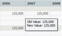
- White background: the data in the cell is unchanged. Hovering above the cell lets you see the old and new values in a tooltip (in this case, they are the same).
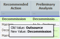
- Green background: the data in the cell was successfully pasted. Hovering above the cell lets you see the old and new values in a tooltip.
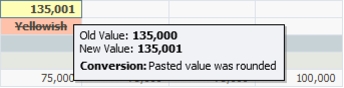
- Yellow background: in order to paste the data, PPM performed an automatic adjustment. For example: a float number was pasted into a cell that was defined for integer input. The new value is automatically rounded so it can be pasted into the cell. Hovering above the cell lets you see the old and new values as well as the performed conversion in a tooltip.
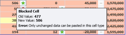
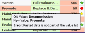
- Red background: the new value cannot be pasted and is seen crossed-out in the cell. Hovering above the cell lets you see the old and new values, as well as the reason the value couldn't be pasted in a tooltip.
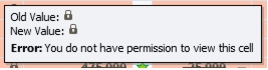
Note: If the cell holds a Calculated or Imported category value, the tooltip will look like the example of the left; if the cell is Denied View, the tool tip will look like the example on the right.