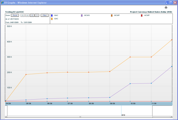
You can view a graphical representation of earned value by clicking the Graph button from the Earned Value log window or from an earned value sheet. This is available for the default earned value sheet and additional sheets available through the More Sheets option. Earned value data can be viewed either by currency over time, or by value percentage over time. The default view is currency.
You must have Adobe Flash Player installed on your system to view earned value graphs.
To display the earned value sheet as a graph
- Open the earned value sheet.
- Click the Graph button and select one of the following:
- All Rows: Shows graphical representation of the sum of all rows on the sheet.
- Selected Row: Shows graphical representation of the row that is currently selected on the sheet (summary or leaf row).
Note: The graph displays the names of the curves as they appear as column names on the sheet. If you change the name of a custom curve, you must also change the column name in order for the name change to display on the graph. The graphical display will also automatically include any custom curves you have added, even if you have not added them as columns on the sheet. You can filter which curves to display.
To change the view
Click the Project Currency or Percentage button next to the View By field. Unifier will gray-out the current view.
To filter which graphs are displayed
- Click the Curves button. The Filter Graphs window opens.
- Select the graphs that you want to display and click OK.
To change the zoom level of the graph
Click Zoom and choose Week (W), Month (M), Quarter (Q), or Year (Y). This will change the plotting of the graph display (not the data calculations), and enable you to view data by time period. Graphs using the Week (W) and Month (M) zoom levels are displayed using the Date Format set in your User Preferences. Refer to Unifier General User Guide for details on setting the date format in User Preferences. Graphs using the Quarter (Q) or Year (Y) are displayed using the Time Scale Format set in the EV Properties General tab.
Note: Some earned value calculations can lead to a negative number. These results are shown on the graphs.
The zoom level that you choose works with the time period by which data is captured. For example, if you are capturing data by the month, and select the zoom level Quarter (Q), the graph will display three months of data. If you select the zoom level Year (y), the graph will show 12 months of data.
For example:
You can create your own time scale by using the scale slider bar at the bottom of the graph. Drag to the right or left to experiment with the time scale.
Note: Custom unit of measure (UOM) - based curves are not shown on earned value graphs.
To reset the zoom level of the graph
Click Reset to return the graph to the default view.
To print the graph
Click the Print icon on the upper right corner of the sheet.