Purpose
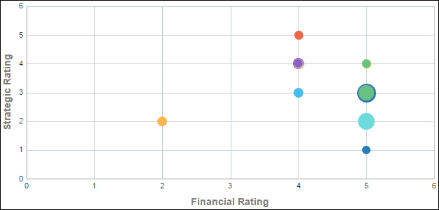
The bubble chart plots projects according to their financial and strategic rating.
The x-axis shows Financial Rating. The y-axis shows Strategic Rating. Bubble size represents At Completion Total Cost, with a larger bubble representing a larger value. Bubble color is used only to differentiate between bubbles. Hover over a bubble for specific details.
Location
- On the Home page, click Dashboards.
- Under Primavera, select Facilities and Real Estate.
- On the Facilities and Real Estate dashboard, click the Overview page.
- On the Overview page, expand the Project Investment Map section.
Subject Area
Activity