Purpose
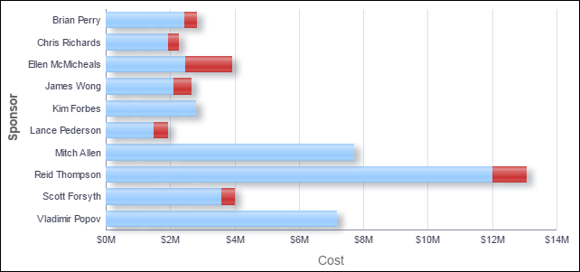
The bar chart shows stacked bars plotting the At Completion Total Cost per sponsor. Each band on a bar represents a different project and bands are colored according to their project score, which is a measure of their performance. Blue bands represent projects with a project score of more than 65; red bands represent poorly performing projects with a project score of less than 65.
The x-axis shows investment Cost. The y-axis shows the project Sponsor. Hover over a bar for specific data and click on the bar to drill down to see more information about the project.
Location
- On the Home page, click Dashboards.
- Under Primavera, select Portfolio Analysis.
- On the Portfolio Analysis dashboard, click the Overview page.
- On the Overview page, expand the Project Performance by Sponsor section.
Subject Area
Activity