Purpose
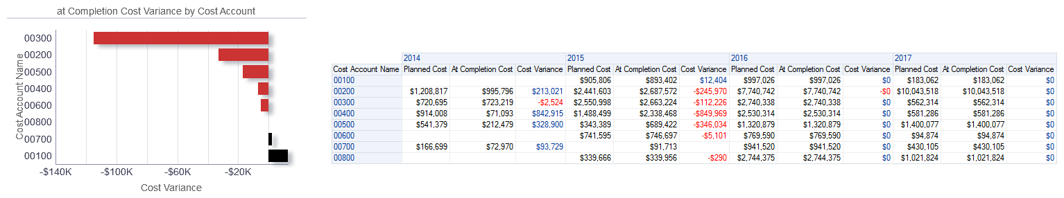
The bar chart shows the cost variance for each cost account.
The x-axis shows Cost Variance. The y-axis shows the Cost Account Name ordered by Cost Variance. Red bars indicate a negative Cost Variance value, whereas black bars indicate a positive Cost Variance value. Hover over a bar to see specific information for the cost account.
The pivot table breaks data down by Cost Account Name and year. The table contains columns for:
- Cost Account Name
- Planned Cost
- At Completion Cost
- Cost Variance
Location
- On the Home page, click Dashboards.
- Under Primavera, select Project Health.
- On the Project Health dashboard, click the Overview page.
- On the Overview page, expand the Cost Account section.
Subject Area
Resource Assignment