Purpose
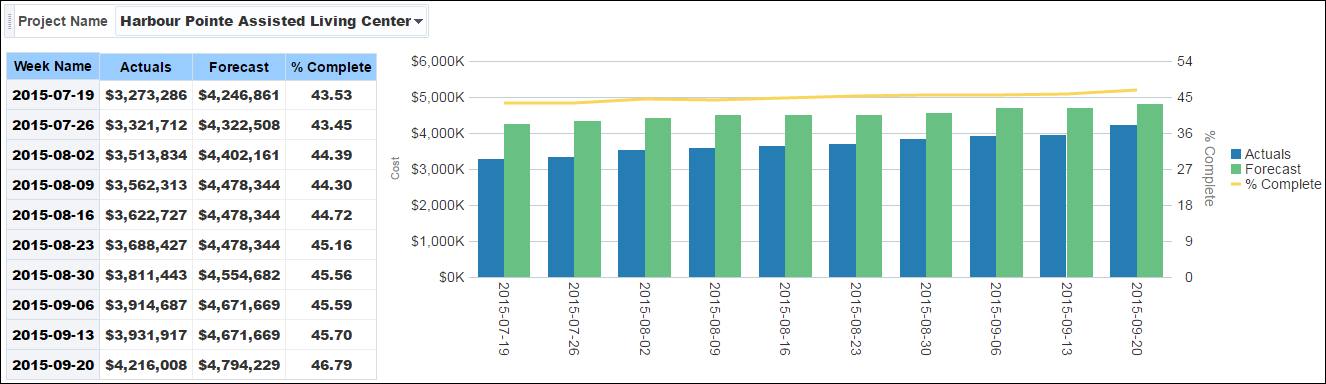
The pivot table shows weekly details for the selected project. It shows columns for:
- Week Name
- Actuals
- Forecast
- % Complete ((Actuals / (Actuals + Forecast)) * 100)
The line-bar chart shows bars for Actuals and Forecast for the selected project. The line represents Percent Complete.
The x-axis shows weeks. The y-axis for the bars (on the left) shows cash flow values. The y-axis for the line (on the right) shows percentages.
Location
- On the Home page, click Dashboards.
- Under Primavera, select Cash Flow.
- On the Cash Flow dashboard, click the History page.
- On the History page, expand the Actual vs Forecast Weekly Trend section.
Subject Area
Cash Flow History