Defining Components
This section provides an overview of the component definition window and discusses how to:
Create new component definitions.
Open existing component definitions.
Add pages to components.
Reorder pages in a component.
Copy or move pages to another component.
Set page attributes.
Validate components.
When you design component pages, the pages must share the same Level 0 key structure because they share the same search record.
Depending on the complexity of a component, the system may take longer to display the first page than to display other pages in the component (or even display the first page again) because it is loading records for the entire component.
The component definition window has two tabs, Definition and Structure, that provide different views of a component.
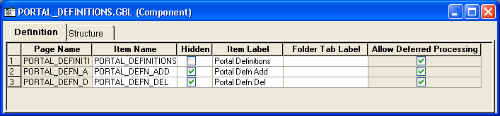
Definition Tab
The default component definition view displays the page items and corresponding attributes of a component definition. You double-click the page name to open the page definition:
Image: Component definition view
This example illustrates the fields and controls on the Component definition view. You can find definitions for the fields and controls later on this page.
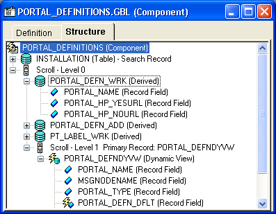
Structure Tab
The structure view shows records and scrolls in a tree representation. It provides information about page levels and component records and their roles. You double-click the objects in this view to open their definitions:
Image: Component structure view
This example illustrates the fields and controls on the Component structure view. You can find definitions for the fields and controls later on this page.
To view the PeopleCode that is attached to any of the components, right-click and select the View PeopleCode option from the pop-up menu. The PeopleCode Editor opens directly in the workspace, displaying the related PeopleCode.
Note: The Structure tab only displays the runtime state of the PeopleCode. That is, it only displays record field PeopleCode. For example, PeopleCode programs that are orphaned as a result of a page definition change do not appear in the Structure tab. On the other hand, these orphaned PeopleCode programs do appear in the PeopleCode Editor, which displays the design-time view of PeopleCode.
|
Field or Control |
Definition |
|---|---|
 |
A key icon appears next to all key and alternative search key fields in the component structure view. |
 |
An asterisk icon appears next to all fields that are required. |
To create a new component definition:
With a new or existing project open in PeopleSoft Application Designer, select
Double-click Component.
The new component definition appears in the workspace.
When saving a component definition, make sure to adhere to the accepted naming conventions for PeopleSoft definitions.
See Saving Definitions.
To open an existing component definition:
Select
Select Component as the type.
Specify the selection criteria.
The component definition appears in the workspace.
This section discusses how to:
Use the Insert menu to add a page.
Drag a page into the component.
Note: The system does not allow you to move or delete all pages from a component definition. The component must contain at least one page definition.
Using the Insert Menu to Add a Page
To use the Insert menu to add a page:
Open a new or existing component in the workspace and make the definition active.
Select
To narrow your search, enter selection criteria, such as name, description, or project.
Click Insert.
A list of available pages matching your search criteria appears.
Select the page that you want to add to the component.
Click Insert.
The page that you selected appears in the component in the workspace.
When you are finished adding pages to your component, click Close.
Save your component.
Component names can be up to 18 characters in length.
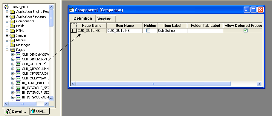
Dragging a Page Into a Component
To drag a page into a component:
Open the project and component.
Drag pages from the project workspace to the component.
This is an example of dragging a page into a component definition:
Image: Dragging from the project workspace to a component
This example illustrates the fields and controls on the Dragging from the project workspace to a component. You can find definitions for the fields and controls later on this page.
After you add pages to a component, you can change the order in which they appear in the component.
Image: Moving a page in a component
This example illustrates the fields and controls on the Moving a page in a component. You can find definitions for the fields and controls later on this page.
To reorder a page in a component:
Select a row number on the left-hand side of the component definition.
Drag the row to the correct position.
The page is inserted immediately below the highlighted line. In the preceding example, the third page (UK) becomes the second page.
After you create a component, you can copy or move pages from one component to another.
Note: The system does not allow you to move or delete all pages from a component definition. The component must contain at least one page definition.
To copy or move a page from one component to another:
Open both components.
In the left-hand column, select the number of the page that you want to copy.
Copy or cut the page:
To copy the page to another component, select
To move the page to another component, select
Select the other component.
Select
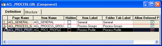
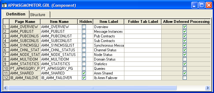
Each page in a component has attributes. Each attribute is represented by a column in the component definition:
Image: Component item label and tab label
This example illustrates the fields and controls on the Component item label and tab label. You can find definitions for the fields and controls later on this page.
|
Field or Control |
Definition |
|---|---|
| Page Name |
Displays the read-only name of the page definition. If you rename the page, the system updates this column automatically. When creating page definitions, you might want to use similar names to make them easily recognizable as a group of pages. For example, if you create three pages to hold the information for the Personal Data Table, the page names might be:
|
| Item Name |
Displays a name for each page in the component. This name must be unique in the component, and the default is the page name. This name is for informational purposes only. If you use the same page for more than one component, you might want to change the item name to reflect the purpose of the page in the component. |
| Hidden |
Specifies whether the page can be viewed by the user at runtime. Pages are usually hidden when they are used in work groups or associated with derived work records. For example, information from a page might need to be loaded into the buffer for PeopleCode to perform calculations, but the user does not need to see it. Note: Marking the page as hidden also hides the toolbar, including the Save button, even if you choose to display the page by means of another method, such as the Transfer PeopleCode function. |
| Item Label |
Serves as the default folder tab label unless you specify a different label. The item label should be unique for each page in a single component menu. The folder tab label is usually used when shorter names are needed for folder tabs. In the preceding example (BANK_ACCOUNT.GBL), the same text appears on both the folder tab and the component menu for the first page in the component. The second and third pages have different menu names and folder tabs. |
| Folder Tab Label |
Displays the text that appears on the folder tab label. If no text is specified, the system uses the text of the item label on the folder tabs. |
| Allow Deferred Processing |
Indicates whether deferred processing is active for that page in its property settings. |
Setting Access Keys
You can set access keys by placing an ampersand (&) in the text of each item label. Put the ampersand in front of the letter that you want to be underlined on the folder tab at runtime:
Image: Item labels with ampersands
This example illustrates the fields and controls on the Item labels with ampersands. You can find definitions for the fields and controls later on this page.
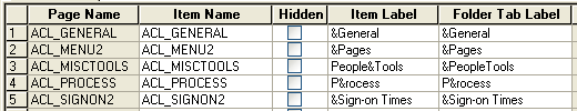
At runtime, a user can navigate between pages by pressing the Alt key plus the letter that is underlined, followed by the Enter key.
Image: Underlined access keys on tabs
This example illustrates the fields and controls on the Underlined access keys on tabs. You can find definitions for the fields and controls later on this page.

PeopleSoft Application Designer includes a validate utility to verify the integrity of components. The validate utility runs a series of tests on components to check that they will operate properly at runtime, and it sends the results to the Validate tab in the output window.
To validate a component:
Open the desired component definition.
Select and make sure that the Validate PeopleSoft Internet Architecture Execution option is selected.
Note: This option must be selected for the validate tests to be invoked.
Select .
View the results that appear on the Validate tab and correct any errors.