Defining Default Layout Options
This topic describes using the Layout Default Options page to define defaults for Mobile Application Platform layouts.
To access the Layout Default Options page (IB_DOCLODFLTS) select .
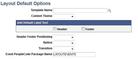
Image: Layout Default Options page
This example illustrates the fields and controls on the Layout Default Options page. You can find definitions for the fields and controls later on this page.
|
Field or Control |
Definition |
|---|---|
| Template Name |
Enter or use the Lookup button to search for a layout template to apply by default to the first page in the layout. |
| Content Theme |
From the drop-down list, select the default jQuery theme to use for content if the selected template does not define one. |
| Add Default Label Text |
Select Header and/or Footer to add default text in the Header/ Footer as a reminder to populate with the appropriate text. |
| Header Footer Positioning |
Select the default position for the header and footer toolbars. The values are:
|
| Button |
The default position of buttons when assigned to a group. The values are:
|
| Transition |
Define the transition from this page to other pages in the layout. The options are:
|
| Event PeopleCode Package Name |
This field is reserved for future use. |