Defining Select Menu Page Element Properties
This topic discusses how to define select menu page element properties.
Many properties that you can define for select menu page elements are also available to define for other page elements. These common properties are described in the topic Common Layout Page Element Properties
This topic discusses using the properties that are unique to select menu page elements only.
This topic describes using the Select Menu Properties section of the Select Menu Properties page.
To access the page select and in the Layout grid click the Properties link next to the element ID of the select menu element for which you want to define properties.
Image: Select Menu Properties section (Default view)
This example illustrates the fields and controls in the default view of the Select Menu Properties section on the Select Menu Properties page. You can find definitions for the fields and controls later on this page.

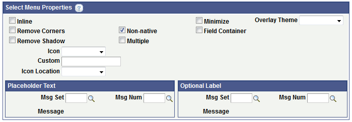
If you select the Non-native box addition properties appear in the section as shown in the following example.
Image: Select Menu Properties section (Non-Native Properties displaying)
When you select the Non-native property in the Select Menu Properties section, additional properties appear as shown in this example.

The following table describes the fields and controls in the Select Menu Properties section of the Select Menu Properties page. The fields and controls are listed in alphabetical order:
|
Field or Control |
Definition |
|---|---|
| Custom |
Enter the name of a custom CSS3 class for a custom icon. The class must be defined in the Layout Designer – CSS page or in the layout template if a template is applied to the layout. |
| Field Container |
Select this option to enable a field container for the element to assist in rendering the element on wider screens, such as in table devices. |
| Icon |
From the drop-down list select an icon for the select menu button. The values are:
|
| Icon Location |
From the drop-down list select the location for the icon. The values are:
|
| Inline |
Select the property so that the length of the button label determines the button width. |
| Minimize |
Select the property to create a more compact version of the element. |
| Multiple |
Select the property to allow users to select multiple options from a select menu. |
| Non-native |
Select the property to provide an alternative to the native select element of the mobile browser. When you select this property the following additional fields and controls appear:
|
| Optional Label controls |
Use these controls to define a group label for the menu options, The label appears just below the menu title.
|
| Overlay Theme |
From the drop-down list select a jQuery theme for the overlay layer of the select menu. For more information about jQuery themes in the Mobile Application Platform see Defining jQuery Mobile Theme Properties |
| Placeholder Text controls |
Use these controls to define a non–selectable overlay title. When defined, placeholder text displays as the title of the menu instead of the first menu item.
|
| Remove Corners |
Select the property to remove the border radius around the button. |
| Remove Shadow |
Select the property to remove the shadow around the button. |