Managing Check Box Page Elements
This topic discusses how to manage check box page elements.
To define a check box page element you specify a boolean primitive element defined in the PeopleSoft document associated with the layout definition.
This section discusses how to:
Add check box page elements to pages.
Use the Select Boolean Primitive for Checkbox page.
View defined check box page elements in the Layout grid.
Define check box display labels.
Adding Check Box Page Elements to Pages
To add a check box page element:
Access the Layout grid on the Layout Designer – Layout page.
Select to access the page.
Determine the position in the grid to add the page element.
Click the row directly above where you want to add the page element to make it the current row.
The Current Row icon (blue arrow) displays in the first column of the row to indicate that it’s the current row.
Field or Control
Definition

The Current Row button.
Click the Add Checkbox button on the Layout grid toolbar.
Field or Control
Definition

The Add Checkbox button.
After you select a position for the element in the Layout grid and click the Add Checkbox button, the “Do you want to create a group?” page appears:
Image: “Do you want to create a group?” page
This example illustrates the fields and controls on the “Do you want to create a group?” page. You can find definitions for the fields and controls later on this page.
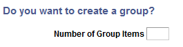
If you want to create a group of radio buttons, enter the number in the Number of Group Items field and click the Yes button. If you do not want to create a group of check box element click the No button. For more information about creating element groups, see Managing Element Groups
After you determine whether to create a group of check box elements, the Select Boolean Primitive for Checkbox page appears.
Using the Select Boolean Primitive for Checkbox Page
Use the Select Boolean Primitive for Checkbox page to select a value for the element.
Image: Select Boolean Primitive for Checkbox page
This example illustrates the fields and controls on the Select Boolean Primitive for Checkbox page. You can find definitions for the fields and controls later on this page.
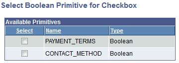
The boolean primitive elements defined in the PeopleSoft document defined for the layout appear on the page. The page displays only displays those elements that are not already defined for an element.
|
Field or Control |
Definition |
|---|---|
| Select |
Select the boolean primitive for the radio button from the list. |
After you select the value for the element the Layout Designer – Layout page appears.
Viewing Defined Check Box Elements in the Layout Grid
After you define a radio button by selecting a primitive value for it, the Layout Designer – Layout page appears and the element appears in the Layout grid.
The default element ID for radio button page elements is the name of the primitive you defined for it., for example <primitive_name>_n.
Image: Check box element defined in the Layout grid
This example illustrates a check box element defined in the Layout grid.

In the example, PAYMENT_TERMS_1 is the element ID.
By default the system populates the Label Text field with the name of the primitive that you defined for the element, PAYMENT_TERMS in the example.
Click the Properties link to access the Checkbox Properties page to define properties for the element.
Defining Display Labels for Checkbox Page Elements
The value in the Label Text field for a check box element is the label that appears for the element at runtime. And as described previously, the default value is the value defined in the Element Name field for the primitive in the PeopleSoft document.
You can keep the default value, define a different value, or remove it.
In the same row as the element are class, style, and theme fields. Use these fields to apply a CSS3 classes and styles to the button label, as well as apply a jQuery theme.
This section discusses defining radio button page element properties.
Understanding Defining Check Box Page Element Properties
To define properties for check box page elements, use the Checkbox Properties page.
Many properties that appear on the Checkbox Properties page also appear on the properties pages for other page elements. For more information and links to topics about these common properties, see the topic Common Layout Page Element Properties
This topic discusses using the properties on the Checkbox Properties page that are unique to working with check box page elements. These properties are located in the Checkbox Properties section of the page.
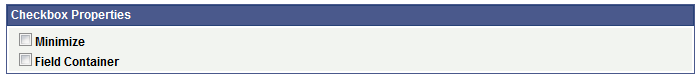
Defining Check Box Properties
To access the Checkbox Properties page, in the Layout grid on the Layout Designer – Layout page click the Properties link next to the check box element for which you want to define properties.
Image: Checkbox Properties section
This example illustrates the fields and controls in the Checkbox Properties section of the Checkbox Properties page. You can find definitions for the fields and controls later on this page.
|
Field or Control |
Definition |
|---|---|
| Minimize |
Select the property to create a more compact version of the element. |
| Field Container |
Select the property to enable a field container for the element to assist in rendering the element on wider screens, such as in table devices. |