Managing Containers in Layout Rapid App Designer
When you add a new layout using Layout Rapid Application Designer, containers as defined on the selected template will be defaulted on the grid. Containers can be nested, meaning that a container can hold other containers. Select of the Add Container icon will create a start and end container. The developer can then add additional element types to the container.
Any style changes in the Rapid Application are applied using the Container Properties Class section. When you create a new Rapid Application Layout, you need to specify the template. In Template Designer you can add additional classes, styles and sub templates to the template. See Using the Containers Page and Using the Add Sub Templates Page.
To apply class properties to the container:
If this is a new layout, save the layout.
Note: You must save the new layout for the Container Class Properties to display.
Add a new container if necessary.
In the layout grid, click on the icon for Container Start Section.
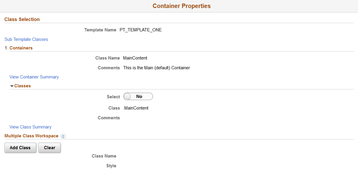
Image: Container Properties – Class Section
This example illustrates the fields and controls on the Container Properties – Class Section. You can find definitions for the fields and controls later on this page.
Field or Control
Definition
Template Name The template name for this rapid application is displayed.
Sub Template Classes Select this link to select a sub template class.
Containers The containers for the template are displayed.
Classes Expand this section to view the available classes.
Add Class To add a class, select the class and click the Add Class button.
Clear Click this button to clear all classes.
Adding Sub Template Classes
To add sub template elements to the container:
Click the Sub Template Classes link.
Select the Sub Template from the drop down.
Select the class.
Image: Select Sub Template Class Information page
This example illustrates the fields and controls on the Select Sub Template Class Information page. You can find definitions for the fields and controls later on this page.
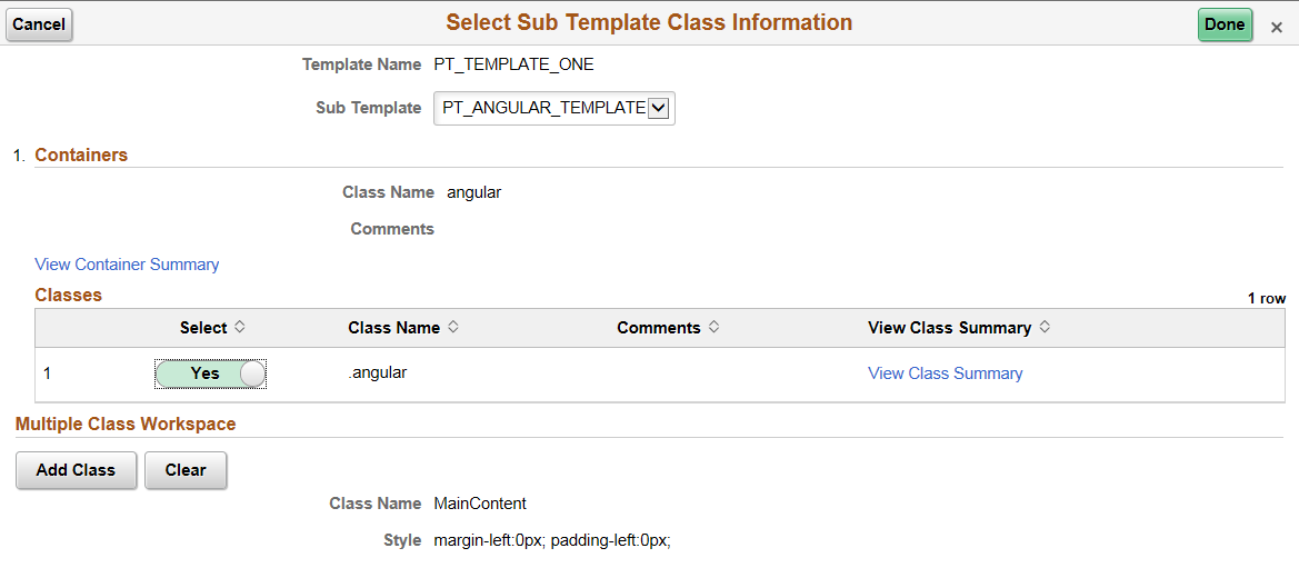
Click the Add Class button.
The class will be added to the existing class.
Image: Sub Template Class added
This example illustrates the Multiple Class Workspace with the Sub Template Class added.
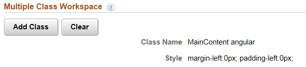
Click Done.
Adding Classes
To add additional classes, the classes must be available on the template for the Rapid Application.
Expand the Classes for the Container you want to add.
Select the Class.
Image: Class Selection with Classes – Classes
This example illustrates the Class Selection section with the Classes expanded for the Container blue.
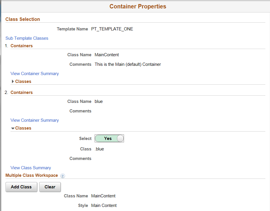
Click Add Class.
The class is added.
Image: Class added
This example illustrates Container Properties page where a second class has been added.
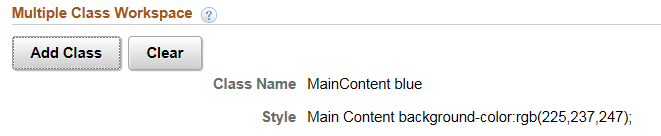
Image: Container Properties page
This example illustrates the fields and controls on the Container Properties page. You can find definitions for the fields and controls later on this page.
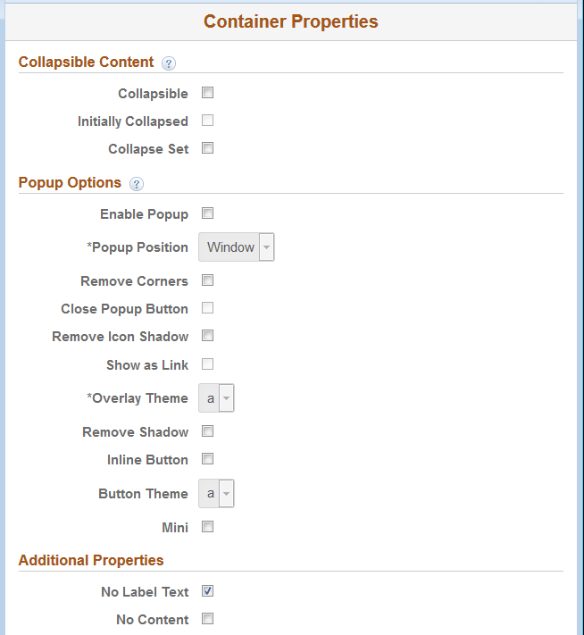
Collapsible Content
In order to create content that can expand and contract, the Collapsible check box should be selected. This will create a header based on the label Text and Content area. The header acts as a button that can be touched to expand and contract the content area. By default, the content area will be collapsed, unless the collapsed check box is disabled. Collapsible content areas can also be grouped to create an accordion. An accordion is essentially a group of collapsible content areas that are aware of each other. To define an accordion, select the collapsible Set check box for the parent container. Add other containers within this defined collapsible Set container. Ensure to select the collapsible check box for the containers added to this parent (containers defined as collapsible set).
Nested Collapsible Content – You can nest collapsible content. An automatic margin will be created for every new level of collapsible panel. It’s recommended not to add more than two levels to avoid UI and DOM complexity.
Accordion – Allows you to group components of collapsible content so that only one panel can be visible at a time. So when you view one panel (content area), all others will be closed
|
Field or Control |
Definition |
|---|---|
| Collapsible |
Select to create collapsible content. |
| Initially Collapsed |
By default, collapsible content will be opened when the page loads. Hide the content by selecting this checkbox. |
| Collapse Set |
To create an accordion. By default the framework opens the last collapsible panel in a collapsible set. |
Popup Options
To pop up a Container (content area) use a Button or Link.
Select the Popup option to create an overlay (with the contents of the container) that floats above the current page. Select the optional Close button if you wish to have a close button as part of the overlay. By default, the popup logic will show as a Button using the Label Text of the Container for the Button label. Select the optional, Show as Link checkbox to show a link with the Container Text label.
Note: Chaining of popup is not currently supported. If the parent container has popup enabled, any child containers that include popup will not work. The jQuery Mobile Popups framework does not currently support chaining of popups so it's not possible to embed a link from one popup to another popup.
|
Field or Control |
Definition |
|---|---|
| Enable Popup |
Select to enable the container to act as a popup. |
| Popup Position |
By default, pop-up content opens centered vertically and horizontally over the page element/component/object selected (also known as the origin). The Mobile Application Platform framework also applies some basic collision detection rules to ensure that pop-up content appears on-screen, so the ultimate position may not always be centered over the origin. To change the default position of pop-up content, the options are:
|
| Remove Corners |
By default buttons appear with rounded corners. |
| Close Popup Button |
Select the box to insert a close button for the pop-up content. After you select this control, the Close Button Position drop-down list box appears for selecting the position of the close button in the pop-up. |
| Remove Icon Shadow |
By default icons appear with a shadow effect. Select this property to remove the shadow. |
| Show as Link |
Select to To show the popup as a link instead of a button. The following options will then be available:
|
| Overlay Theme |
Theme of the popup's background, which covers the entire window behind the popup. From the drop-down list select a jQuery theme for the overlay layer of the select menu. For more information about jQuery themes in the Mobile Application Platform see Defining jQuery Mobile Theme Properties |
| Remove Shadow |
By default buttons and icons appear with a shadow effect. This option removes the shadow. |
| Inline Button |
Select this box to use an inline button to invoke the popup content.. Inline buttons do not use the whole width of the view port |
| Button Theme |
Theme to use on the button |
| Mini |
Create a more compact version of the button element |