Managing Headers and Footers in Layout Rapid App Designer
In the Layout Rapid App Designer, the header and footer sections are defined in the Layout Grid by default. This topic discusses how to manage headers and footers in Layout Rapid App Designer.
To insert elements in the header or footer section, place the current row (arrow icon) on the Header Start Section or the Footer Start Section.
You can include the following page elements into header and footer sections:
Button
URL
Mobile Grid
Container
Static text
Note: Mobile Grid and Input are not allowed in a Container in a Header or Footer. If a Container is deleted from the Header or Footer all elements contained within will also be deleted.
The same properties are available for both headers and footers. The property will determine how the header or footer is displayed on the page.
To set the header properties click on the Header icon in the layout grid. To set the footer properties, click on the Footer icon on the layout grid.
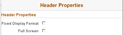
Image: Header properties page
This example illustrates the fields and controls on the Header properties page. You can find definitions for the fields and controls later on this page.
|
Field or Control |
Definition |
|---|---|
| Fixed Display Format |
For headers, the header will appear at the top of the viewport and remain there as the user scrolls, regardless of where the user is in the content. For footers, the footer will appear at the bottom of the viewport and remain there as the user scrolls, regardless of where the user is in the content. |
| Full Screen |
For headers, the header will appear within the viewport, however as the user scrolls the header will also scroll and may no longer be displayed. For footers, the footer will appear within the viewport, however as the user scrolls the footer will also scroll and may no longer be displayed. |